When our client assigned to us to create for him full visual branding for his new project (PIZZA N’ CREMAS).
He explained to us his intention to start a new chain specialized in mid-dough pizza (not pan like American and not thin like Italian) As will as soft cream and frozen yogurt.
That’s why he needs to differentiate himself by new style based on European standard not American nor Italian.
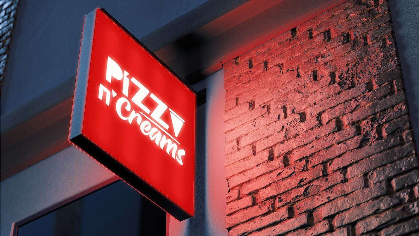
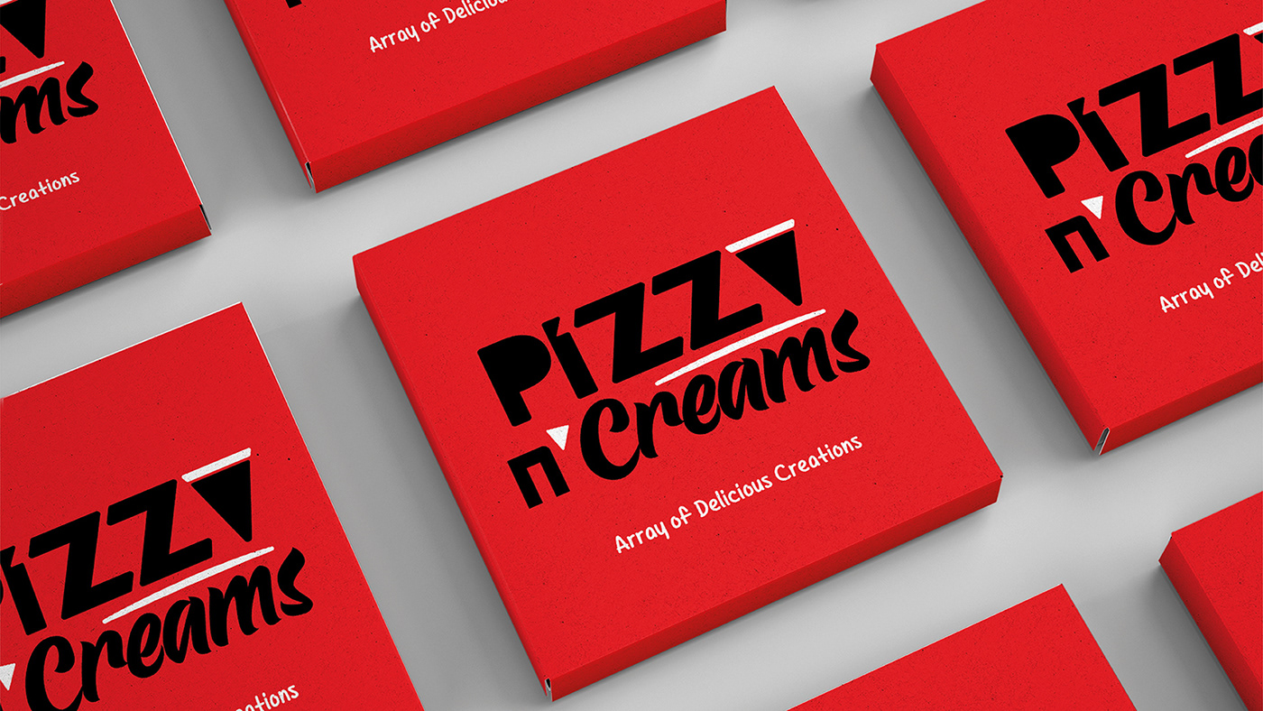
We studied our homework well and then we started with the logo, we had chosen slide of pizza instated of “A” letter with black stuffed edge, and the “ˊ “upon the “N” refers to pizza slide and the cone of soft cream, Also we chosen the font of creams to be creamy rounded and the “S” is like top of the soft cream or the frozen yogurt.
After that, we used the triangular shape as a pattern that give a dynamic in all applications and to facilitate finding out the brand identity.
We used also, hot red color as the main hero of the brand sending appealing emotion and giving the hot pizza that’ spirit of just coming out from oven, also using black color to inspire the richness and luxury of “pizza n’ creams" brand.
We completed the project and our target is to convey the sense of European charm to make the brand eye catching and memorable.


