Project:
Culca Bay Corporate ID
Brief:
Generate a name and corporate identity for a Nature Reserve
Criteria:
- Company logo & name generation
- General branding (focus: functional corporate media)
Approach:
The Great Barrier Reef was chosen
Final:
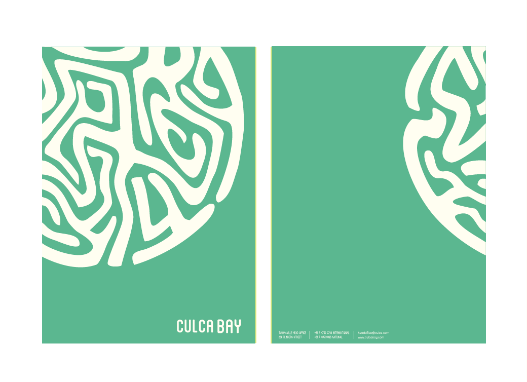
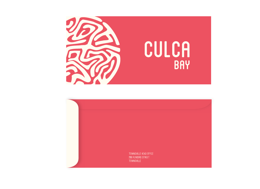
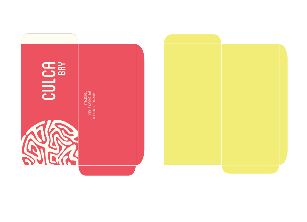
Culca is a derivative of the words “coral” and “coast”. It is a term created specifically for the
brand with a primitive underpinning, the focus here was to create a linkage to the past- a
reinforcement of how old the reserve is. This primitive aspect is echoed in the logo itself
baring thick strokes, which create an earth-like circular element, an indication of its worldly
appeal. The inspiration behind the logo and most of the brand identity was from the reef
itself. The pattern in the logo resembles that of brain coral, and the color palette was
generated from images of the reef. The logos circular element was reused through out
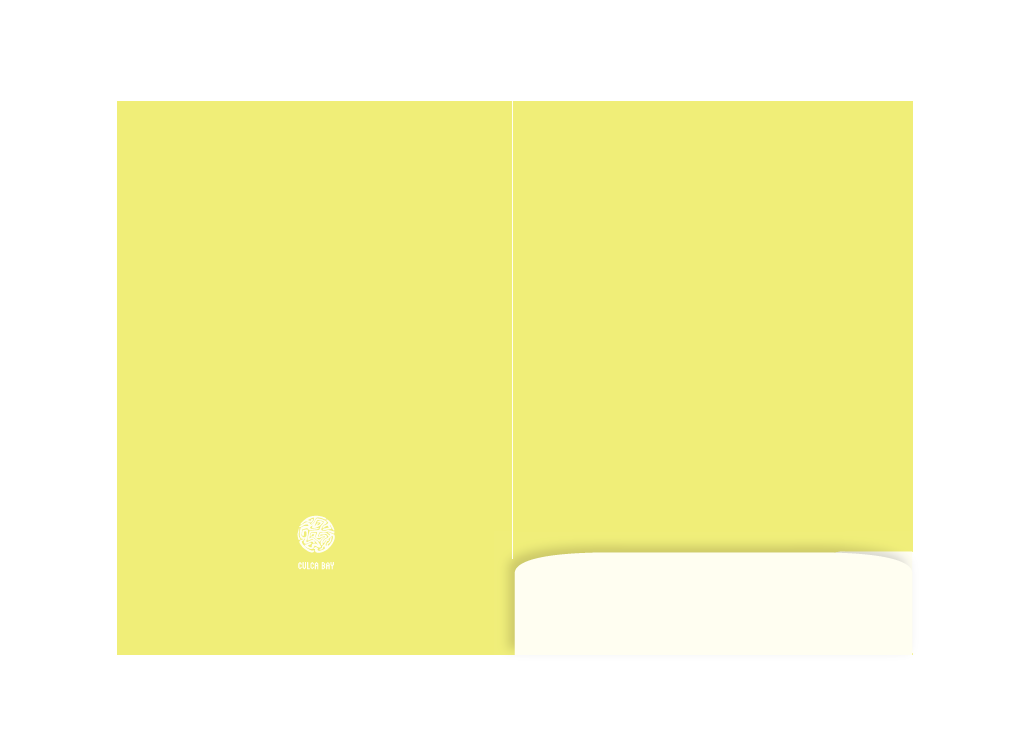
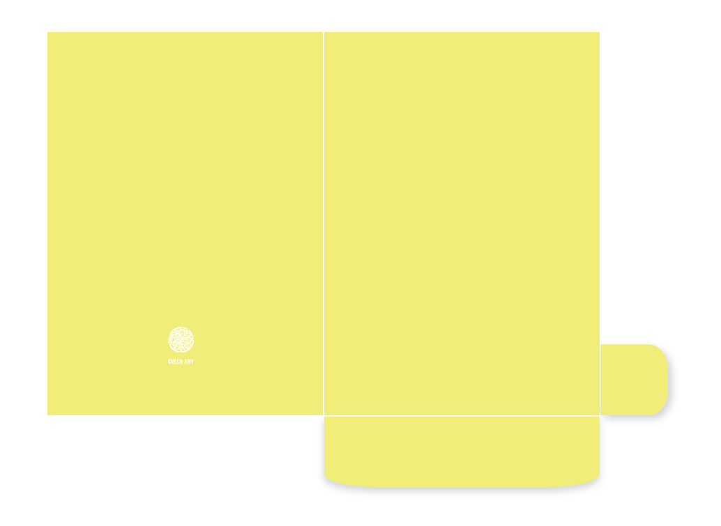
the entire identity in various ways, some of which mimic coral formations in the water such
as on the corporate folder and envelope. This repetition of the circular element and the
colours creates a coherent look- and proves to be a strong design element
Disclaimer:
Additional Media Mockups/Mockups were sourced off the internet, accreditation
therefore goes to the owners. These documents are not for commercial use.
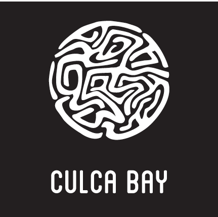
Black & White Logo
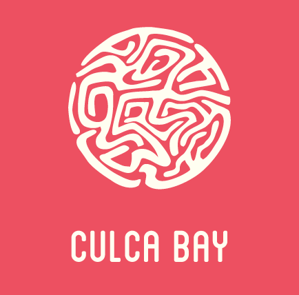
Colour Logo
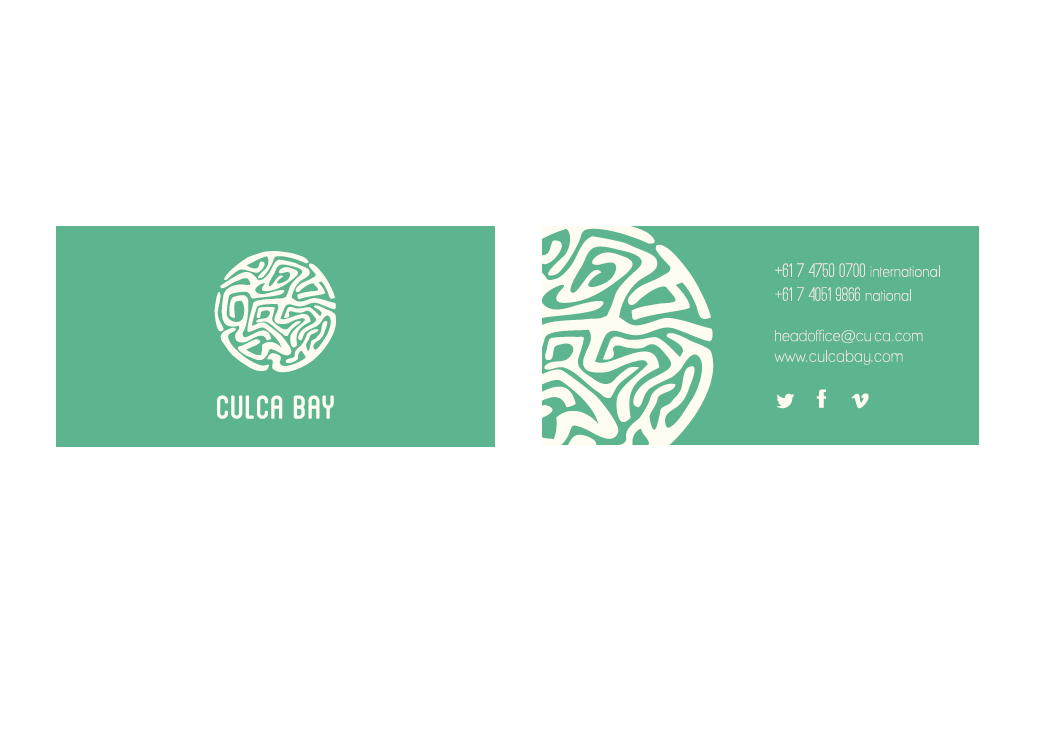
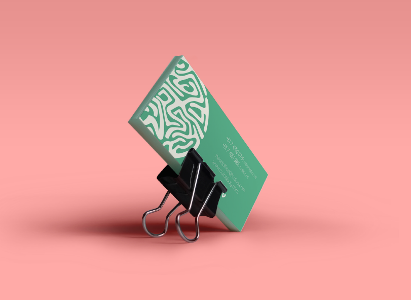
Business Card Mockup

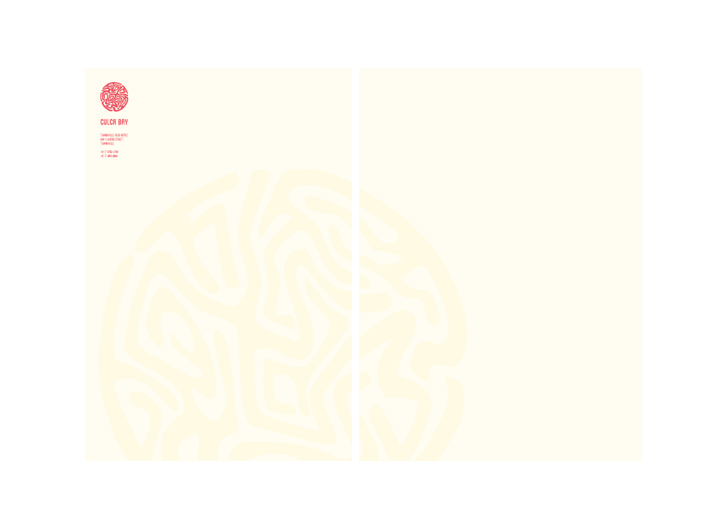

Letterhead Application
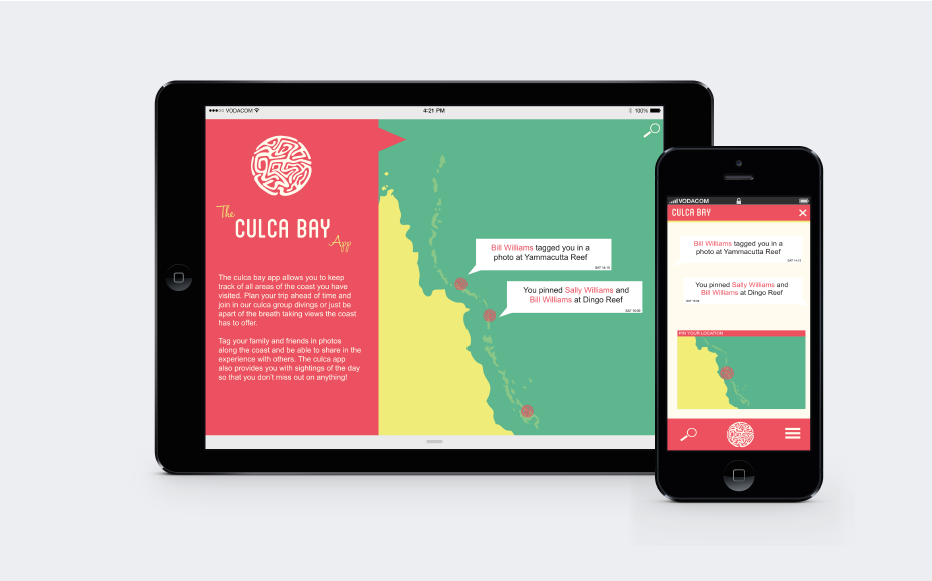
Possible Additional Media: App


