The reason I re-branded Tampax, is to make it less of a medical product, and add a more ‘human’ tone of voice and visuals. Other brands have attempted making sanitary products more feminine, but this has mostly resulted in ugly pastel colours and flowers or butterflies, and other stereotypically clichéd things associated with femininity. I want to take the shame / embarrassment out of buying tampons and having them in the bathroom, to something nice to look at, fun to read and proud to have on the shelf.
In my research I found that many women do not like to have thier sanitary products on show in the bathroom because either because they live with men and they hate the packaging. They would rather it blend in, not stand out.
Key words:
-Tacky
-Boring
-Too loud/ bright
-Not subtle
-Too cutesy
Other key points
-Women want less science and jargon, more human and empathetic
-Want it to be entertaining, funny, unashamed
-Hate the ‘period lies’- it’s not a ‘happy’ period.

IDENTITY
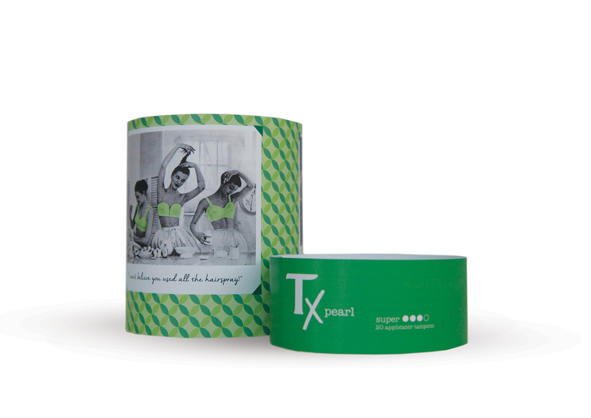
I changed the brand mark to ‘Tx’, keeping the same ‘T’ typeface as the old brand. this is to make the branding softer, and less harsh. The word ‘Tampax’ sounds much like ‘tampon’, and for reasons of subtlety I decided to change this. Luckily they are such a well established brand I felt this would benefit rather than hinder the brand.
PACKAGING
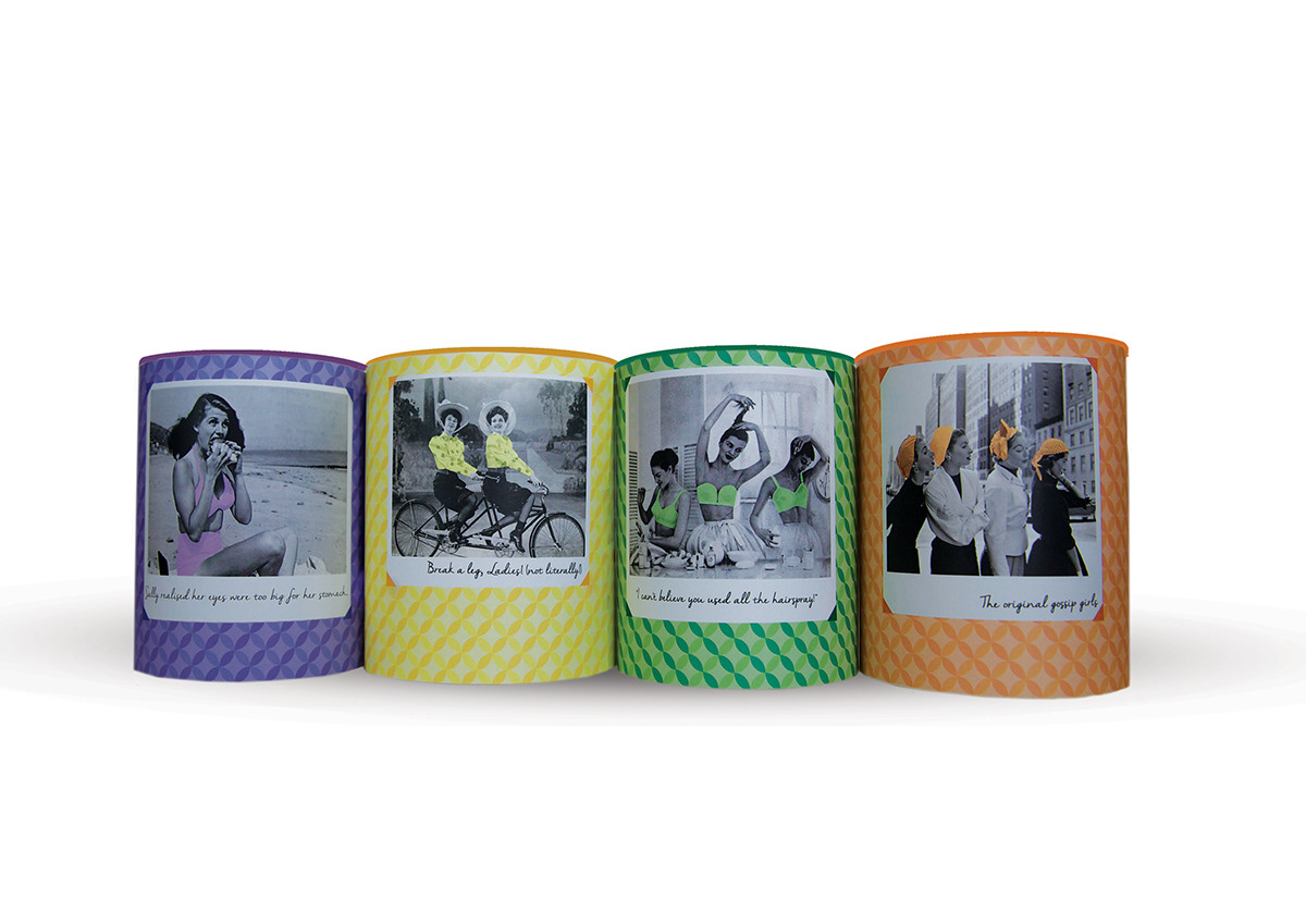
The packaging is fun, engaging and takes the ‘shame’ or embarrassment out of buying tampons, and turns the product from a ‘need’ to a ‘want’, with desirable packaging and quirky, interesting language on the packs.
KEY VALUES
-CELEBRATE WOMEN
-HUMAN
-EMPATHETIC
-KEEPSAKE
-FEMININE
-COSMETIC
-PROUD YET DISCREET
-FUN
-USER EXPERIENCE

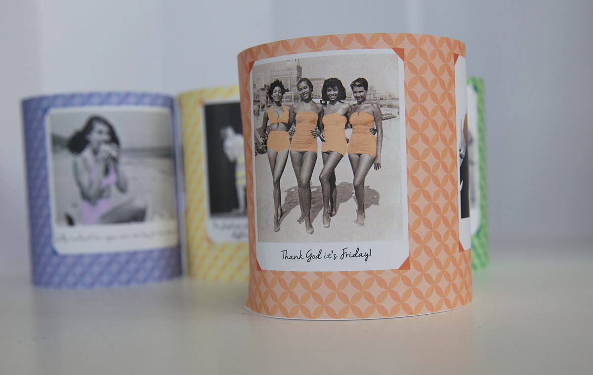
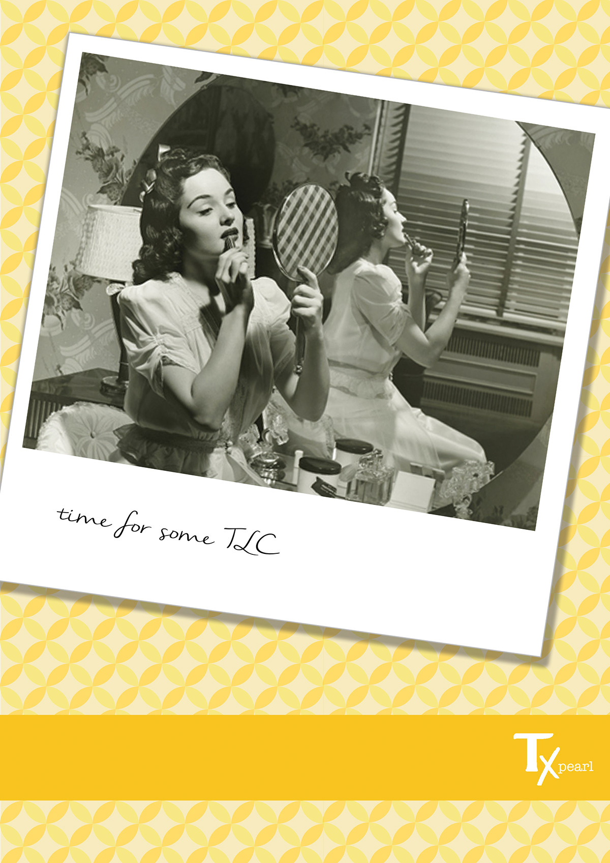
VISUAL IMAGERY
The use of ‘vintage’ style polariods of real women and retro geometric patterns are all an attempt to make Tampax more human, and hopefully pretty enough to keep as a keepsake. it is a far cry from the current ‘medical’ packaging and is there to reassure you and comfort you.
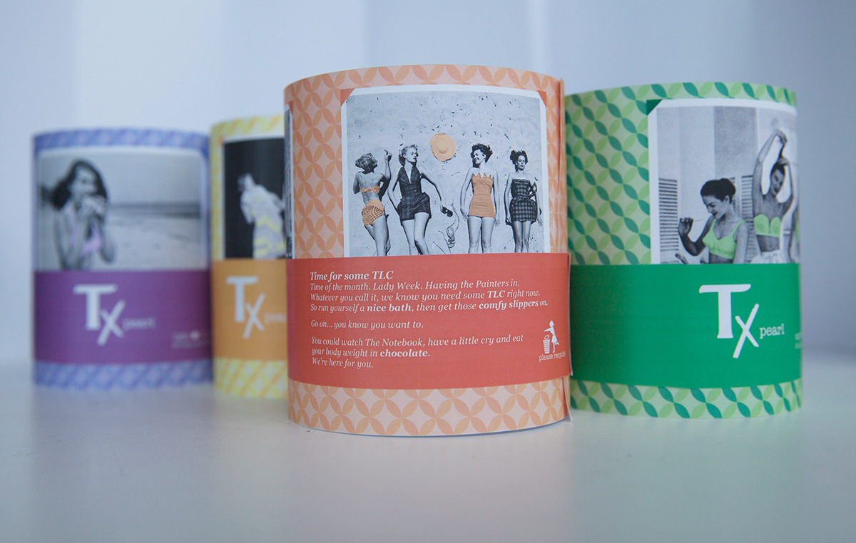
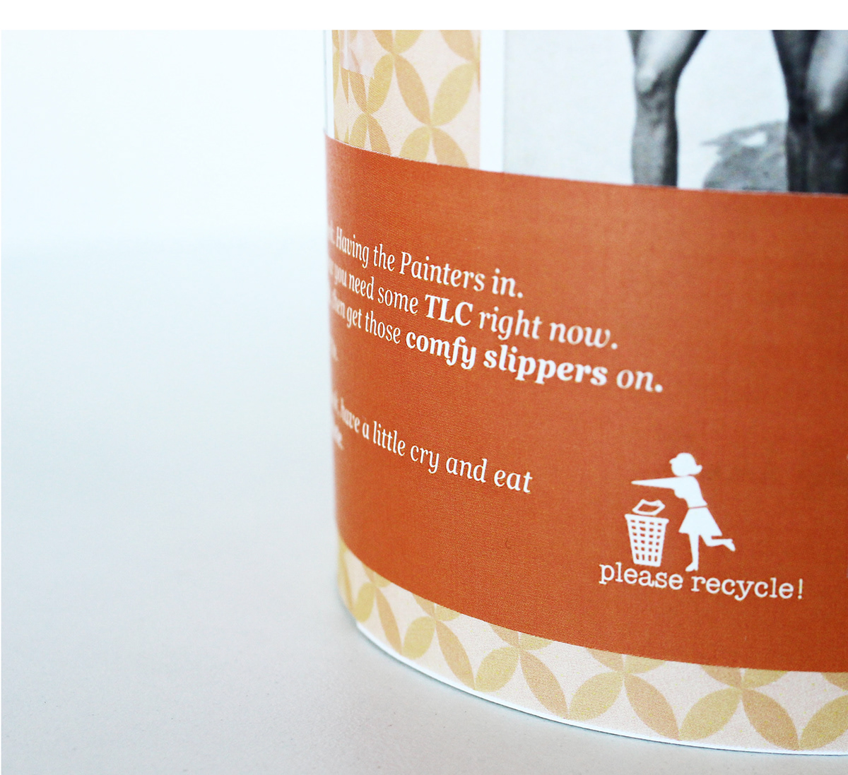

TLC CAMPAIGN