( PACKAGING DESIGN )
Chobani Natural
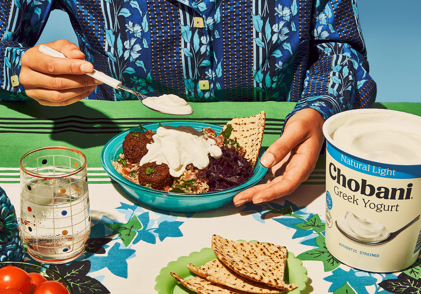
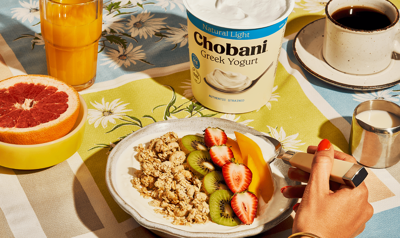
Chobani Greek Yogurt is deliciously simple and at the heart of their portfolio is their Natural and Natural Light core variants. Crafted using Chobani’s traditional method of triple straining, they preserve the nutritious goodness of Greek yogurt, while creating a luxuriously thick and creamy texture that is rich in natural protein and boasts a delightful tangy taste.
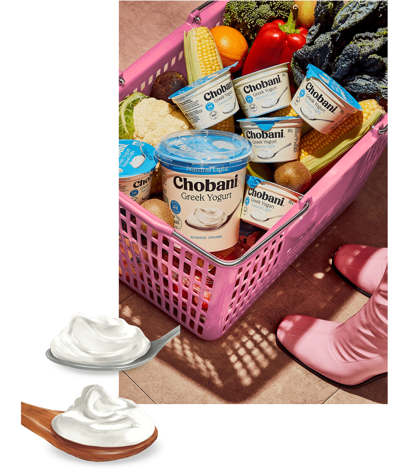
Whilst Chobani’s Natural variants are the perfect addition to lots of food time occasions, it was important that it communicated specifically to the local Australian market. Previous iterations of the packaging design carried variant names and colours associated with the US market but it was essential these important core variants resonated with how Australian customers shop dairy products. Available in convenient single-serve tubs or versatile large tubs, the Natural range is designed to satisfy your taste buds and add a touch of joy to any dish.
(THE SOLUTION)
Drawing inspiration from Chobani's distinctive brand assets, we aimed to create packaging design that was as simple and elegant as the product itself. The cream colour palette paired with punchy blues showcases their iconic leadership in Greek Yogurt. We incorporated their authentic yogurt texture into the design by featuring original illustrations of a silver and wooden spoon asset that represents each variant whilst evoking a wholesome eating occasion.
By utilising the brand's unique assets and incorporating them into the design, we created packaging design that stands out on the shelf and communicates the simplicity, authenticity, and indulgence of Chobani’s Natural Greek yogurts.
Photography: Alice Hutchison