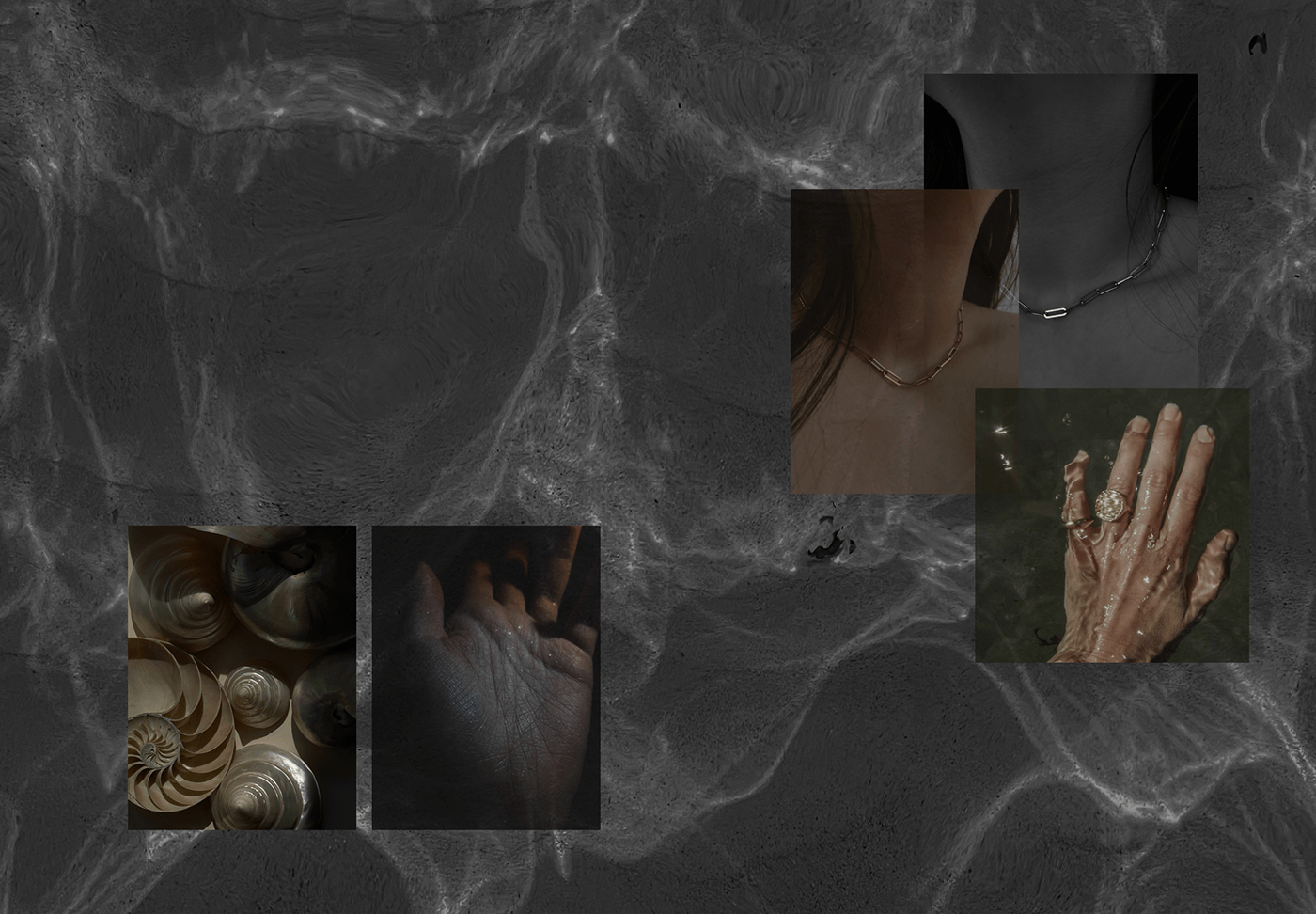
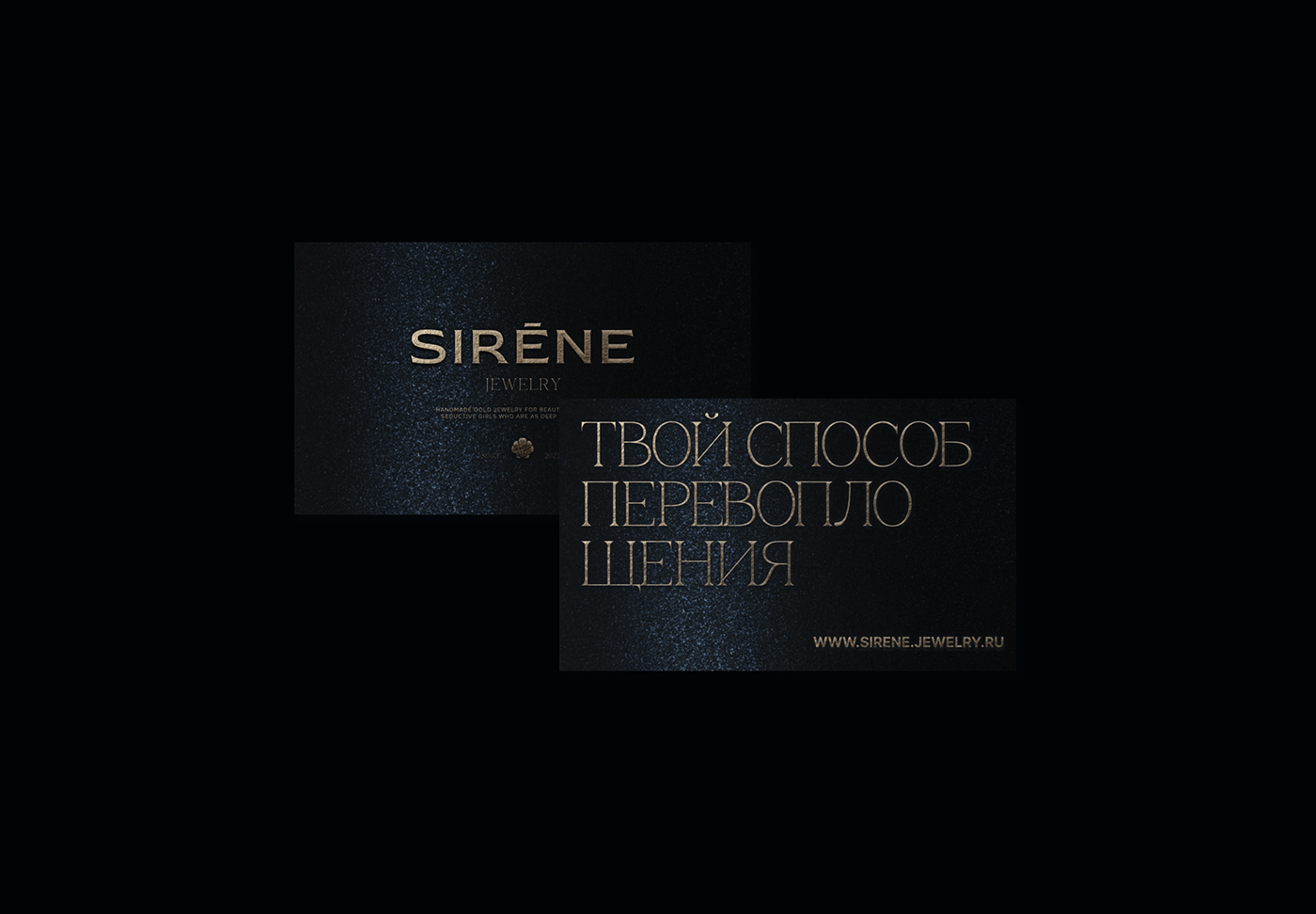
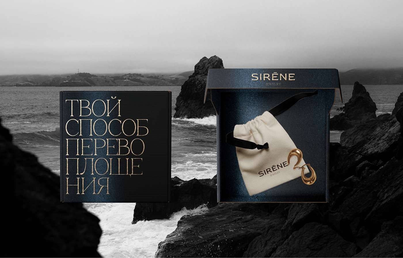
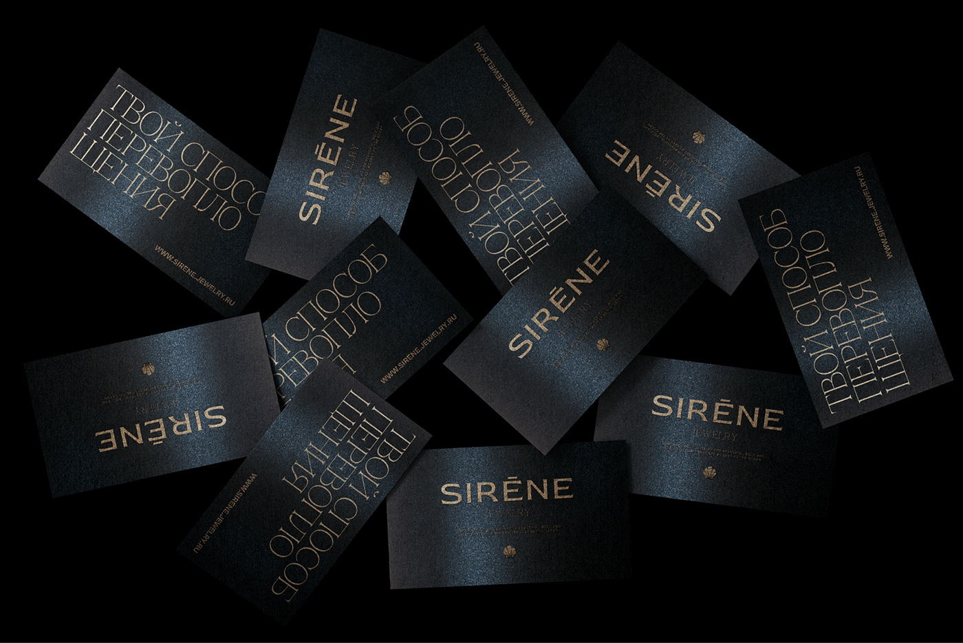
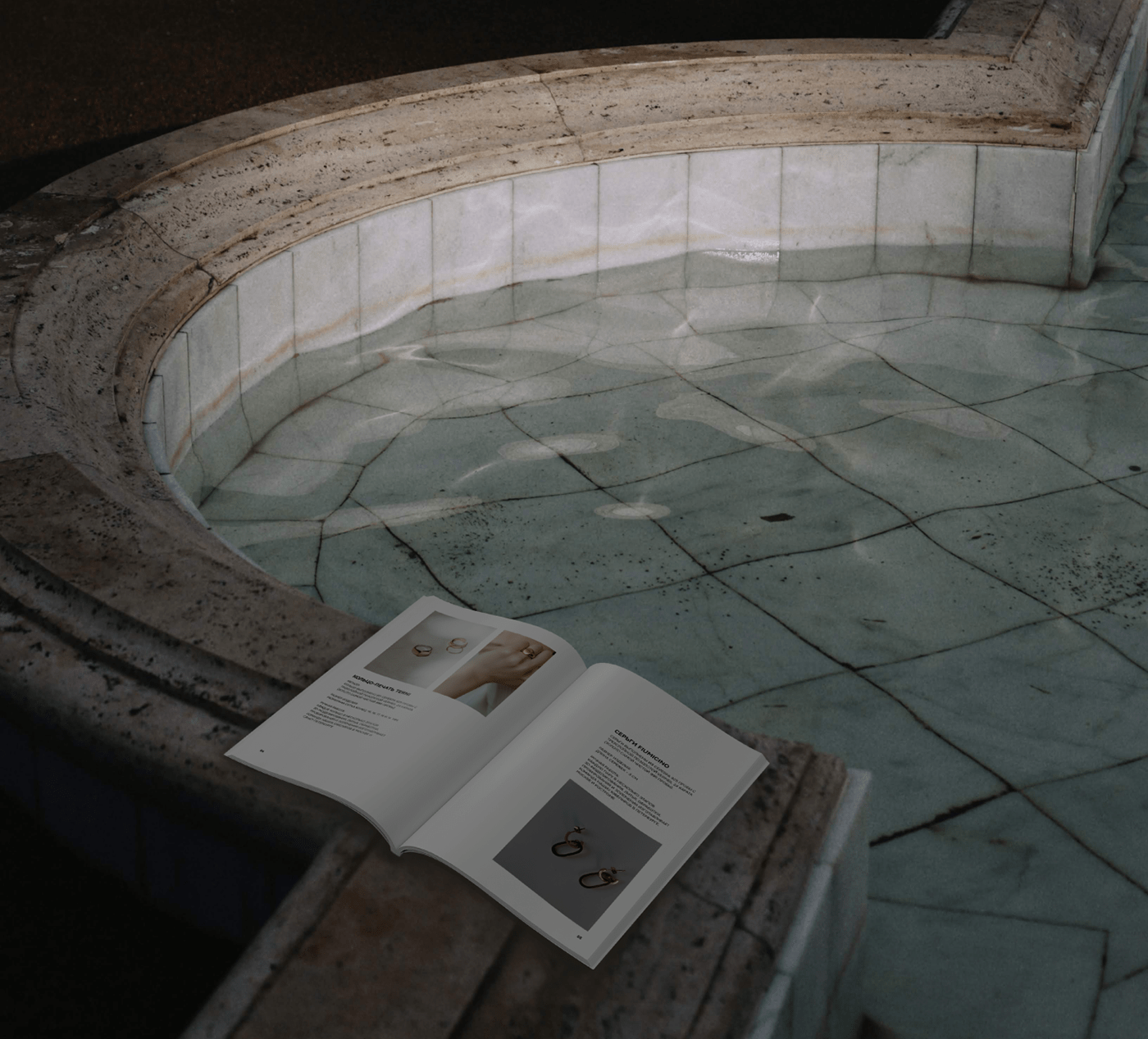
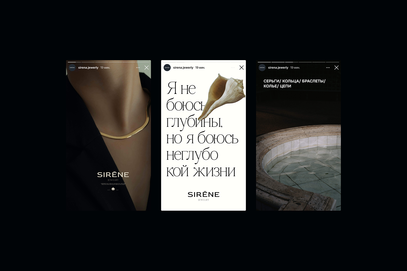
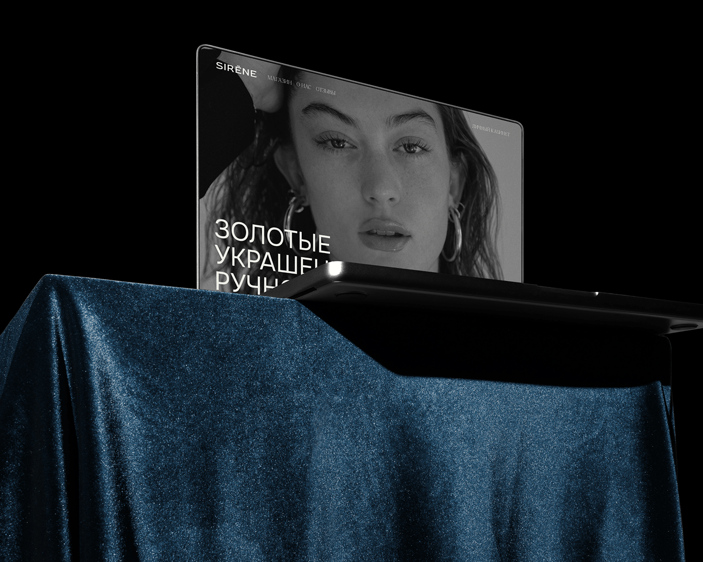
SIRENE is a brand of handmade gold jewelry for beautiful, strong and seductive girls. Translated from French, "sirene" means mermaid. Key states: mystery, mystery, beauty, seduction, attraction, splendor, strength. A corporate identity was created for the project, which includes a logo, corporate colors and corporate fonts, a graphic technique, a box with a bag for jewelry, corporate media (business card, postcard, gift certificate, catalog), as well as a visual for Instagram (posts and stories ). The logo used a thick, sharp serif font to reflect the strength and audacity of the Sirene girls. And the leg of the letter R resembles a mermaid's tail. In addition to it, a modern elegant serif was chosen, which reflects the attractive beauty and femininity of these girls. The contrast of these fonts personifies these girls, like sirens they are magnificent, but they can drag you to the bottom of the sea. The large typography on the media suggests that these girls are bold and ready to make a statement. For the printing of this project, I selected dark blue designer paper with double-sided coating and a pearlescent effect. Gold foil stamping technology is applied to branded media, as if a ring lying at the bottom of the sea plays with reflections in the depths.
Designer: Ksena Bogdanchikova
SIRENE - бренд золотых украшений ручной работы для прекрасных, сильных и обольстительных девушек. В переводе с французского "sirene" означает русалка. Ключевые состояния: загадочность, таинственность, красота, обольщение, притяжение, великолепие, сила. Для проекта был создан фирменный стиль, который включает в себя логотип, фирменные цвета и фирменные шрифты, графический прием, коробочку с мешочком для украшений, фирменные носители (визитка, открытка, подарочный сертификат, каталог), а также визуал для инстаграма (посты и сторис). В логотипе был подобран толстый шрифт с острыми засечками, это отражает силу и дерзость девушек Sirene. А ножка у буквы R напоминает хвост русалки. В дополнение к нему была выбрана современная изящная антиква, которая отражает притягательную красоту и женственность этих девушек. Контраст этих шрифтов олицетворяет этих девушек, как и сирены они великолепны, но могут утащить на дно моря. Крупная типографика на носителях говорит о том, что эти девушки дерзкие, готовые заявить о себе. Для полиграфии этого проекта подобрала дизайнерскую бумагу темно-синего цвета с двухсторонним покрытием и перламутровым эффектом. На фирменные носители нанесена технология тиснения золотой фольгой, как будто кольцо, лежащее на дне моря, играет бликами в глубинах.
Дизайнер: Ксения Богданчикова