.
RU
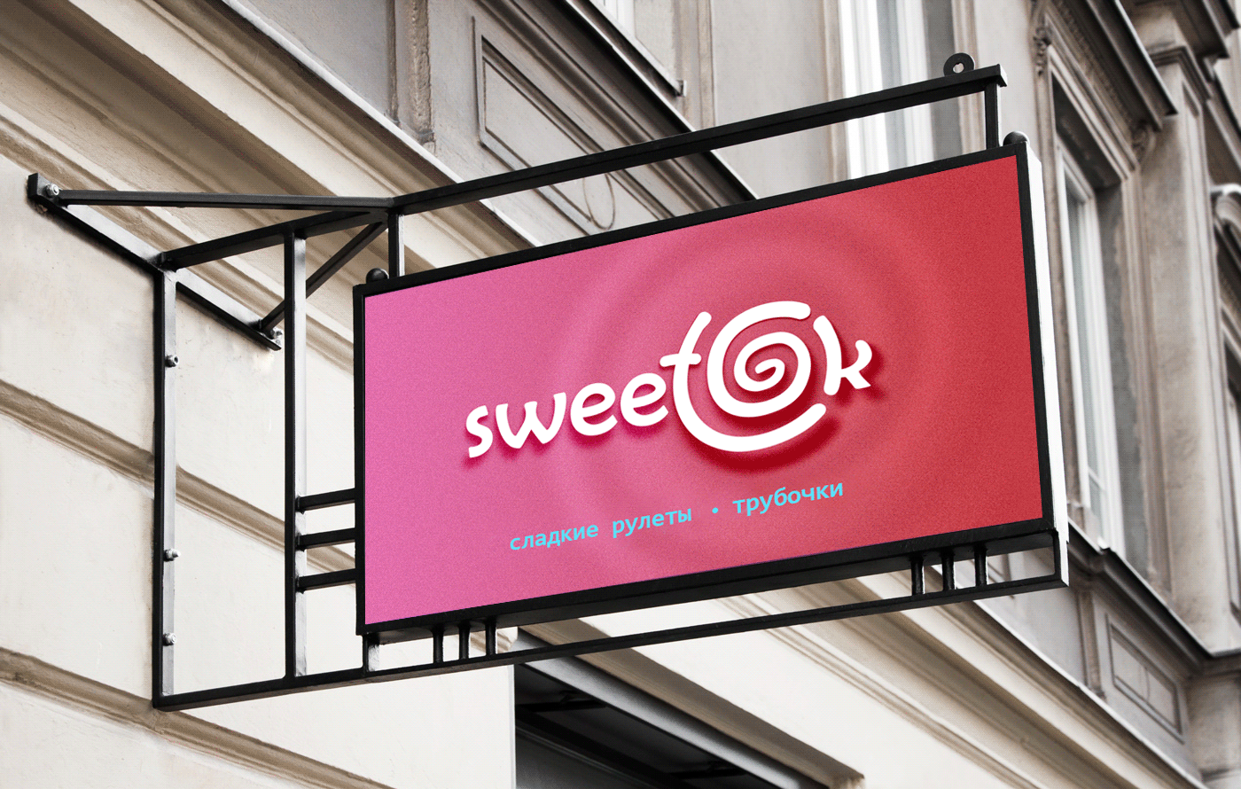
Все началось с логотипа для небольшой уютной кондитерской SWEETOK.
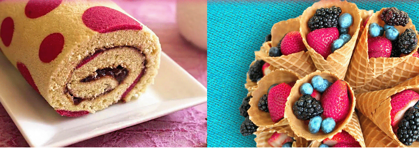
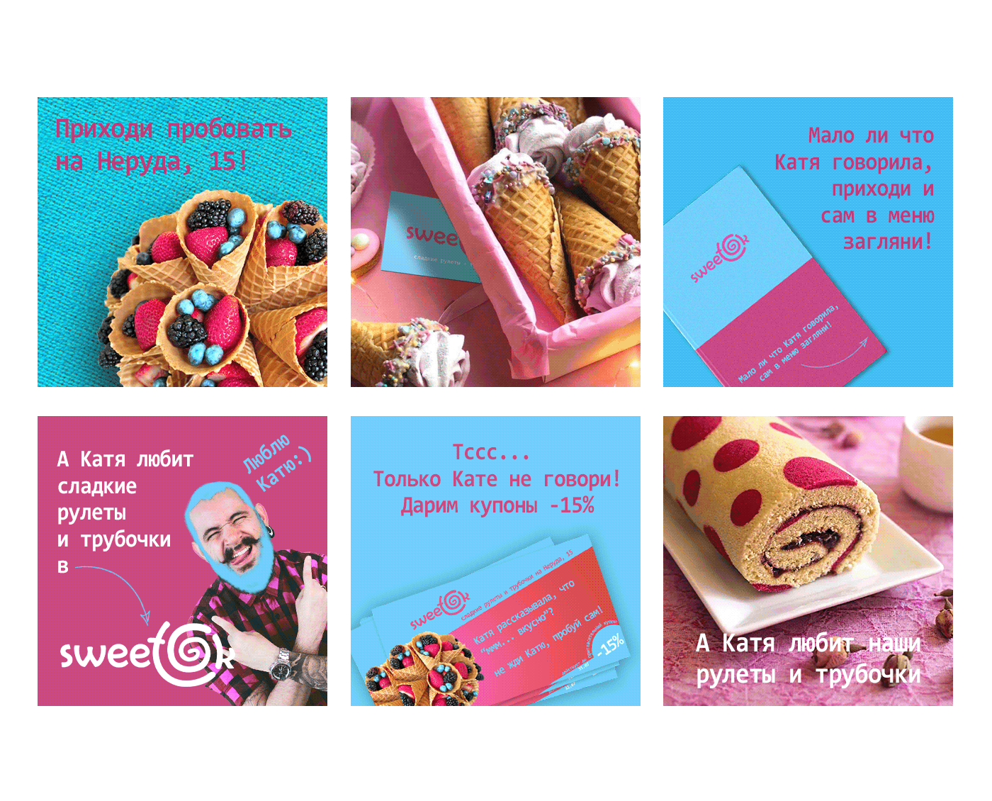
Название сочетает английское написание "сладкое-окей" и русское звучание "свиток" - скрученный лист, который и стал символом логотипа. Айдентика завязана на равном сочетании двух цветов - модных, ярких, смелых. Кроме того, ввели виртуального бренд-персонажа Катю, которую никто не видел, но она всем что-то рассказывала. На этом построили визуальную коммуникацию. Получился молодежный, вкусный и веселый проект.
Название сочетает английское написание "сладкое-окей" и русское звучание "свиток" - скрученный лист, который и стал символом логотипа. Айдентика завязана на равном сочетании двух цветов - модных, ярких, смелых. Кроме того, ввели виртуального бренд-персонажа Катю, которую никто не видел, но она всем что-то рассказывала. На этом построили визуальную коммуникацию. Получился молодежный, вкусный и веселый проект.
.
.
ENG
It all started with the logo for a small cozy confectionery SWEETOK.
The name combines the English spelling "sweet+ok" and the Russian-language "свиток" - a twisted sheet that has become a symbol of the logo. The identity is tied to an equal combination of two colors - fashionable, bright, bold. In addition, they added a virtual corporate character Katya, whom no one has seen, but she tells everyone something. This is the basis of visual communication. It turned out to be a youthful, tasty and cheerful brand.
.


.
.