
Design 100: Cut Light
"Under the see"
Phase 1: Sketching and ideation
The fourth and final design experiment required us to design a lamp using a moodboard theme, and fabricate it using laser cutting of mat board.
As part of the brief we are required to use the same moodboard across both lamp projects meaning I was stuck with organic as my theme. To begin, during our first studio we did a class exercise where we made a concept sketch and passed it around our table where each person comes up with a modification for the sketch. Attached below is my sketch.

Following on from this task, I was not interested in any of the ideas produce, so I made some more sketches, eventually settling on a wave idea shown below. I liked the idea of waves and the ocean as I always find myself feeling relaxed when at the beach or near the ocean and its a comfortable idea for me. I then discussed the idea of waves and the ocean further with my tutors who suggested stacking several slices of mat board in order to create a layered effect. I found I was quite intrigued with this idea.


The design that I gravitated towards was that of a wave bearing down on a central pool of water, with the pool being cut so as to create a wavy shadow pattern on the ceiling. From this idea, I created a rough prototype out of paper, just to see what it would look like. However, the flat base combined with the upright wave felt disjointed and clunky. The design itself felt a little dull to me and I couldn't envision enjoying the fabrication process of this design. Thus I did not end up liking this idea.


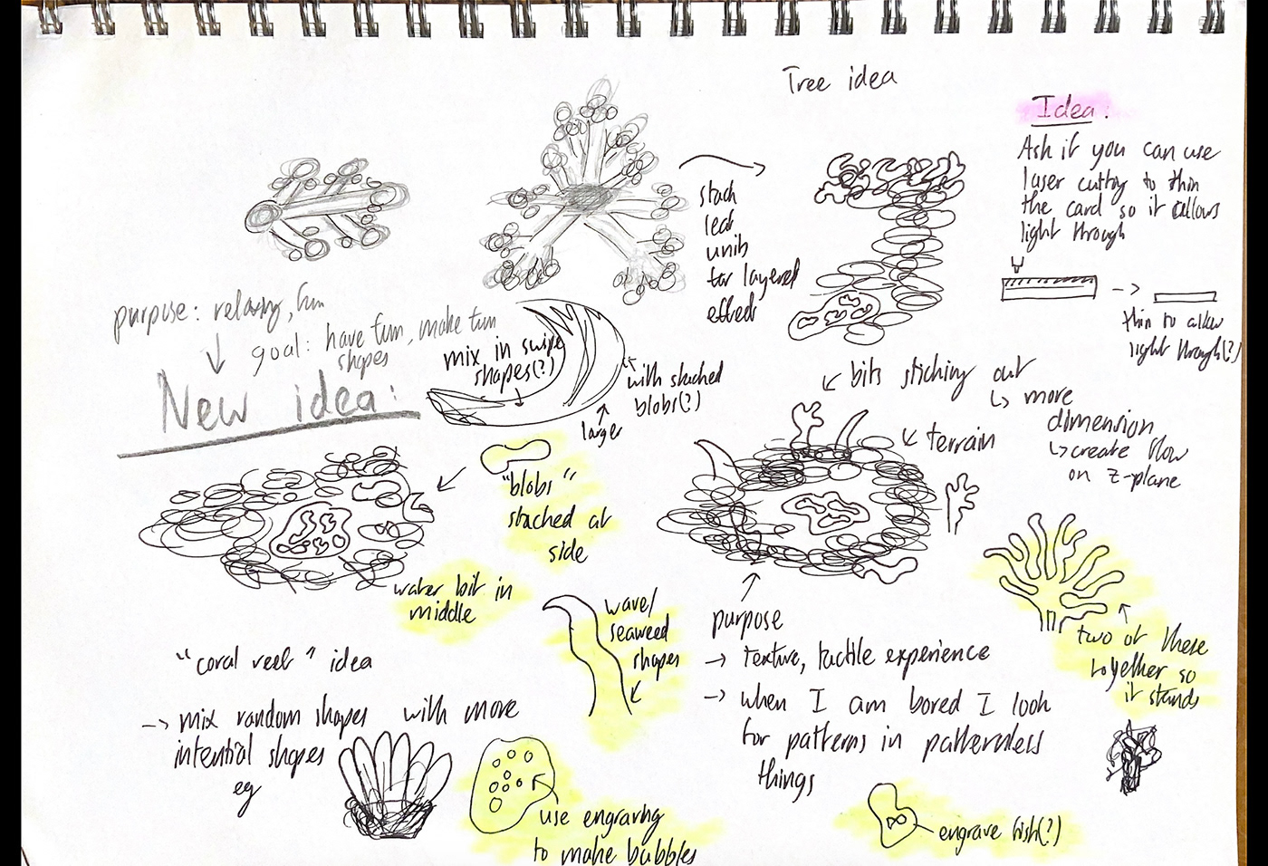
Due to not liking my first design I spent a bit more time exploring sketches. I tried to use a strategy where I draw a shape and try draw forms within that shape without taking my pen off the paper. I also tried just scribbling on a piece of paper to see if inspiration would manifest itself. From these exercises I decided I liked idea of flowing, random forms and its relation to the organic theme.


Phase Two: A random prototype and more sketching
After struggling for a while I decided to just open Adobe Illustrator and have a play around with the software to see if I could come across some form of inspiration, as well as try learn the software, especially since, in comparison to my classmates, I was a little behind.
When drawing shapes, I adhered to the idea I used in my sketches of drawing a continuous line without lifting my pen. This allowed me to create the desired flow in my shapes. I also drew out the central pool of water used in my first paper prototype as I still found that aspect of the design intriguing.

I eventually decided to laser cut these random organic shapes and glue them stacked up together around the middle pool of water, kind of like terraforming a terrain. The result is shown below. The second photo depicts a test of how the light looks when passed through the middle pool.


My first thoughts on design were its similarities to a topographical sketch as well as how fun it was to explore the textures of the design with touch.
I talked with my friend Erin, who mentioned the surroundings looked like coral, an idea that I really liked since it aligned with the sea theme I had in earlier sketches and iterations. I brought this coral idea and my prototype to discuss with my friend Mac, who suggested I have the bumpy landscape part wrap around the central pool as opposed to being on one side of the pool. Mac also suggested I have component such as coral sticking upward to add more dimension to the design. With these ideas I was able to complete a moodboard which is shown below.

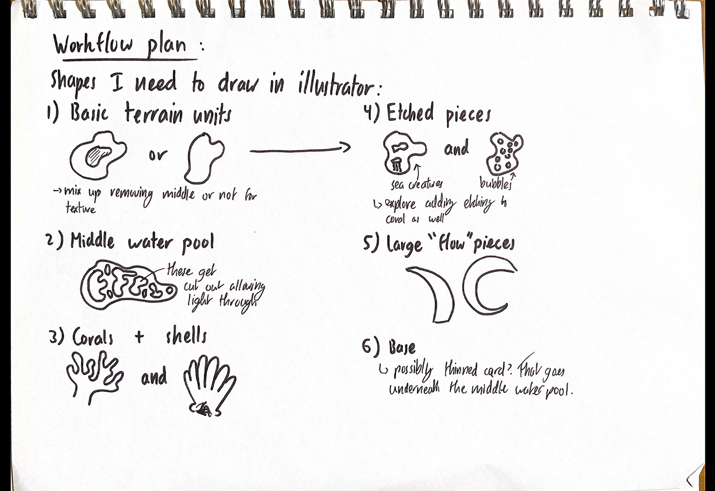
From this moodboard I also managed to create more sketches iterating off this initial prototype which are shown below. Highlighted in yellow are the components that I decided I ended up wanting to include in my next prototype. I also came up with a goal, being "to have fun making fun shapes". I also created a workflow plan, better detailing the components I wanted to include.
Phase Three: Second prototype
From the sketches I made using the first prototype, I ended up making a second prototype. This time I included vertical, coral-like aspects to the design to add depth. Another notable change I made was adding little engraved doodles to some pieces, inspired by my goal to have fun with this design. Photos of this prototype are shown below, along with a photo of the illustrator document.


My initial thoughts on this were that I liked the depth that the coral, seaweed and wave like shapes added to the piece. I also found the doodles that I added were enjoyable and a little silly at the same time.
I then asked Jed, my tutor, for feedback who suggested to:
> Refine the base as it is too large.
> Refine the engraved doodles since the goofiness of the doodles don't match the vibe of the rest of the lamp.
> Add a second layer to the central water pool.
> Consider the shapes of the waves since they are jarring compared to the rest of the lamp.
Following on from my discussion with Jed, I decided to make the base smaller and to make the doodles cleaner. I also decided to switch out the waves for different shapes of seaweed that are smoother and more cohesive with the rest of the design. Another thought I had when looking at this second prototype are the need for a lot more layers to fully create depth. Attached below is a photo showing the doodles in question. As per the photo, these doodles are extremely silly looking.

Phase Four: Making my final lamp
Firstly, I went back into illustrator and started playing with the sizes of my design as well as the shapes I wanted to include. I increased the number of smaller components that I would cut out so that I would have more material with which to create depth. I also made sure to draw smaller shapes inside some of the larger ones in order to save material, but also create more depth by have open rings mixed in with flat pieces.

To improve my little doodles, I ended up using Boram's Ipad to facilitate cleaner drawings and copied them into illustrator. Shown below are the doodles (and some random face doodles drawn by my classmates).

After this, I sent my design to the laser cutter and printed out the pieces. Some of the pieces were so small that they ended up falling into the holes of the laser cutter, but thanks to FabLab Technician Steve, I was able to retrieve these. Assembling this design was a little tedious due to how many pieces there were. Shown below are some photos of my workspace as I assembled the piece.


Here is a photo of the shadow that my final design creates on the ceiling of my room, there is no way to get a nice photo of both the lamp and the shadow on the ceiling so I decided to just include it here. Since the lamp isn't physically in this image I am unfortunately unable to use it as a final photo

Final design
Final photos and a little bit of explanation

This photo indicates the relation of the lamp to the organic theme. I used a blue background to create connotations of the lamp with the ocean, from which I drew a lot of inspiration in order to create this design. This photo shows the curves of the terrain surrounding the central pool of water as well as how the light interacts with the surrounding materials. I like this idea of the spreading of light as, I think that light represents energy and, its propagation to the surroundings portrays the lamp sharing energy with its surrounding. The giving of energy also relates back to the idea of the goal of the lamp being to have fun, and how having fun can help someone feel less tired and more relaxed.

This photo give a close up of the hidden doodles and the textures created by the stacked layers showing the fun and tactile aspects of this lamp. Symbolically, the hidden doodles represent how joy can be found anywhere if you search for it hard enough.

This image shows the lamp as a desk lamp. The lamp's contrast with the cluttered desk environment is reminiscent of the idea of using the lamp as a way to separate yourself from everyday responsibilities of work. The calculator placed in front of the lamp, especially the uniformity of the keys emphasizes the organic theme of the lamp by creating contrast to the randomness and free flowing nature of the lamp's composition. The mathematics working on the paper behind the lamp shows its importance as a desk lamp to remind the user to have fun, even in the dullness of a corporate world. This photo also showcases some of the shapes in the shapes that the lamp is able to create.
Explanation of final design:
Overall, the purpose of my final design is for it to be fun and relaxing to whoever is experiencing it. While making this lamp I had a lot of tests and assignments due so coming to the design studio to work on my lamp was a sort of escape. From this idea I would have my lamp, in its current state, be a desk lamp to help remind me to have fun. As a side note, the randomness present throughout my fabrication of this lamp helps to remind me that, beauty can be derived from disorder and that, sometimes the lack of rigid structures can be exciting.
The stacked organic shapes in my final design make it unique and natural as the placement of these pieces was done by feel to create a one of a kind piece. The randomness in this placement method also relates to idea of flow that I wanted to portray through this piece as, the lack of order creates a natural, organic feeling. The pieces in the background help tie the lamp to the theme of the sea and the ocean and add dimension to the piece, allowing for more surfaces for the light to bounce off of. The middle pool of water is intended to create a flowing effect that emulates the bending of light when it interacts with flowing water.
I wanted to include elements to the lamp that weren't just to do with light and more to do with a person's experience when interacting with the lamp. Firstly another intended purpose of the stacked pieces is to create a special tactile effect to the lamp, the sensory effect of the bumpy edges is satisfying to explore and also calming. This part of the lamp also makes it so that people who are visually impaired can experience the lamp. Another aspect of the lamp catered to a person's experience with it are the little engraved doodles, which I initially made for fun. I ended up hiding these within the organic crevices of the lamp to create a little "find the sea creature game". With this idea I wanted to add another fun aspect to the lamp. Shown below is a little challenge card I made to go with the lamp.

Feedback on final design
I then asked my peers for some feedback on the final design and some possible improvements:
Erin - "The design reminds me of a drip sandcastle. The texture part of the design is fun."
Eddie - "The tactile wavy lines are fun. The light shining through the hole makes a cool effect, it looks like a pond with light as the water. The wavy lines are random like in nature and has an organic vibe."
Mike - "You could have played around more with the abstract form of your inspiration. Consider removing the seaweed and just focusing on developing the idea of your pool of water."
Future developments
One development I had in mind was to play around with the angle of the light at the bottom and also the distance between the "light filter" portion of the lamp and the light. I also want to play around more with colors to create more of an ocean vibes. Another idea I had was creating a stained glass effect by putting different colors into different holes in the central pool. If I could, I would scale the lamp up and use a more powerful light sources to magnify the shapes created by the shadows of the central pool of water.
Reflection
Compared to the other Design 100 experiments, I had less time to work on this lamp due to tests and upcoming exams. However, I am overall very proud to have been able to finish the lamp as well as fit in two prototypes given my time constraints. I found this experiment quite fun, and enjoyed learning illustrator and having the opportunity to use laser cutting. I found the process of laser cutting very satisfying in how precise and clean the cuts it can make are.
The ideation phase this time around was challenging to me and I felt extremely lost at the very beginning, which, compared to my other Design 100 experiments, is a new feeling to me as I generally didn't have too much trouble deciding on what to make.
The fabrication part of this experiment was enjoyable as I liked playing with laser cutting and, in comparison to the other fabrication methods I have tried in Design 100, it was relatively less complex.
If I were to do the assignment again, I would most likely start making laser cut prototypes earlier and from those, be more intentional about seeking out feedback and implementing it into my future iterations. I also would have liked to have time to go to the beach and look around for inspiration as well as take photos of my lamp there.
Extra Bonus photos and video :)
As mentioned earlier, I wanted to experiment with different colours of light, so shown below are some photos with different coloured light. Also included are some other photos that I thought were cool but were too similar and didn't show enough aspects of the lamp to be part of my final three photos.


Attached below is a little video demonstrating the find the doodle aspect of the lamp, pause the video at each photo and find the doodles, then press play when you are ready to see the answers.
Thank you for reading! :D


