[EN] Starting with the naming, this project needed to be striking enough to stand out in the market, but needed to go straight to the point to work with traditional customers. It was here that the concept began to develop.
With its partners located in the Porto Alegre City, the company's objective is always to seek the best solutions for the clients, focusing on the main point of the work: the result. The naming "Ponto 51" (affectionately also called P51) alludes to the area's code.
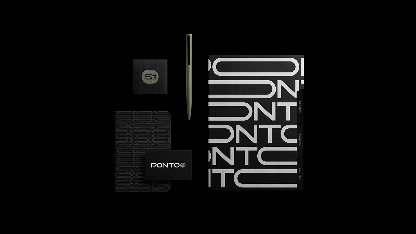
A dynamic lettering makes the visual identity versatile, with the letter "O" expanding and retracting in the applications, forming a search bar and returning to its original form. The predominance of black conveys seriousness, while pure white is replaced by a checkerboard to solidify the materials.
.
[PT] Começando pelo naming, esse projeto precisava ser marcante o suficiente para se destacar no mercado, mas precisava ir direto ao ponto para trabalhar com clientes mais tradicionais. Foi aqui que o conceito começou a se desenrolar.
Tendo seus sócios localizados na cidade de Porto Alegre/RS, a empresa tem por objetivo sempre buscar as melhores soluções para os clientes, com o foco no ponto principal do trabalho: o resultado. O naming "Ponto 51" (carinhosamente também chamado de P51) faz alusão ao DDD da região.
Um lettering dinâmico torna a identidade visual versátil, com a letra "O" se expandindo e se retraindo nas aplicações, formando uma barra de pesquisas e voltando à sua forma original. O predomínio do preto transmite seriedade, enquanto o branco puro é substituído por um quadriculado para solidificar os materiais.