

New brand identity for Fluence
We embarked on an inspiring journey to rebrand Fluence, a family office providing wealth management and investment services. Our mission was to construct a visual identity that not only encapsulates Fluence's core values and expertise, but also exudes an air of professionalism and sophistication.
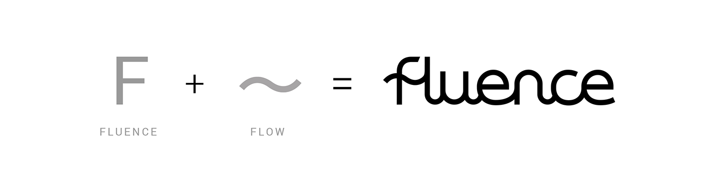
Drawing inspiration from the Latin root of "Fluence", meaning "flowing", we aimed to infuse the principles of fluidity, clarity, and transparency into the brand, reflecting the firm's approach to wealth management.
The centerpiece of our design was the imagery of a wave, symbolizing the dynamic nature of Fluence and their client relationships. This visual motif reinforces Fluence's commitment to clear and simple wealth management solutions, marking a new chapter in their visual story.


Colors
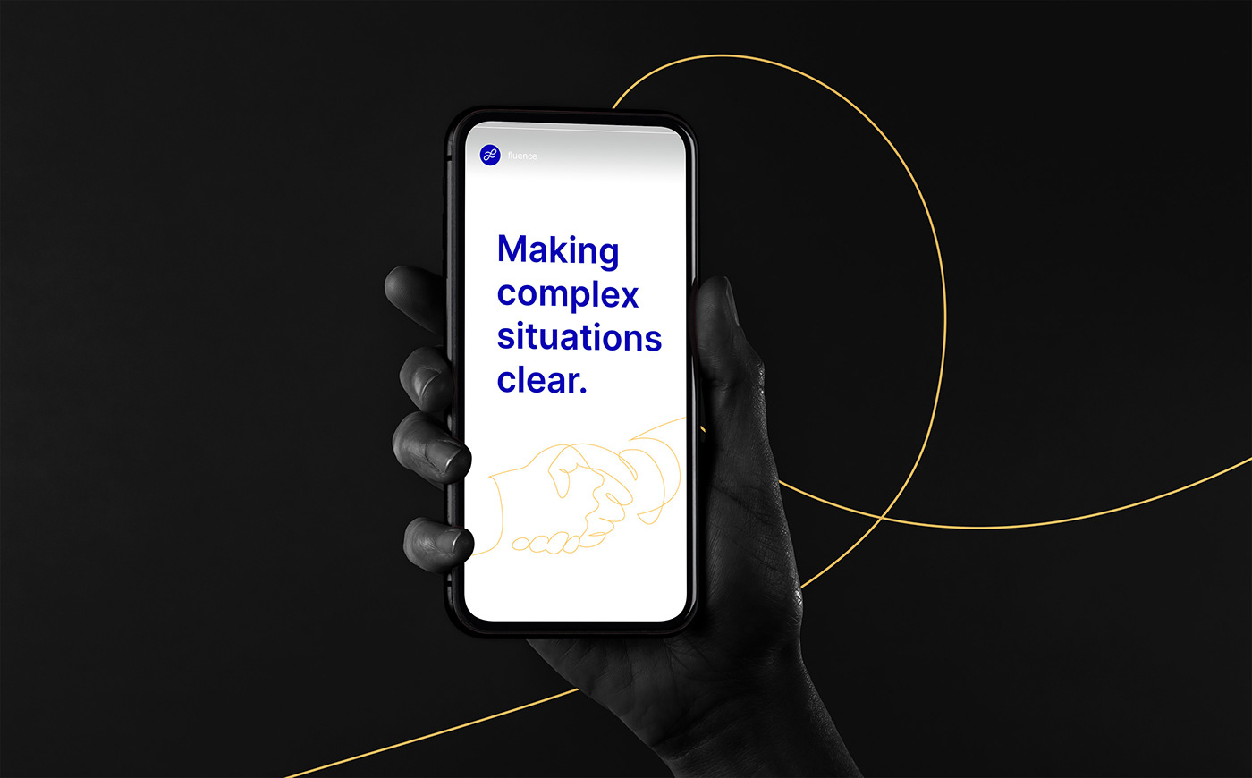
Using zaffre blue as the primary color, we've imbued professionalism and highlighted Fluence's digital expertise. The addition of aurora yellow accents creates a striking contrast and underscores their human-centric approach. For private client interfaces, we've utilized a black background with white or yellow elements to maintain balance and focus.


Emblem
We designed a submark emblem blending an 'F', infinity, and a flowing equals sign, symbolizing Fluence's continuous, aligned services, and applied this branding across diverse platforms like stationery, website, signage, and social media.
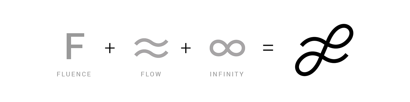
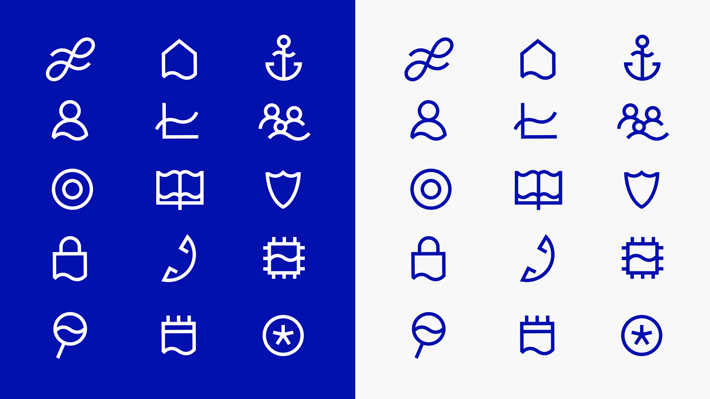


Illustration & Iconography
In addition to the wordmark logo and submark icon, we created custom continuous line illustrations that added an element of exclusivity and bespoke service to the brand's visual identity. We also designed icons based on the submark that are minimalist and abstract, further strengthening the brand's visual identity.


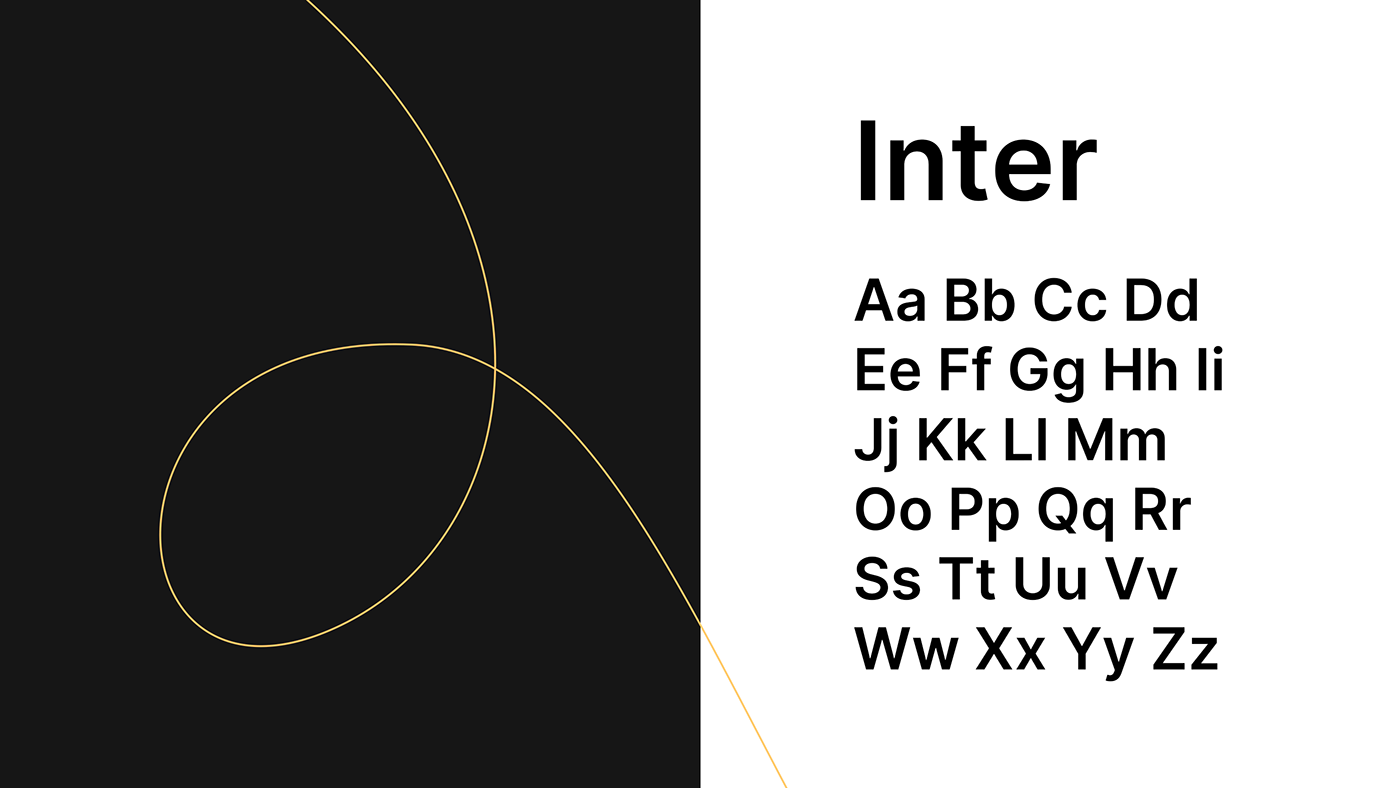
Typography
The chosen title font, Inter, and body text font, Poppins, are both Google Fonts, ensuring seamless deployment across various media and platforms. These fonts, with their clean lines and modern aesthetics, contribute to a cohesive, visually appealing design that aligns with Fluence's brand ethos, enhancing readability and user experience.


Photography
We embraced a minimalist approach, using black and white photography. The associated text can be primarily arranged in juxtaposition, although in certain instances wev can overlaid an icon or the emblem, in either a large or small signature format, enhancing the overall visual cohesion.


Thank you and hope you enjoyed it!
If you want to see more, you can follow us on Instagram : we post one line a day!


