Flowmail
Custom logotype

Flowmail is an email management system geared towards small businesses, those new to marketing and people who are tired of complicated solutions.
The Flowmail team was looking for a distinct and simple typographic logo that instantly conveyed the brand’s informal, friendly and playful personality. It was also important the logo had an element that can be used as a stand-alone graphic. After discussing the initial creative brief, we agreed on working toward a solution using custom lettering.
For the initial concept, I drew up a casual script with a loose, brush-like feel. I explored a variety of options for the ‘f’ and decided to go with a lowercase character to immediately introduce an approachable and friendly personality. The initial concept explored the idea of forming a wave element with the ‘wm’, which created interesting challenges that needed to be resolved, including legibility.

Flowmail logotype development sketches
After collaborating on several iterations with the Flowmail team, we landed on a logotype that “totally speaks to the brand and the client demographic,” said Flowmail co-founder Jon Thorpe. The final logotype solution resulted from subtle adjustments and revisions to the original concept sketches.

Throughout the process of creating the digital version, I played close attention to several details. All the letters were connected to establish continuity and flow. Letter-spacing was modestly increased for better legibility, especially when the logotype was reduced in size, for example, to appear on the footer of the Flowmail website. Loops and counters were slightly widened to open up the letters, which also aided legibility. Connecting strokes were smoothened, particularly between w-m, to soften transitions. Playful variations were added to the baseline to convey movement and fluidity. The lowercase ‘f’ was scaled slightly larger to become the prominent letter in the logo. The character also served as a unique and recognizable stand-alone icon.

The lowercase f also serves as a stand-alone icon.
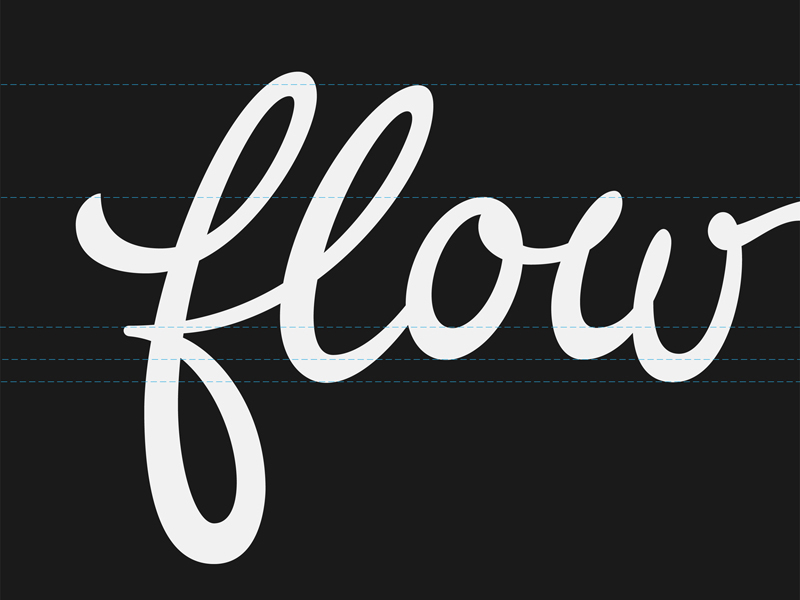
Close-up view of guidelines for alignment and baseline variations to convey playful movement and fluidity.

View of bezier nodes and handles in Adobe Illustrator.

Visit flowmail.com to start creating, scheduling and sending beautiful newsletters.


