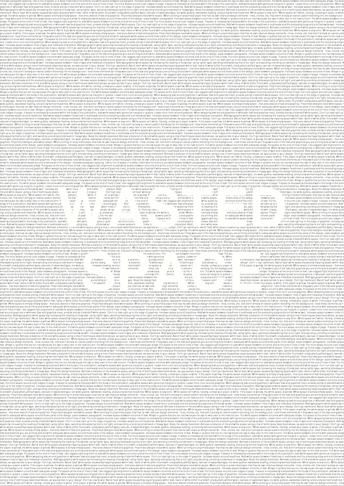
The first poster shows that wasted space is space that is misused and over crowded.
The second poster shows a viewer how white space is supposed to be used. At the bottom of the page there is a section explaining how to use white space properly.
Dołącz do Behance
Załóż konto, lub Zaloguj się,aby wyświetlić spersonalizowane rekomendacje, obserwować autorów i nie tylko.
lub
Dołącz do Behance
Załóż konto, lub Zaloguj się,aby wyświetlić spersonalizowane rekomendacje, obserwować autorów i nie tylko.
The main aim of the posters is to show that white space is not wasted space. When in fact, wasted space is space which is over crowded. My first Rozwiń