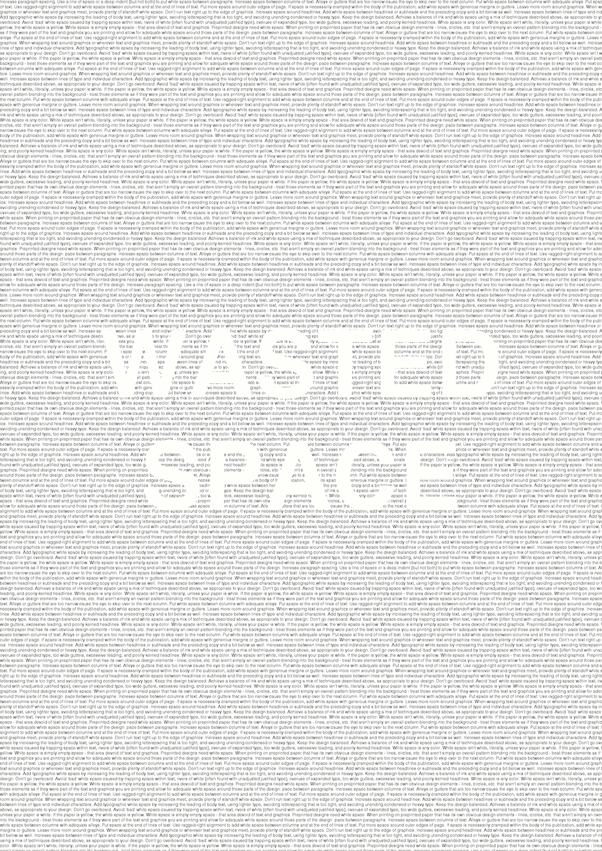
The first poster shows that wasted space is space that is misused and over crowded.
The second poster shows a viewer how white space is supposed to be used. At the bottom of the page there is a section explaining how to use white space properly.
Liity Behanceen
Rekisteröidy tai Kirjaudu sisäänhenkilökohtaisten suositusten tarkastelua, luovien alojen osaajien seurantaa ja muiden toimintojen suorittamista varten.
tai
Liity Behanceen
Rekisteröidy tai Kirjaudu sisäänhenkilökohtaisten suositusten tarkastelua, luovien alojen osaajien seurantaa ja muiden toimintojen suorittamista varten.
The main aim of the posters is to show that white space is not wasted space. When in fact, wasted space is space which is over crowded. My first Lue lisää