Design Direction (Concept)
The general design evolves around sharp, geometric shapes, the main graphic is a symbol or an item relative to the text setting the mood for the book's story. Very minimal shapes with emphasis on the typography was the main goal while retaining the feeling of each book and maintaining the layout as each book is part of a collection.

Ekaterini by Marija Knezevic
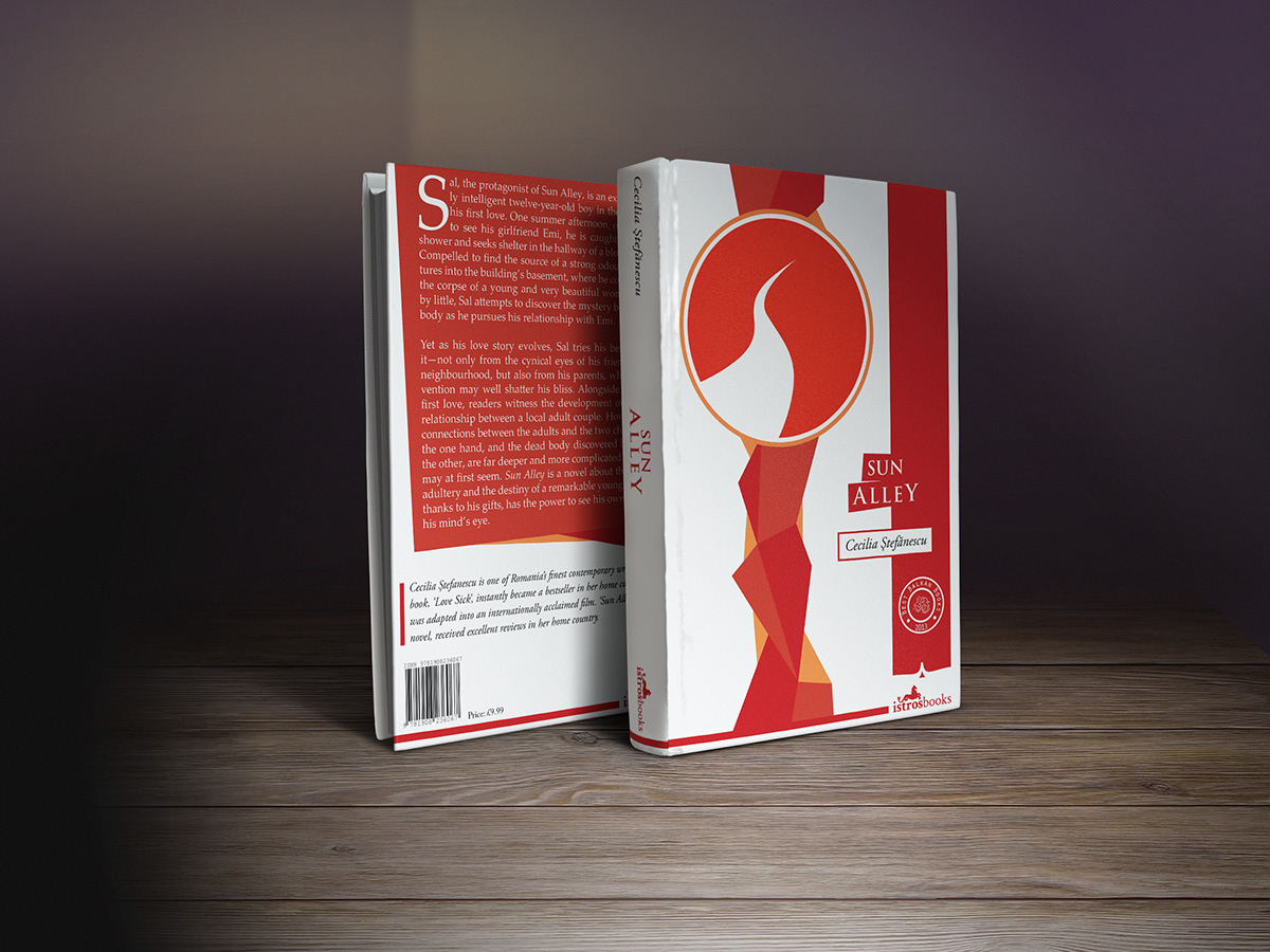
Sun Alley by Cecilia Stefanescu
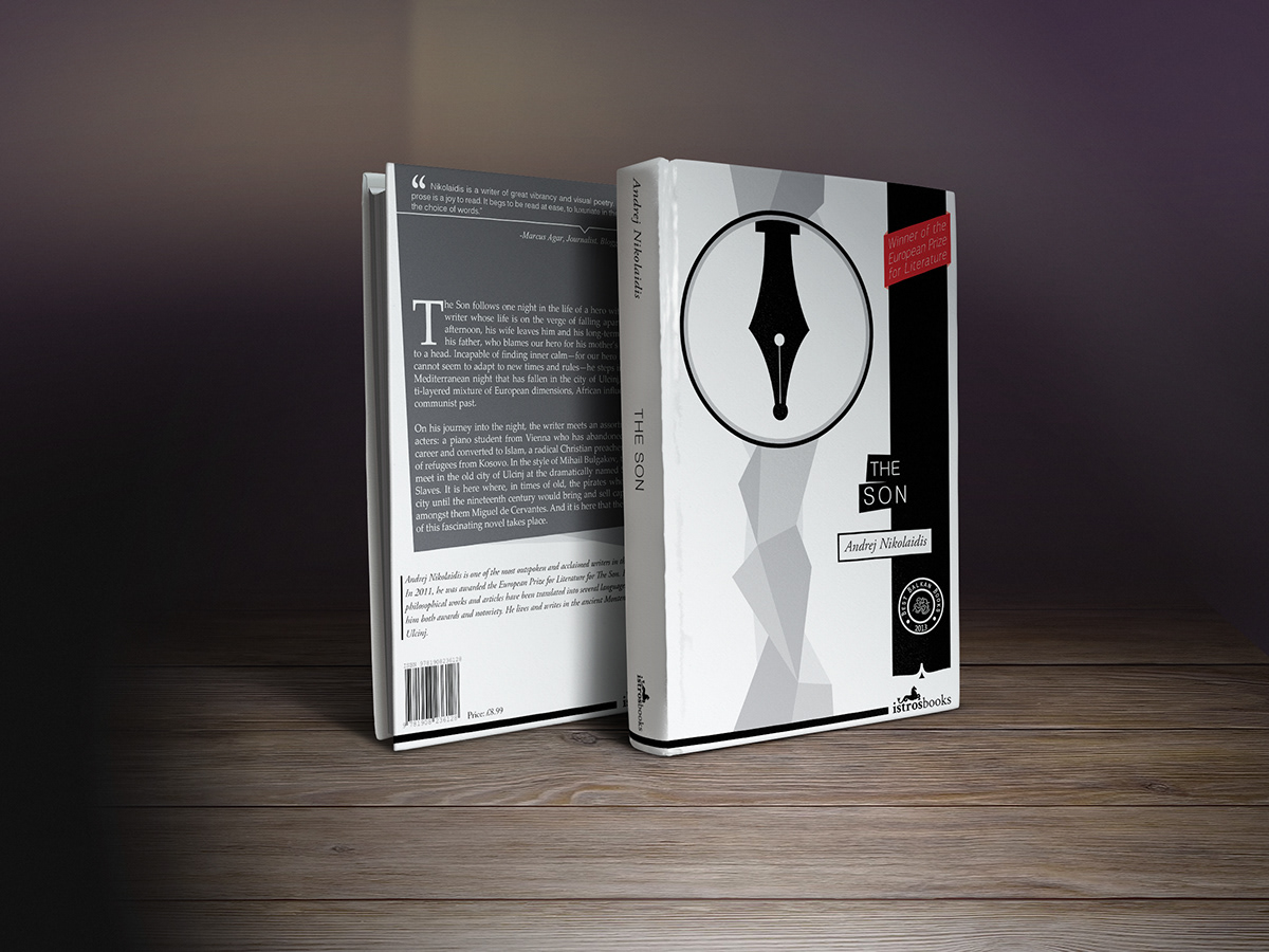
The Son by Andrej Nikolaidis

The Fairground Magician by Jelena Lengold

Detail from the front cover of "The Son" by Andrej Nikolaidis
A special symbol was created for the series of Best Balkan Books. Here a detail from the cover showing the vertical graphic that works as a "holder" for the main graphic and on the right side the emblem and the finish of the side ribbon containing it. Below it is the publisher's logo with a horizontal line in the height of its lettering.
