
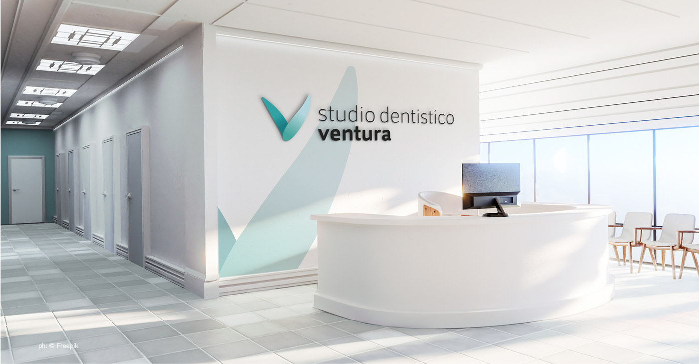
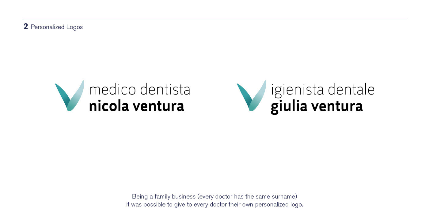
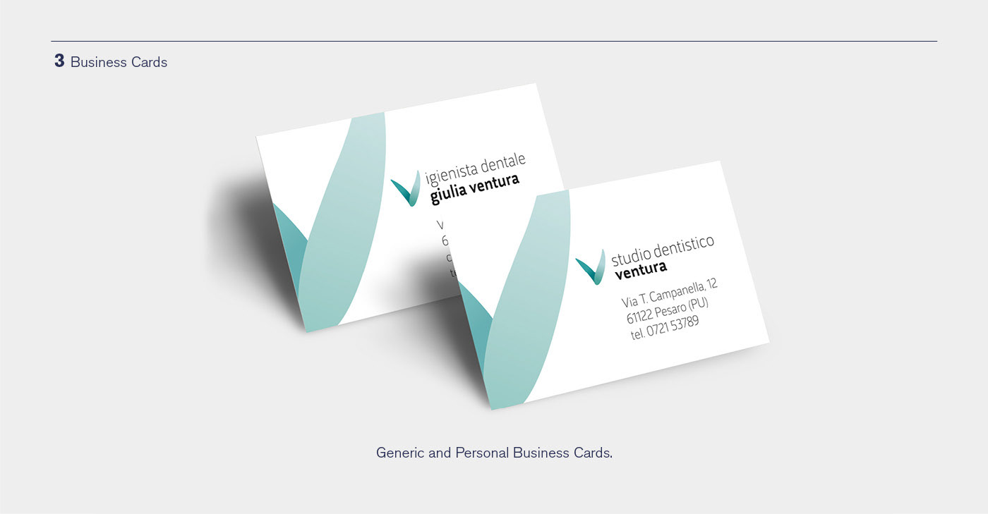
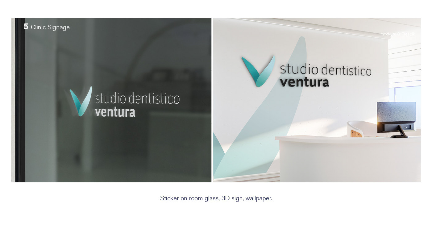
Brand Identity for an Italian Dental Clinic. Every design choice in the logo was made with the idea of not looking intimidating to the fearful possible clients. The V of the icon (stands for Ventura) is round and hand drawn, can be seen as two wings (lightness) or a sprout (freshness). There are no uppercase letters and the font is light. The hue is a mix of light blue (sky/lightness) and green (nature/freshness).


thanks for watching!

