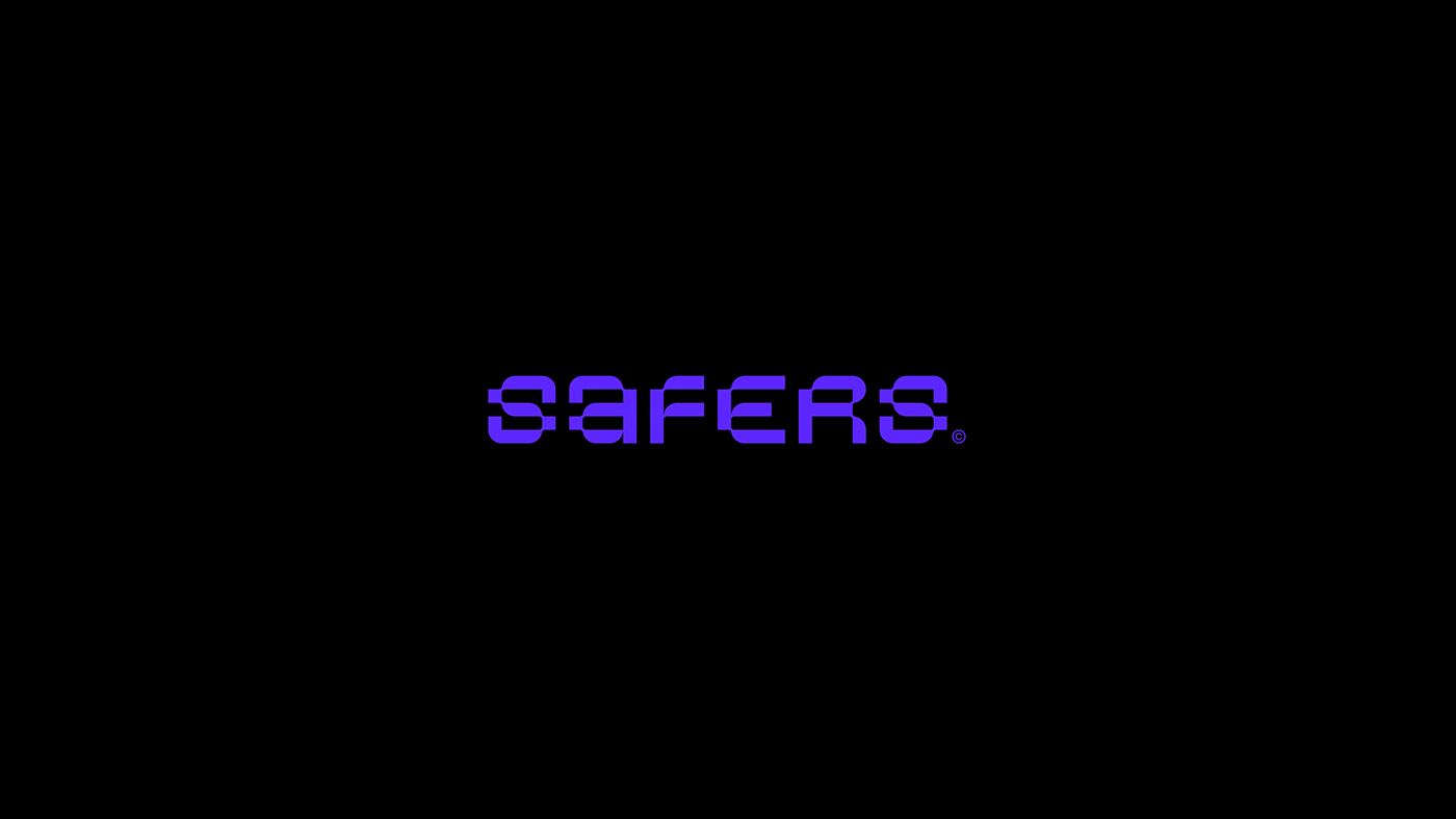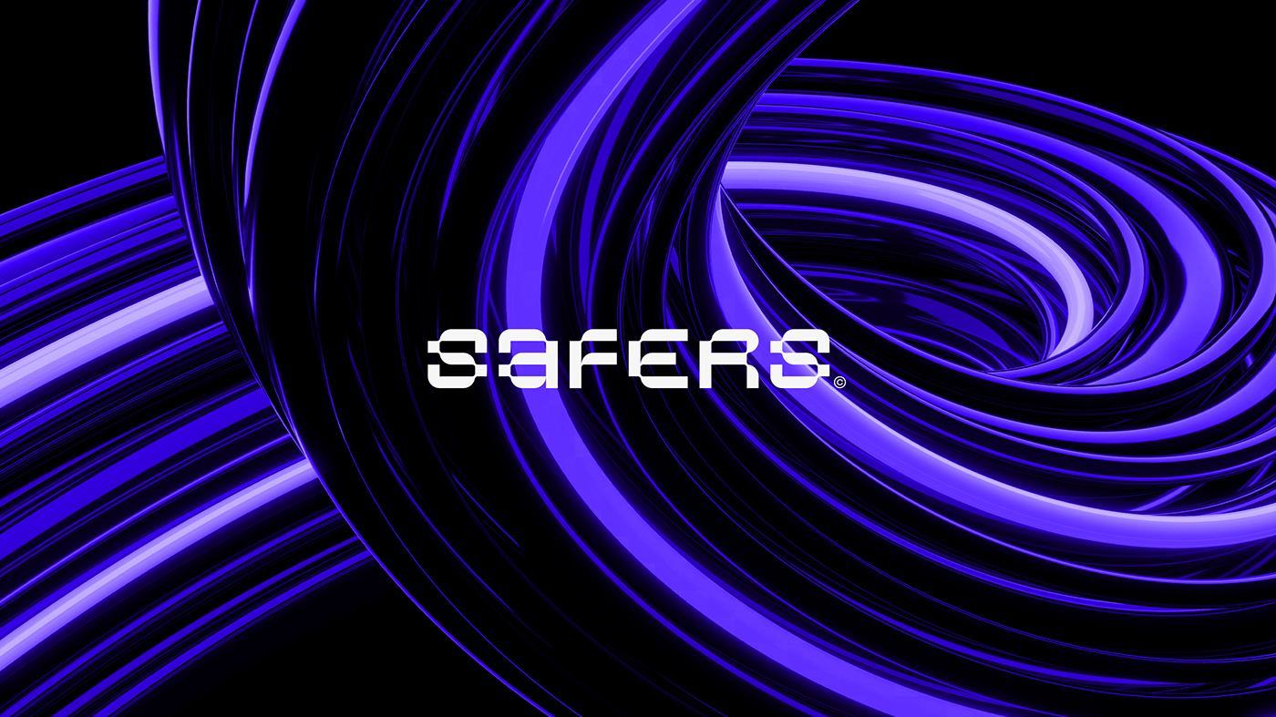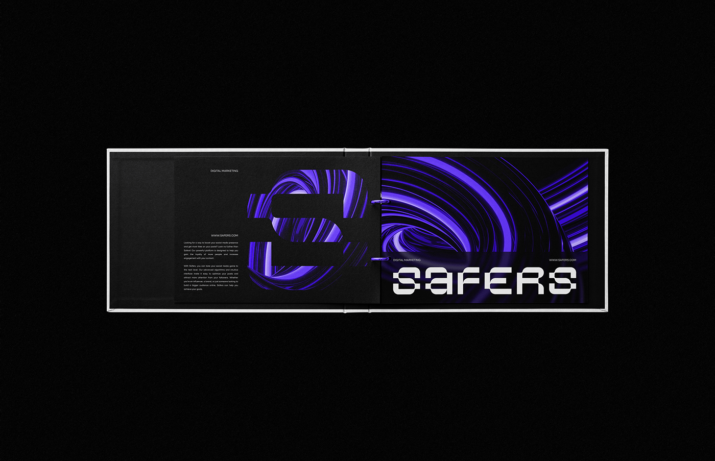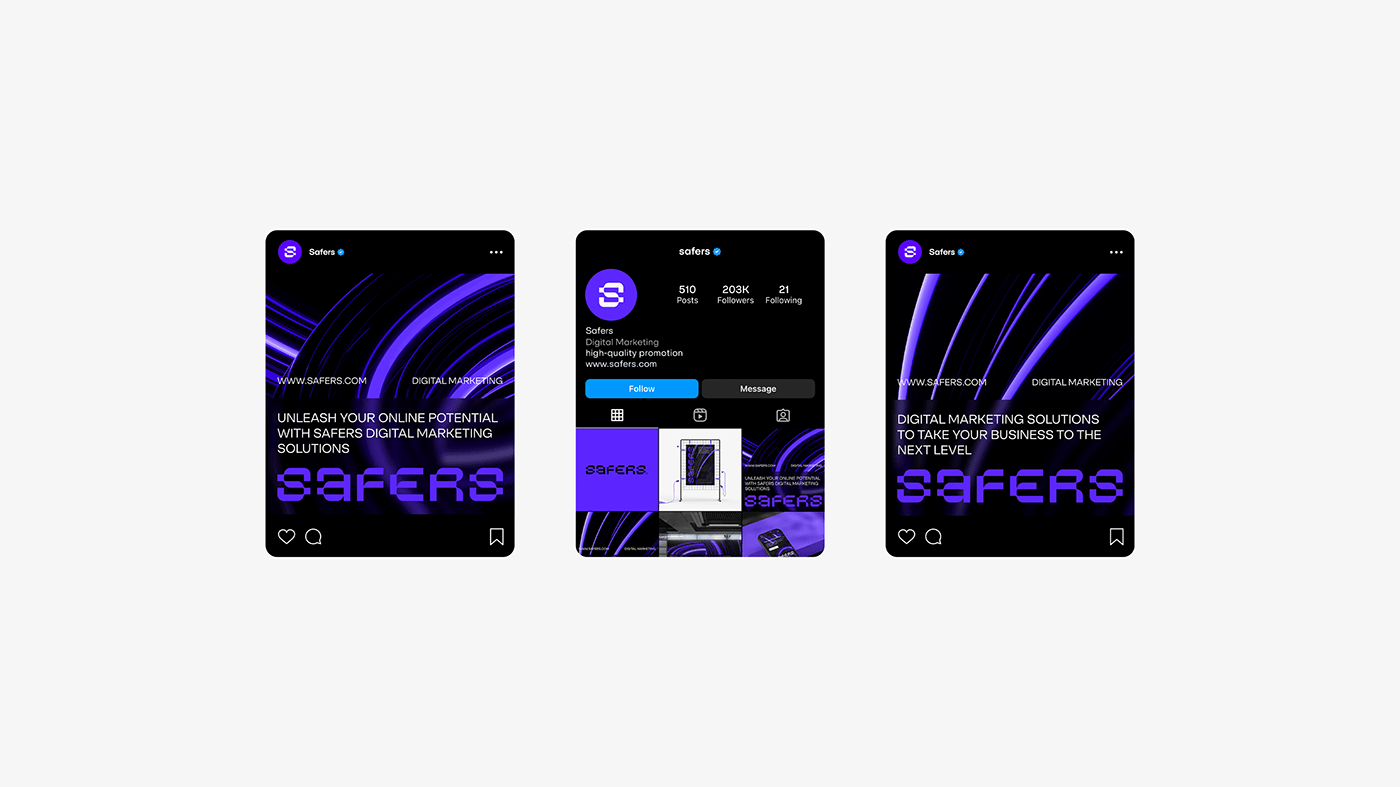
Safers
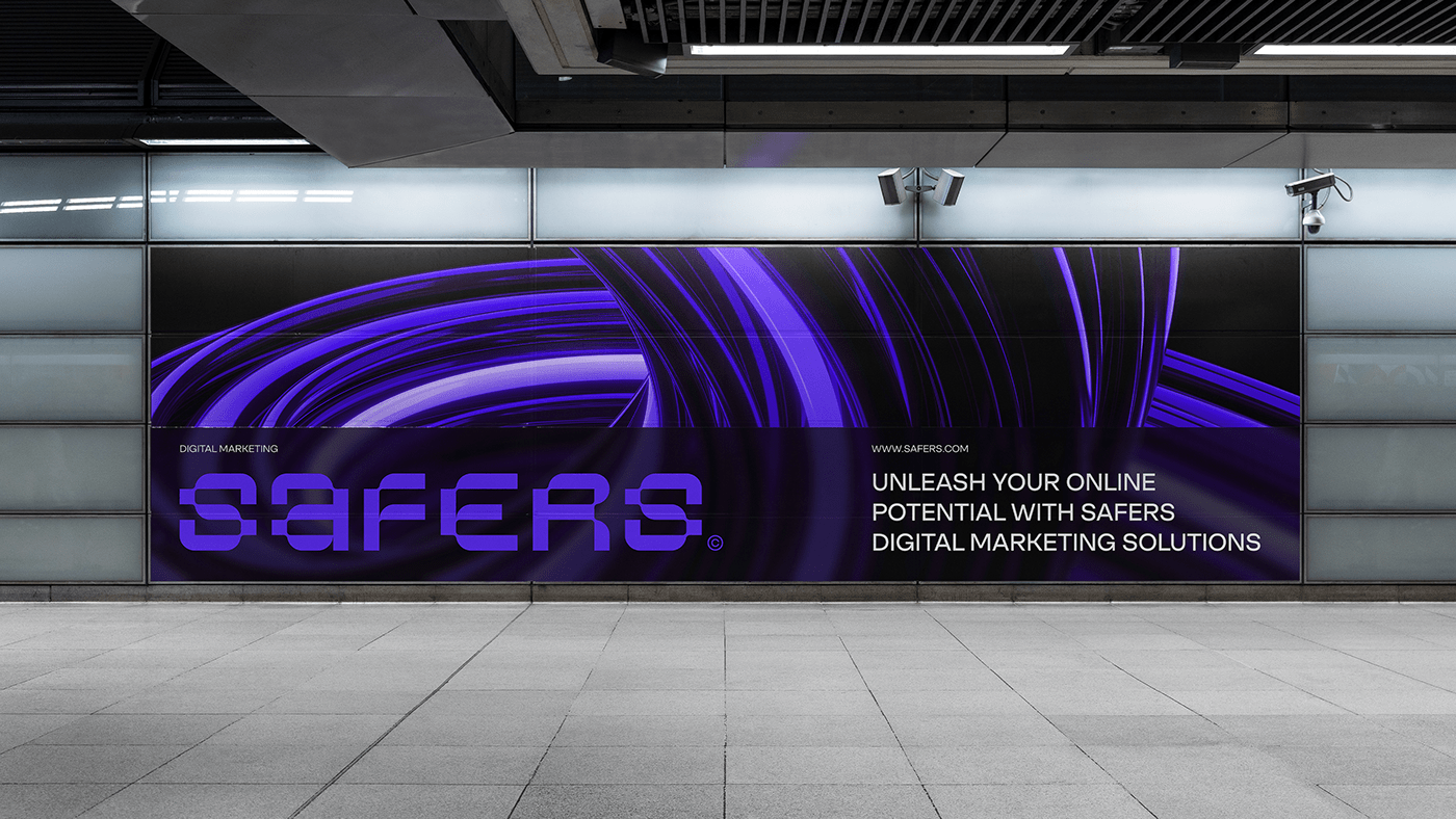
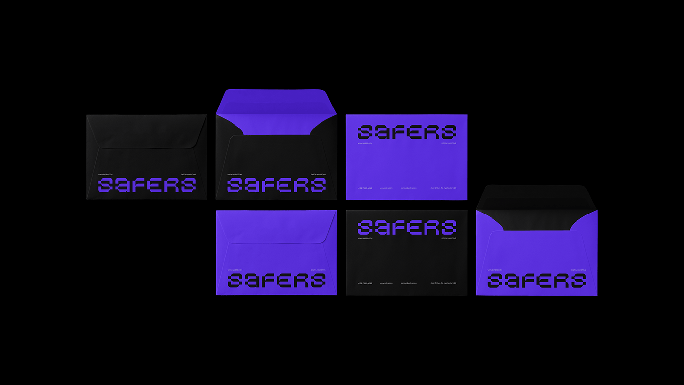
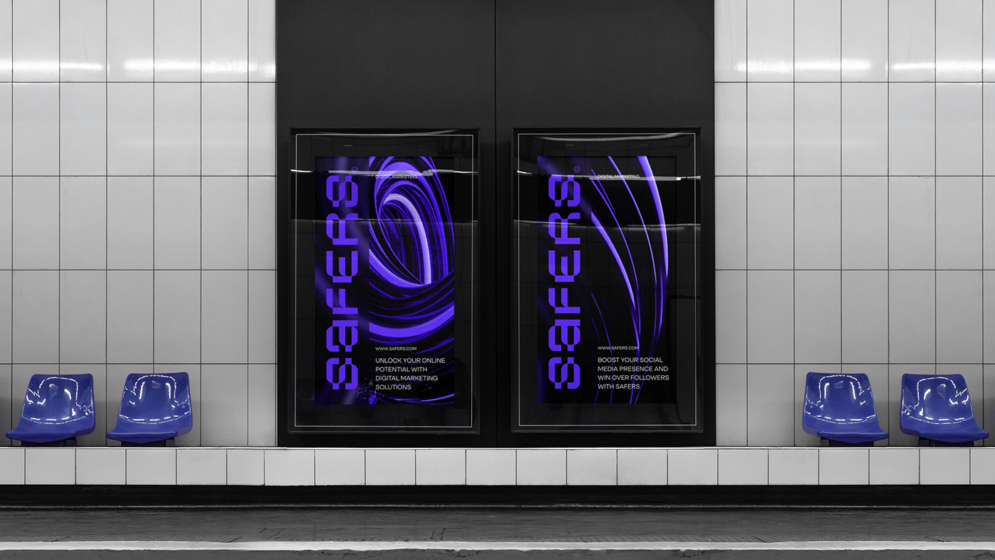
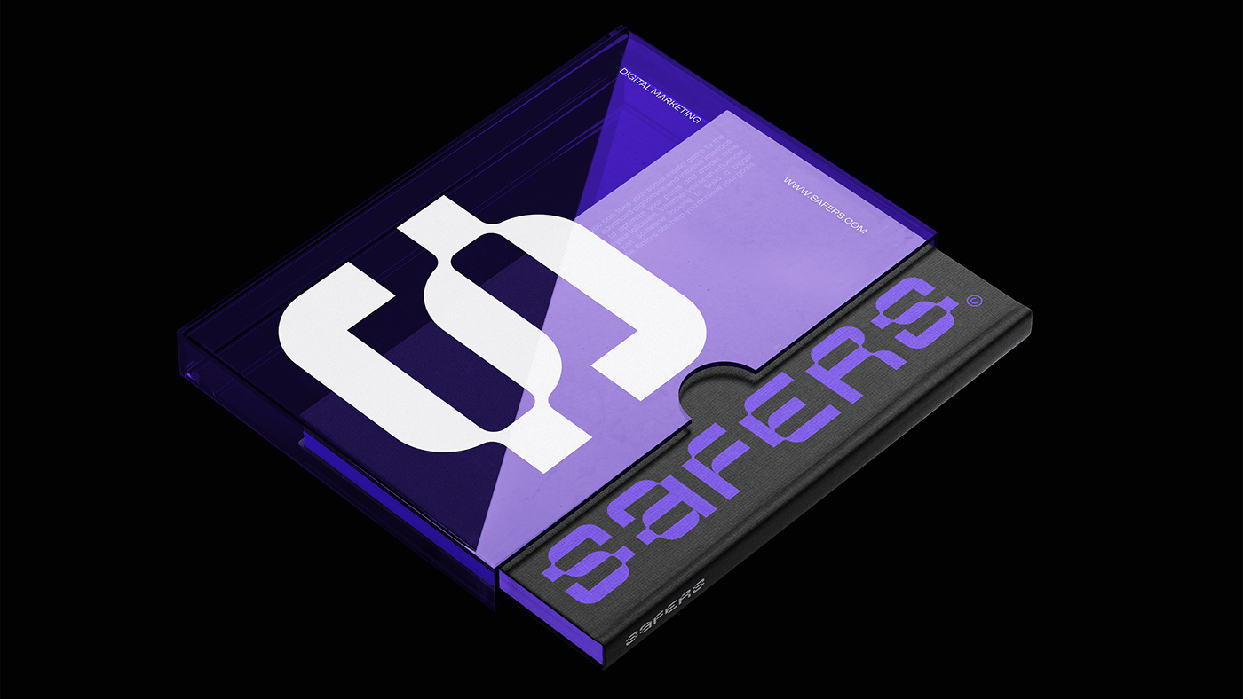
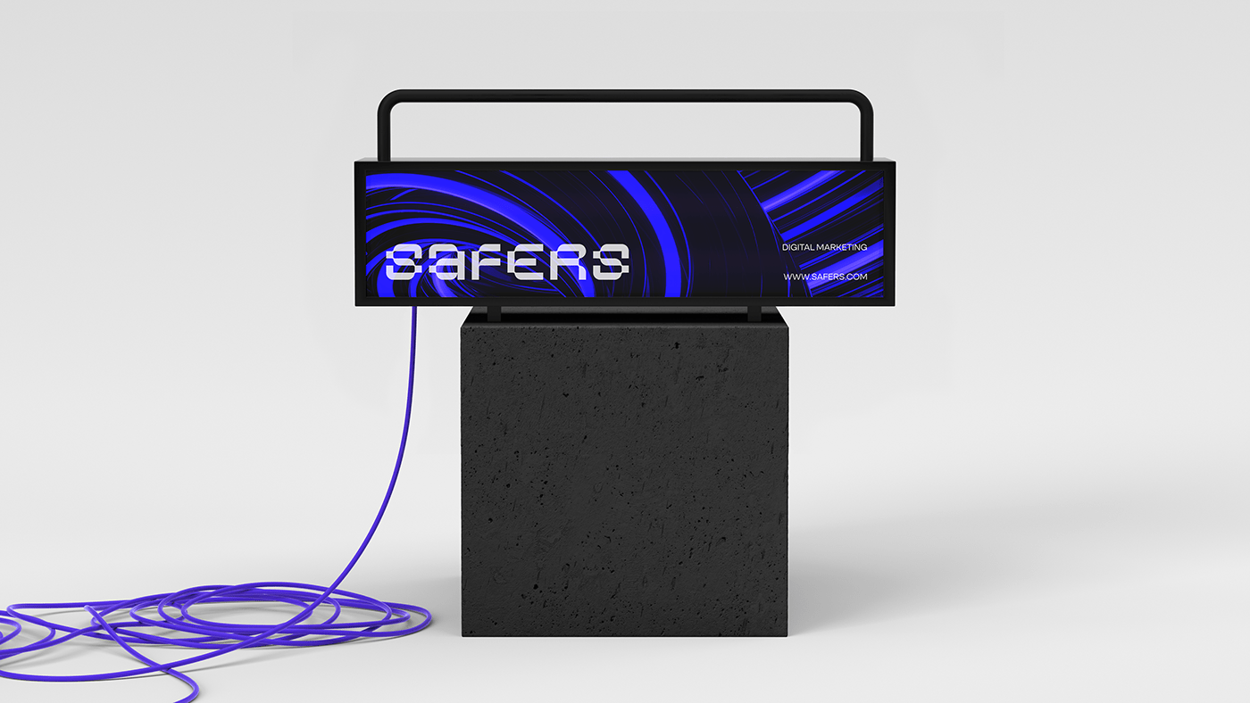
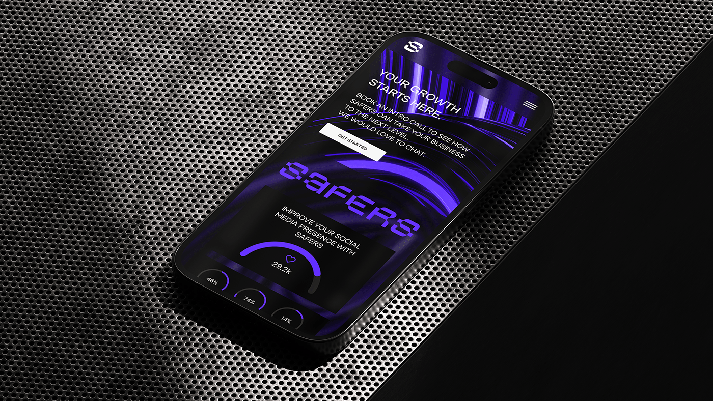
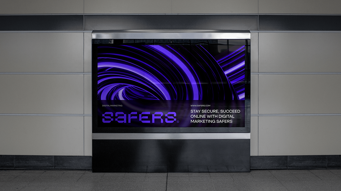
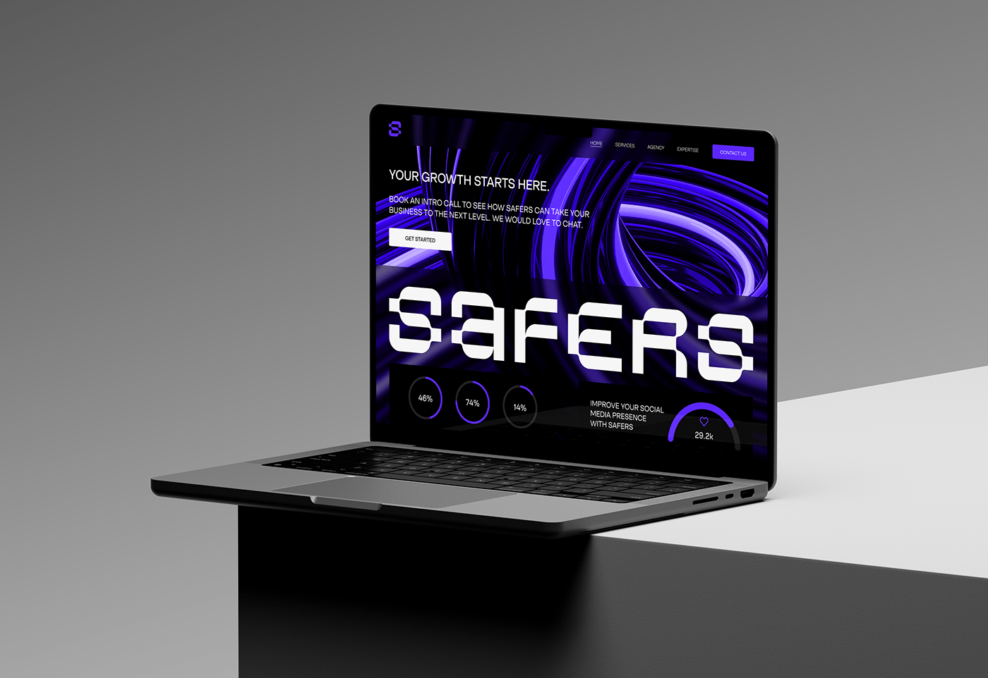
Safers, an American digital marketing company, is seeking to update its corporate identity with a technologically savvy and one of a kind logo design. The company, which specializes in top-notch Internet marketing, web design and online store support, demanded a unique and recognizable logo that radiates modernity and sophistication. In a world dominated by digital solutions, Safers aims to stand out with a bold visual identity that combines minimalism and technology.
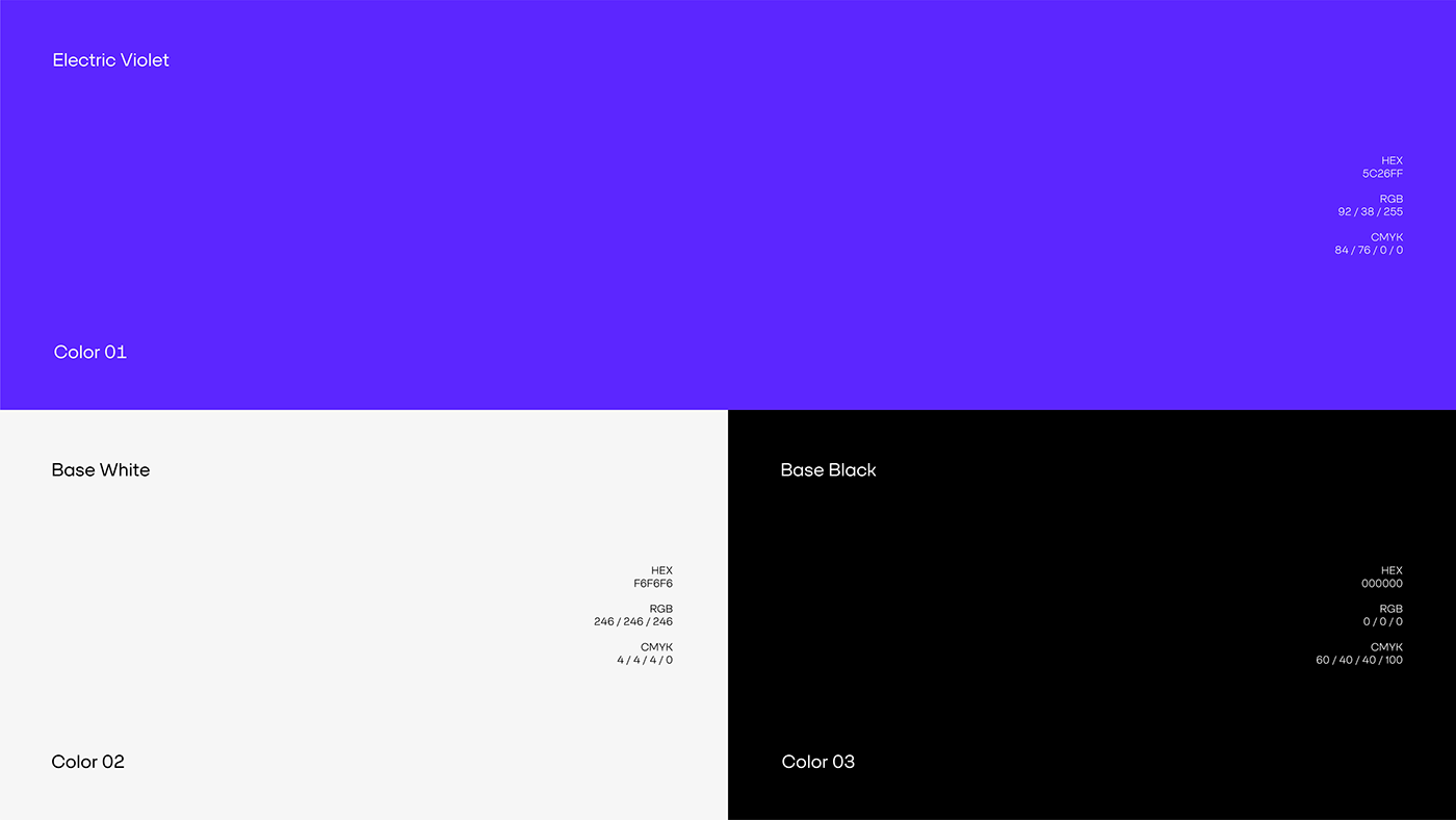
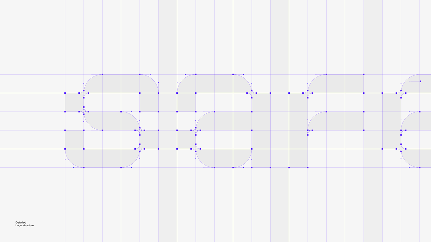
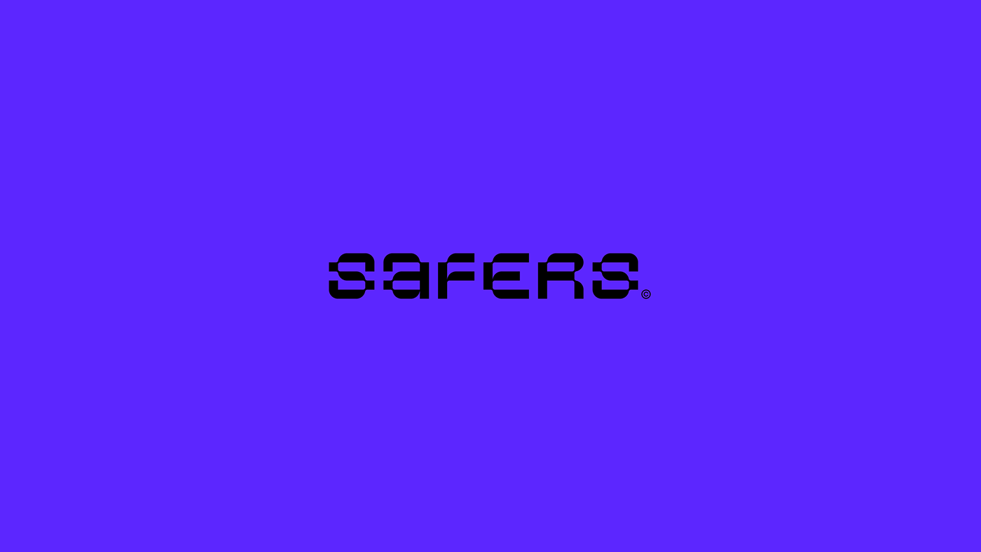
Typography plays a crucial role in making a lasting impression on customers, and intricate details set the brand apart from the competition. An elegant and sophisticated color scheme with vibrant shades of purple, black and white was chosen. The choice of SFT Schrifted Sans typography is a masterstroke, as its wide range of thickness makes it ideal for websites, print publications and banners.
—