Bring Back the Soul
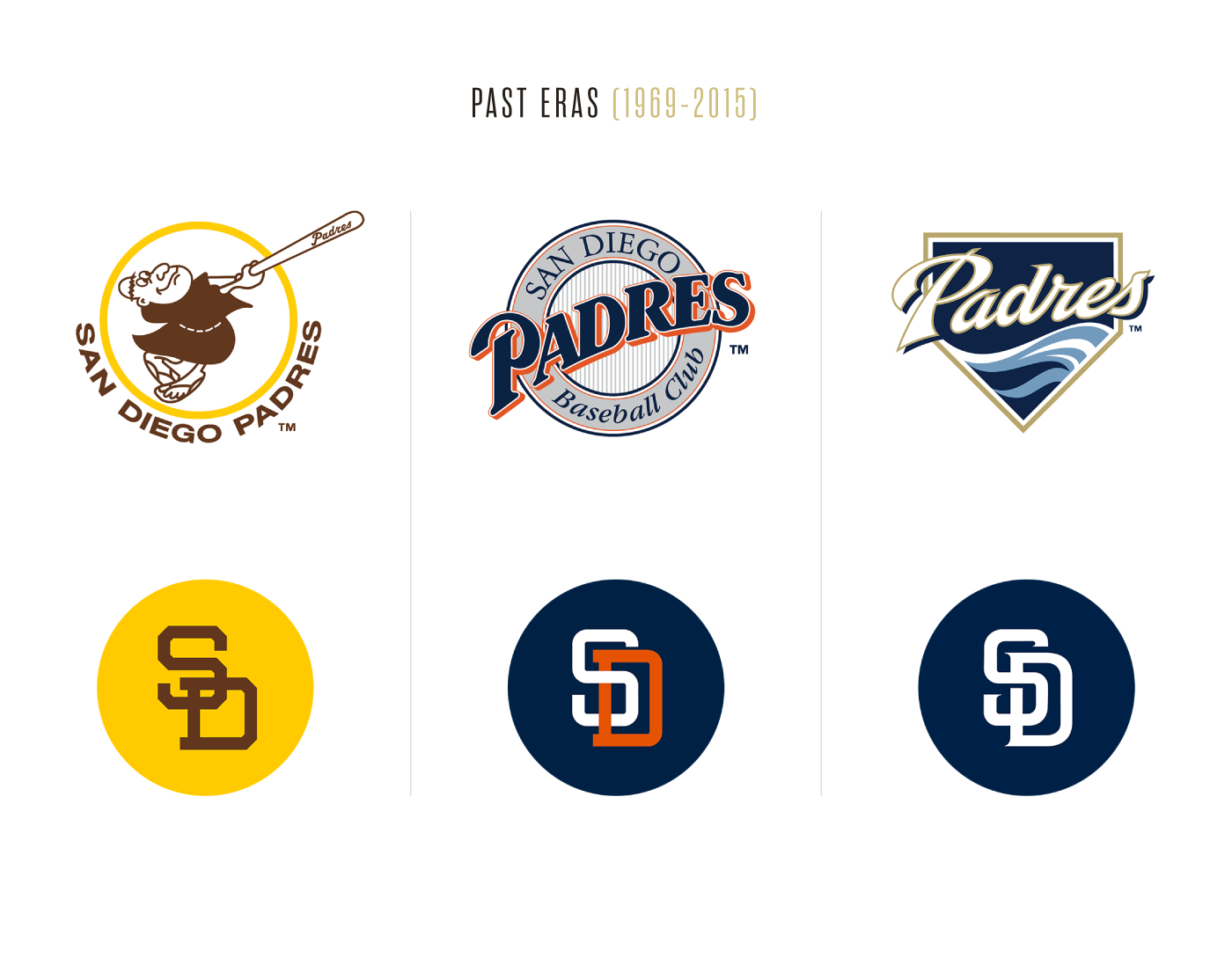
An aimless team brand, a struggling organization, and a long bout of losing records. A recipe for “Rebrand”.
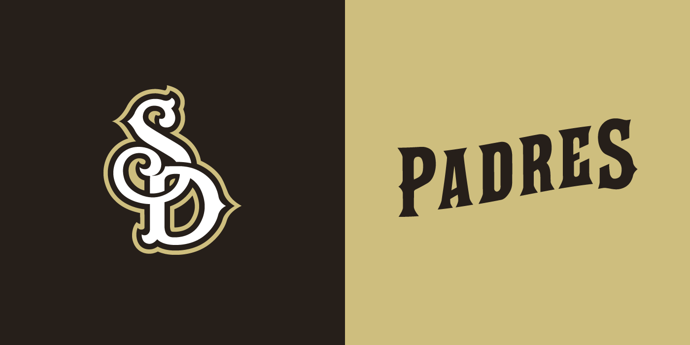
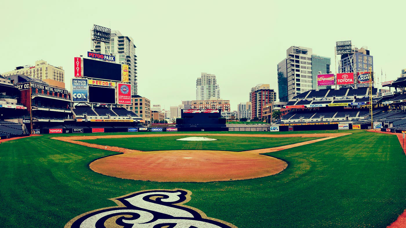
The San Diego Padres are in our in our backyard, so it’s easy to pick up on the overall temperature of fans discontent for their beloved, nostalgia-fueled baseball club. In attempt to clean up the Pads and build a champion-worthy team, their more serious identity over the past decade became rather corporate and cold. It had more San Diego ties, but was somehow less San Diego than ever. One thing they had going for them, was a bold, no frills attitude to their brand an uniform system. However, the confusing transition resulted in many variations of alternate and throwback unis to make fans happy, but ultimately clashed and scattered the core brand. We took it upon ourselves to help reimagine a concept rebrand for how the Padres could continue the path of professional, but tie back to their soulful roots without looking like a “throwback” team.