
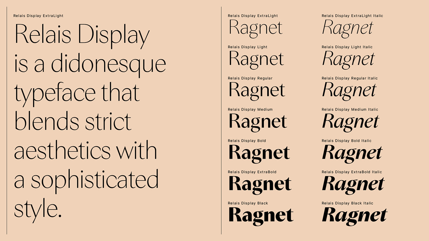


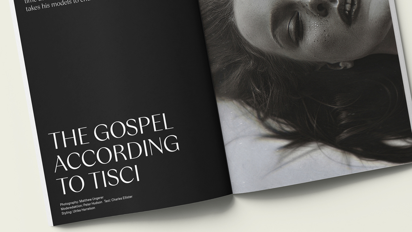

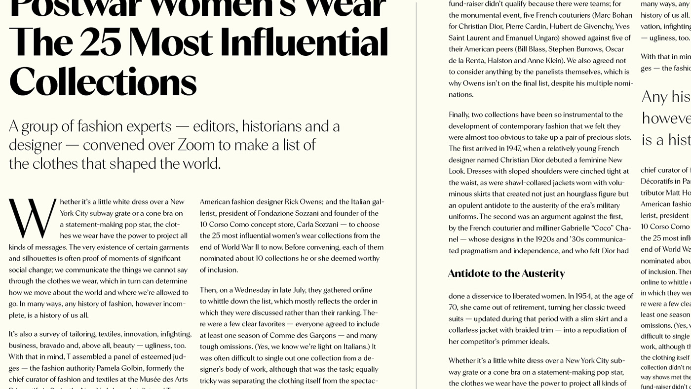
Relais Display is a generous and elegant Didone typeface designed for screen and print use. Although its proportions and letterforms are inspired by magazine titles from the late 1970s to 80s, this font family is not an echo from the past. It captures the aura of the times and is designed to fill todays expectations regarding legibility and versatility.
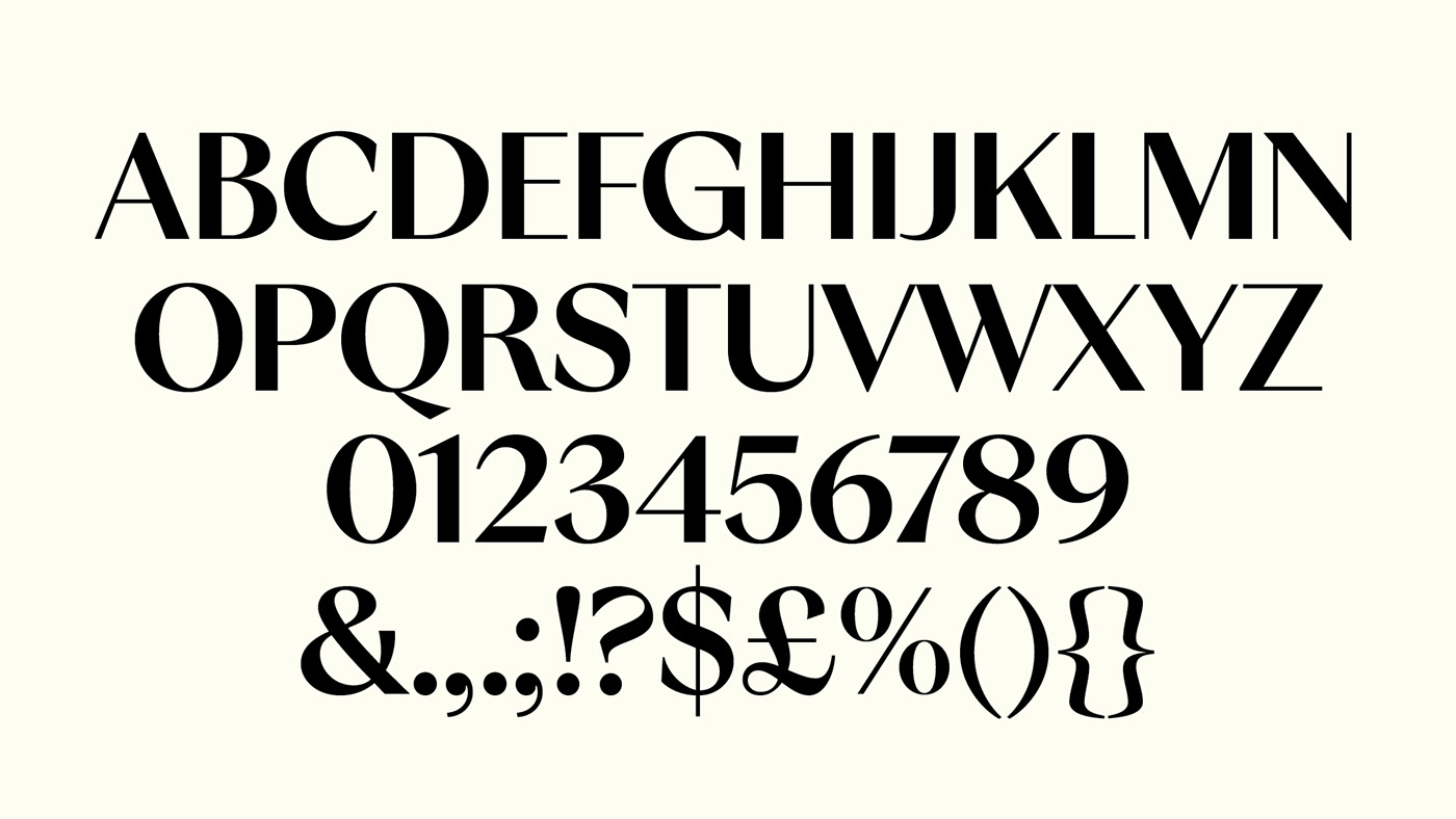
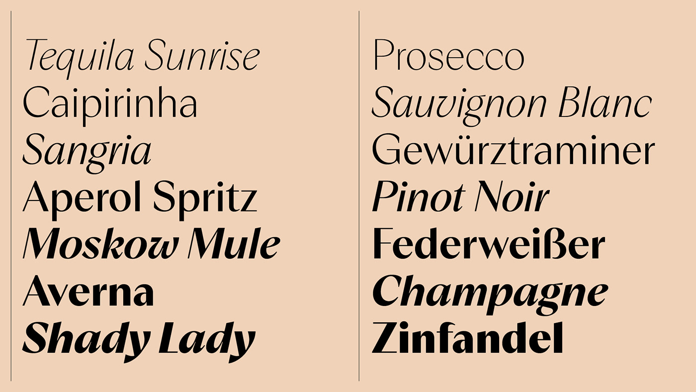
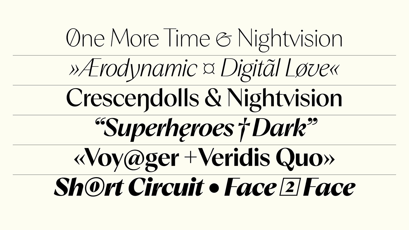
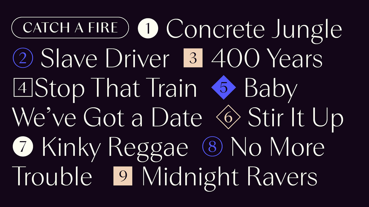
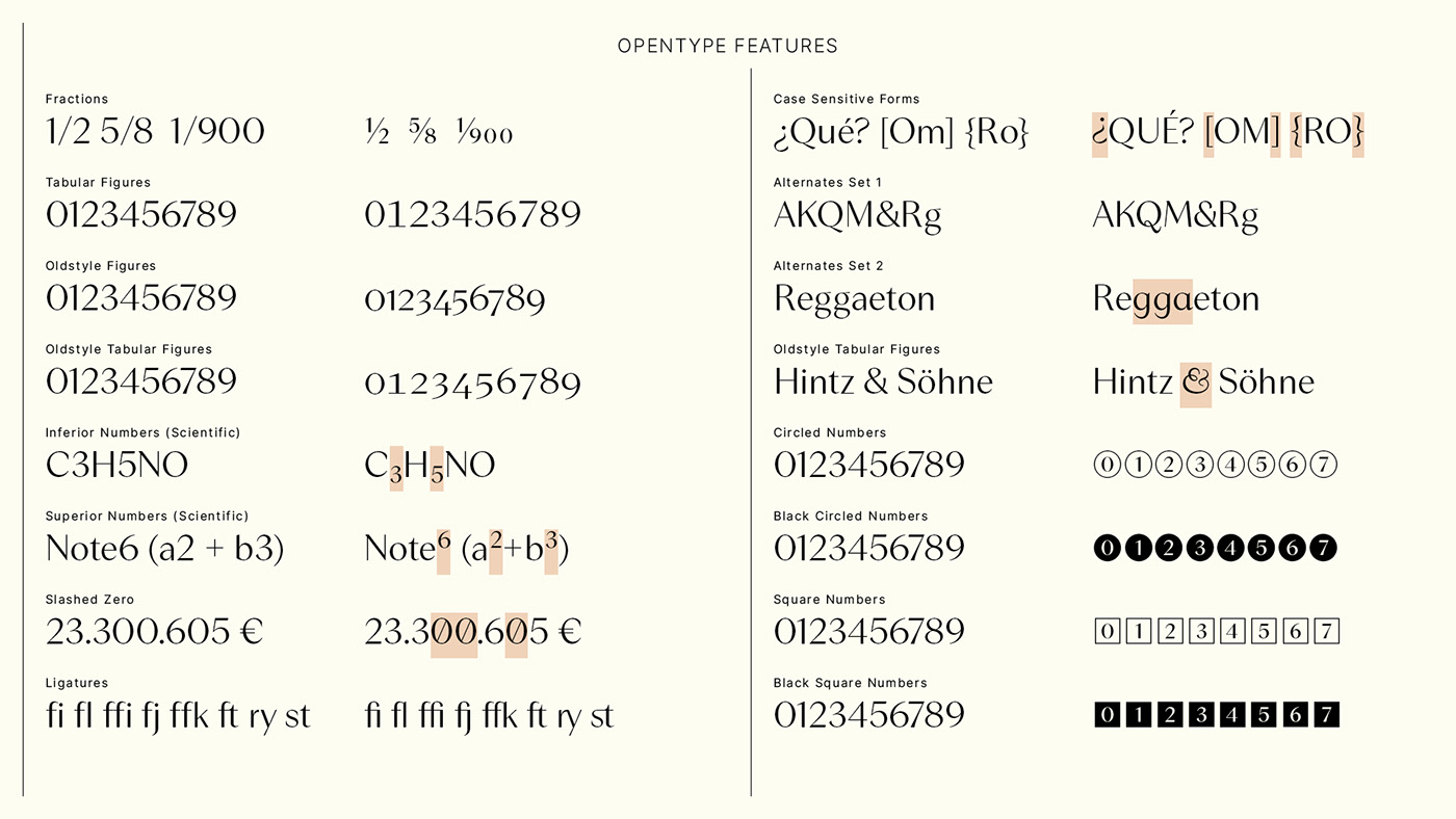
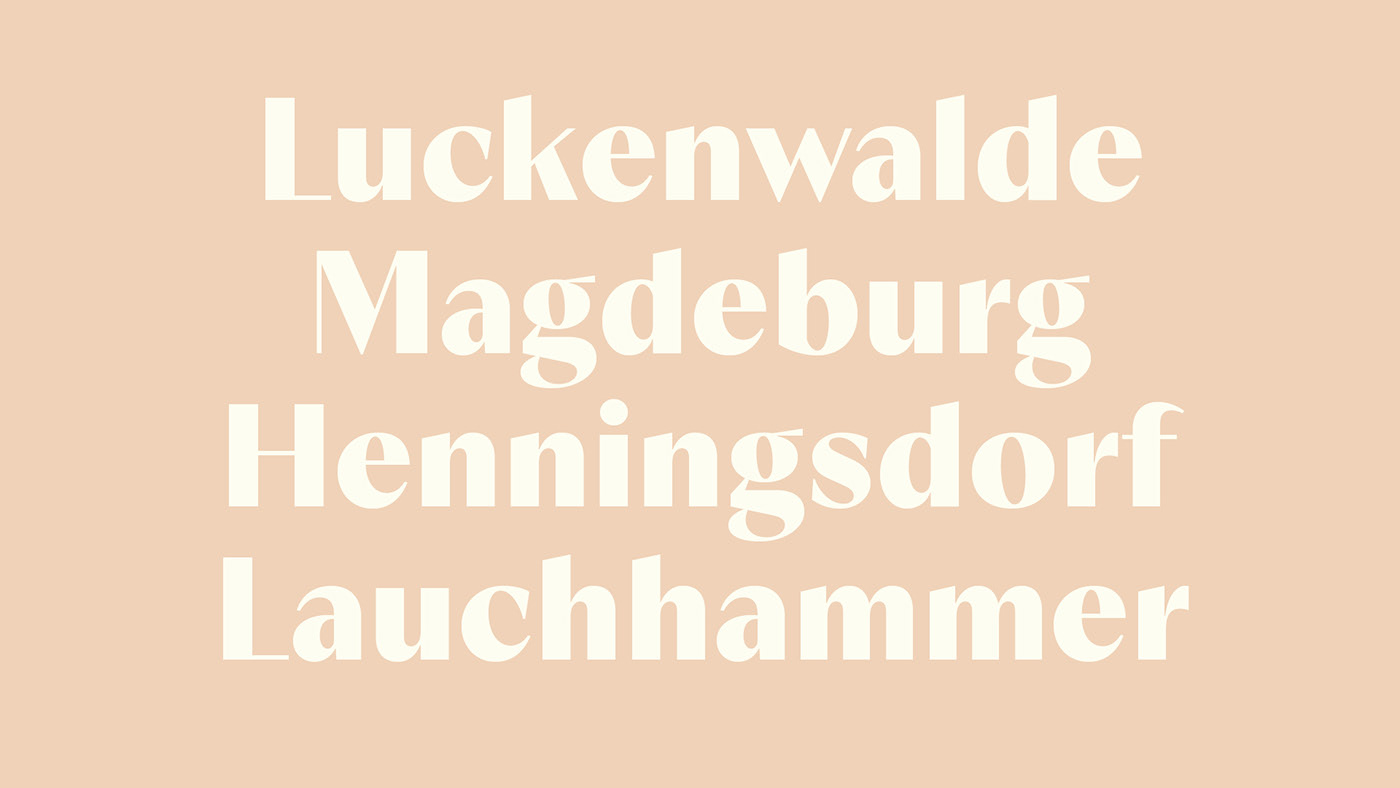
Relais Display comes in 7 different Weights with corresponding Italics. Stylistic alternates as well as standard and discretionary ligatures offer the possibility of adding interesting detail. Thanks to its clean shapes, featuring sharply cut terminals, pointed apexes, dynamic stroke endings and smooth transitions, it combines strict aesthetics with a sophisticated style. The italics sport exuberant details, especially in the heavier weights, giving it a lively expression. A moderate stroke-contrast teams up with optical corrections like ink-traps to increase the legibility at smaller sizes. It also has generous spacing for a display typeface, allowing it to work in medium sized typesetting as well as in display use. This font family will do wonders when used on any strong type layout especially for magazines, newspaper and movie titles.
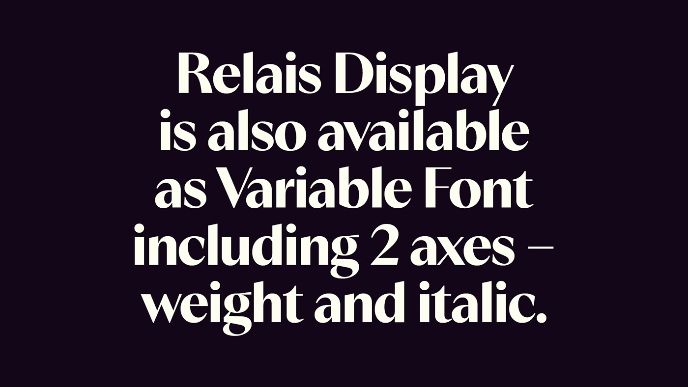
The font family is set up as a variable font with 2 axes (Weight, Italic) and supports extended latin for day to day design needs.
Relais Display is available at Blazetype.eu


