No Words Just Love
The brief for this project was to design a cover for a mixtape of beats compilation. The entirety of the revenue accumulated from the mixtape, titled No Words Just Love, would be donated to Best Day Foundation. Best Day Foundation is a volunteer organisation that helps children and young adults with special needs to build confidence and self esteem through safe, fun, adventure experiences.
Initially the compilation was to be released physically on CD but the brief changed direction a couple of times as it progressed. The final product turned out all the better for the changes.

The first concept direction discussed was to design a vector of a cassette tape with either a handwritten title on the cassette or lettering tape stuck on. A few variations were worked on but nothing really clicked so a new approach of actually photographing a cassette was suggested and abandoned before trying something different.
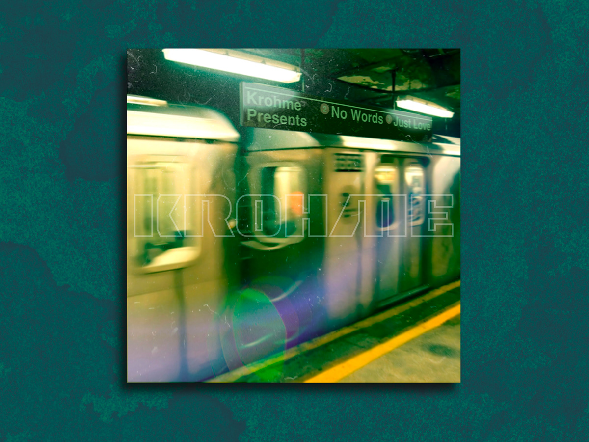
The next idea was to tie in with the Hip Hop theme and go for something more urban. As the bulk of the contributing artists providing beats were New York residents, it was decided that something that reflected that needed to be worked into the design. Some early imagery utilised images of graffiti, street scenes and skylines before settling on an image of a subway train. The above image was signed off as a final piece and submitted for production.

At the eleventh hour the project took a dramatic turn and the whole approach was revised. As much as the subway train idea worked as a reflection of the urban content on the compilation, the actual product and the organisation it was supporting needed to inform the aesthetic. Something vibrant, full of life, colourful and abstract. This was definitely the tonal shift that the project needed. Another distinction that changed was that as this was a mixtape, why not actually put it out on cassette instead of a CD. So with a change of direction and a change to the layout a shortlist of images were decided upon before mocking up a final design.
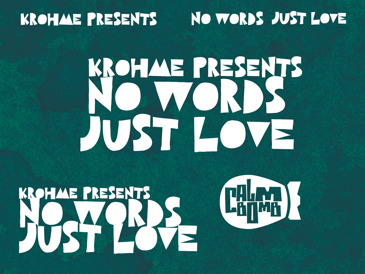
A hand cut font worked best with the imagery and punctuated the feel and aesthetic perfectly.

With the home straight in sight a design for the ‘j-card’ approached finalisation, all barring a few final tweaks, and was signed off for production.

Loved how the final product turned out and was happy to find that it had sold out.


