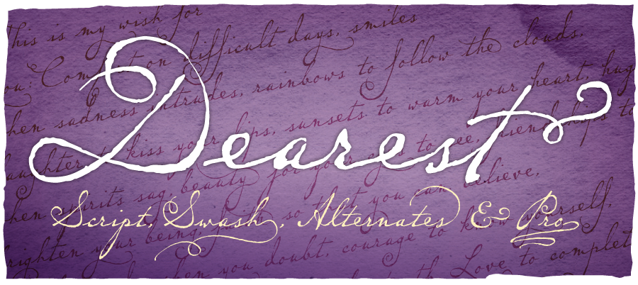
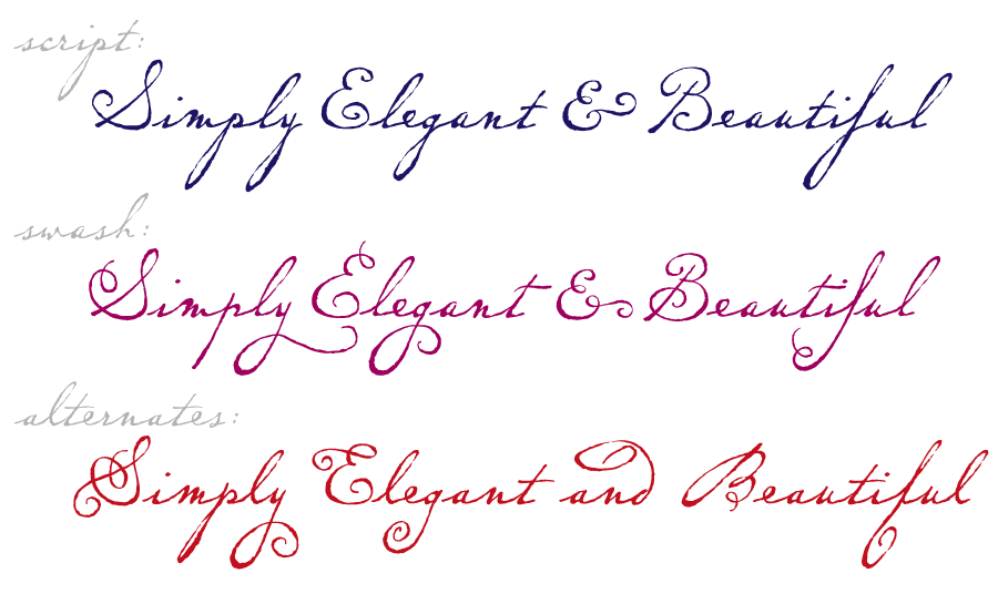
A flowing script font set, P22 Dearest was designed by Christina Torre in 2001. It was inspired by handwritten characters found in a 19th century German book chronicling a history of the Middle Ages. Both P22 Dearest Script and Swash fonts were designed to be used interchangeably with one another, to create a look that can be tailored to your needs and closer simulate elegant handwriting. There are many snap-on swashes included to give versatility to the design.
The original Dearest two font system anticipated the possibilities of Opentype scripting and alternate options.
An expansion of Dearest was started by Paul Hunt in 2008 with added Cyrillic forms, but was put aside. Now Miranda Roth has completed the new Dearest Pro in 2013-14 building off of and incorporating the work of Torre and Hunt. The new OpenType pro version of Dearest features over 900 glyphs with Greek and Cyrillic, expanded ligatures, and more swashes, embellishments and contextual alternates. The original non-pro versions are still available for those who do not use advanced OpenType features. The addition of "Dearest Alternate” as a third font variation can extend the design flexibility for existing users.
Specimen from the TDC award Annual where Dearest was awarded a Judges Choice award for type design.


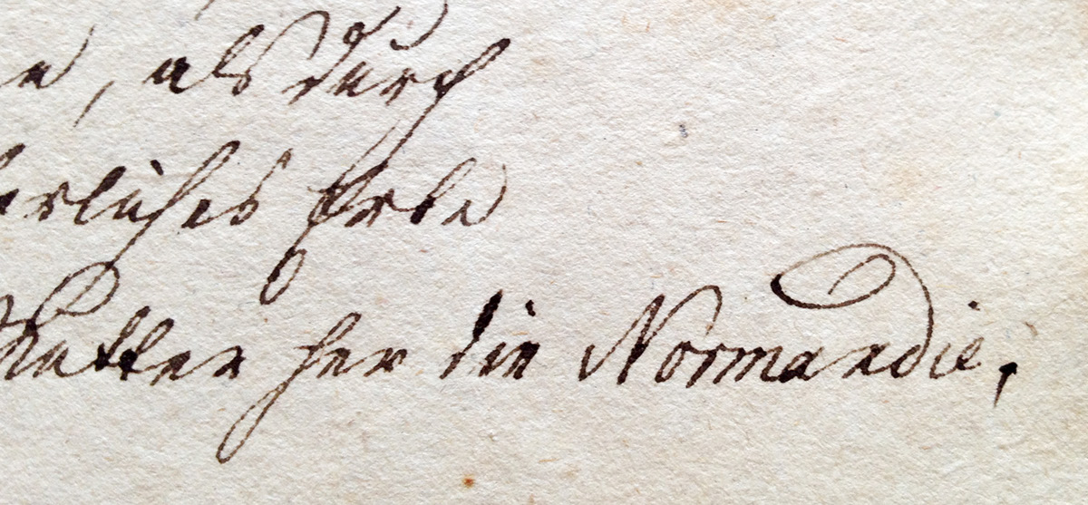
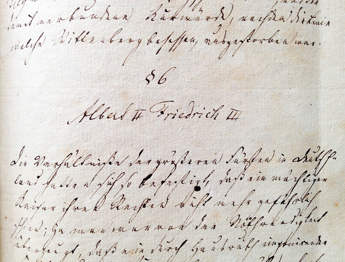
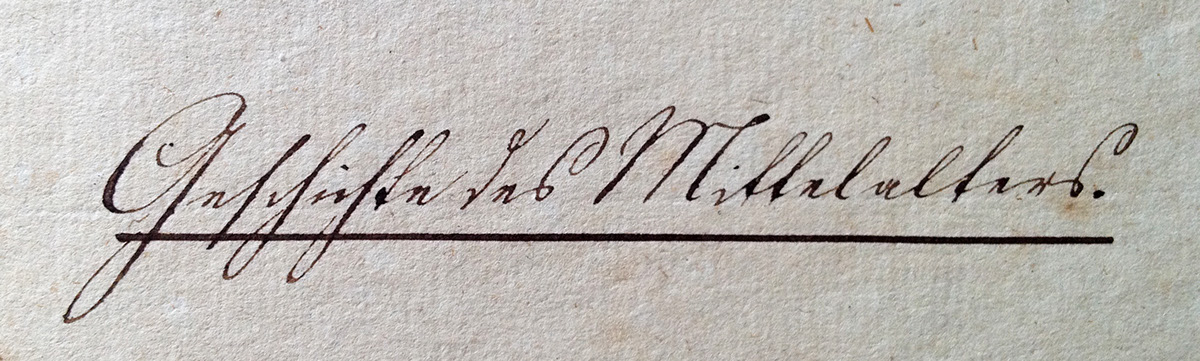
Photos of original handwritten book that was the basis of the Dearest font: Geschiche des MIttlealters 2. Heft
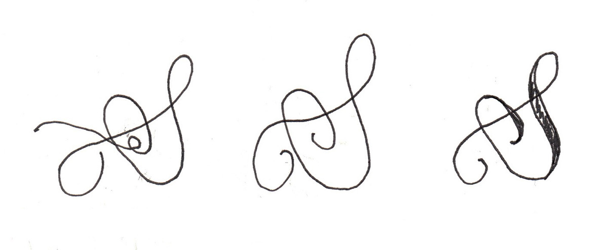
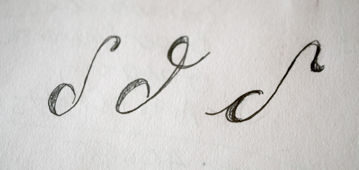
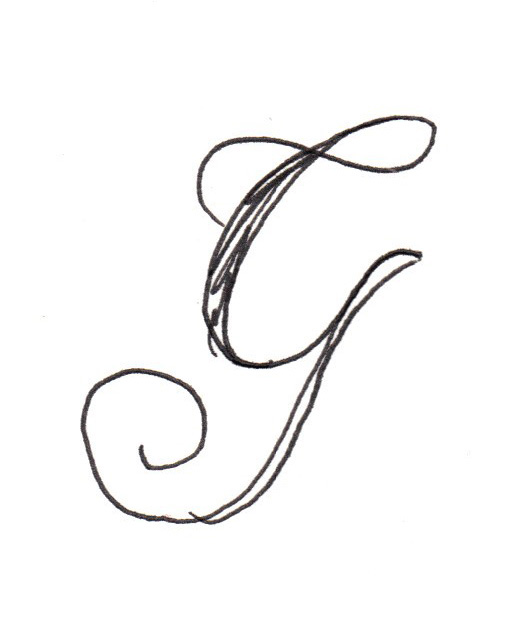
Sketches for Alternate Dearest Character shapes

Studies for Dearest Cyrillic forms

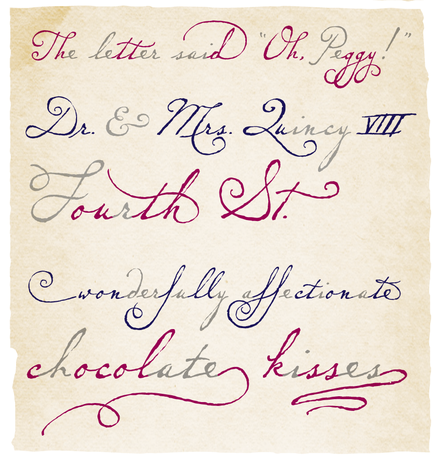
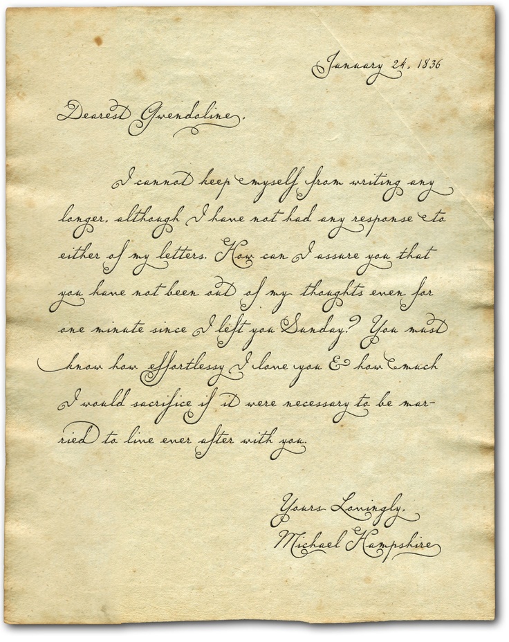
Perfect for Elegant invitations and Single Malt Whiskies. Here are a few of the various uses of the Original Dearest Script and Dearest Swash Fonts
The Dearest fonts are available at P22.com

