FACILITY
Facility Promotora is a payroll loan company for public servants, retirees and pensioners. It's located in Florianópolis - Brazil. More than just talking about money, Facility aims to motivate its clients to explore new opportunities. Facility has an optimistic and courageous spirit. It aims to make achievements possible, expand opportunities, and empower individuals through payroll loans. The brand believes that life is more beautiful when we are the first to see the landscape.
FACILITY
A Facility Promotora é uma empresa de crédito consignado para servidores públicos e aposentados e pensionistas do INSS, localizada em Florianópolis. Mais do que falar de dinheiro, a Facility quer motivar seus clientes a desbravar novas oportunidades. A Facility tem uma alma otimista e corajosa. Quer tornar as realizações possíveis, ampliar oportunidades e fortalecer a autonomia através do crédito consignado. Acredita que a vida é mais bela quando somos os primeiros a ver a paisagem.


CHALLENGE
Facility approached Bradda with a very common challenge for companies that grow rapidly in their markets: a lack of consistency in their brand identity. Every touchpoint the customer had with the brand was communicating differently. Our challenge was to bring alignment and a new visual identity that represented the company's current values. Furthermore, the company was launching a new sub brand entirely focused on financial services and needed to build everything from scratch. Our task was to position these two fronts in a way that they had connection with each other.
DESAFIO
A Facility procurou a Bradda com um desafio muito comum em empresas que crescem rapidamente em seus mercados: falta de consistência em sua identidade de marca. Cada ponto de contato que o cliente tinha com a marca, estava se comunicando de uma maneira. Nosso desafio era trazer alinhamento e uma nova identidade visual que representasse os valores atuais da empresa. Além disso, a empresa estava lançando uma nova submarca totalmente voltada para serviços financeiros e precisava construir tudo do zero. Nosso trabalho foi posicionar essas duas frentes de modo que tivessem coerência entre si.


BRAND STRATEGY
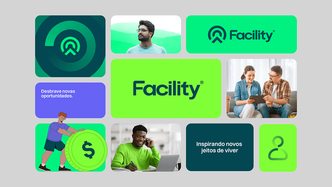
In an immersive process, we discovered an explorer DNA within the brand. They are optimistic and always seeking new opportunities. With a persistent, brave, and confident soul in their market experience, Facility aims to motivate and encourage its employees and clients to explore new paths. Therefore, we have defined a new brand platform that represents the key attributes of the company: explorers, collaborative, determined, and engaged.
ESTRATÉGIA DE MARCA
Em um processo de imersão, descobrimos um DNA explorador na marca. Eles são otimistas e estão sempre procurando novas oportunidades. De alma persistente, corajosa e confiante em sua experiência no mercado, a Facility quer motivar e incentivar seus colaboradores e clientes a desbravarem novos caminhos. Por isso, definimos uma nova plataforma de marca que representa os principais atributos da empresa: desbravadores, colaborativos, obstinados e engajados.

TAGLINE
Explore new opportunities.
Facility's tagline calls for action and shows the company's personality, motivating and inspiring courage. It reinforces the purpose of looking beyond money and seeking new paths, both for its employees and its clients.
A Tagline da Facility chama para a ação e mostra a personalidade da Facility, motivando e inspirando coragem. Reforça o propósito de olhar além do dinheiro e buscar novos caminhos, tanto para seus colaboradores quanto para seus clientes.

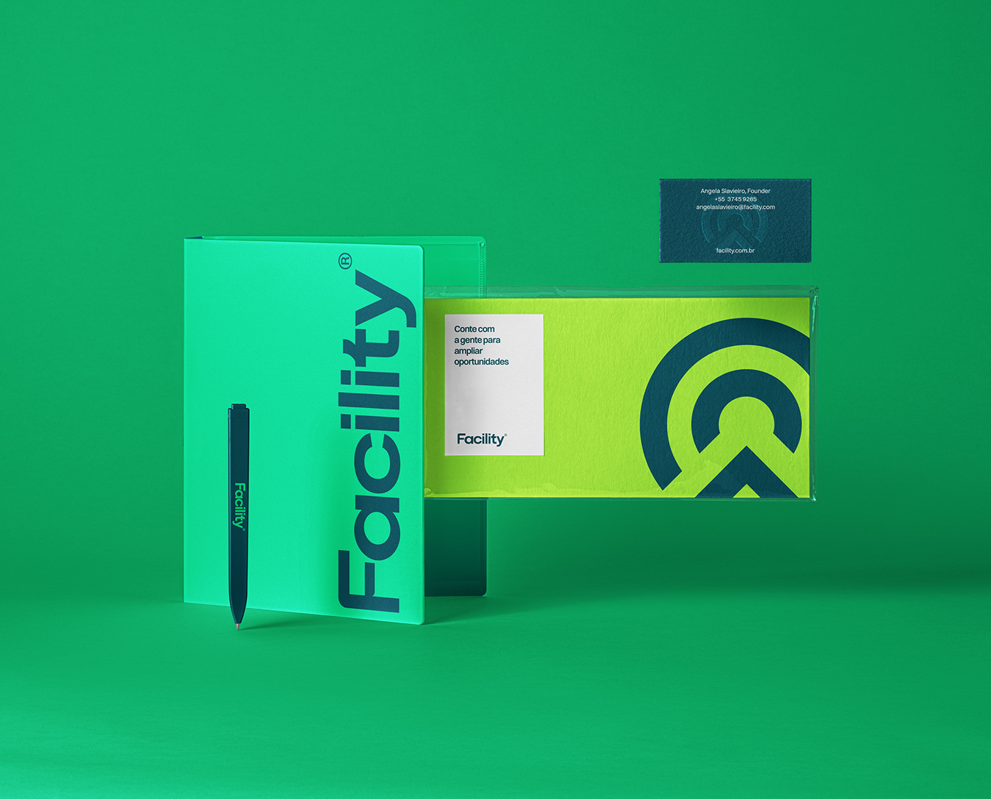

VISUAL IDENTITY
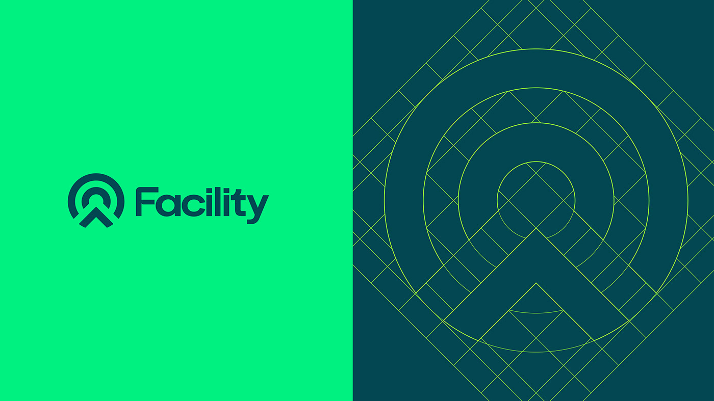
For the construction of the visual identity, we arrived at the new Facility symbol by combining two concepts: the mountain, which symbolizes exploration and obstinacy represented by a target. Additionally, to make the brand more approachable and accessible, we customized a new typography with lowercase letters and some rounded corners.
IDENTIDADE VISUAL
Para a construção da identidade visual, chegamos ao novo símbolo da Facility com a combinação de dois conceitos: a montanha, que simboliza o desbravar e a obstinação representada pelo alvo. Além disso, para tornar a marca mais próxima e acessível, escolhemos uma nova tipografia, com letras em caixa baixa e alguns cantos arredondados.

FACILITY BNK
Facility Bnk is a sub brand of Facility Promotora. Located in Florianopolis, the fintech offers financial services. In addition to its financial focus, the brand aims to expand opportunities and transform possibilities for its clients and partners. The banking version of Facility looks to the future with planning and courage, not neglecting its ambitious spirit, but balancing it with skill, caution, and intelligence. It drives greater achievements by exploring new territories and experiencing new ways of living life.
A Facility Bnk é uma submarca da Facility promotora. Localizada em Florianópolis, a fintech oferece serviços financeiros. Além de seu foco no setor financeiro, a marca tem como objetivo ampliar oportunidades e transformar possibilidades para seus clientes e correspondentes. A versão bancária da Facility busca o futuro com planejamento e coragem, mantendo sua ambição, mas equilibrando-a com habilidade, cautela e inteligência. Ela impulsiona conquistas maiores ao desbravar novos territórios e experimentar novas formas de vivenciar a vida.

CHALLENGE
The challenge was to work on the brand architecture. The main differences between the two presented brands are the target audience and communication style. While Facility Promotora targets a B2C audience with a more informal, approachable, and popular language, Facility Bnk needs to communicate in a more restrained, serious, and corporate manner, targeting a B2B audience. Therefore, it was necessary to think of two distinct languages that would still be part of the same universe and point towards the same purpose.
O DESAFIO
O desafio foi trabalhar na arquitetura da marca. As principais diferenças entre as duas marcas apresentadas são o público-alvo e a comunicação. Enquanto a Facility Promotora tem um público B2C e uma linguagem mais informal, próxima e popular, a Facility Bnk precisa se comunicar de forma mais contida, séria e corporativa, direcionada a um público B2B. Portanto, foi necessário pensar em duas linguagens distintas, mas que fizessem parte do mesmo universo e apontassem para um mesmo propósito.

BRAND STRATEGY
Throughout the project, we understood that the purpose of both brands were the same, but their communication style, approach, products, and services would be different, meaning the verbal universe, brand platform, "how," and "what." We worked to make these tools complementary for both brands, with Facility Bnk being more rational, measured, and balanced. Both brands would have the same foundation, the same worldview, and the same reason for existence, but they would unfold in different paths as they depend on their respective contexts.
ESTRATÉGIA DE MARCA
Ao longo do projeto, entendemos que o propósito das duas marcas era o mesmo, mas suas formas de comunicação, atuação, produtos e serviços seriam diferentes, ou seja, o universo verbal, a plataforma de marca, o "como" e o "o quê". Trabalhamos para que essas ferramentas fossem complementares em ambas as marcas, sendo que no Facility Bnk tudo seria mais racional, comedido e equilibrado. Ambas as marcas teriam a mesma base, a mesma visão de mundo e a mesma razão de existir, mas se desdobrariam em caminhos diferentes, pois dependem de seus contextos.


TAGLINE
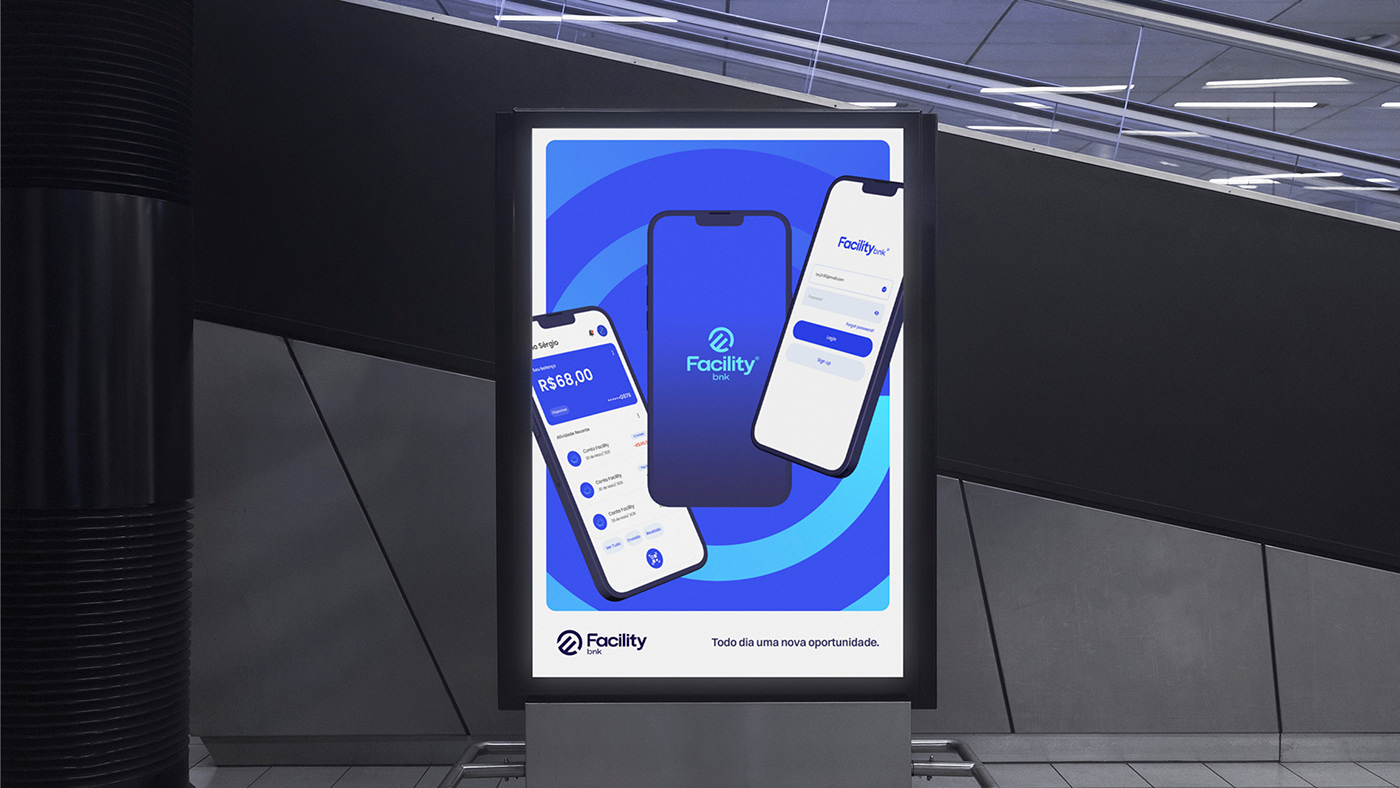
Bravely to the future
The Tagline of Facility Bnk showcases the ambitious spirit of planning for the future and anticipating, demonstrating an optimistic and inspiring approach to facing the world, and ultimately establishing a connection with the Facility Promotora brand.
A Tagline da Facility Bnk mostra o espírito ambicioso de planejar o futuro e antecipar-se, demonstrando uma abordagem otimista e inspiradora para enfrentar o mundo, e por fim, estabelece uma conexão com a marca Facility Promotora.


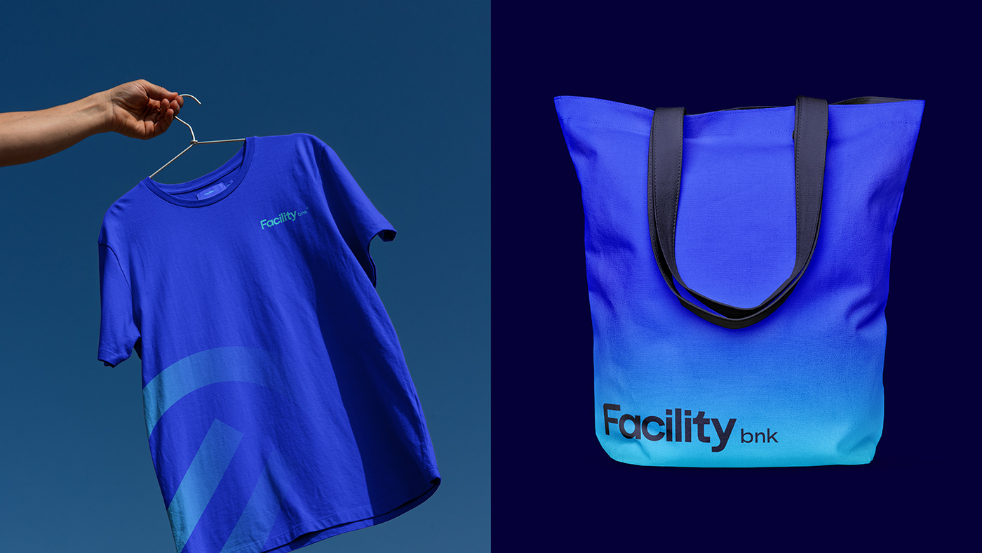
THE VISUAL IDENTITY
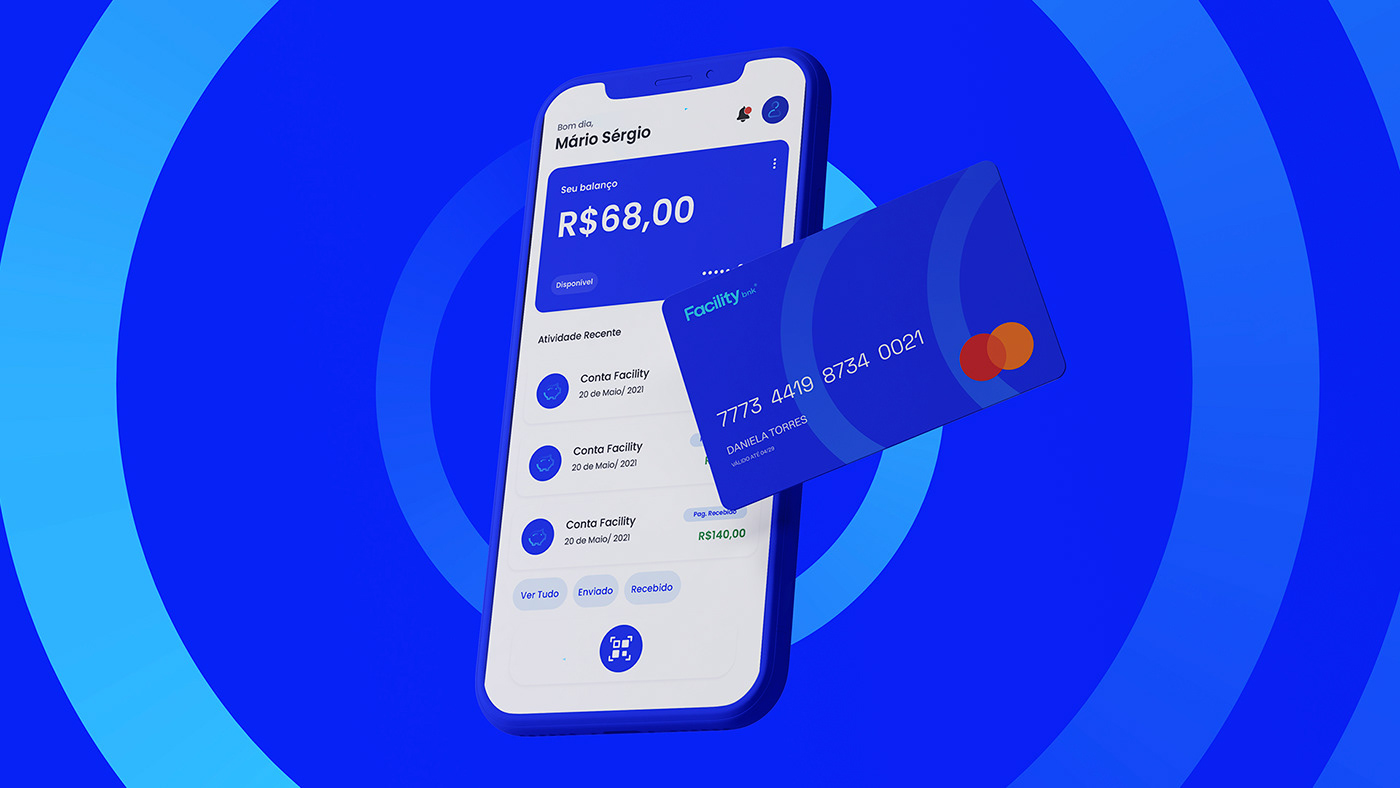
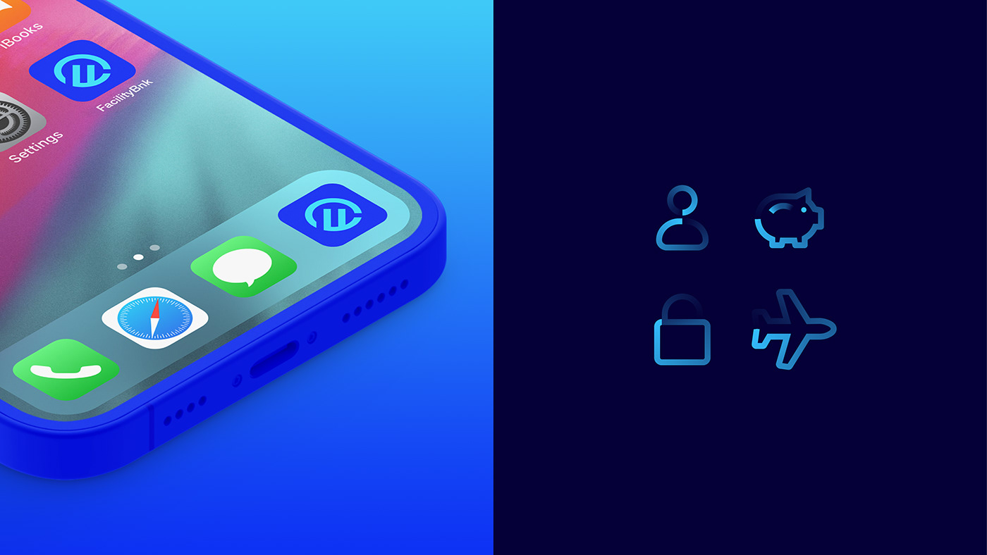
The visual identity of Facility Bnk maintains similarities with Facility Promotora. Its differentiation lies in the symbol, formed by the combination of the initial "F" with the mountain, which is also the conceptual basis of the promotora and highly representative for the company. The color palette focuses on shades of blue, aiming to convey security and solidity. Additionally, there was a need to bring a greater sense of seriousness compared to the promotora, which is why illustrations are not used.
IDENTIDADE VISUAL
A identidade visual do Facility Bnk mantém semelhanças com a promotora. Sua diferenciação está no símbolo, formado pela junção da inicial “F”com a montanha, base conceitual também da promotora e muito representativa para a empresa. A paleta é focada em tons de azul, que buscam trazer segurança e solidez. Além disso, havia a necessidade de se trazer uma seriedade maior em relação a promotora, por isso não são utilizadas ilustrações.