Brand Concept
Glow Bite is a brand dedicated to providing delicious and healthy food. The brand aims to make health a norm in daily life and help people achieve physical and mental balance through healthy eating habits. We believe that only in a state of balance between the body and mind can one truly feel radiant and energetic.
At Glow Bite, we focus not only on the delicious taste of the food, but also on the nutritional value of the food. Our menu offers a range of healthy and light foods, providing guests with a balanced and nutritious diet. We hope that while enjoying delicious food, guests can also gain health insights, thereby guiding them to develop scientific and healthy eating habits.
We firmly believe that a healthy dietary habit can enhance physical and mental balance, thereby further improving the quality of life. Therefore, our brand is committed to providing customers with the best healthy food, allowing them not only to be satisfied with their taste buds, but also to enjoy pleasure and happiness both physically and mentally.

Logo Presentation
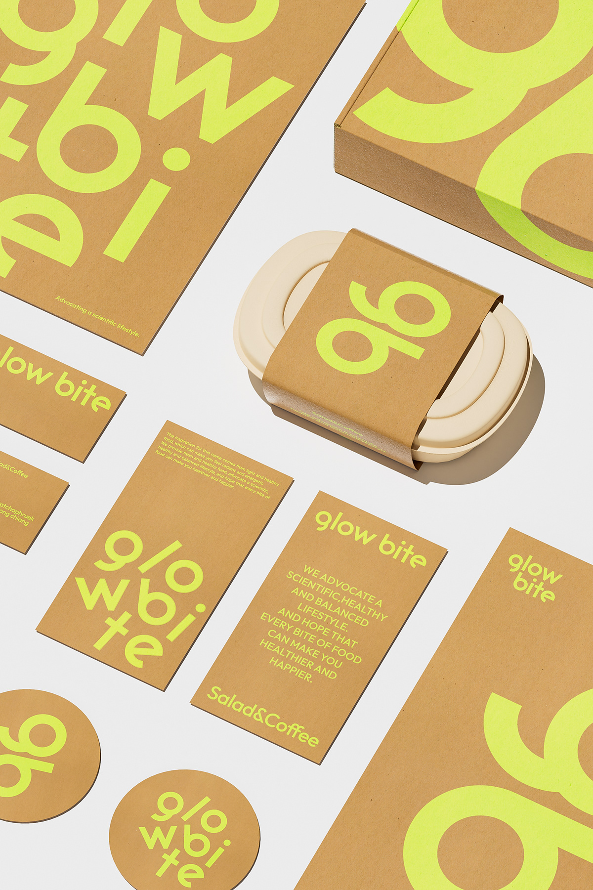
In terms of logo design, we extract the common letter O of the brand name and present the font shape through direct line processing through circular cutting, without excessive decoration, presenting a concise and clear appearance, which is easy to recognize and spread. O also represents the brand concept of health, nature, and sustainability.
Symbol
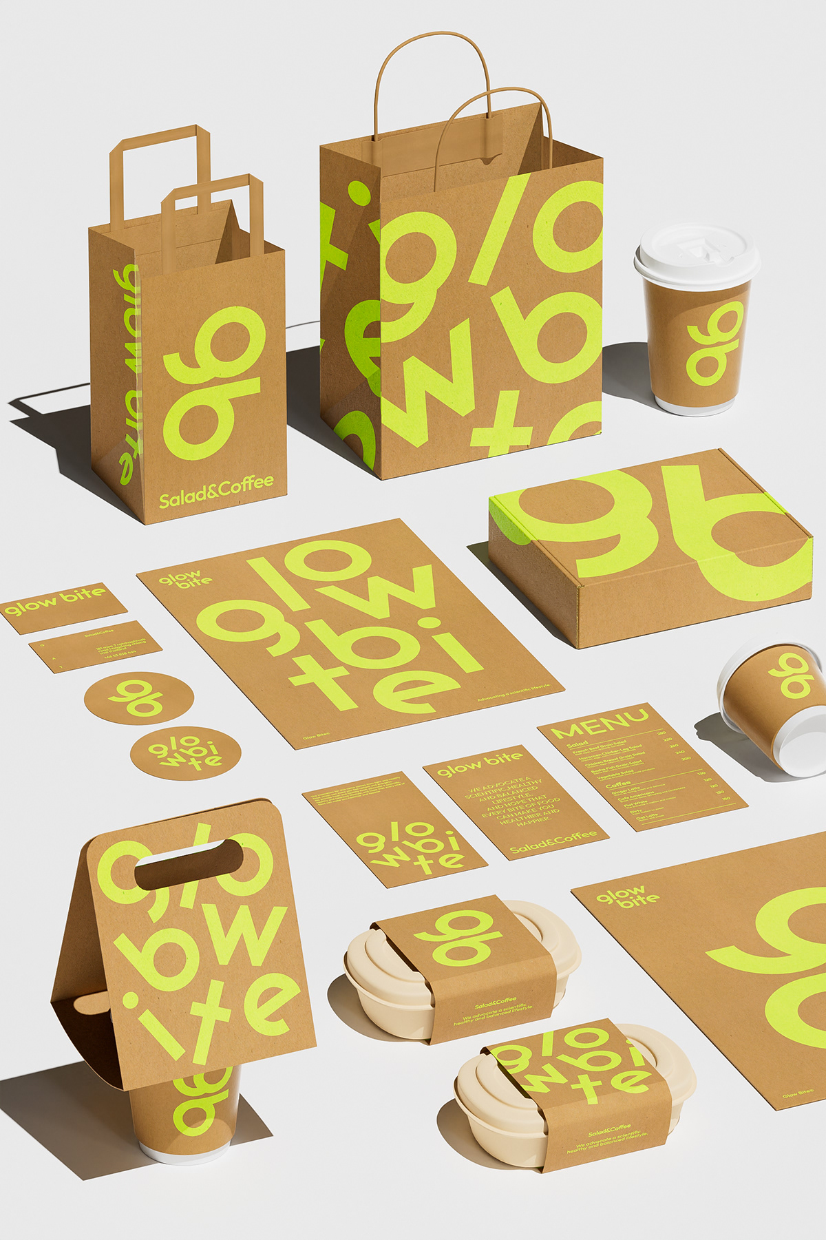
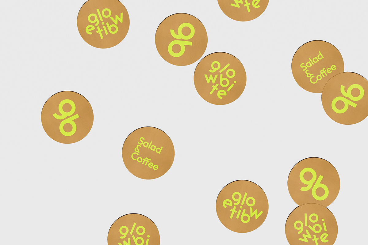
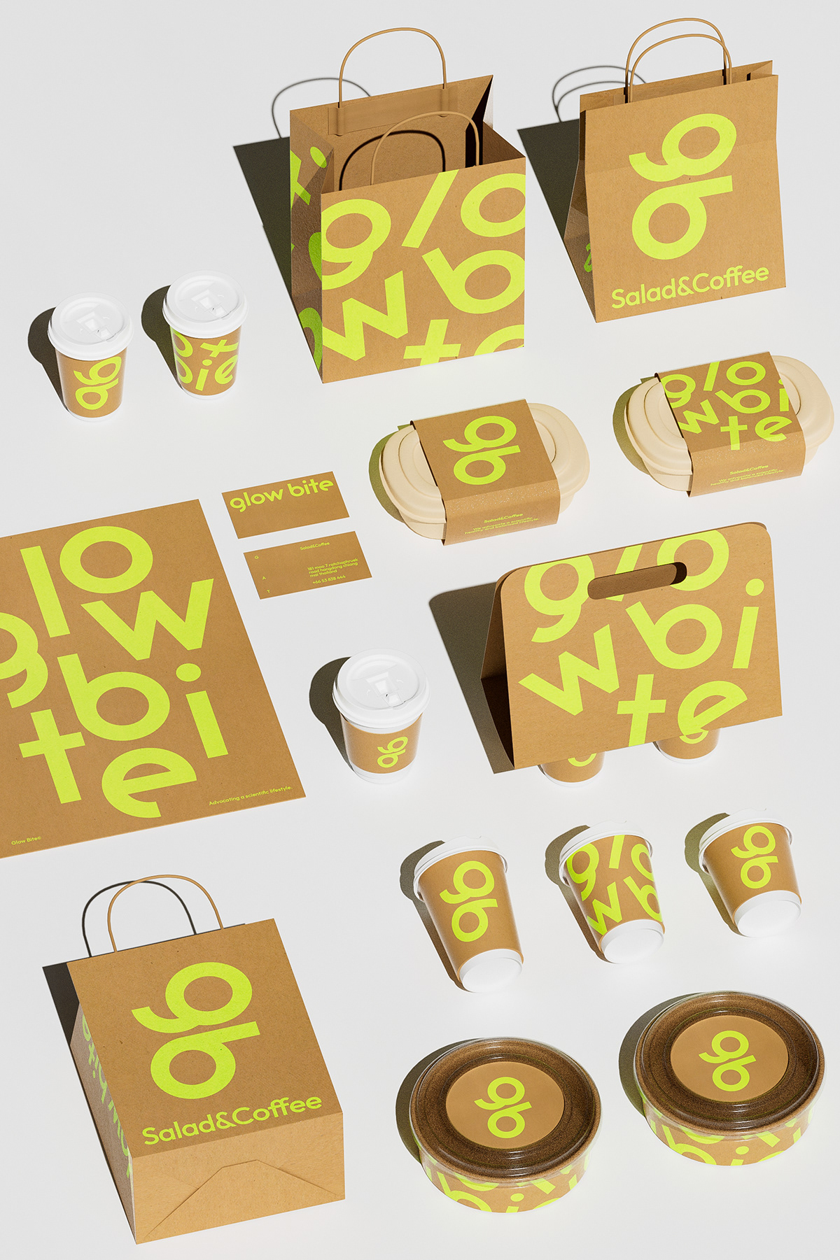
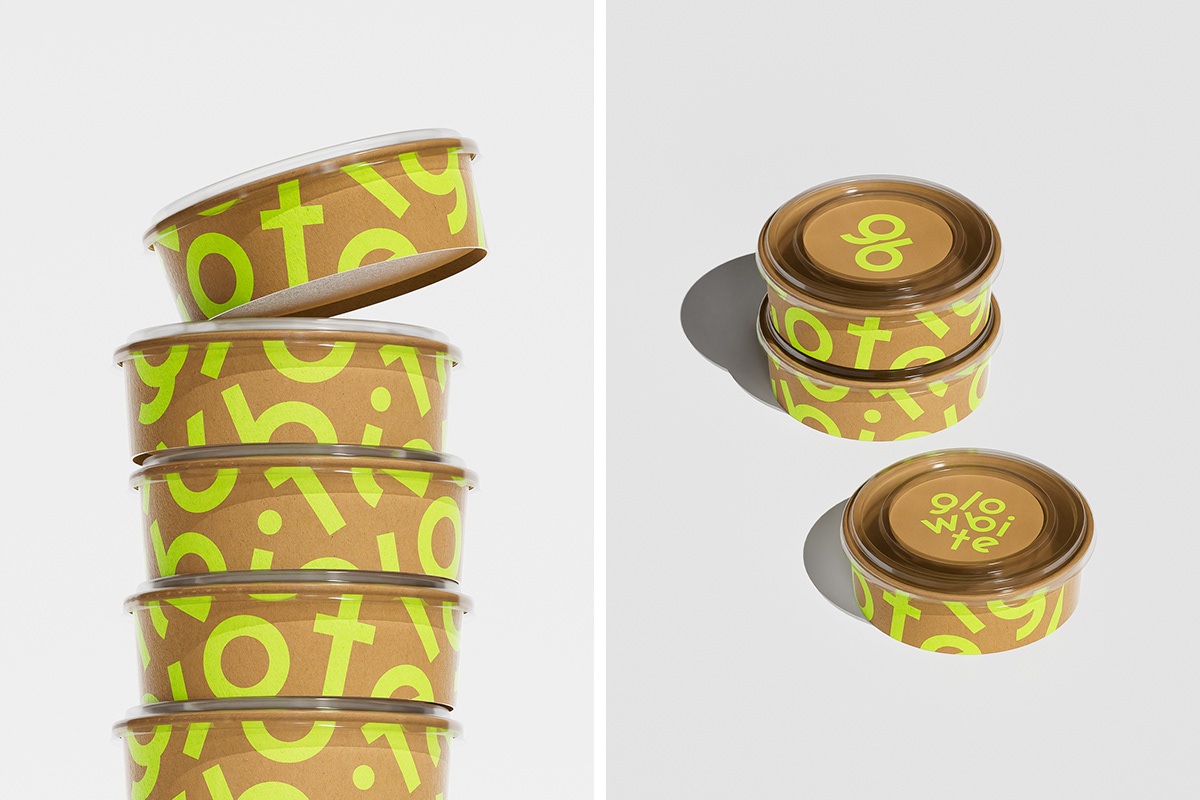
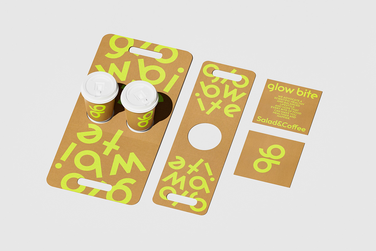
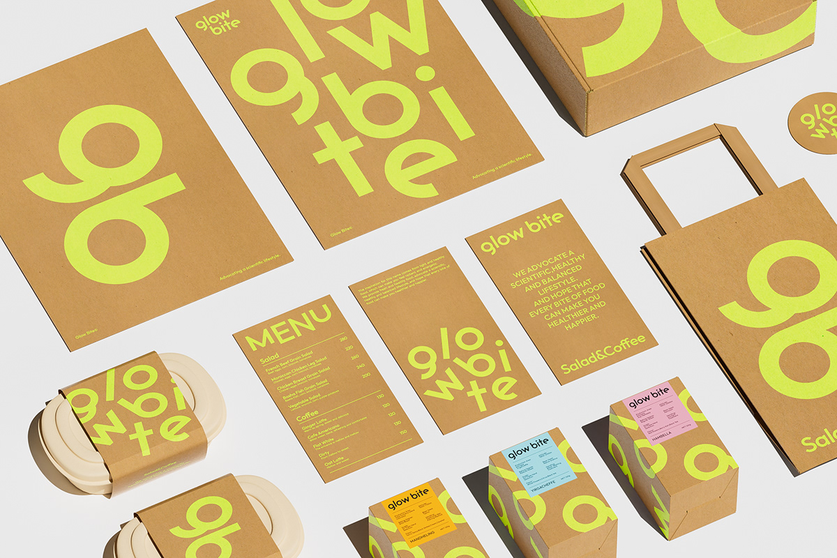
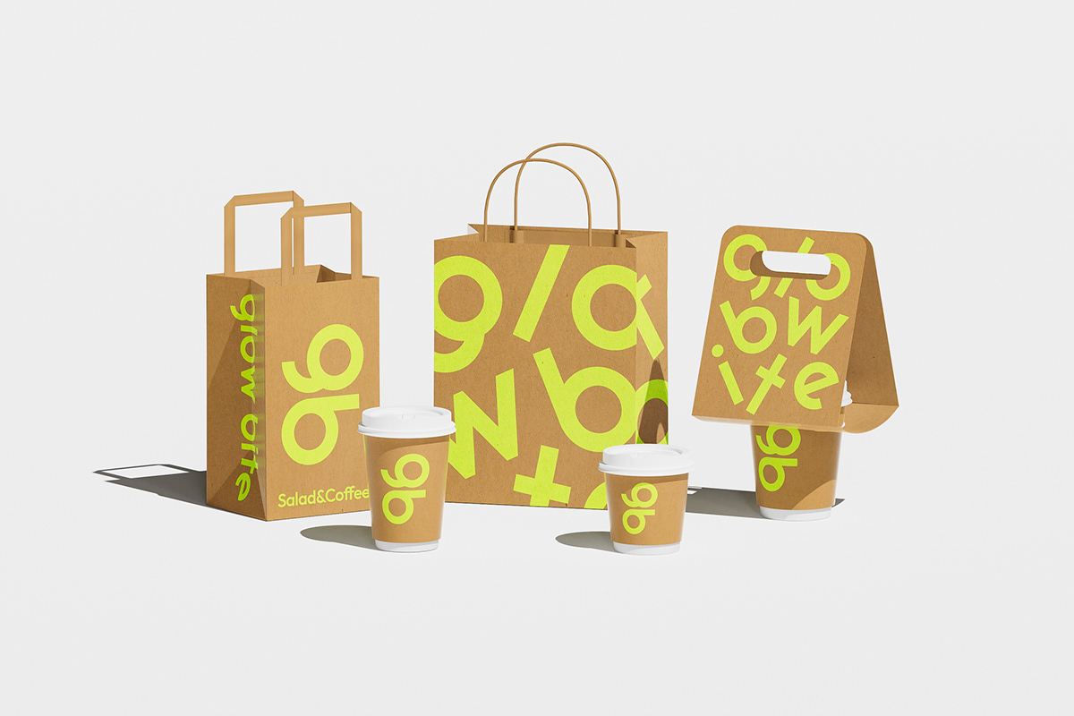
We extracted a combination of the brand logo letters "g" and "b" and flipped them 90 degrees to form a key to opening the door to health or a balance, effectively creating a visual focus. By breaking and restructuring the letters of the brand logo, a constantly changing graphic language is formed, which can effectively convey the brand concept and touch the product experience, while also establishing an unforgettable visual recognition.


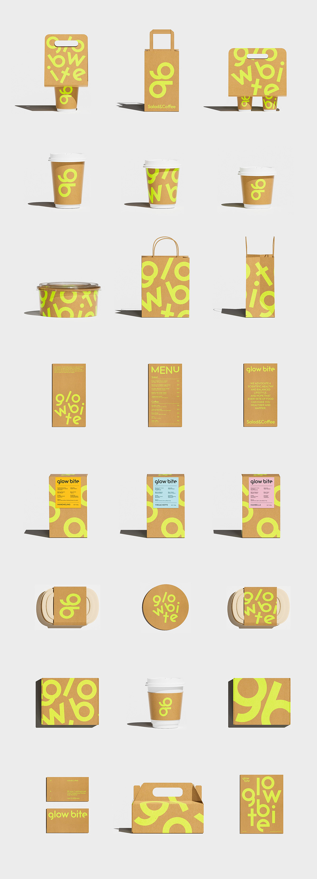
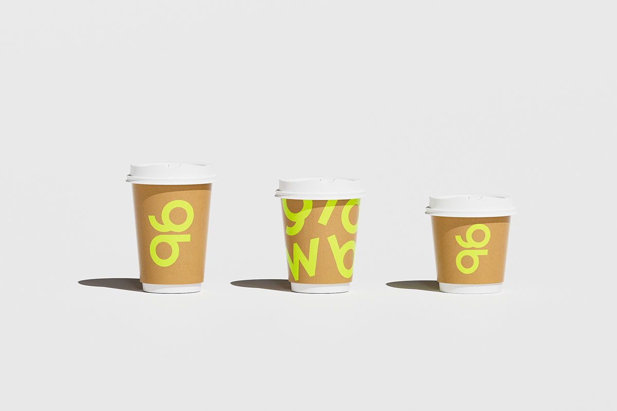
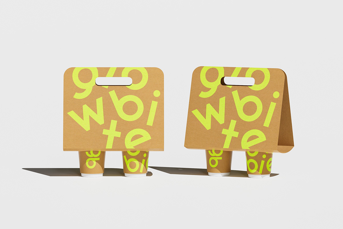
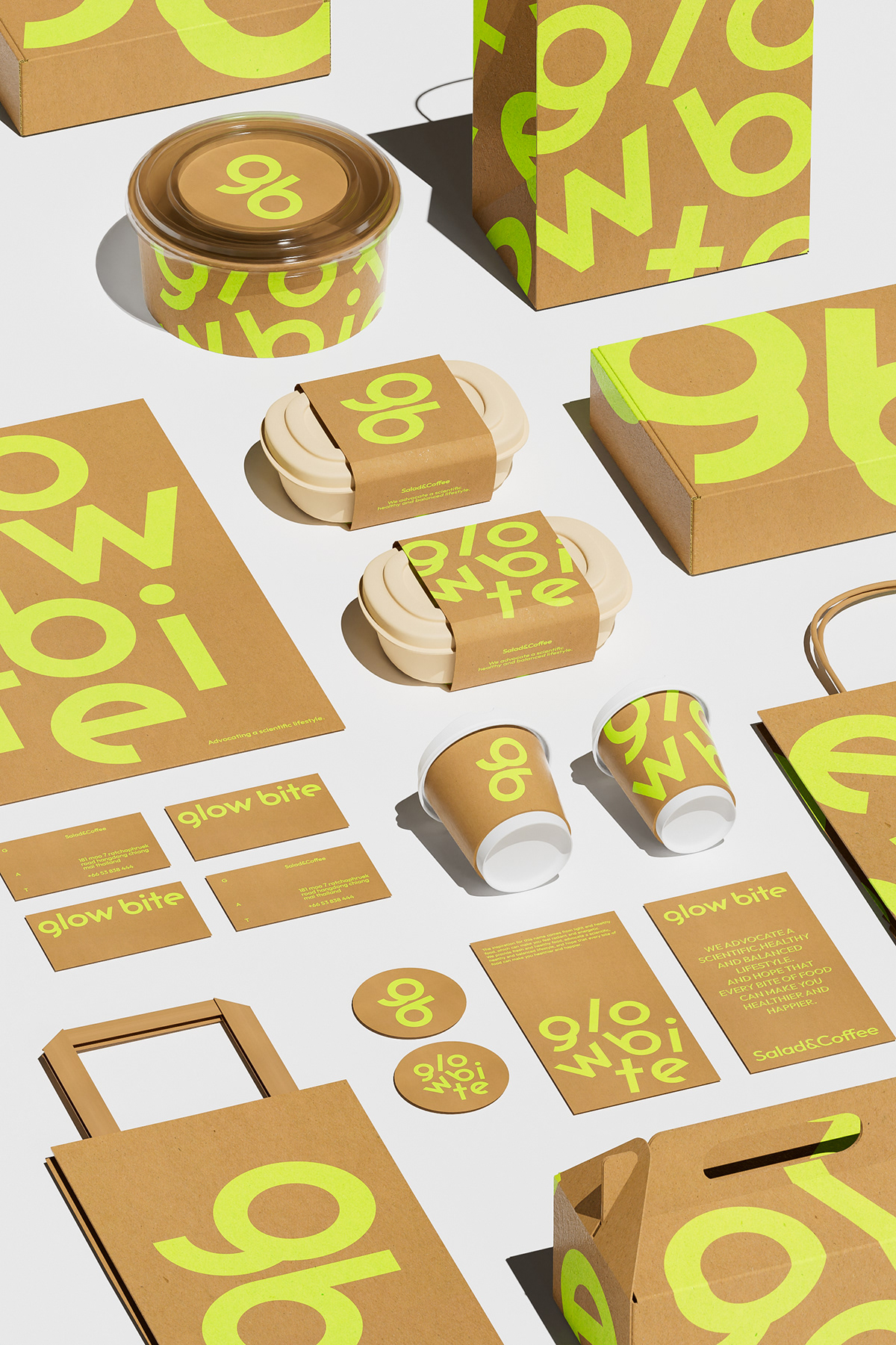
Brand Color and Material Application
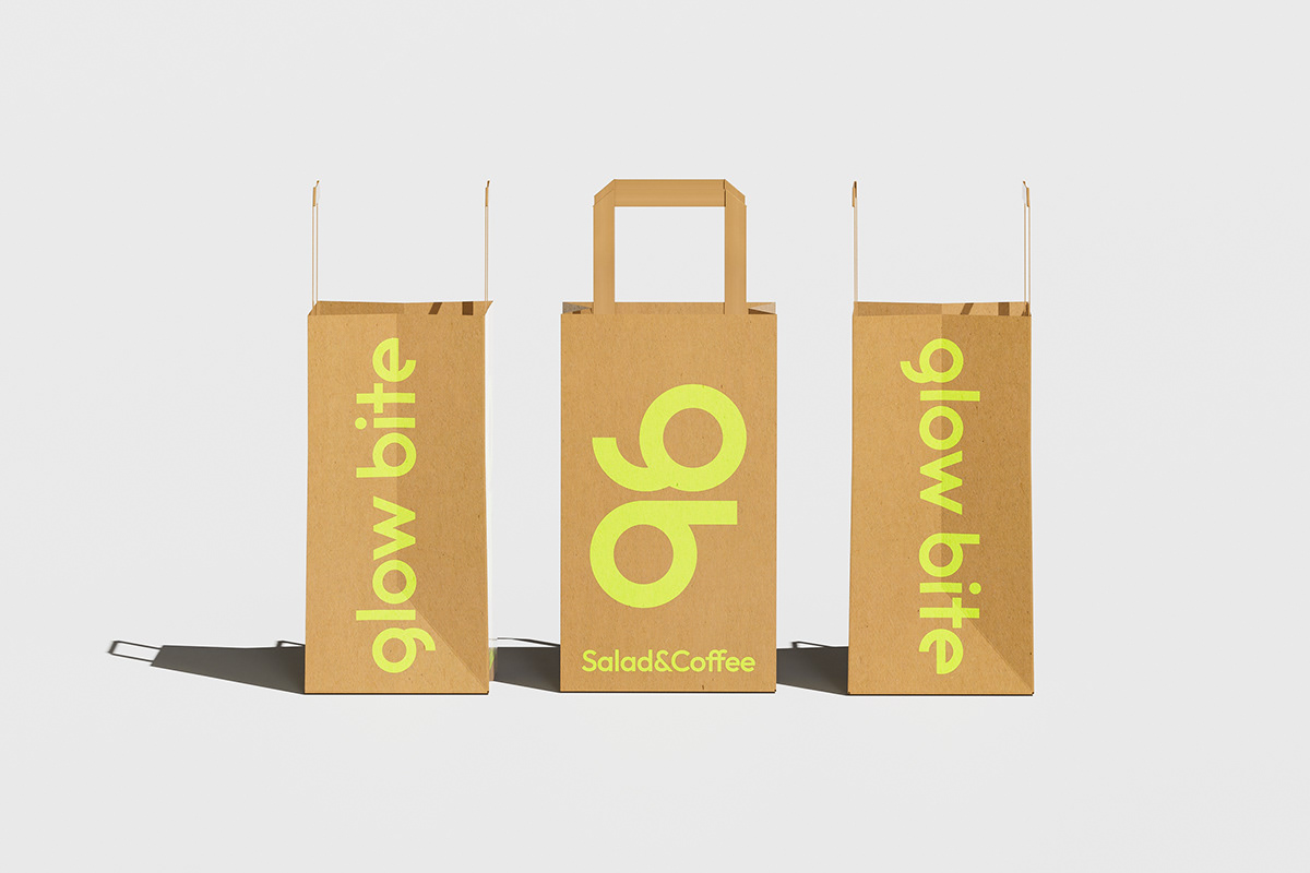
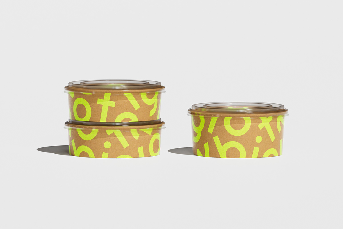
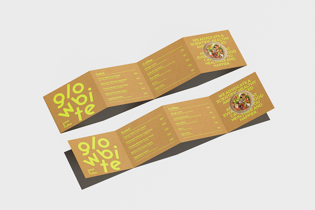
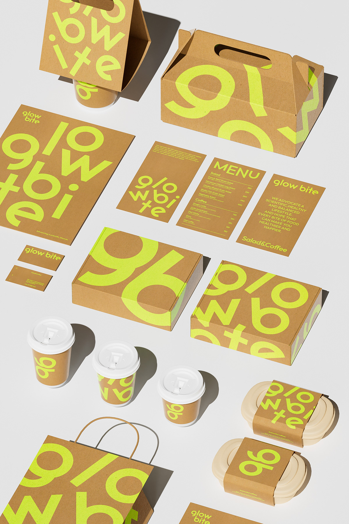
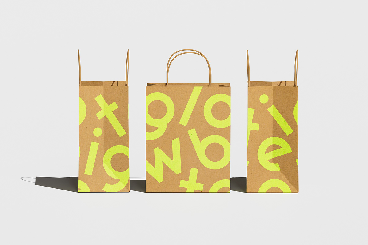
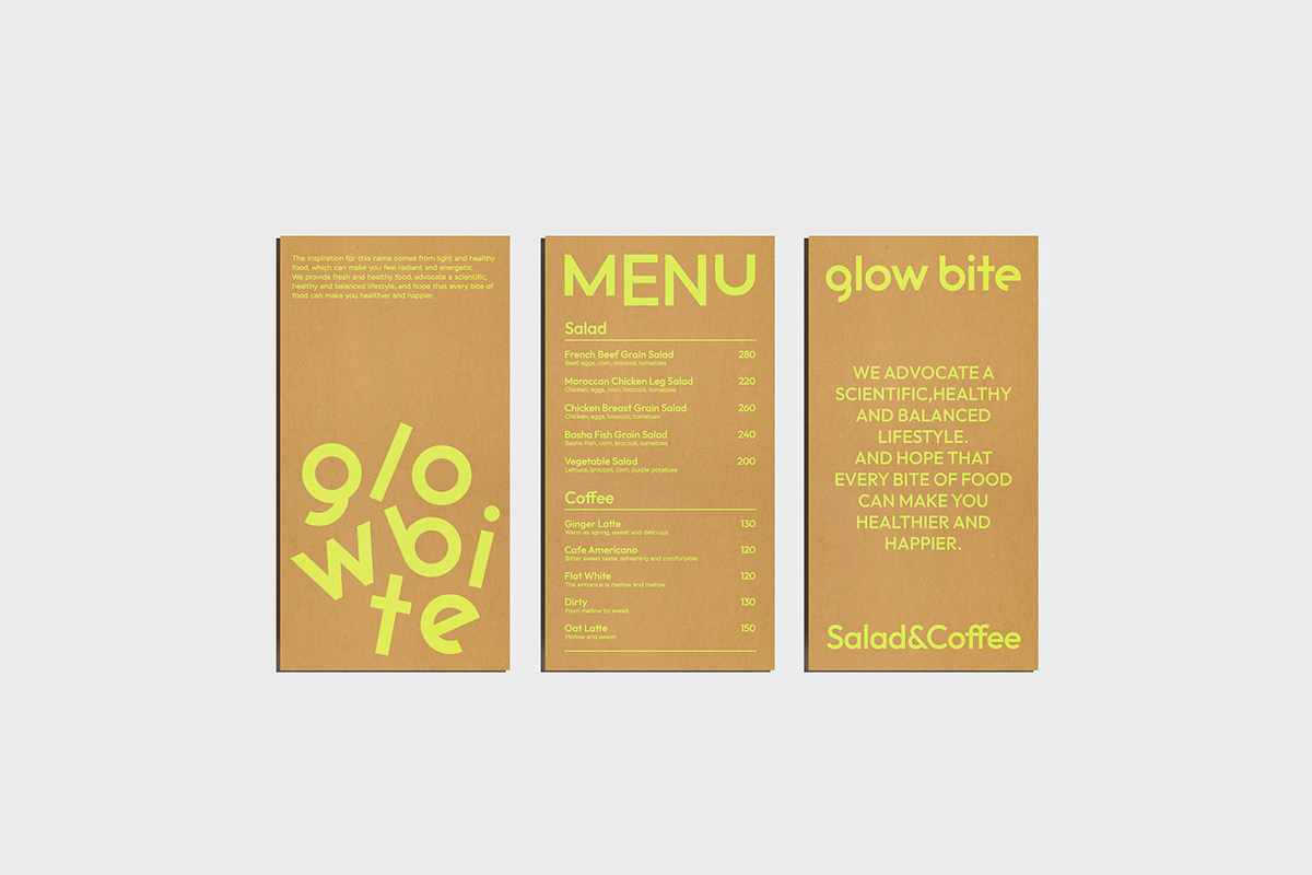
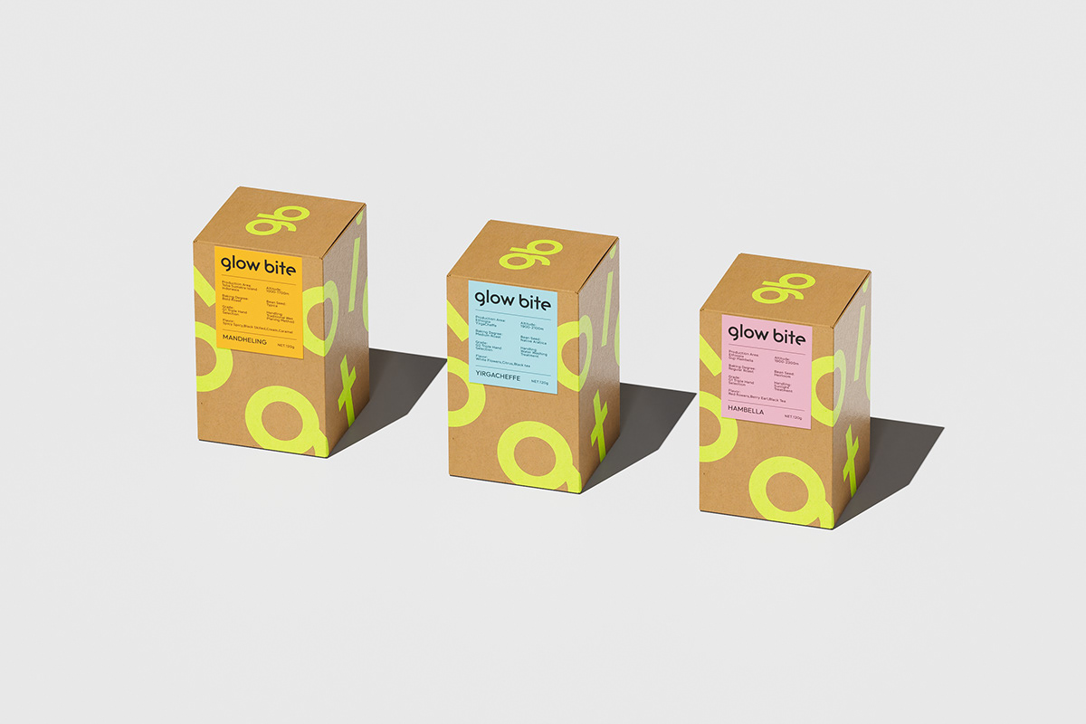
In terms of brand color selection, we have chosen the natural, environmentally friendly, and sustainable characteristics of kraft paper, which complement the green and yellow embellishments, injecting more vitality and freshness into the brand. At the same time, we use the combination of color and graphics to create more personalized visual effects and convey the brand's health value.
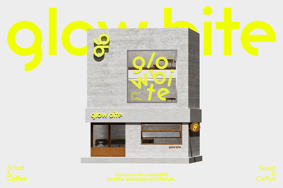
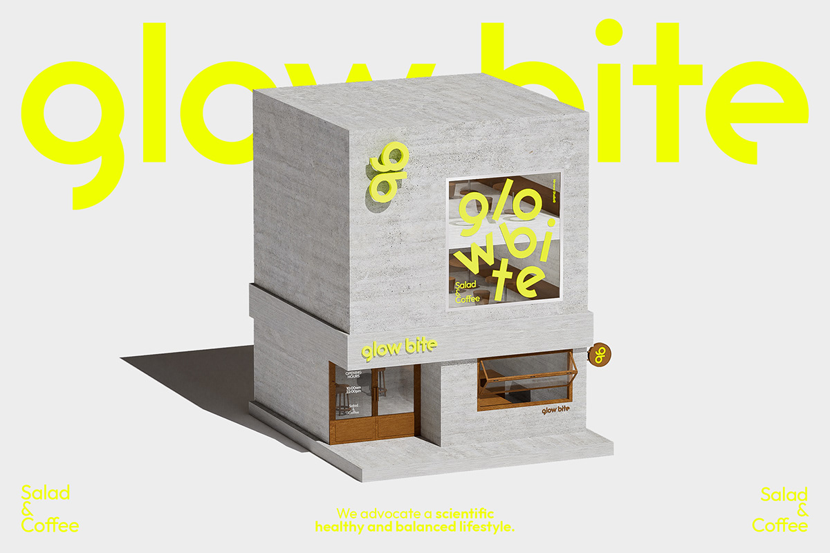
Spatial Manifestation
In terms of spatial presentation, we adhere to the concept of scientific environmental protection and renewable circulation, using renewable and environmentally friendly wood to customize a series of hard furnishings and furniture. The entire space creates a warm, healthy, and environmentally friendly atmosphere, bringing a pleasant experience to consumers.