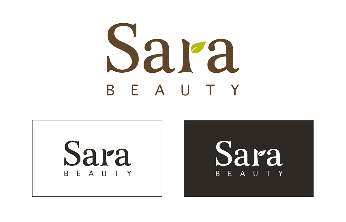
This is a logo design for a local home spa business in Nepean, Ottawa. The Sara Beauty logo has been redesign to give a strong visual image as well as helping the company’s look becomes more professional to stand out from other home spas in the area.
Sara Beauty helps the customers look best and feel their best while maintaining a affordable price. It’s a place for women to relax and get rejuvenated after a stressful day. Besides, the spa uses only the finest products which contain only natural ingredients. To emphasize that, The body of letter r in the word Sara. is made in a branch shape, and the tail of the letter r is made in the leaf shape. Plantagenet Cherokee font is choosen for the letter s and a in Sara. Indeed, Plantagenet Cherokee font is a beautiful elegant serif font with great lines and curves. It brings the elegant and professional look into the business. Besides, Thonburi font is selected for the word beauty. In fact, the Thonburi font is a clean san-serif font which have a unified stroke weight throughout . It goes well with the Plantagenet Cherokee font above. Together they create a simple but beautiful logo.
Two colours were put in this logo: espresso brown and minty green. The minty green is used in the leaf and the rest of the logo is in espresso brown. In fact, the brown color brings out the natural, back to the earth and affordable feeling while the green helps convey the natural, fresh, young and rejuvenated sensation.


