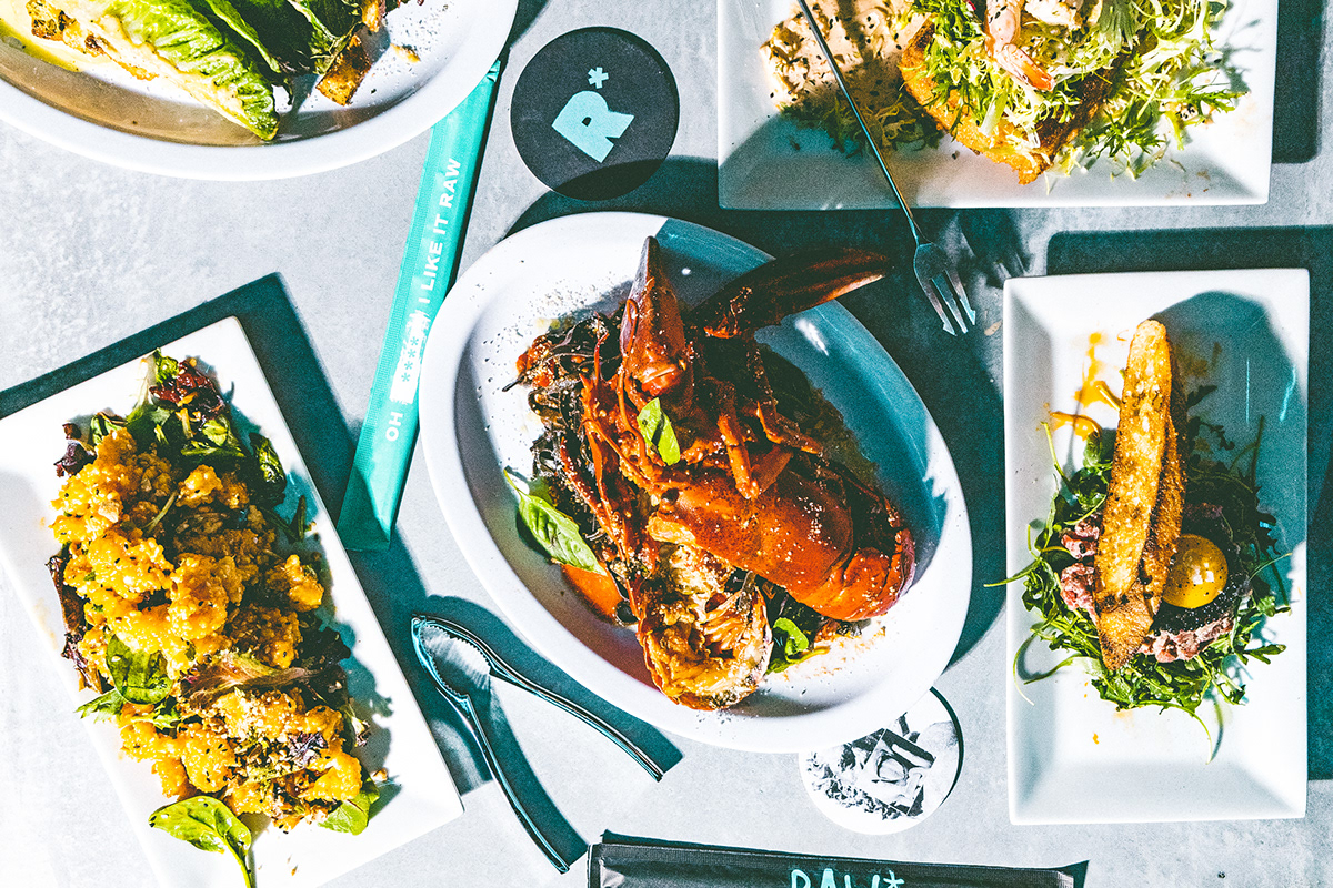
RAW* defaces the typically overly fancy and esteemed experience of oysters and raw bars, turning it into something inherently more daring and strategically positioned toward a younger demographic.
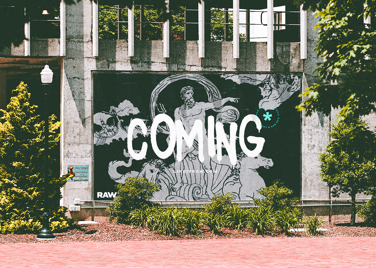
The visual inspiration of RAW* stems from the obvious: wet – using bleeding ink and overprinting textures, imagery of water and the ocean god, Poseidon, and dripping graffiti. This translates into the environmental/interior design of the restaurant: the atmosphere lives somewhere where drained-out pool turned skatepark and Toyko nightclub converge.
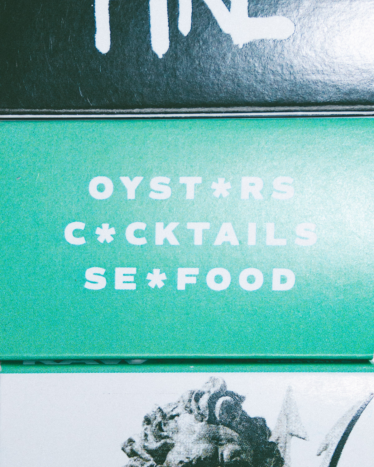
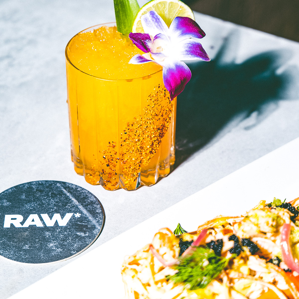
The brand icon, the asterisk, are generally used on restaurant menus to denote the Consuming Raw Food warning. Additionally, an asterisk is a beautiful shape but when interjected into a word it makes that word look censored, suggestive, and a little inappropriate. The asterisk is pretty but also adds edge and attitude.
Branding, Print, Website, Packaging
Agency: Box 8 Creative
Client: The Statement Group – Hartford, CT
Role: Lead Designer / Branding, Design, Copywriting
Collaborators: Meghan Olsen / On-Site Photography