CF Napa Refines VR Brand of Mexico
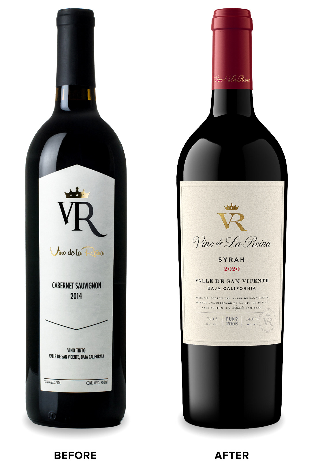
Mexico’s Viñedos de La Reina came to CF Napa to refresh their VR brand. As the higher-end brand in their portfolio, the design needed to look more premium while continuing to use a VR monogram and crown lock up – a nod to their company name which translates to “vineyards of the queen.”
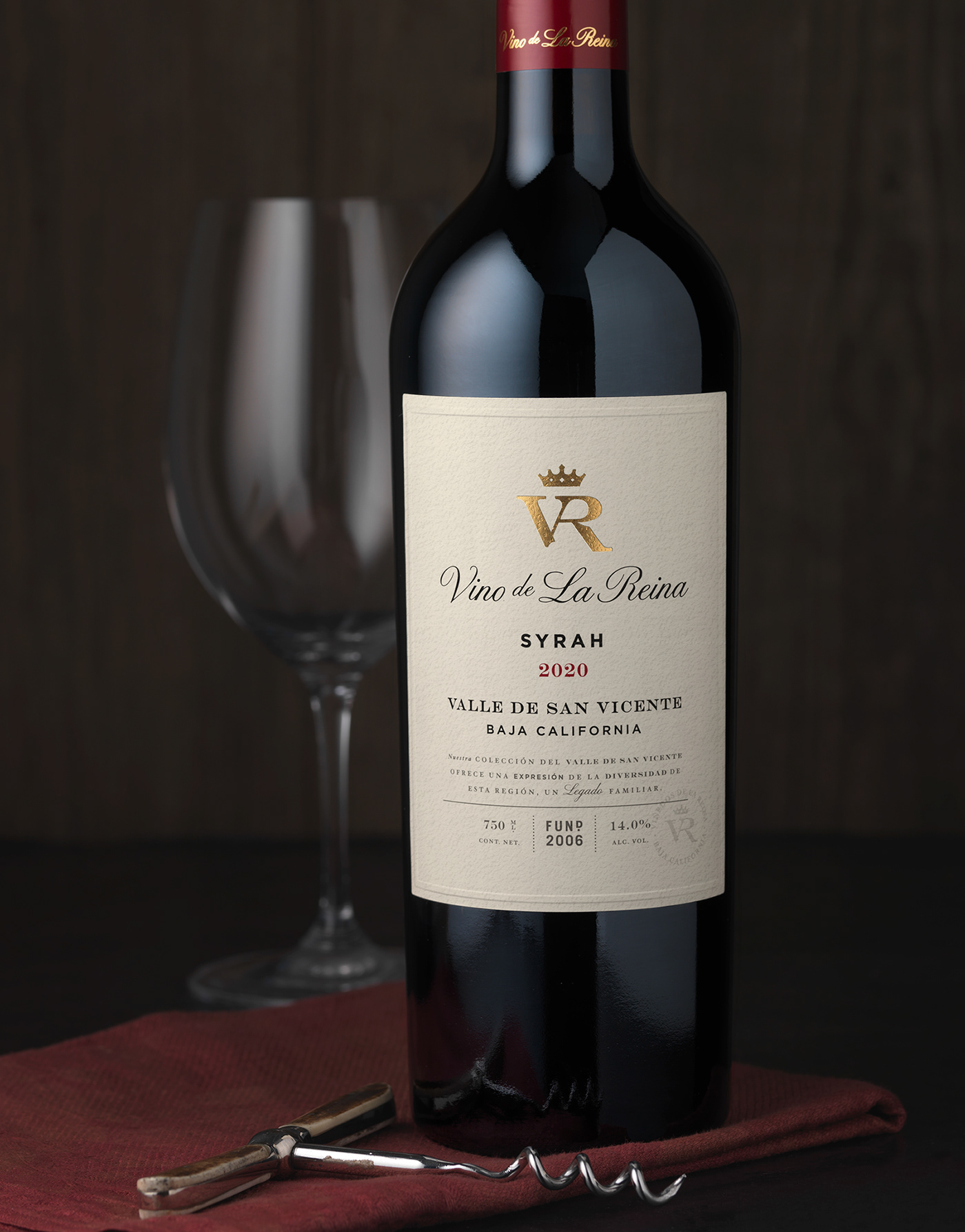
CF Napa gave the icon the royal treatment by refining the letterforms into a stronger, more contemporary monogram stamped in luxurious gold foil. The label shape was modernized by moving away from the triangle die cut to a classic straight-sided, larger label. A toothy, cream-colored paper gave the design a warmer, more approachable feel. The embossed border detail, beautiful typography, and watermark seal better communicated the quality and pedigree of this well-established brand.


Drink With Your Eyes®


