Project Scope: Rebranding; Research & Analysis, Strategy, Logo, Visual Identity System, Iconography, Publication Design, Social Media, Print, Motion
Inventity Foundation
Inventity provides professional advisory services. Their team consists of over 50 managers who deliver high-quality services in the areas of strategic, operational, financial, and ESG advisory.
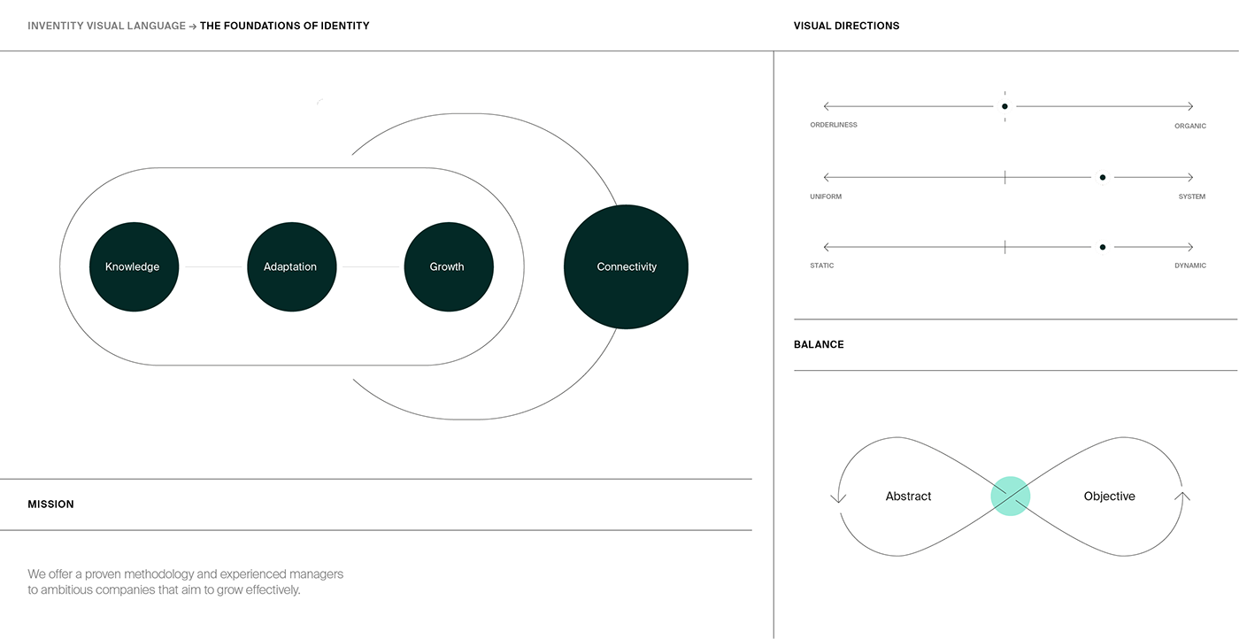
Key categories: Adaptation, Knowledge, Growth, Connectivity
Brand mission: We offer a proven methodology and experienced managers to ambitious companies that aim to grow effectively.
We were invited to conduct a comprehensive rebranding of a brand that had been functioning for 12 years. Our main goal was to create a cohesive and recognizable system that better reflected the existing pillars of the company's identity while appropriately responding to new areas of its operations, thus enabling further brand development. A crucial part of the process was identifying and preserving key elements from the previous strategy, while redefining them in an unconventional manner that would strengthen the brand's position as a market leader.
The new visual identity system aims to enable seamless communication with the target audience, providing flexible tools for effective communication across all currently available carriers and media channels.

The Change
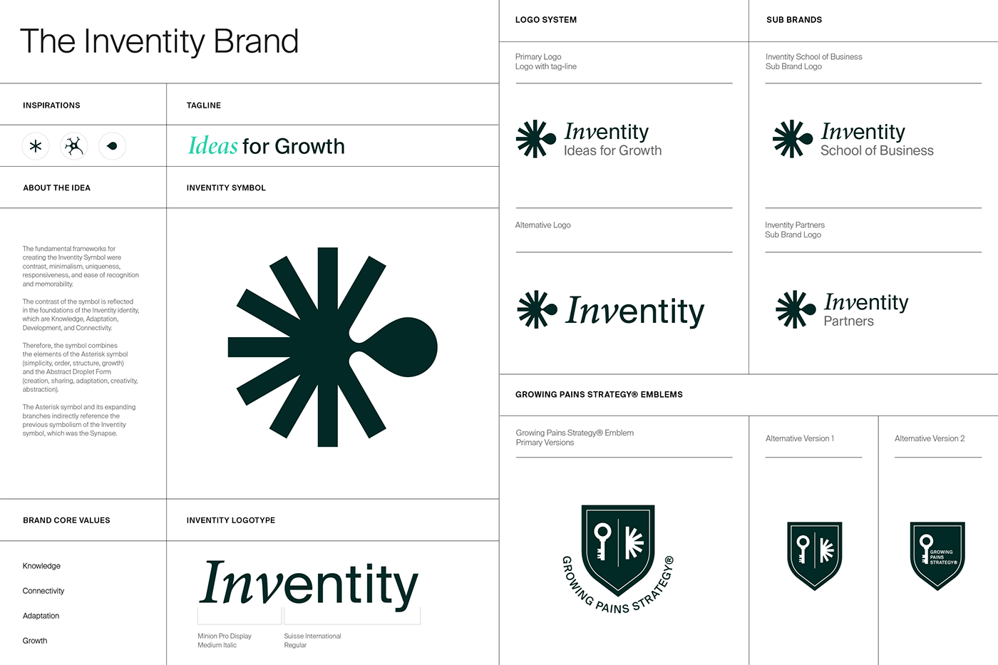
The strategic efforts have resulted in the creation of new design frameworks for the system. One of these frameworks is based on the principle of contrast, which combines two opposing visual directions. This principle derives from the vivid foundations of Inventity's identity, represented by knowledge, adaptation, development, and connectivity, each contrasting with one another.
As a result, the new symbol blends the characteristics of an Asterisk symbol (simplicity, structure, expansion) with an Abstract Droplet Form (creativity, sharing, adaptation, abstraction). The new symbol's form and its expanding branches also reference the previous Inventity symbol, which took the shape of a synapse.

Visual Language
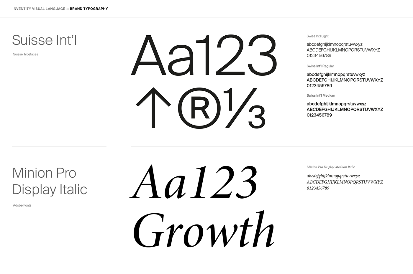
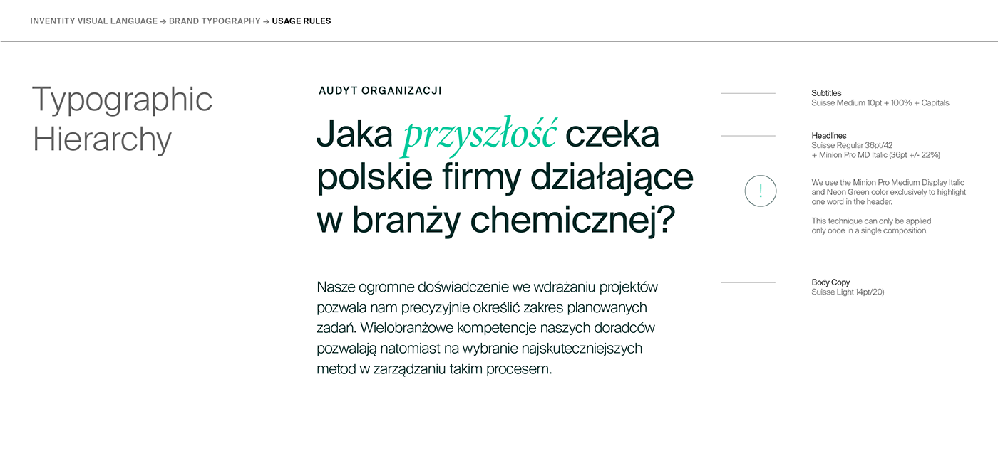
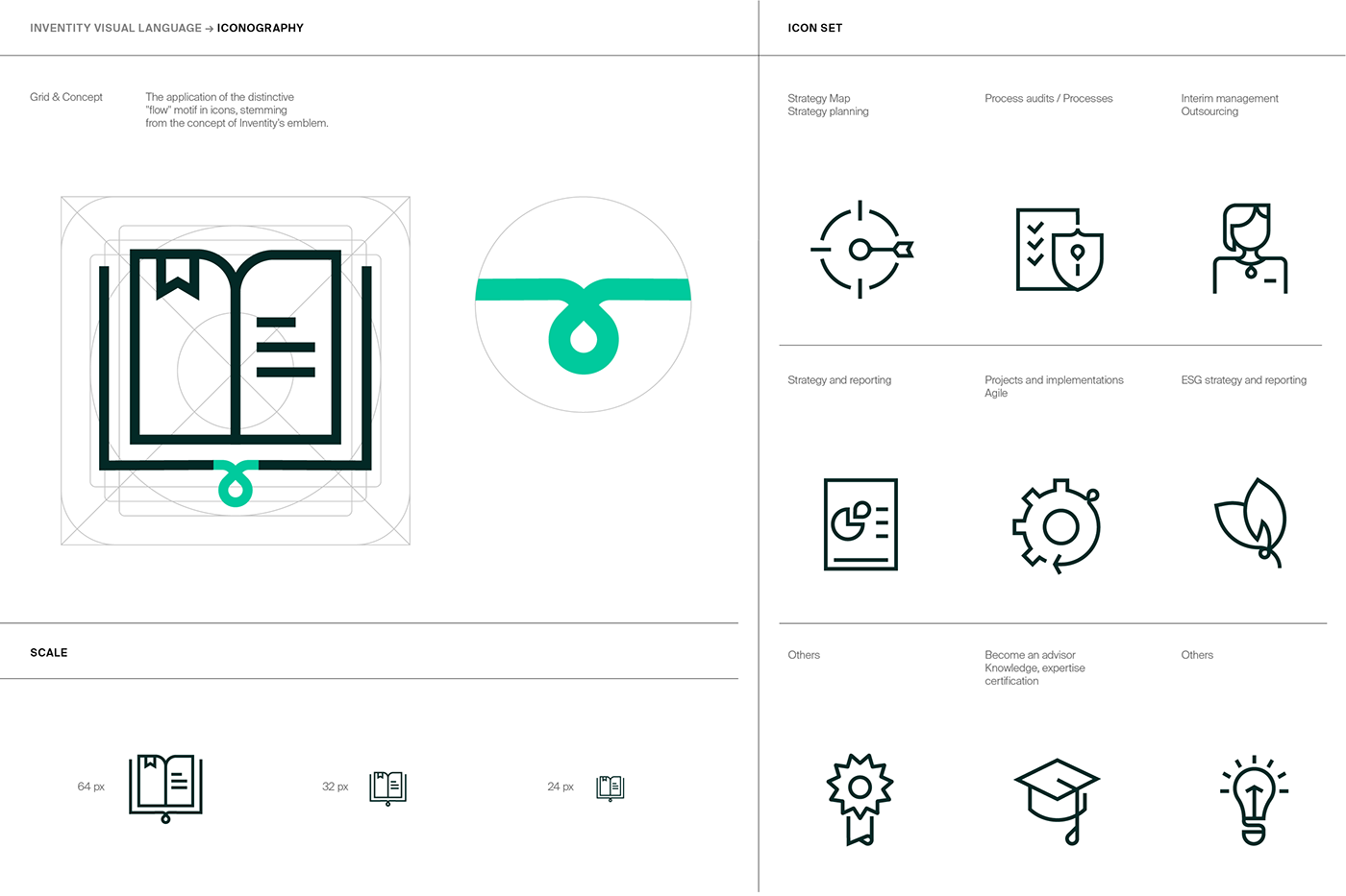
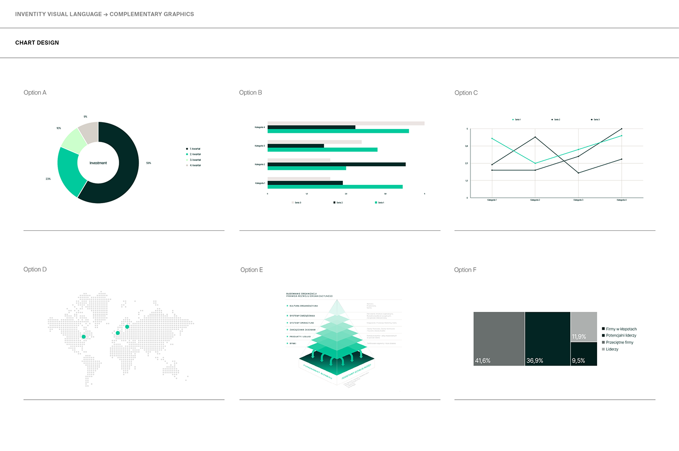
The new visual language encompasses the Inventity brand system and its derivatives, a color palette, brand typography, composition guidelines, complementary graphic elements such as data visualization charts, iconography, and animation guidelines.
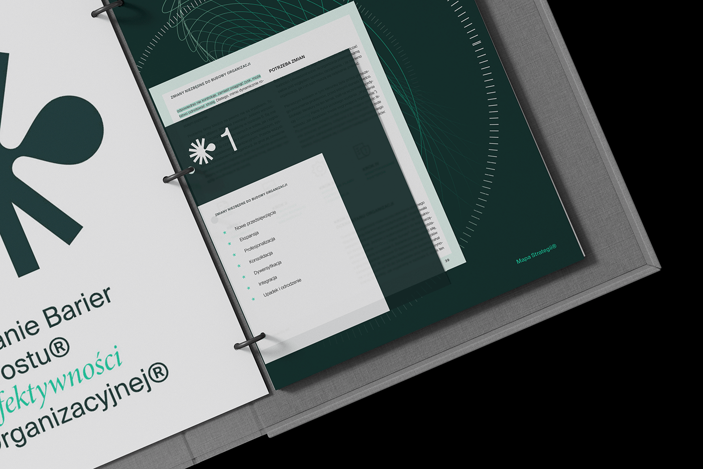
The project scope included the development of a comprehensive visual identity manual, materials for digital communication, a package of corporate presentation templates, the redesign of a 400-page publication, the creation of promotional materials such as posters, banners, corporate stationery designs, and consultations for website redesign.





Credits:
Concept, Strategy, Art Direction & Graphic Design: Michał Markiewicz
Graphic Design, Motion, Editorial Design & Iconography: Edyta Mucha
visit us at:
Thank you!


