


Proteam
The brand combines the entire range of professional products for cross-country skiing and biathlon, and can serve as a full-fledged replacement for foreign brands and manufacturers that have left the Russian market.
Designed specifically for professional athletes and prize-winners of the World Championships and the Olympic Games. The brand's products are already being tested by the Russian biathlon team and technical specialists of the Russian Olympic Committee. Proteam is an expert product built on the experience of domestic production of professional equipment and advanced modern technologies.
We have developed a bright, strong and dynamic identity with a recognizable image that will go down in the history of world sports.
Client: Proteam
Concept / Visual identity / Equipment & outfit design
Concept / Visual identity / Equipment & outfit design
Moscow, Russia / 2022


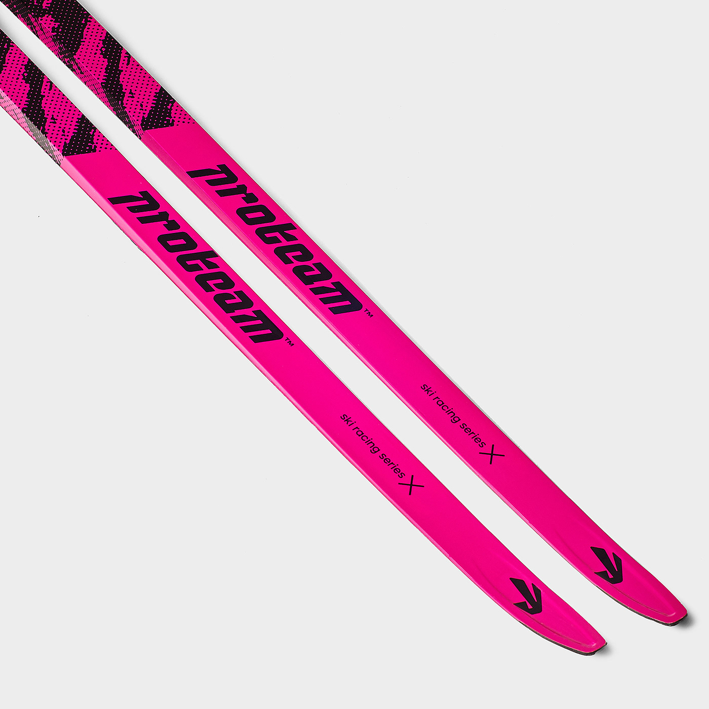
The image of a hare is sewn into the logo, which can be described as fast, snowy, ours. The white hare is one of the symbols of the Russian winter, the hero of fairy tales, familiar to everyone since childhood. Characterized by his speed and ingenuity. The shape of the rabbit ears is similar to the shape of cross-country skis. Footprints in the snow and flying snow formed the basis of bright patterns and a dynamic corporate identity.


Advertising & communication


Merchendise


Ski equipment


Thanks for watching
Art Directior — Alexander Nazarov
Graphic Designer — Dmitry Syrpin


