CF Napa Unmasks New Look for The Grappler
Due to high demand from their loyal clientele, Vinoce Vineyards was inspired to bring back their single SKU Zinfandel brand, “The Grappler”. They turned to CF Napa to completely reimagine the brand that would now be an exclusive offering for their tasting room and wine club. Vinoce wanted to use the relaunch as an opportunity to reposition the brand with a bold, attention-grabbing design while maintaining a personal connection to the Vinoce Vineyards owner and the family’s love of wrestling.

There are many parallels between winemaking and the sport of wrestling (grappling). Both demand creativity, discipline, and hard, physical work to be rewarded with success. CF Napa developed a colorful cast of six characters inspired by the vibrant tradition and masks of Lucha Libre (Mexican Wrestling).
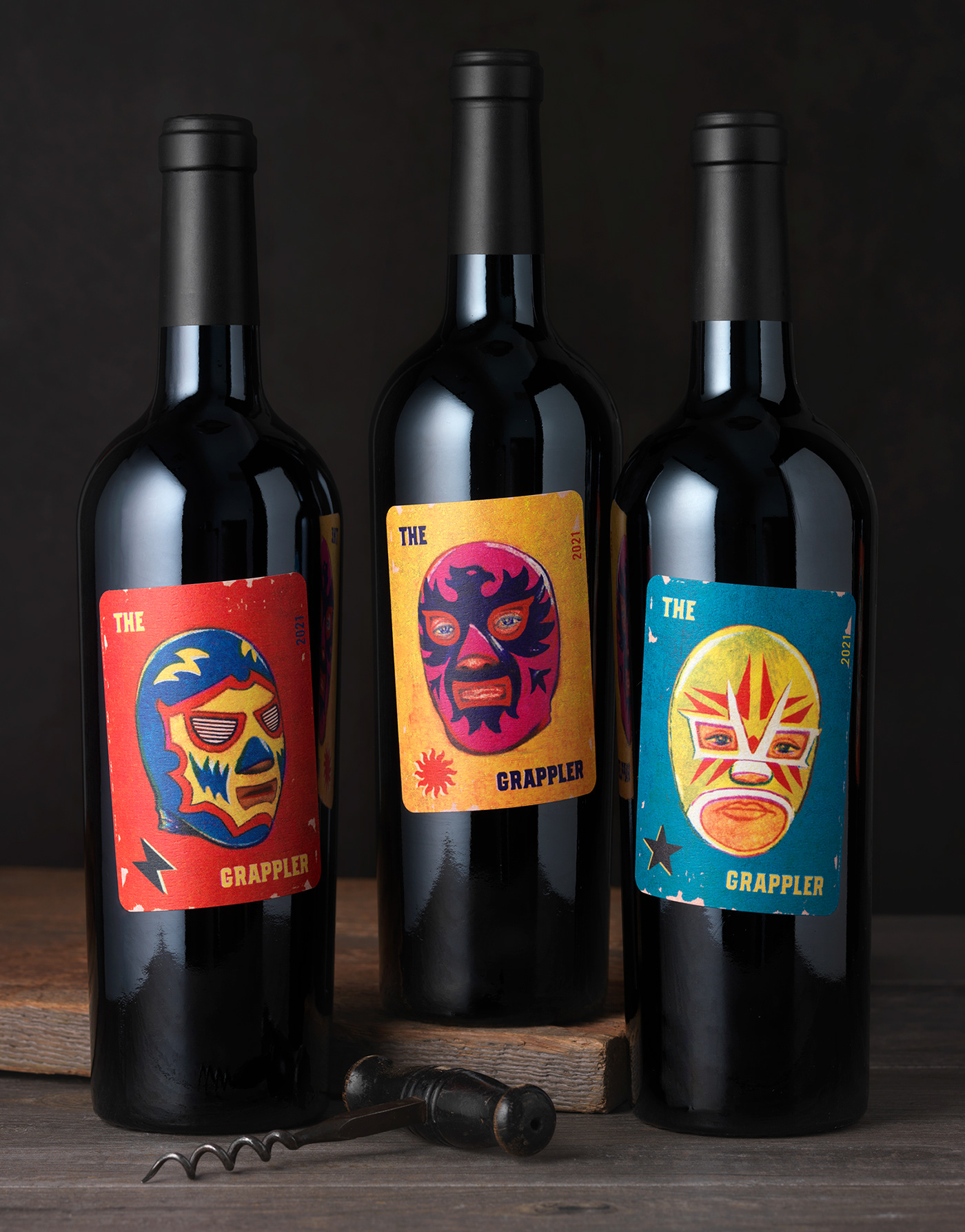
The labels are placed on the bottle at an angle to give the packaging a fun, rough-and-tumble vibe. The solution brought together the sport of wrestling and the Vinoce Vineyards owner’s residency in Mexico, while also honoring the many Mexican farmworkers that form the hardworking backbone of the wine industry. CF Napa created the series of unique masks to encourage imbibers to collect all six of the wines.

Drink With Your Eyes®


