Jockey - Conceptualized advertisement campaign design
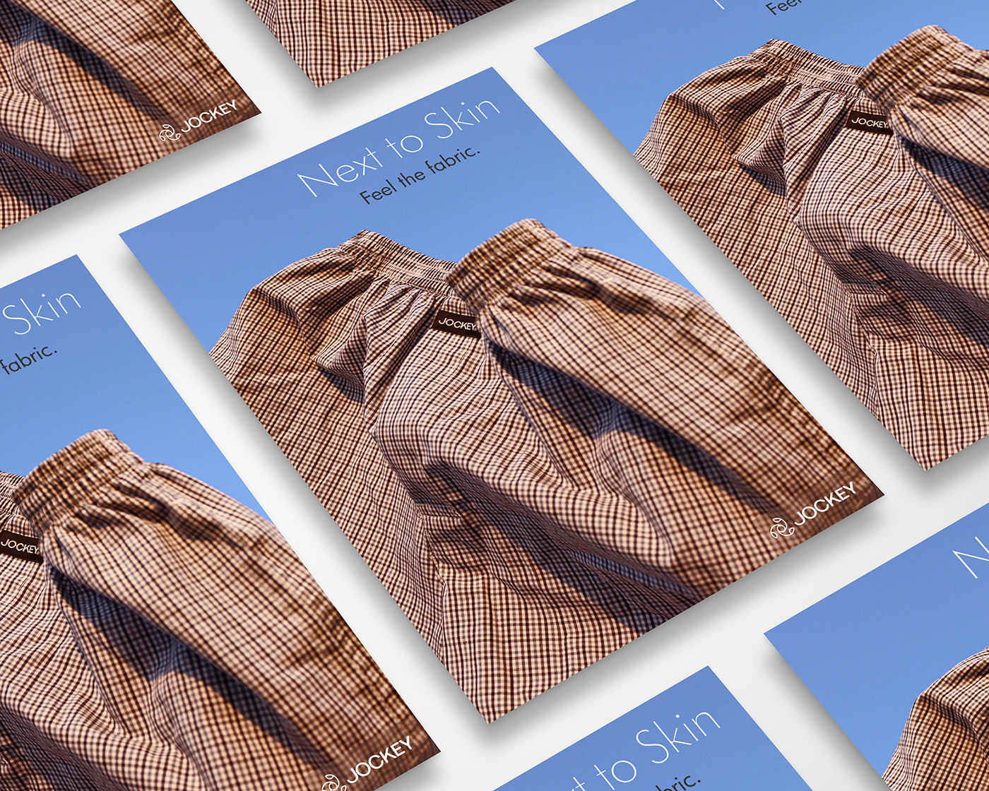
As I reflect on my experience with advertisement design, I recognize the importance of simplifying the message and making it visually appealing and that why my campaign for Jockey is ‘Next to Skin’ because it portrays how comfortable, relaxing, light, airy, feather lite and breathable the fabric is when you wear it. And I tried to depict all these characteristics in my photography.

Additionally, considering the placement of the advertisement can impact its effectiveness. Text placement is a critical aspect of advertisement design as it can significantly impact the advertisement's effectiveness. The placement of text can influence how the viewer reads and perceives the message, and it can also affect the advertisement's overall balance and visual appeal.
For instance, placing the text at the top of the advertisement can capture the viewer's attention immediately, making it more likely that they will read the rest of the ad. Alternatively, placing the text at the bottom can create a sense of closure and leave a lasting impression on the viewer.
For my campaign, I chose Futura thin typeface because it is versatile and elegant typeface that can add a touch of sophistication and modernity to any design.