

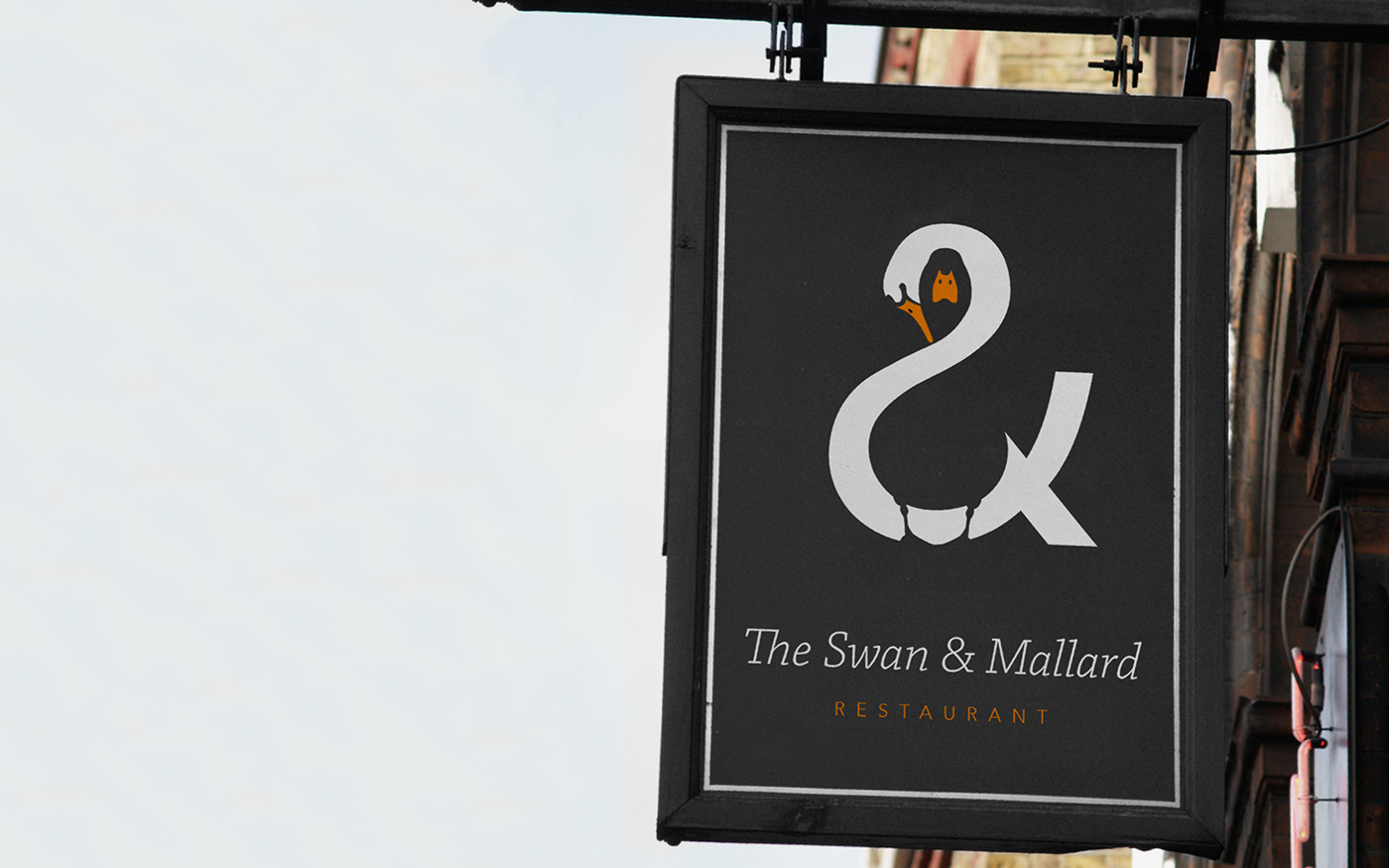


The Swan & Mallard
Brand identity | Printed collateral
A logomark that plays upon the three aspects of
the restaurant’s name by unifying both swan and
mallard through the positive and negativespace
within the ampersand. A limited colour palette
and minimalistic style helps create a simple yet
balanced feel.
the restaurant’s name by unifying both swan and
mallard through the positive and negativespace
within the ampersand. A limited colour palette
and minimalistic style helps create a simple yet
balanced feel.
The design aims to be memorable by hoping to
create a smile in the mind of those that see it.
create a smile in the mind of those that see it.


