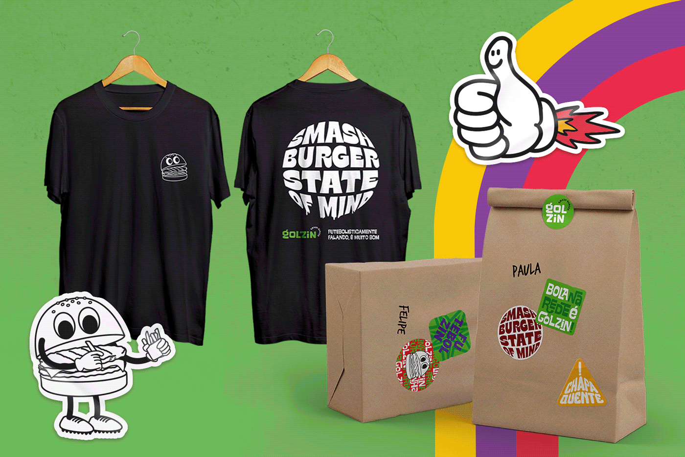
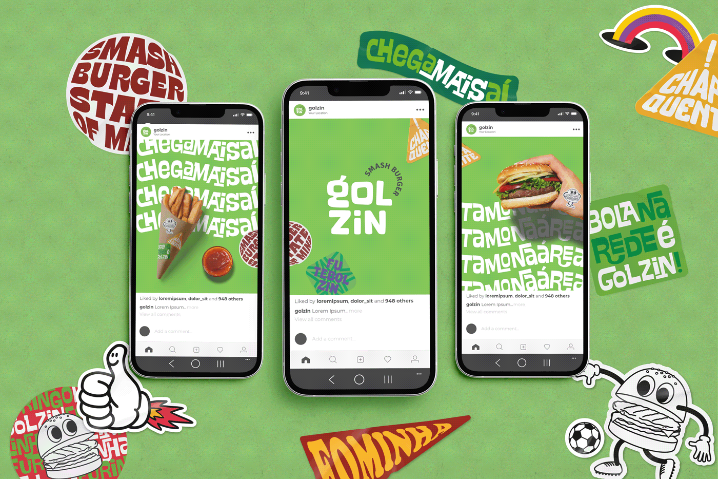
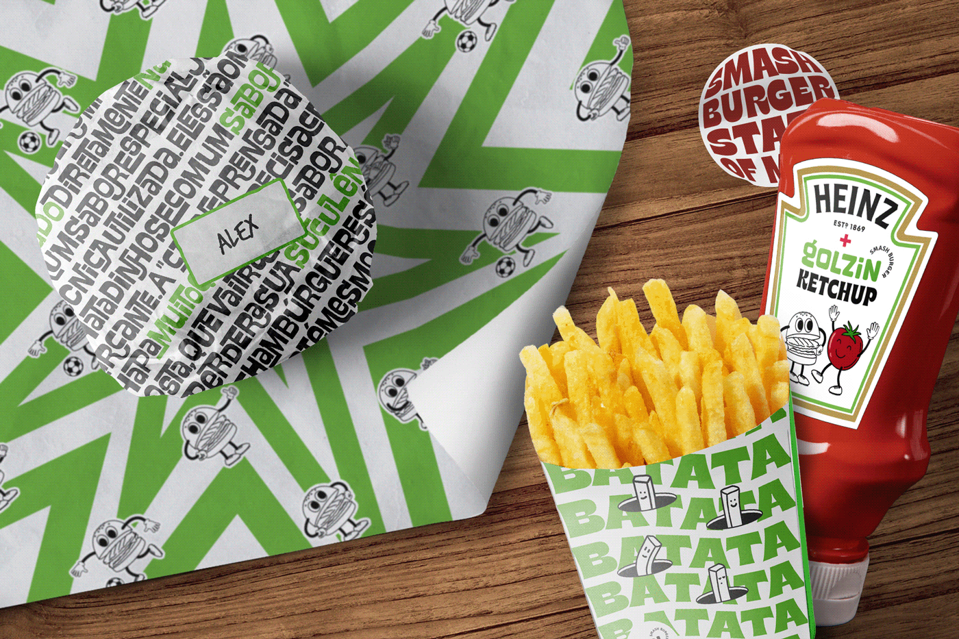
I D E N T I D A D E V I S U A L
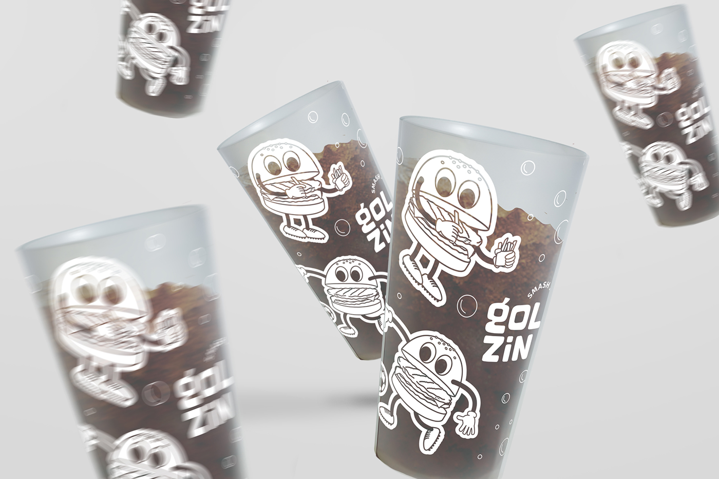
Autêntico, versátil e com uma proposta mais imediatista e popular, o Golzin Smash Burger nasceu como uma marca irmã do Gol Burger. Sua identidade visual evidencia a conexão entre ambas as marcas, mas possui uma personalidade própria, mais enérgica e divertida. Inspirada na cena artística urbana e na linguagem das intervenções, a identidade é expressada através de lambe-lambes, adesivos e grafites, que usam de cores saturadas e do excesso de informação para tornar a comunicação única tanto nas mídias digitais quanto em seu ambiente. O logotipo, composto em unicase, é um lettering exclusivo. Além disso, um mascote completa o conjunto, trazendo o ponto de contato ideal da marca para dialogar com seu público de forma carismática, ingênua e simplista.
__
V I S U A L I D E N T I T Y
Authentic, versatile, and with a more immediate and popular approach, Golzin Smash Burger was born as a sister brand to Gol Burger. Its visual identity highlights the connection between both brands while also having its own personality, which is more energetic and fun. Inspired by the urban art scene, the identity is expressed through posters, stickers, and graffiti, using saturated colors and an overload of information to make communication unique both in digital media and in its restaurant interior. The logo, designed in unicase, is an exclusive lettering. In addition, a mascot completes the set, bringing the ideal brand touchpoint to interact with its audience in a charismatic, innocent, and simplistic way.


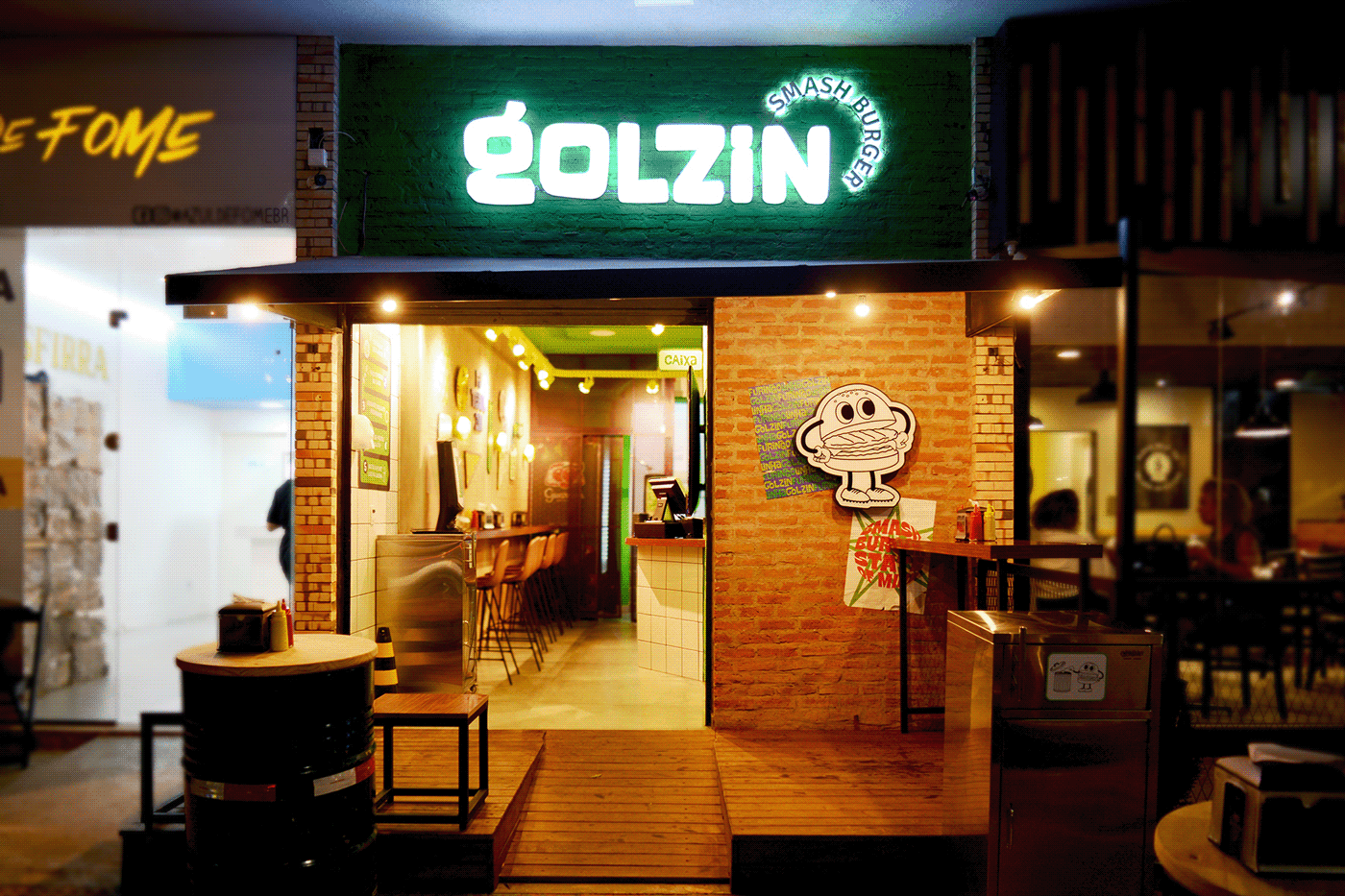
A M B I E N T A Ç Ã O
O projeto de ambientação precisou transmitir ao máximo a essência e os recursos gráficos da marca em um espaço bastante reduzido. Os elementos utilizados refletem o discurso de oferecer algo rápido, prático e saboroso. Sendo derivada de outra marca que tem como base a interação com o futebol, o novo ambiente também seguiu este conceito, porém de forma mais integrada na linguagem textual, e menos de forma visual. A sinalização aplicada ao local também auxilia o melhor uso do espaço e integra a decoração. O banheiro, por exemplo, utiliza da linguagem gráfica e textual particulares para transmitir as mensagens pertinentes.
A execução manual de pinturas, colagens e grafites garantiu a autenticidade e consistência nas escolhas visuais na transição entre diferentes mídias, trazendo o resultado orgânico e espontâneo exclusivo da arte feita à mão. O resultado é um ambiente integrado à narrativa da marca, auxiliando na fixação dos recursos visuais da identidade na memória dos clientes e fortalecendo a percepção de valor do Golzin.
__
I N T E R I O R D E S I G N
The interior design project had to convey as much as possible the essence and graphic resources of the brand in a very limited space. The elements used reflect the message of offering something quick, practical, and tasty. Derived from another brand that is based on interaction with football, the new environment also followed this concept but in a more integrated way in the textual language and less in the visual form. The signage applied to the location also assists in the best use of space and integrates with the decor. For example, the bathroom uses particular graphic and textual language to convey relevant messages.
The manual execution of paintings, collages, and graffiti ensured authenticity and consistency in visual choices in the transition between different media, bringing the organic and spontaneous result unique to handmade art. The result is an environment integrated into the brand narrative, helping to fix the visual resources of the identity in the memory of customers and strengthening the perception of value of Golzin.