This video c̵l̵e̵v̵e̵r̵l̵y̵ shows you the entire website in 30 seconds

Client
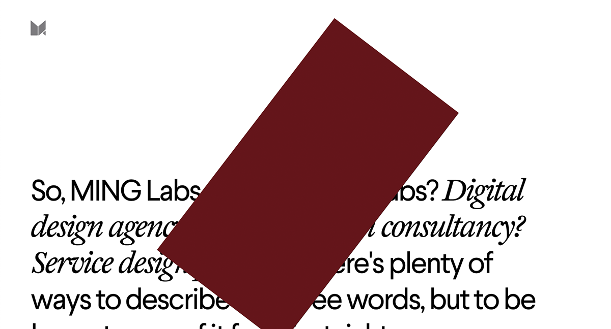
MING Labs, a business-minded design company
What they wanted
A cool new website that would reflect MING's values and character
What we’ve done
THEORY: New visual identity and tone of voice
What they wanted
A cool new website that would reflect MING's values and character
What we’ve done
THEORY: New visual identity and tone of voice
PRACTICE: 20-ish pages of modest, unimposing, designless design, and honest,
plain, and somewhat witty copy
Specifically,
Creative direction, art direction, tone of voice, design, copy, development supervision, confusing puns
Awards and mentions
plain, and somewhat witty copy
Specifically,
Creative direction, art direction, tone of voice, design, copy, development supervision, confusing puns
Awards and mentions
FWA Site of the Day, CSSDA Site of the Day, Awwwards Honors, Awwwards Mobile Excellence, SiteInspire feature, etc.
(Could this comma-separated list have been replaced with a bunch of logos? Oh yes.)
One can argue that weeks of developers’ time could have been used for something more meaningful, yet the distortion effect is still SO AMUSING to play with — especially on other people’s faces. (Especially with this caption)

Surprisingly, there is a bit of thinking behind this website. We tried to prove that you can be serious and silly within the same screen
Premise: most things online are very sad. These apps and website are functional and maybe even useful, yes, but they are not enjoyable. At all.
Perhaps we’re naive, or maybe in the wrong trade, but — at any rate — we want stuff online to be entertaining, to have character, to be alive.
The red line (more on that later) spits out section’s titles through a weird animation, while distortion keeps distorting everything you scroll over
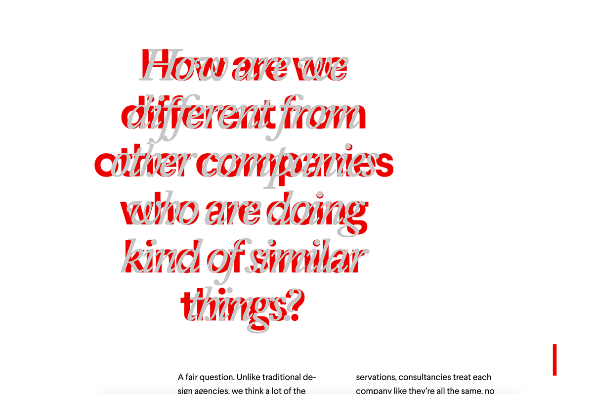
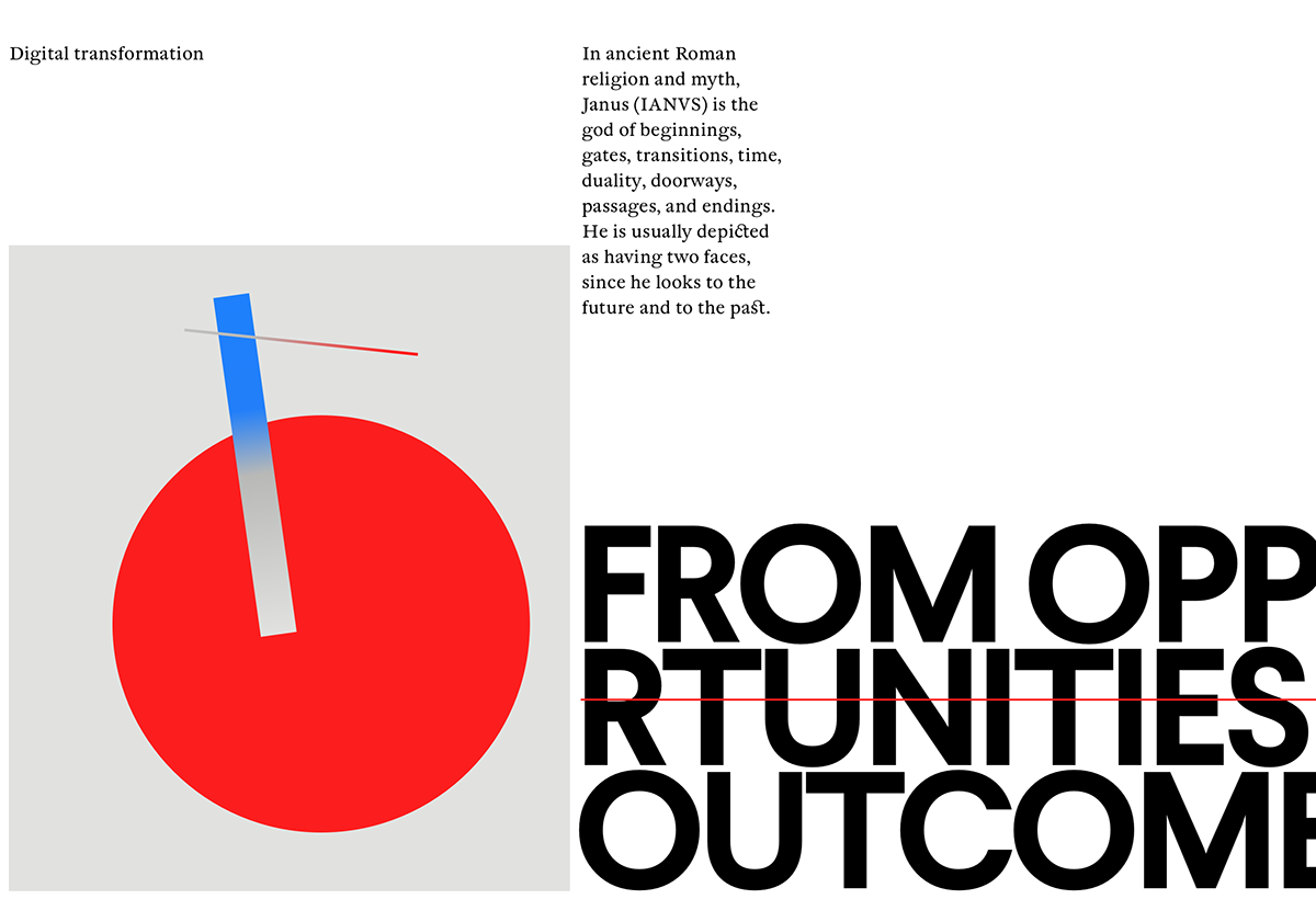
The foundational element of this website’s identity is duality: two narratives — one regular, one meta — coming together in one. This is a example of duality at play, and NOT a glitch
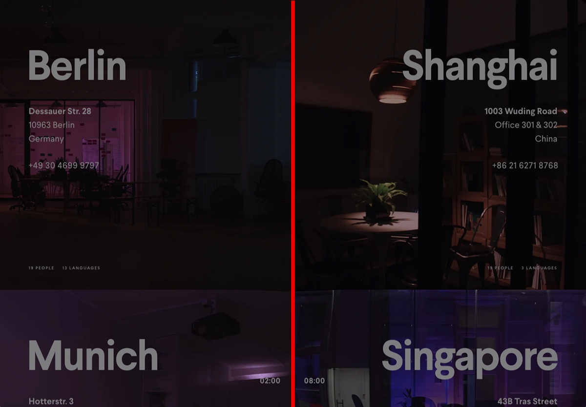
The “Offices” section changes throughout the day, based on current time in every office

During the working hours the officies/cities grow bigger and the photos are full of light. Outside working hours, the offices shrink — and the photos show empty nighttime offices
Here, the intention was to make a website based entirely on meaning — without it being boring, and with some twists and surprises on the way.
How do you capture emotion and put it online? Below is our (maybe not very successful) attempt at doing that.
Fancy brutalism without the fancy
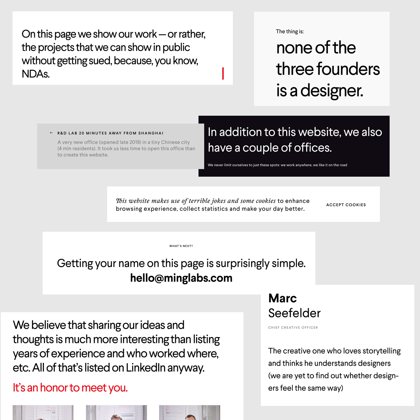
A design company should not show off. A design company’s job is to affect and transform other objects — companies, people.
Following this thinking, the website design is largely austere and restrained. Just 2 colours, primitive layouts, and unexpected font pairings. This is the closest we managed to get re: the impossible task of creating a designless design.
Following this thinking, the website design is largely austere and restrained. Just 2 colours, primitive layouts, and unexpected font pairings. This is the closest we managed to get re: the impossible task of creating a designless design.
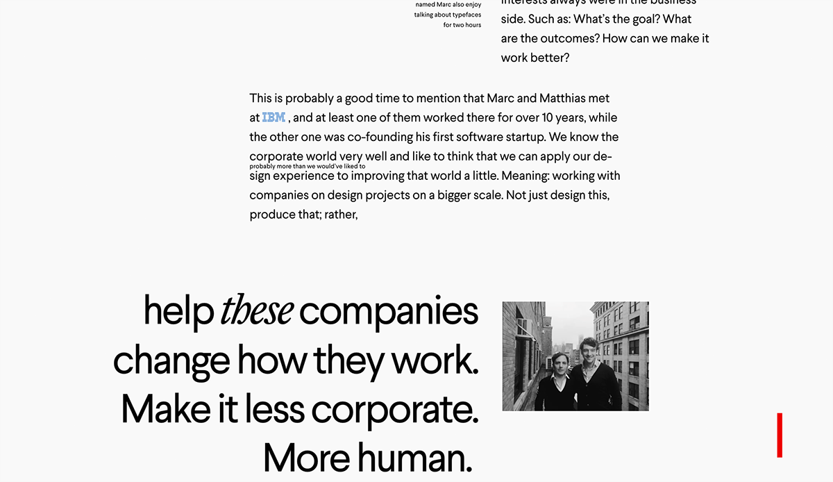
About us. The composition of this layout is beautifully weird — and so are tiny details like the IBM logo piercing the paragraph (see second line)
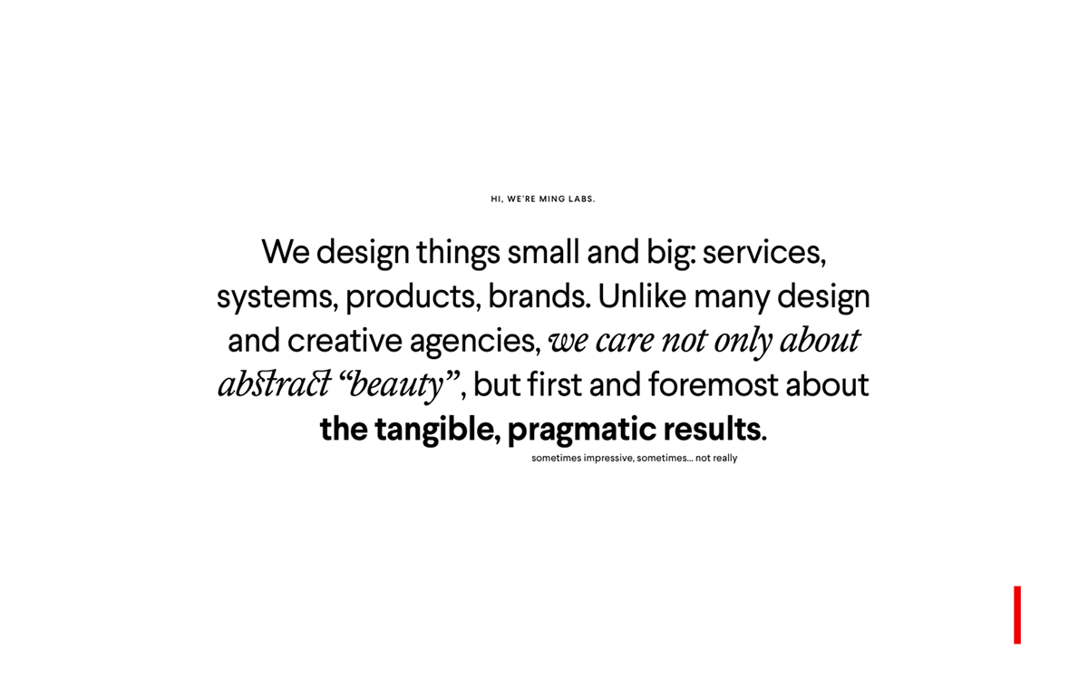
The very second screen, where MING says hi. Pairing of sans serif with serif is the oldest trick in the typographer’s book (pun intended)
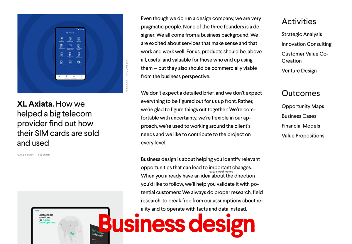
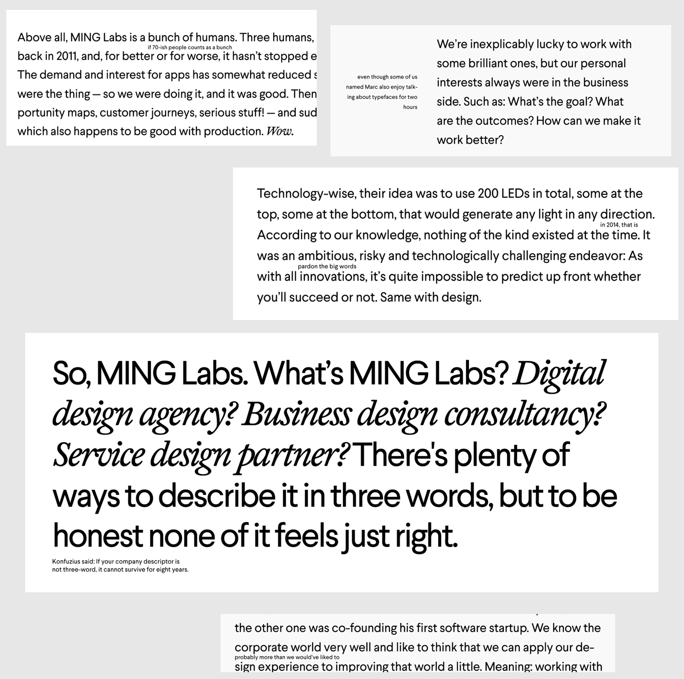
What we do. A rather long essay mixed with magazine-style inserts
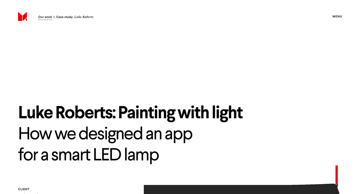
Case study, first screen. Lots of whitespace to make the title properly stand out
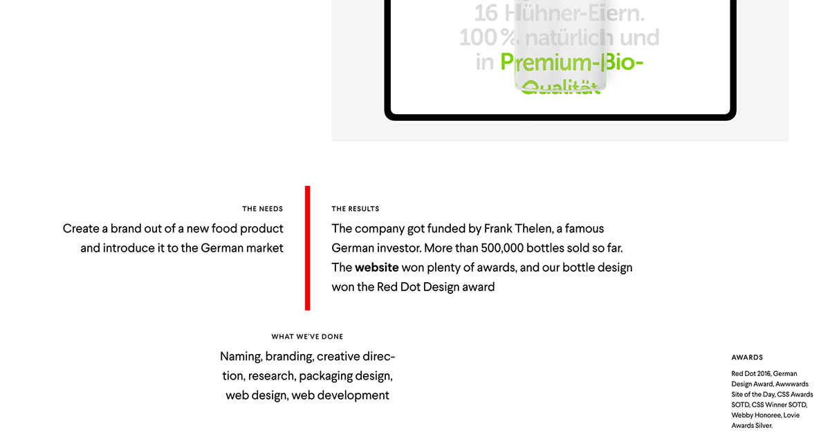
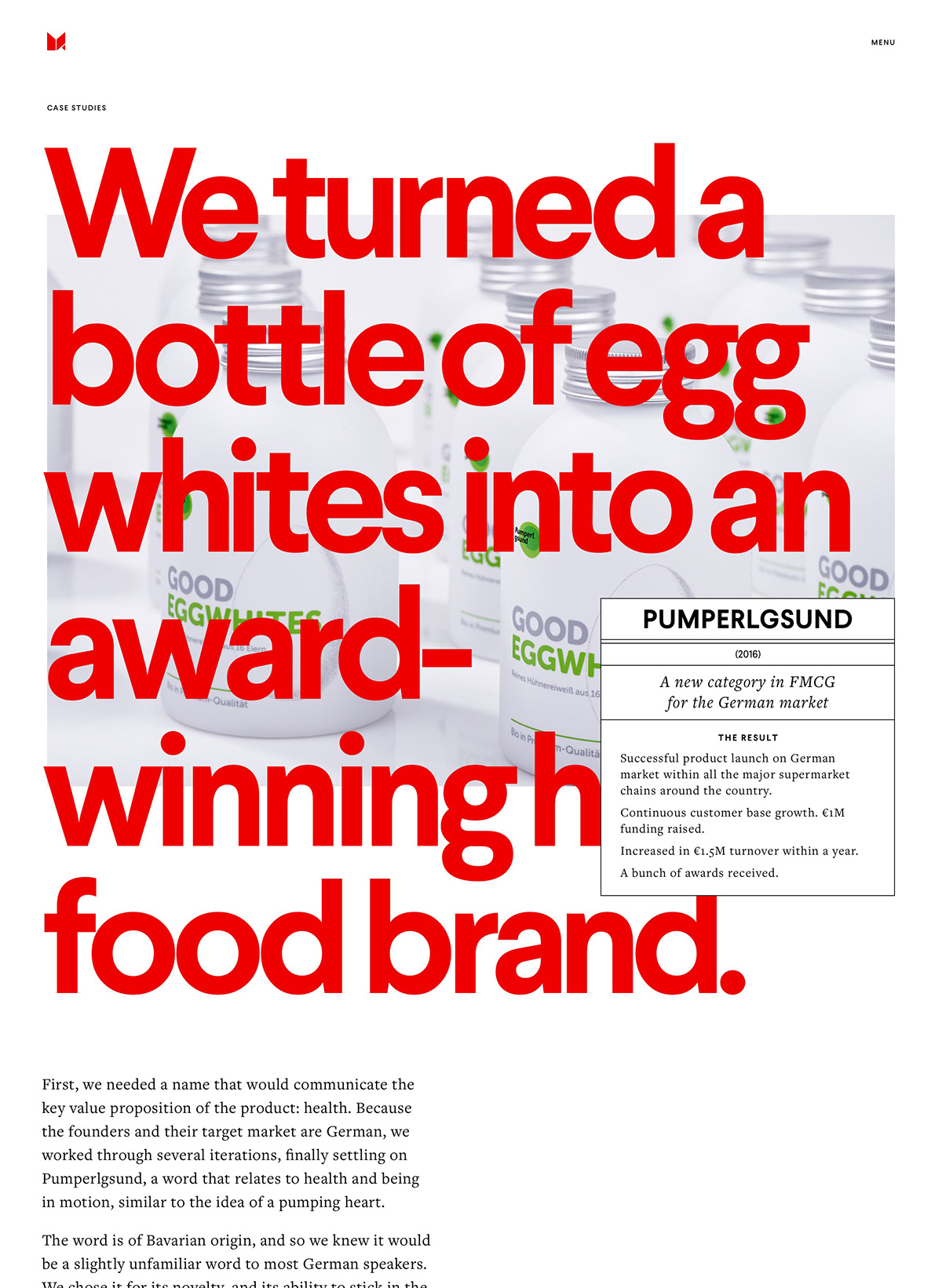
Case study. The cover page nicely summarizes one year of work in three sentences and one list: the needs, the results, what we’ve done, awards
Case study. A section title is only good when it’s referencing a popular (albeit exhausted) joke setup

Case study. For full effect, prominent images are set in full bleed, borrowing from print tradition — again

Case study. Avoidably, at some point you need to show 300 screenshots.
A bunch of experimental layouts hopefully help avoid repetition and boredom
A note on motion. Following the note on online things being alive, there should have been some animations. However…
There’s a distinct trend of animations-for-the-sake-of-animations, of “hey look at me i’m expensive” animations. Some awards websites with 4 Ws (do not confuse with 3 Ws) in their title are full of those.
Not that there’s anything wrong with that. But we don’t agree. We wanted to use animation to say something, to make a point, to have meaning — instead of just being flashy and showoffy.
Other than typography, the red line is the sole element of the visual identity. It hints at the design company’s power to directly change the objects it comes in contact with
The Line works as a separator between the current page and the page you’re about to scroll to, and it has a curious spring effect to it, almost resisting to let you keep scrolling (if only Instagram had something like that)
If you pause the animation halfway, you get interesting LinkedIn x Malevich compositions
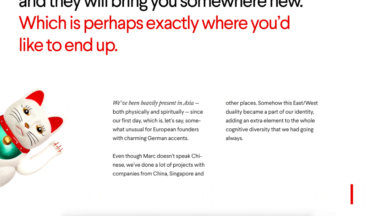
Of course we couldn’t resist putting Maneki-neko aka Chinese Lucky Cat (which is actually of Japanese origin) on the website
Honest, meta, serious, silly
To not to sound the way LinkedIn does — like a tired middle manager without a personality — this website speaks in a plain, albeit slightly pretentious manner.
The whole point of this website is to display personality. To give a tiny preview of what it’d be like to work with these people before sending the very first email.
The tone of voice of this website is closely modelled on the way MING founders talk themselves. Friendly, human, helpful — with a touch of funny, meta, and weird.
The narrative contains two “tracks”. The main one, in large letters, Serious Business, delivers Unique Selling Points.
The ironic/self-referential/meta one is hidden in tiny letters between the lines.
The ironic/self-referential/meta one is hidden in tiny letters between the lines.
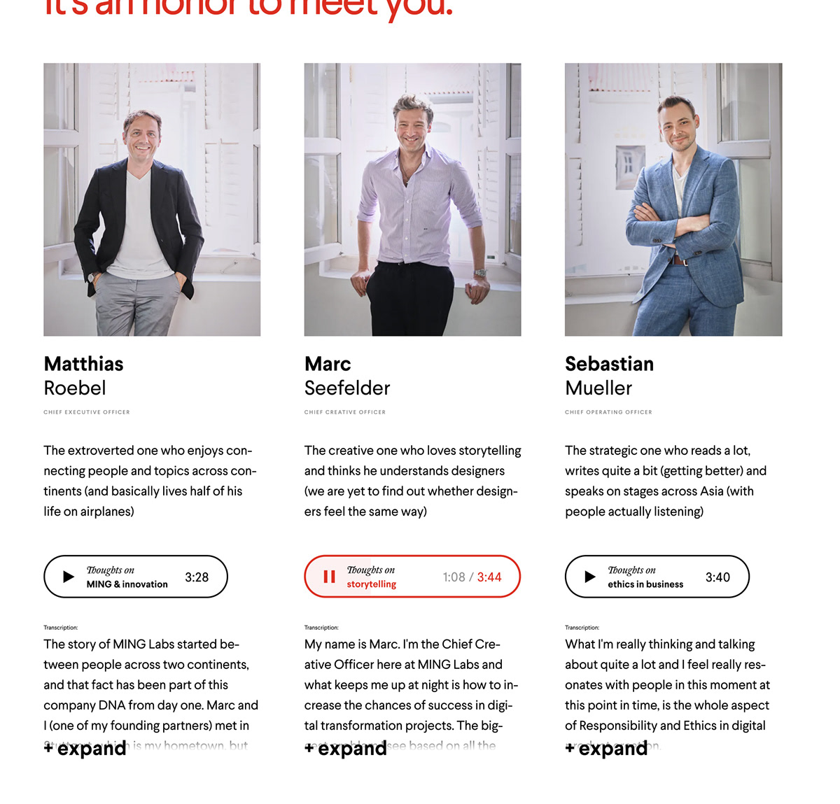
To really capture the founder’s personalities, we interviewed them on record and put the audio recordings on a separate page.
You’re probably as tired as we are of reading “We are an award-winning multidisciplinary digital design studio based in Whatever” on each and every website.
So, we put some tags — a lot of tags! — very upfront on the homepage. Kind of like bullshиt bingo, but not quite.
So, we put some tags — a lot of tags! — very upfront on the homepage. Kind of like bullshиt bingo, but not quite.
Homepage, first screen. A mix of sensible keywords that describe what MING is, very briefly — and parody nonsense gibberish like “cool abbreviations” and “firm handshakes”. That’s our idea of funny.

Well, this is it then.
You just scrolled through 32,767 pixels. Quite a workout, come to think of it.
You just scrolled through 32,767 pixels. Quite a workout, come to think of it.
Made by
Sergey Skip — art direction, design and development supervision.
Sergey Skip — art direction, design and development supervision.
Eugene Kudashev — tone of voice and copy.
Hoodies — back-end and front-end development.
Special thanks to Marc Seefelder, Dionne Lim, Kristina Würz,
Sebastian Müller and Matthias Röbel.
Sebastian Müller and Matthias Röbel.


