La Cucina Della Mamma means "the kitchen from the mom". It is an Italian bistro (a small restaurant) becoming part of already existing chain of 9 restaurants.
https://lesbistrotspasparisiens.com/
CHALLENGE
I was told to create an old fashion/retro branding with a soul, as if the restaurant existed for years, to express the authenticity of
restaurant's cuisine, sincerity, elegance and
nobility. Usage of tomatoes and olives (if possible).
restaurant's cuisine, sincerity, elegance and
nobility. Usage of tomatoes and olives (if possible).
SOLUTION
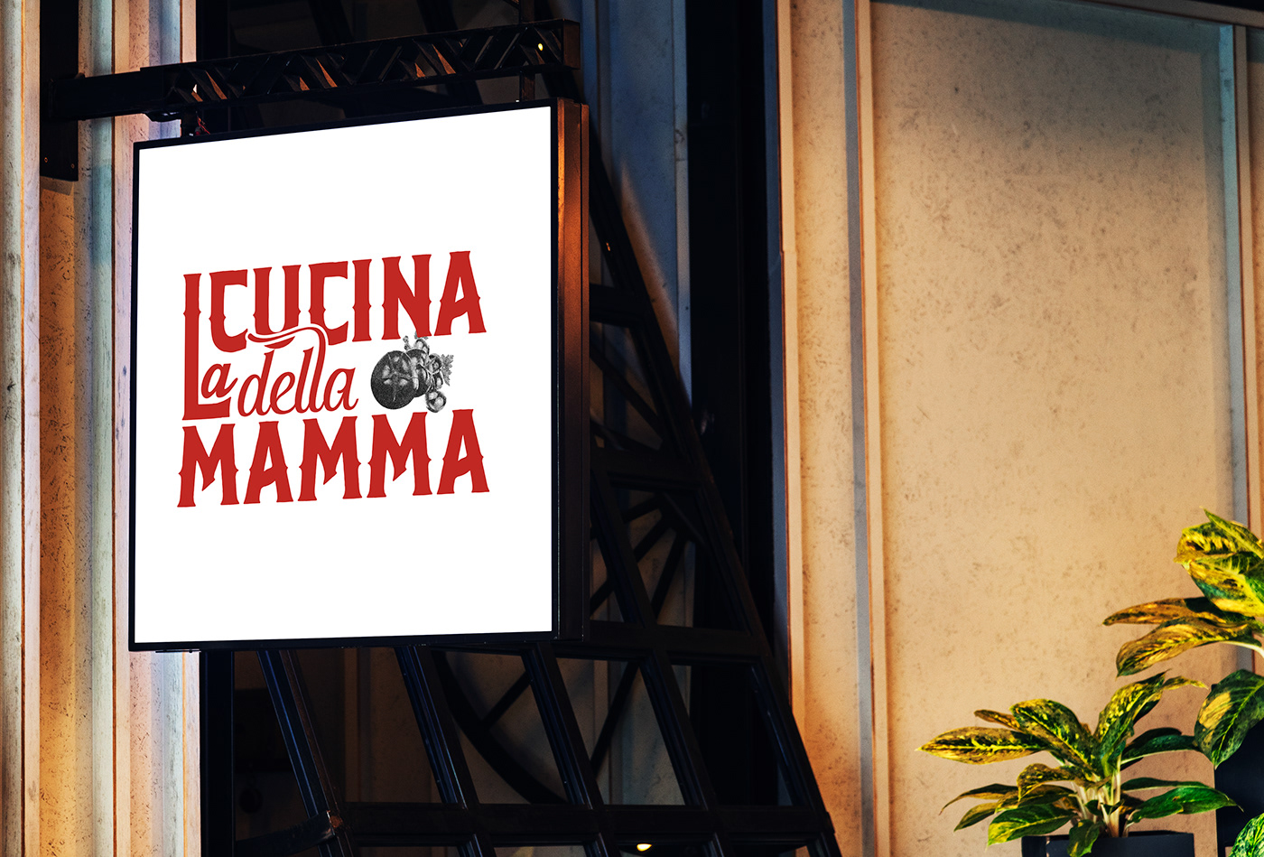
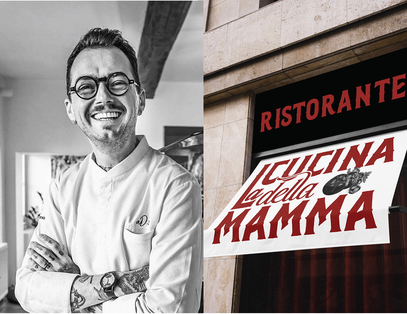
After gathering information about their existing restaurants I came up with this concept to maintain the consistency of the logos of their 9 restaurants, this will make their brand more consistent and will make an impression about their mission of serving delicious food and splendid hospitality. The color and fonts used in the logo signifies the maturity of the restaurant (which was the client's major requirement). Typography itself makes it memorable, unique, and retro. An image of tomatoes and olives is used in the white space and colors of image are kept neutral so
that it didn't disturb the typography, look old and retro, and made it unbusy.
that it didn't disturb the typography, look old and retro, and made it unbusy.