An in-progress polyptych
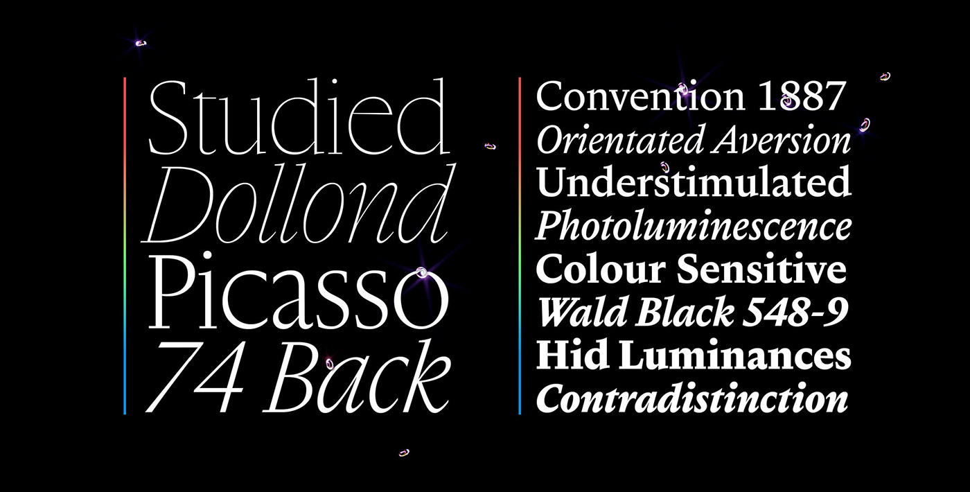
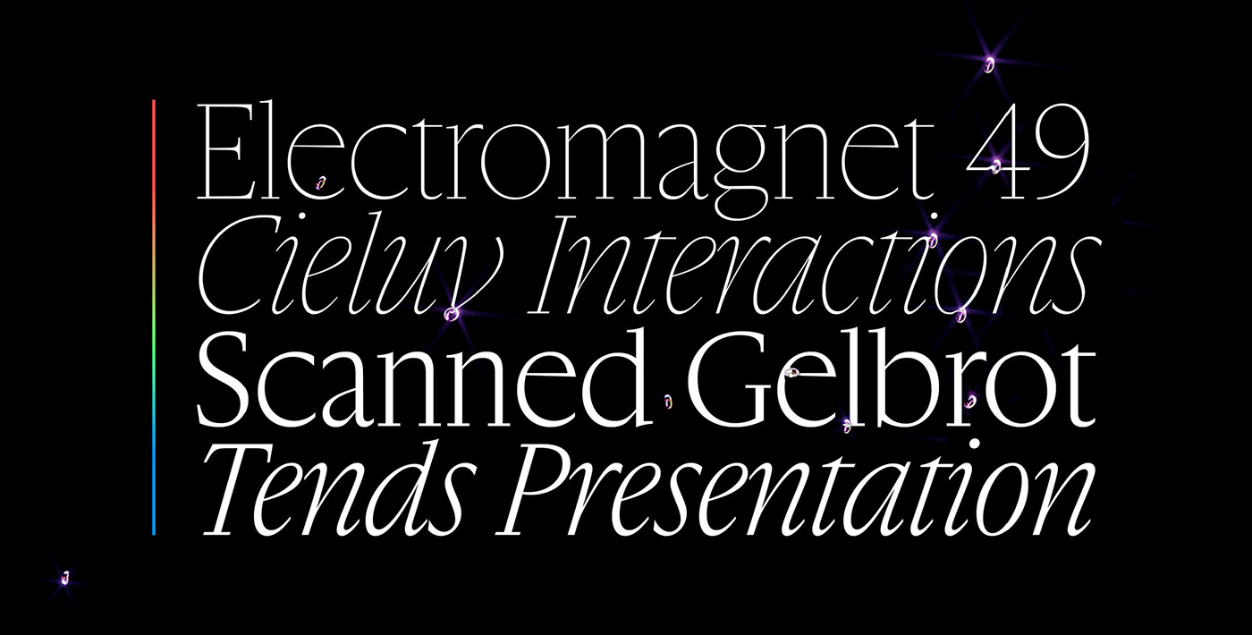
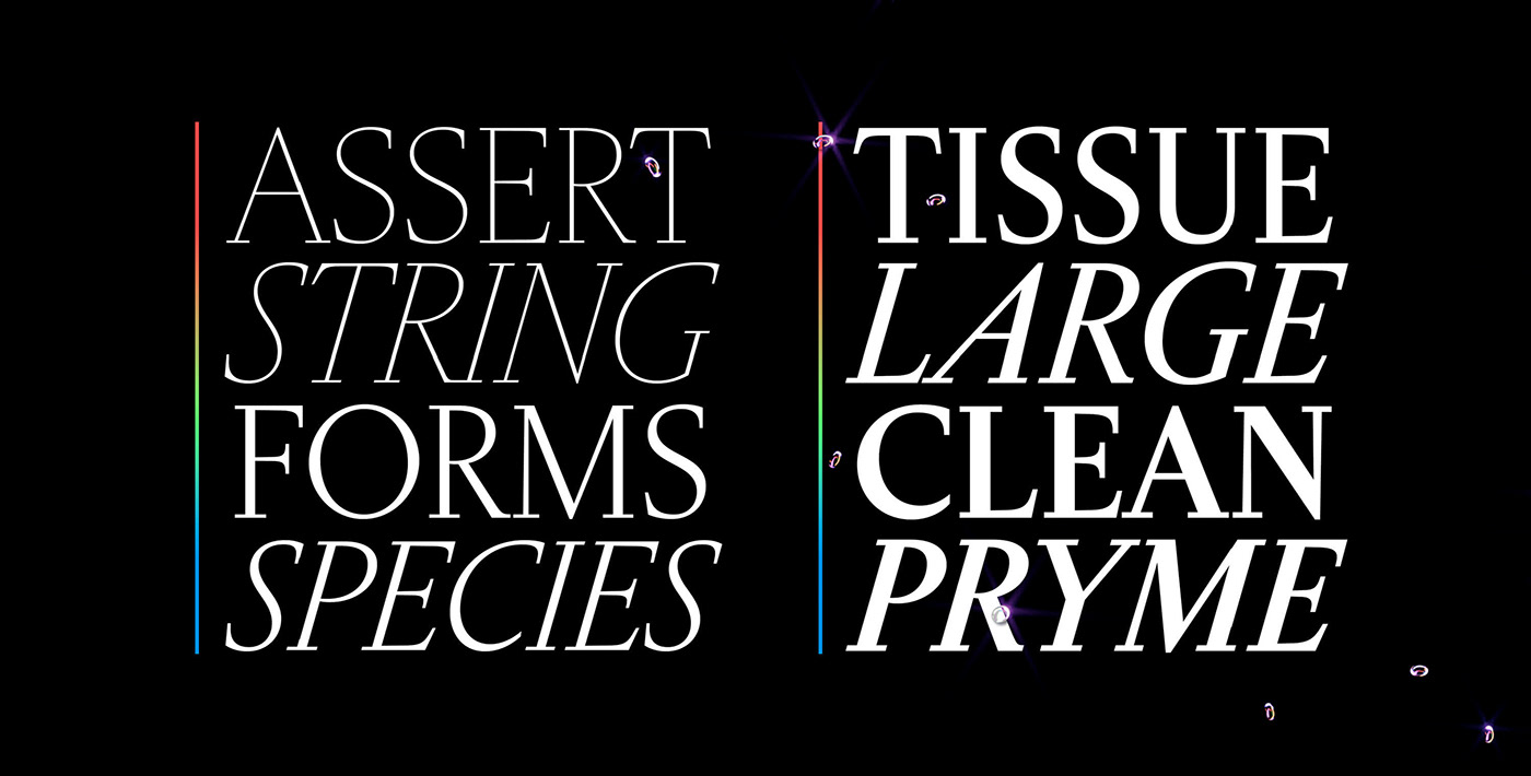
Gamuth is conceived as a multi-faceted work, of which the first panels are two optical sizes (Display, Text) of the same serif typeface. Gamuth borrows from Dutch Baroque faces and their typical breadth: narrower than usual proportions, generous x-heights, and crisp detailing are key features of the typefaces, and contribute to giving a dense, deep texture to running text.
Gamuth was initially designed to perform well for on-screen, long-form consultation. Its hybrid origins made it a work of pure syncretism: the Display cuts have a life of their own, and while they work hand in hand with the Text cuts, the rhythm of lowercase proportions dances a different ballet. Meanwhile, they sport an even crisper and sharper texture. Departing from the historical roots of the romans, the italics are normalized towards a more predictable behavior on modern displays and therefore have a constant angle. Gamuth is designed to perform graciously in demanding environments such as content-heavy websites while proving distinctive enough for branding applications where a touch of depth and substance are sought.
Gamuth’s next panel is already set to unfold as Gamuth Sans.
Design: Max Esnée.
Team: Jean-Baptiste Levée, Marion Sendral,
Arthur Schwarz, Léa Bruneau, Igino Marini.