


Timeless Odyssey
Introducing the inaugural brand design for Bygone, a groundbreaking time travel company. As the pioneer in offering time travel adventures through a Web3 experience built on blockchain, Bygone is set to make history.
Role: Metaverse Brand Designer
My task as a brand designer was to forge a brand identity that's easily recognizable and scalable across various historical periods, crafting a visual language as uniquely captivating as the experience Bygone offers.
Illustration by Maddalena Stanca


Scenario
Web3 technology has unlocked a plethora of immersive gaming experiences, and with the power of VR, these experiences become unparalleled. In the blockchain landscape, where futuristic visuals reign supreme, Bygone establishes a link between past, present, and beyond.
Iconic figures from history come to life in this fantastical world, where you might stumble upon Michael Jackson dancing alongside dinosaurs or Queen Elizabeth II partying in 2099. All it takes is stepping into Bygone's time capsule, selecting an Avatar-NFT, and embarking on your journey.


Design Journey
Time travel is a well-established concept in film and literature, with recognizable elements for enthusiasts of temporal exploration. Our design process involved steering these familiar concepts in a bold, innovative direction, setting a new standard for visual allure. This entailed reinventing time travel with clear artistic direction, resulting in a logo versatile enough for scenarios ranging from the 1970s to the 3120s and adaptable for 3D objects or tokens for interdimensional excursions.
I experimented with various solutions, exploring typography from different eras and diverse graphic concepts. Ultimately, I honed in on a single element and a proposal I was confident in.
Bygone transcends mere collection of worlds within the metaverse; it represents the mode of transportation enabling users to traverse these experiences. This is why the brand identity is intrinsically linked to the time travel machine, encapsulating the essence of that element.


Users can enter the capsule, spend their Bygone tokens, and embark on a journey through space and time within the metaverse.
The capsule serves as a gateway to novel experiences and defies the constraints of physical laws.


Depending on context, the brand mark can take different forms - from a simple black-and-white shape for the token marketplace to a more three-dimensional, descriptive composition. Its final form is the actual 3D time capsule machine found in the game.


The capsule is designed with strong principles in mind: ease of customization, adaptability, and transportability through time. Upon encountering the capsule, users are immediately connected to the concept of time travel through its simple, familiar, and memorable shape.


The logotype features distinct geometric shapes and a clean, classic foundation for easy readability, aligning with blockchain industry standards. The curves, particularly in the "n," mirror the capsule's shape.

The letter mark's perfect center houses the "IO" elements, signifying that these time travel experiences are made possible through human-developed technology based on binary code.

The typeface is geometric, original, and bold, with a moving version that suggests an ascending, blending motion. It invites users to ascend, travel, and traverse time alongside various characters.
//////////////////////////////////////////////////////////////////////////////////////////////////////////////////////////////////////////////////////////////////////////////////////////////////////////////////////////////////////////////////////////////////////////////////////////////

Colors
For Bygone's ecosystem, I developed an intricate color system and palette. Starting with vivid colors, these hues not only stand out in the darkness of the laboratory but also represent the vibrant colors of different time periods (1990s, 1980s, 1970s).
Who says the past must be black and white? Vivid colors evoke a lively and engaging reality.


These vivid colors blend to create unique, recognizable gradients that convey the exhilaration of time travel. Moreover, the colors themselves transform as the metamorphosis unfolds.

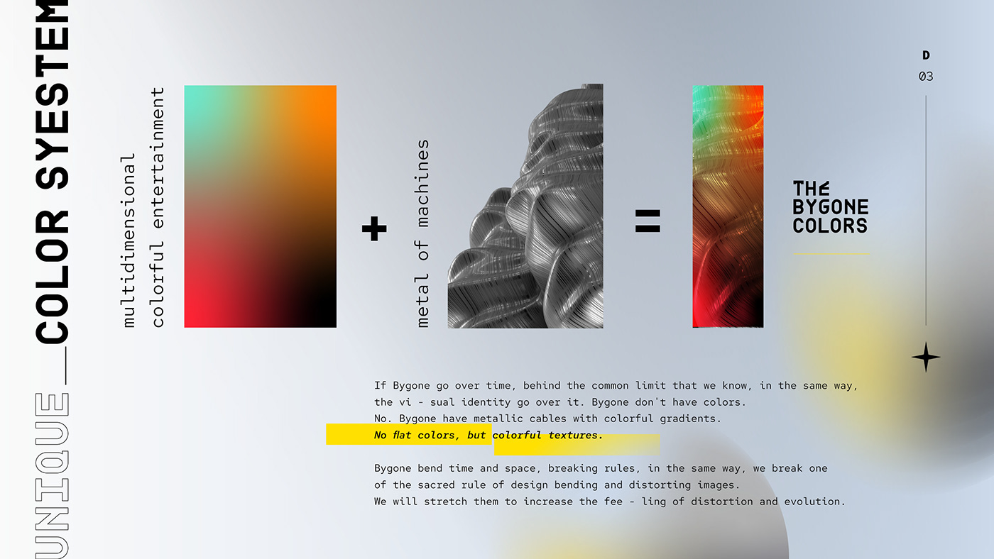

Bygone surpasses the boundaries of time and our reality. Similarly, the visual identity is designed to transcend. Bygone doesn't merely have colors; it boasts metallic cables with colorful gradients. The brand opts for textured colors instead of flat ones, bending time and space, defying fundamental physics rules. In the same vein, we challenge one of the sacred principles of design by distorting and stretching images to amplify the sense of transformation and evolution.
Machines derive gradients through the use of light, which we aim to represent here.

Typograph
As a designer, I firmly believe in enhancing brand recognition through unique typography. To accomplish this, I employed two fonts:
BDR Mono: Designed by Lopetz in 2006, this font is based on a geometric grid and imparts a flawless Sci-Fi aesthetic to titles without compromising readability.
Red Hat: A modern interpretation of the geometric sans genre, Red Hat draws inspiration from various American sans serifs, including Tempo and Highway Gothic. The Display styles feature low contrast and tight spacing, while the Text styles have a slightly smaller height and narrower width for improved legibility, more generous spacing, and thinned joints for optimal performance at smaller sizes.


//////////////////////////////////////////////////////////////////////////////////////////////////////////////////////////////////////////////////////////////////////////////////////////////////////////////////////////////////////////////////////////////////////////////////////////////


Key Visuals, Communication, and Payoff
"Time to Travel" perfectly encapsulates Bygone's offering in three words. With diverse visuals, we aim to showcase the colorful worlds present in Bygone's Web3 universe.
Moreover, we strive to visually represent how users can "ascend & shift" by leveraging our blockchain-based technology to transform themselves into famous historical figures.
Textures and patterns also help convey this sense of change and metamorphosis.
//////////////////////////////////////////////////////////////////////////////////////////////////////////////////////////////////////////////////////////////////////////////////////////////////////////////////////////////////////////////////////////////////////////////////////////////
Logo Animation
To provide a comprehensive multimedia branding experience, I've created a logo animation focusing on sonic logo and sonic branding. The logo animation has four variants to suit all circumstances.
Conclusions
This project has been my most intricate brand identity creation to date. The innovative brand and the absence of direct competitors have been both a challenge and an opportunity. With no limits to interdimensional travel, my goal from the outset has been to establish boundaries and direction through a fitting brand image.
The next phase will involve expanding the brand's vision by creating NFTs, avatars, and a 3D world, all in line with the brand guidelines and extending Bygone's visual universe. The design will be an integral part of the journey experience, marking just the beginning for an innovative blockchain startup on the brink of launching.


