


iTel
New Visual Identity System
Background
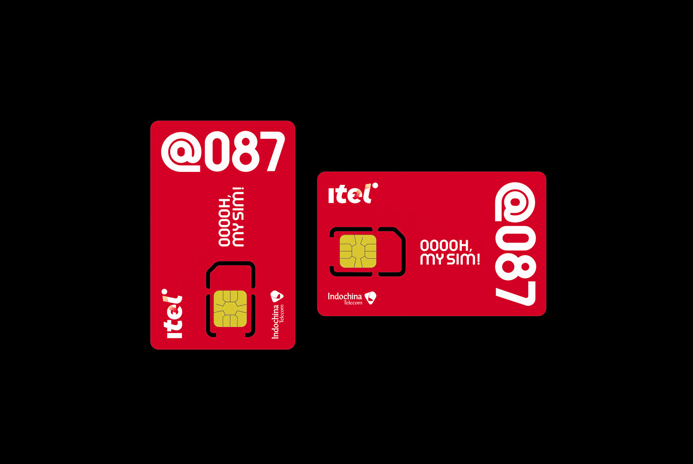
Mạng di động iTel (đầu số 087) - Thương hiệu của Indochina Telecom là nhà mạng tiên phong triển khai mô hình mạng di động ảo - MVNO (Mobile Virtual Network Operator ) tại Việt Nam thông qua thỏa thuận hợp tác sử dụng sóng mạng di động VinaPhone để cung cấp các dịch vụ viễn thông tối ưu về chi phí và trải nghiệm khách hàng vượt trội.
____
iTel mobile network (first number 087) - Indochina Telecom's brand is a pioneer in deploying the mobile virtual network model - MVNO (Mobile Virtual Network Operator) in Vietnam through a cooperation agreement to use mobile network waves. VinaPhone to provide cost-optimized telecommunications services and superior customer experience.
Objective
Về tổng quan, thương hiệu iTel hiện tại đã có một thiết kế Logo rất tốt, hiện đại và phù hợp với tính chất thương hiệu của iTel.
Mục tiêu ở phạm vi công việc lần này của InSpace đến từ Agency Aurora và khách hàng iTel đề ra chính là từ những nền tảng đã có của thương hiệu từ đó chúng ta có thể phát triển, làm tươi mới và quy chuẩn hóa các yếu tố nền tảng của thương hiệu như đường nét, họa tiết nhận diện, màu sắc, kiểu chữ, phong cách minh họa... nhằm mục tiêu xây dựng một cái nhìn mới, có bản sắc, tăng tính nhận diện và hệ thống hơn cho iTel trong các mục đích ứng dụng cụ thể hơn trên các nền tảng online và offline.
_____
In general, the iTel brand currently has a well-designed, modern logo that aligns with the brand's characteristics. The goal of this particular project from InSpace, in collaboration with Agency Aurora and the client iTel, is to leverage the existing brand foundations and revitalize and standardize the elements of the brand platform, such as lines, visual patterns, colors, typography, and illustration style. The objective is to establish a fresh, distinctive look that enhances brand recognition and provides a more cohesive and systematized approach for iTel across various online and offline platforms, catering to specific application purposes.

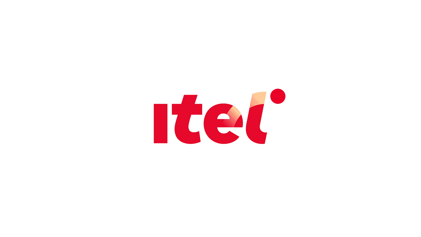
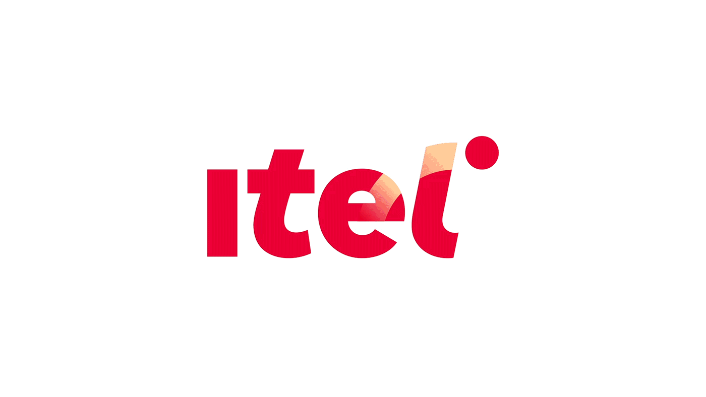
The current official iTel logo is provided by iTel, we have re-standardized the overall with new lines and new colors
Solution
InSpace tập trung phát triển khai thác các yếu tố nền tảng sẵn có của thương hiệu nhằm tạo nên một hệ thống các họa tiết nhận diện riêng biệt, ứng dụng cho các nội dung truyền thông khác nhau. Làm tươi mới hệ thống màu sắc, đa dạng hơn, đặc biệt là màu đỏ iTel để có thể tối ưu về mặt thị giác và khác biệt với các đối thủ cạnh tranh. Xây dựng một bộ quy chuẩn nhận diện hoàn chỉnh để tối ưu hóa trên nền tảng Digital.
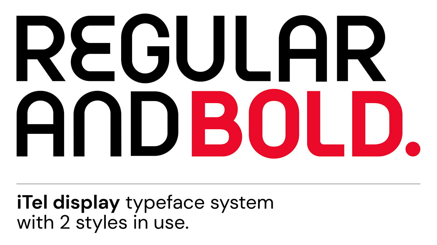
Phát triển một kiểu chữ Display riêng biệt cho các nội dung lớn, kiểu chữ này cần phải tạo nên từ những nền tảng thiết kế của thương hiệu, từ đó tạo thành một hệ thống nhận diện đồng bộ, độc đáo, mang nét đặc trưng cho iTel và tạo ra nhiều không gian cho việc ứng dụng nhận diện thương hiệu.
_____
InSpace focuses on developing and leveraging the existing brand elements to create a system of distinct visual patterns that can be applied to various communication materials. The color system is refreshed and diversified, particularly with regards to the iTel red color, in order to optimize visual impact and differentiate from competing rivals. A comprehensive brand identity guideline is developed to optimize the digital platform.
A unique Display typeface is developed specifically for prominent content. This typeface is derived from the brand's design foundations, resulting in a synchronized and distinctive visual identity system that embodies the characteristic traits of iTel. This approach creates ample room for brand identity application and enhances brand recognition.


Visual Cue
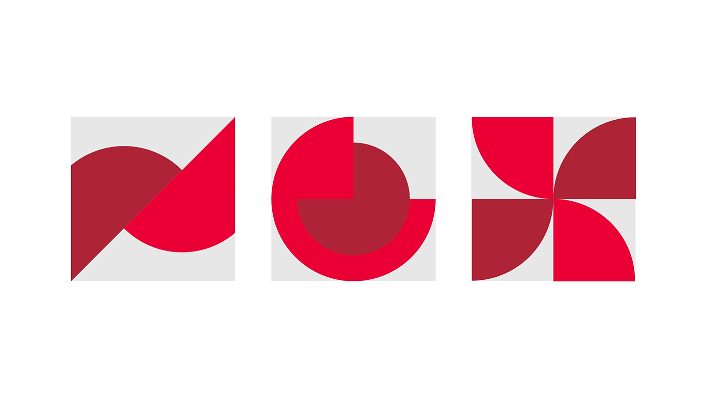
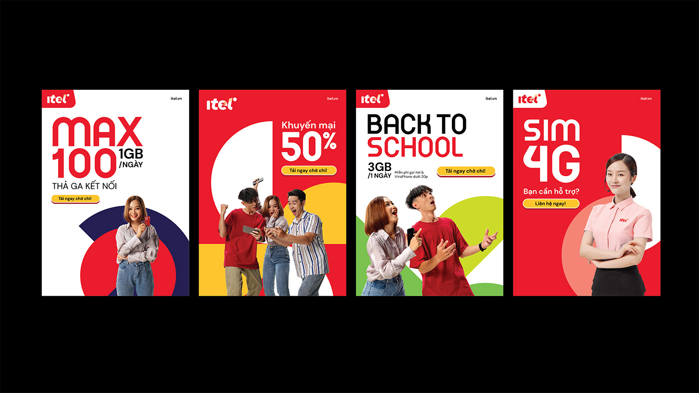
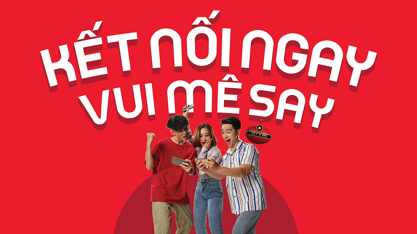
Hệ thống visual cue được phát triển từ biểu tượng "Red Dot" của Logo iTel để hình thành nên 3 yếu tố đồ họa đại diện cho 3 tính chất đặc biệt của ngành viễn thông: Kết nối - Chuyển động - Lan tỏa. Các yếu tố này được ứng dụng linh hoạt cho các nội dung được quy định cụ thể trong hệ thống nhận diện của iTel.
_____
The visual cue system was developed from the "Red Dot" symbol of the iTel Logo to form 3 graphic elements representing 3 special personality of the telecom industry: Connection - Movement - Spread. These elements are flexibly applied to the content specified in iTel's identity system.


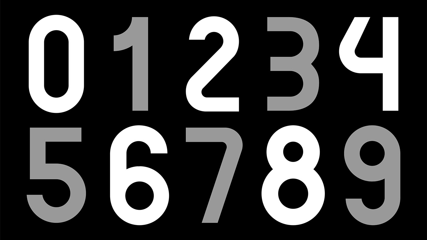
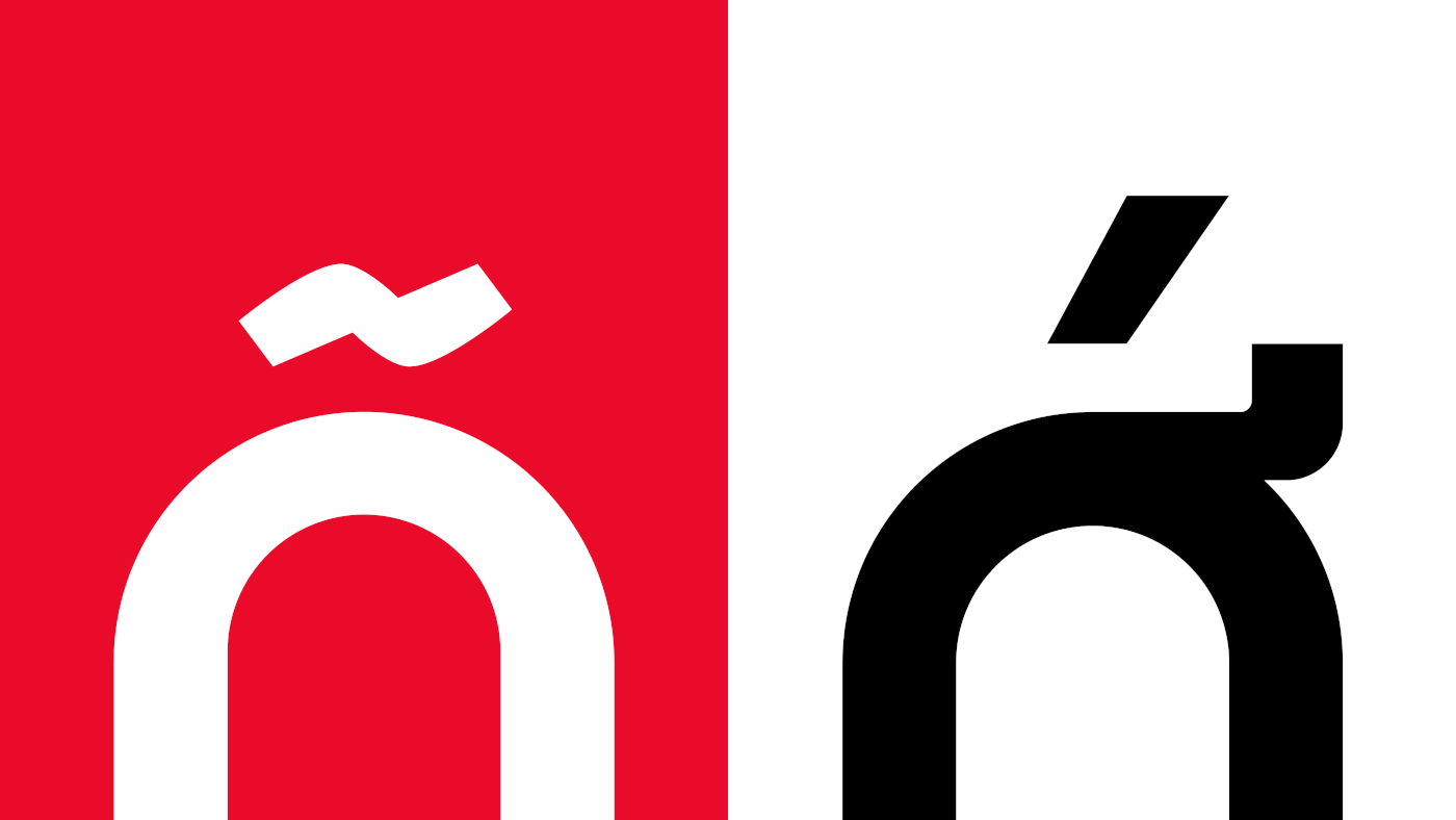
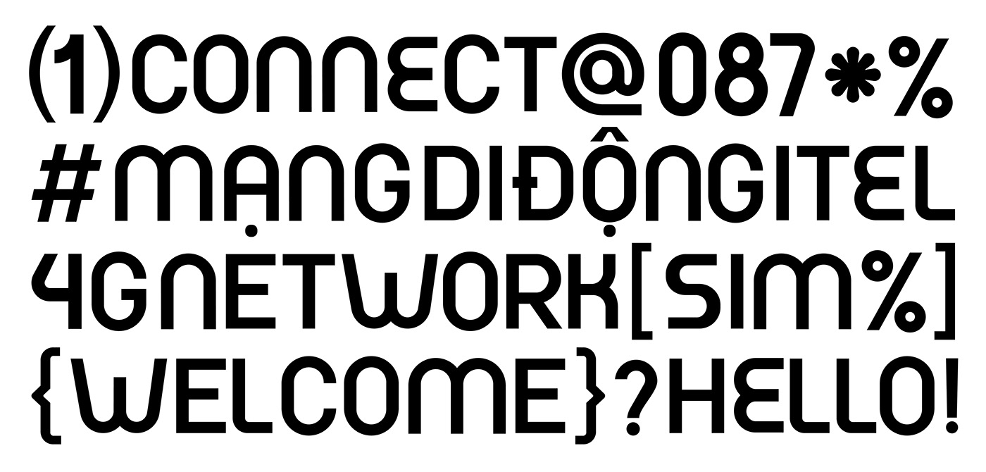
Typography
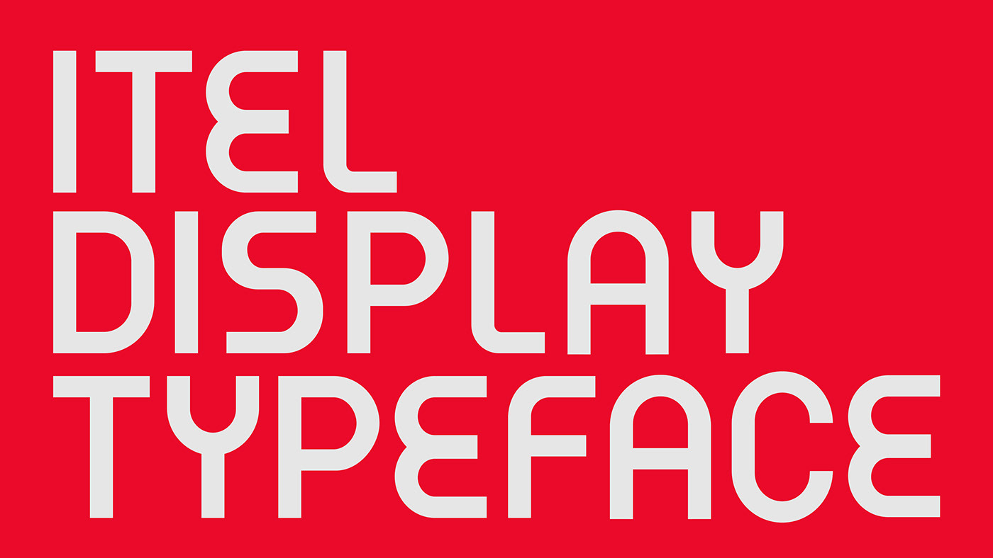
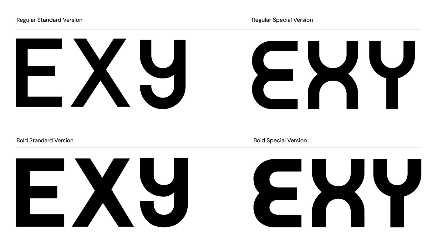
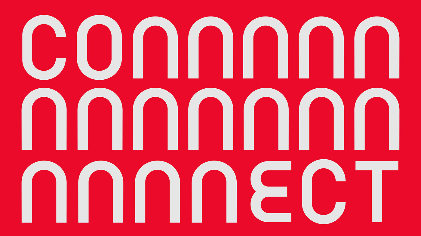
Kiểu chữ iTel Display được phát triển từ đường nét tròn trong yếu tố của Logo iTel, kiểu chữ được tùy chỉnh với các ký tự đặc biệt khi kết hợp với nhau tạo thành nhịp điệu và các góc bo tròn thân thiện, đặc trưng giúp gợi liên tưởng đến tính hiện đại, công nghệ và kết nối.
_____
iTel Display typeface is developed from the rounded lines in the element of the iTel Logo, the typeface is customized with special characters when combined to create a rhythm and friendly, characteristic rounded corners that help associated with modern, technology and connectivity.


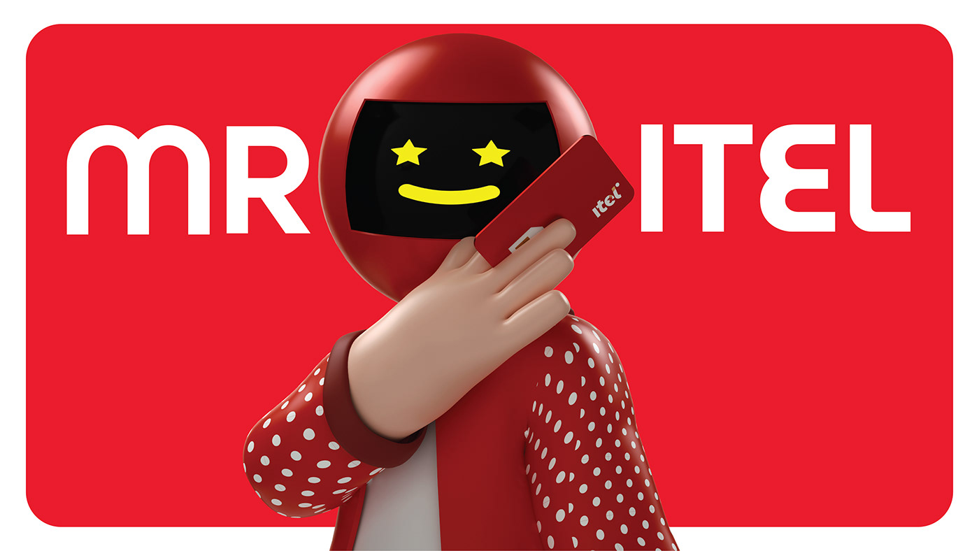
Hệ thống minh họa cũng được bổ sung phong phú thêm với các concept minh họa nhân vật Mascot anh iTel với phong cách trẻ trung, năng động với với các phiên bản từ minh họa đến 3D, để có thể ứng dụng đa dạng hơn cho các ngữ cảnh thương hiệu.
_____
The illustration system has also been enriched with various character illustrations of the iTel Mascot in a youthful, dynamic style, ranging from 2D to 3D versions. This expansion allows for a more diverse application in brand contexts.


Credits:
___
Project: iTel - Visual Identity System
Client: iTel - Indochina Telecom
Brand Consultant Agency: Aurora Vietnam
Project Account: Phuoc Dinh
___
Creative Partner: InSpace Creative
Scope of Work: Visual Identity System, Typeface Design, Design Guideline System, Illustration Concept
Creative Director: Sanh Nguyen
Art Director: Nhi Tuong, Duy Trinh
Creative Designer: Trung Chau, Vi Le, Rella Lem, Zahy
Typeface Design: Trung Chau
Illustration: Nhi Tuong, Vi Le, Rella Lem
3D Artist: Zahy
Project Manager: Trang Ho
Published: 2022
.
Thanks for your time.


