
ISHONCH — chain of hardware, electronics and household goods stores.
The company is actively developing in Uzbekistan, and ISHONCH came to our agency with a global goal – to prepare a platform for expansion throughout the whole country and expand the chain of stores in the regions.
The company is actively developing in Uzbekistan, and ISHONCH came to our agency with a global goal – to prepare a platform for expansion throughout the whole country and expand the chain of stores in the regions.
We have realized a large–scale rebranding - we have developed a brand platform, brand strategy, communication strategy, slogan, visual identity, brandbook. The brand carried out interior and exterior design, advertising campaign and image photo shoot under our art direction, but with the involvement of creative market professionals.

Strategy
At the research stage, we noticed that in Uzbekistan, particularly in the retail category, there are two noticeable problems: competitors easily copy each other's style, the transformation from the bazaar to modern retail has not yet been carried out smoothly. More comfortable spaces for shopping have appeared, but humanity, attention, clarity and liveliness went to waste.
We decided to make a rebranding, which, first of all, would affect the user routes and help customers feel more comfortable in retail sphere.
We realized that if we solve such a problem, it will be difficult to copy our solution, because it is not just external changes, but transformation from within. Depot Strategy department proposed the «Truzbek» hypothesis – a brand about a modern resident of Uzbekistan who values culture and heritage and aim to change yourself and the environment around him for the better, believes in change and strives to help others. Truzbek is a person, a philosophy, a principle. This is a new type of thinking when you don't expect a better life, but create it by yourself. Truzbeks can be our neighbor, our parents, friends – those who change the world around themselves and loved ones not by words, but by actions. ISHONCH as a brand helps in these issues by selecting modern and convenient products for life, business, education and personal development. Additionally, we have worked out a communication system in retail, with the help of which the brand will create a more comfortable space in stores –
to communicate with customers, give and tips.
The Truzbek concept assumes that ISHONCH acts as a visionary and leader of change. It is the brand that dictates to customers what is new, relevant, what you need to pay attention to, and what to refuse. The value for the buyer is that he always knows that what exactly ISHONCH sells, does or says and this is relevant. The communication strategy is based on the principle of "acting, not talking".


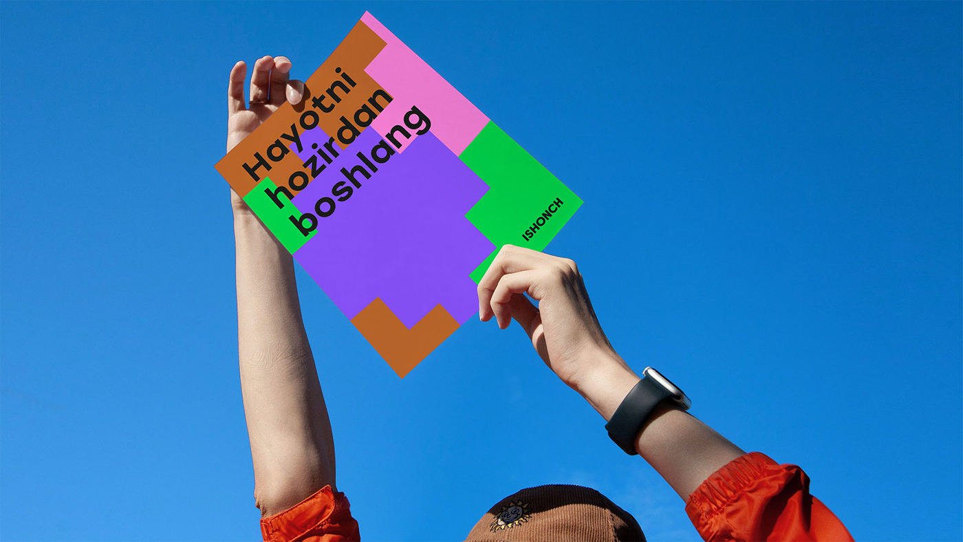
The slogan
Live better today org. Hayotni hozirdan boshlang reflects the new principles of the brand and the desire for continuous development. The slogan offers the audience a new look at the usual patterns of behavior, says that with the help of ISHONCH products, a person can live a full and eventful life right now, achieve goals and realize plans.


Design
The identity reflects the brand's desire for active changes and a modern approach to design, which is atypical for the retail market of Uzbekistan.
The style-forming element of the concept is the pixelation technique, which forms the basis of the author's pattern, proposed as an alternative to typical patterns widely used in visual communications of brands in Uzbekistan.
When developing the logo, it was decided to use strict and minimalistic solutions, which distinguishes ISHONCH in the competitive environment of Uzbekistan. The letter «I» becomes the style-forming element, which can be used as a short version of the logo or bullets for text blocks. We have developed various animations illustrating the movement of pixels, and also proposed a scalability technique for the letter «I» – the first letter of the logo, from which various images unfold and grow.
The letter «I» becomes a living pulsating element, easily adaptable to various types of media.
The letter «I» becomes a living pulsating element, easily adaptable to various types of media.

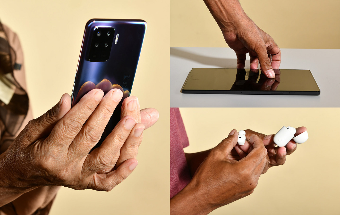
We offered examples of product and image communications, developed pictograms, loyalty card design, examples of the design of pages in social networks – thus, the retailer's team immediately had the opportunity to see how the concept of visual identity is revealed in different formats. HR-communication became a separate element: a special photo style with a close-up of employees' faces was proposed for it, emphasizing that employees do not care about clothes and elements of cultural or religious identity, only the person and his personality are important. We have developed a minimalistic form, but at the same time it turned out to be beautiful and functional, capable of providing everyday comfort for an employee.
Moreover, we have developed a corporate merch, which is reflecting the identity of the «Truzbek» concept.
So the concept became not only an internal description of the brand platform, but also an independent concept,
which is broadcasted to a wide audience.
So the concept became not only an internal description of the brand platform, but also an independent concept,
which is broadcasted to a wide audience.


When developing design solutions for interiors and exteriors, it was important to reflect the idea of brand empathy for people. Recreation and public leisure areas (comfortable benches, playgrounds) are appearing in the exteriors. Elements used when opening new stores became a separate category of carriers: welcome flags, banners, a shelf at the entrance to the store. In the interior of the store, we proposed to provide zones not only with product communications, but with image and educational ones.
For developing the interior and exterior designs, a joint work was organized with the «Kidz» architectural studio. The Depot team oversees the studio's work, is responsible for the author's supervision and the correct use of visual identity based on the developed brand platform. For example, during the work on the project, recommendations were given on the selection of building materials for the design of new stores: preference was given to natural materials and colors that have a reference to the natural and cultural heritage of Uzbekistan.
In addition to the work of the Kidz architectural studio, the Depot team is also creating a CJM mini–guide for the retail space of ISHONCH stores, specifying the rules for placing communications at key points of contact with the consumer.


Our team continues to participate in the life of the brand and oversees the ISHONCH design team on the developed layouts and communications. Consultations with the brand's art director are held on a weekly basis, where the analysis of specific media developed by the design team for the week takes place.
Creative Director Raushan Sultanov gives comments on each of the presented media from the point of view of the developed visual identity and compliance with the guide book. The format of training workshops for the client's design team is also actively practiced with the development of key tools for working with a new visual identity.

Ishonch is planning a large-scale release of the «Truzbek» platform by the end of 2022. For this purpose, a creative campaign was developed, within which the Depot team works in the format of art-directing: participates in organizing workshops and generating creative ideas, provides consulting services to a production studio and organizing the process of creating advertising communications. Several teams were involved in the work on the creative campaign: the ISHONCH team, the Synthesis agency, the DBLA production studio, and the Depot team. Work on the project began with the organization of a two-days workshop on generating ideas for a creative campaign.
The key idea of the creative company was the concept of "No, thank you", which reflects the national peculiarities of the mentality of a resident of Uzbekistan – it can be difficult for people to go against established rulles, express their disagreement, show individuality. Collective thinking prevails in society, where a person's personality and his own interests do not have sufficient value. In its creative campaign "No thanks" ISHONCH highlights problems and offers a solutions, telling his consumer: "You have the right to live better today and say no to what you disagree with." In the developed videos, the main characters are ordinary people in typical life situations: a wife whom her husband asks to iron a shirt, an office employee whom the boss instructs to scan documents. With the help of Ishonch products, people see an alternative solution to typical problems, say "no" to habitual patterns of behavior. So, the wife says that she will not iron the shirt, because she plans to steam it, and the employee will scan the documents two times faster using a smartphone. The developed plots clearly illustrate the slogan and the key idea of the brand.
Also, as part of the creative campaign, the Synthesis agency was engaged in the development of key images with the participation of art directoring from Depot. The Creative director and senior strategist of Depot consulted on the developed layouts, gave recommendations in terms of the choice of colors, principles of layout and reflection, and exact compliance with the Truzbek brand platform.
Depot Team
Raushan Sultanov — Creative Director
Farhad Kuchkarov — Director of Strategy
Anastasia Tretyakova — Managing Creative Director
Maria Lutsenko — Senior Strategist
Milena Apayeva — Junior Strategist
Ekaterina Nosenko — Project Manager
Anna Rozhnova — Director of Customer Service
Anna Kalinicheva — Development Director
Evgeny Nikitin — Motion designer
Anastasia Enhanser — Creative Director
Anna Pazyuk — designer
Anna Pazyuk — designer
Polina Sergeeva — designer
Daria Ivanova — designer
Rustam Usmanov — designer
Grigory Khromov — designer
The ISHONCH Team
Kakhkharov Farrukh — General Director
Zamira Rakhmanova — Creative Director
Urmatbek Beishenaliev — Marketing Director
Sardor Kuchkarov — trade manager
Nurbek Abyldaev — Brand manager
Alisher Boykuziev — Marketing Communications Manager
Selivanna Sin — PR Manager and Assistant Creative Director
Donierbek Soliev — Art Director
Anastasia Talacheva — graphic designer
Anastasia Gavrilina — 3D motoin designer
Nizami Piriyev — Motion designer
Sogdiana Babakulova — graphic designer
Akhror Alikhanov — graphic designer
Production team
Ksenia Leontieva — producer
Helga Geller — Production designer
Laylo Zakirova — costume designer
Lilia Nasyrova — photographer
Zara Rajapova — makeup artist
Dayana Mingalieva — makeup artist
Asya Osipyants — casting/admin/location
David Grigoryants — backstage
Radion Sakharov — backstage
Goldvision — lighting equipment
Models:
Miroslav Mirzaev
Abdukhamid Ashirbayev
Matlyuba Meminova
Dilshodbek Khudoberdiev
Dostonbek Nuriddinov
Madina Bayrashevskaya
Elzara Safarova
Mukhammadamin Abdurakhimov
Mavlyuda Murtazayeva
Lola — owner of the house
Studio — Portfolio
Synthethis Agency
Alina Mirzayeva — Director of Customer Service
Liya Gerasimova — account manager
Farrukh Sharipov — Creative Director
Tamila Mirzayeva — Art Director
Sergey Gorobtsov — creative copywriter
Denis Eliseev — Creative campaign Coordinator
Andrey Popov — Creator at the workshop
Nikita Bocharov — Creator at the workshop
DBLA production
Anastasia Lee — Producer of the project
Alisher Seitniyazov — Producer of the project
IDNT
Mikola Chumak
Alexander Kozhnov
KIDZ
Egor Bogomolov — founder of the studio
Ivan Gorbunov — architect
designed by Depot wpf
© all rights reserved
© all rights reserved


