
Revival of the Armenian Uncial – Yerkatagir typeface variant recreated by Venice Armenian Mekhitarist Congregation and published in 1816.
HISTORY
Original Yerkatagir (ironclad letters) dates back to early 5th century. The typeface is considered to be the first ever designed Armenian typeface by Mesrop Mashtots himself – the founder of Armenian alphabet and Hropanos – a Greek scribe having big expertise in calligraphy, who is believed to consult Mashtots and test the layout by writing The Proverbs of Solomon.
Yerkatagir is considered to be analogous to Western tradition Latin Uncials or Greek Majuscules, though having its authentic construction principles. It contained no lowercase letters, which were finally created later by 13th century. Yerkatagir is created in glyptic tradition with no slanted oval axis and with significant contrast. Traditional Yerkatagir had also huge contrast in width, containing extremely wide oval letters and extremely condensed rectangle letters.
Yerkatagir had 2 main variants – curved as the major typeface and perpendicular as supporting smaller type. Yerkatagir had also normal and oblique variants. The significant contrast between thick stems and thin connectors was growing through centuries finally almost disappearing. In Mekhitarist Yerkatagir there are literally no connectors. In my revival I added hairlines to connect some scattered elements, which really tore the letters apart, resulting in failure in legibility. Some unusual shapes like Ձ, Խ or Ծ kept their original approach, while for instance Ջ was changed drastically.
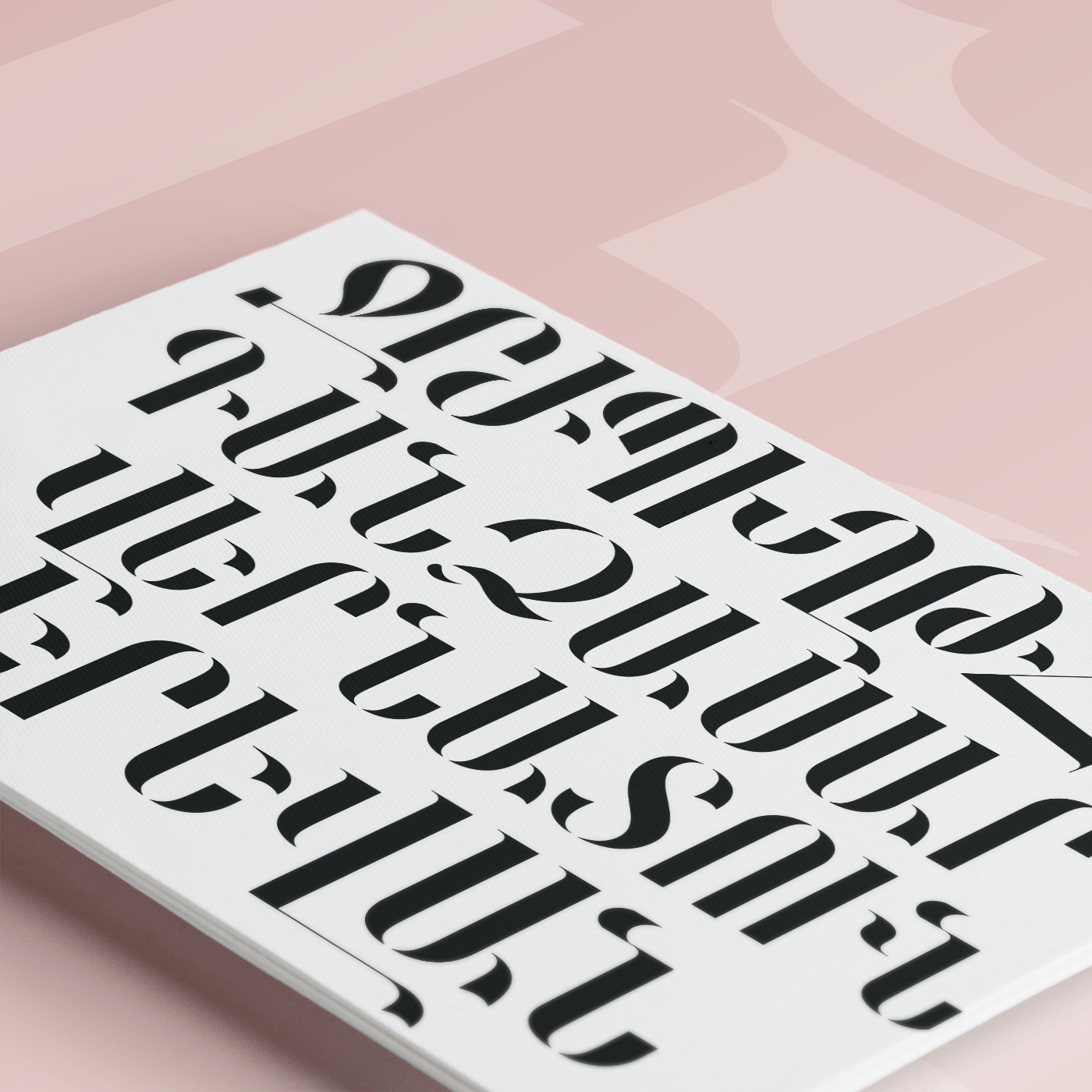
The final layout made an exclusively display type, which when in use needs to be modified because of extremely far extending terminals and unusual heights. The issue is solved by adding additional ligatures, even modifying stem heights, which is a common practice in Armenian traditional display typewriting.
RECREATION OF 1816

Original cover page of Armenian Yerkatagir specimen, published in 1816.
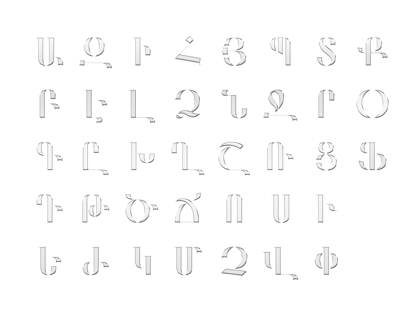
REVIVAL IN 2023
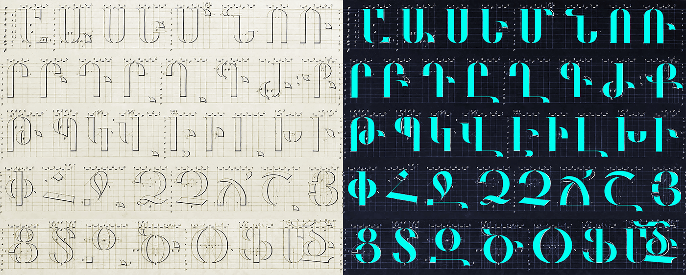
Major principles of the Mekhitarist Yerkatagir are preserved, while some glyphs are significantly modified.
All glyphs received equal stem widths. Հ header was too low, making the letter too short. Now moved upward. Բ had extremely small counter and a terminal below. Now adjusted lower, preserving the upper-heavy model anyway. Same happened to Գ, locating terminal on same height level with Դ. Ճ stretched upwards not to break down the row with smaller scale. Ջ counter sides originally slightly merging in below are separated. The open counter here preserves original mood, while borrowing modern look alongside. The rectangle in Ջ and Զ borrowed their look from Հ upper element, turning more dynamic. Ֆ lower oval lower curve reached the baseline. Ած monogram has ծ escaping from inside of the leg, though looking a little bit wide, yet preserves the uppercase line and avoids looking to small beside Ա. Տ reborn with Latin S principles, smaller upper part, bigger lower part, thicker mid-part of spine, upper arc nudged in a little bit. Ձ skewed up terminal, which originally looked weird, now kept its original look, making one of my favorites. Ց turned slimmer, opening the counter more, yet preserving the cupped upper terminal with fully horizontal lower one. Ծ finally convinced me to keep the right part terminal in the proposed mid-level position, though causing huge problems in text, for display typeface is good anyway. It would look good when forming ligatures or individually kerned in concrete cases.


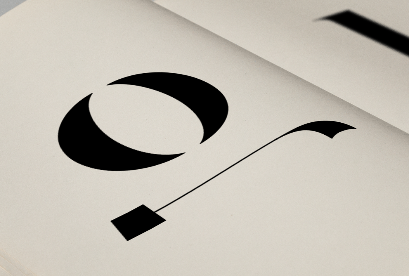


A monogram denoting the Armenian word Աստված (eng. God).
THANK YOU


