Brand strategy, design of the new identity and visual system for Barcelona's Clinic Hospital
Clínic Barcelona
Clínic Barcelona
Hospital Clínic, a university hospital founded in 1906 in Barcelona and an international reference healthcare center (positioned among the seventy best hospitals in the world and the best in the Catalan healthcare system), as a result of the multitude of logos and identifications that it had in its ecosystem and that dispersed its identity, commissioned us the project of creating a new brand and its strategic positioning, helping the institution to strengthen its story and facilitating the projection of a clear, unique, compact and renewed message. A project that includes strategic support for the definition of its mission, values and brand architecture in the construction of a new identity and visual languages.
The project began with a research phase (Design Research) to get to know in depth the institution and its satellites, the various audiences, their perception of it and to lay the foundations on which to develop the identity project for this centenary reference center.

During the initial phase, desk and field research included 34 in-depth interviews with professionals (management and strategy, assistance, researchers, residents, assistants…) and users (beginners and experts), in which they were asked about their perception of the institution, the service and their knowledge of the brand. Six observation sessions were also carried out in different services and environments (headquarters, maternity, emergency, hospitalization, day hospital and outpatient clinics). From the information collected, an analysis and subsequent extraction was carried out to obtain literals of the visions of each person (insights), which were then coded in order to group them anonymously (clustering), distill the findings and define the journeys of professionals and users. At this point, the Gaps model is worked on and the necessary opportunities and needs are identified and can be addressed from the branding project. For the brand project, we will focus only on the conclusions that have an impact on the brand and that can be worked from this, although the in-depth research work allows the institution itself to know more about the vision that people have of the institution and to be able to face other challenges from the design of the service and the user experience, improving care aspects.

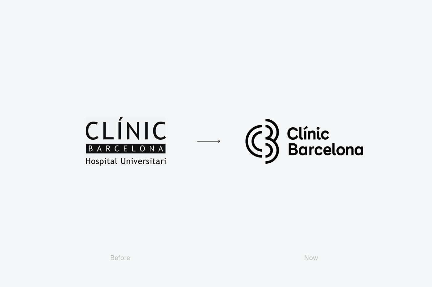
The conclusions of this research lead to a change of name from “Hospital Clínic de Barcelona” to “Clínic Barcelona”. This change becomes a combination of three factors: the existence of a “Hospital Clínic” in each province of the state (which takes away personality and uniqueness to the institution), the need to place ourselves in a global environment incorporating Barcelona in the name and taking a more international denominative structure eliminating the combination of the words “Hospital” and “Clínic” that share semantic meaning and internationally are not bought and is seen as a duplicity. However, this new name seeks to remove the weight of care through the elimination of the word “hospital”, seeking to facilitate the inclusion of the different institutions of the ecosystem: the Faculty of Medicine of the University of Barcelona and the Research Institute (IDIBAPS).
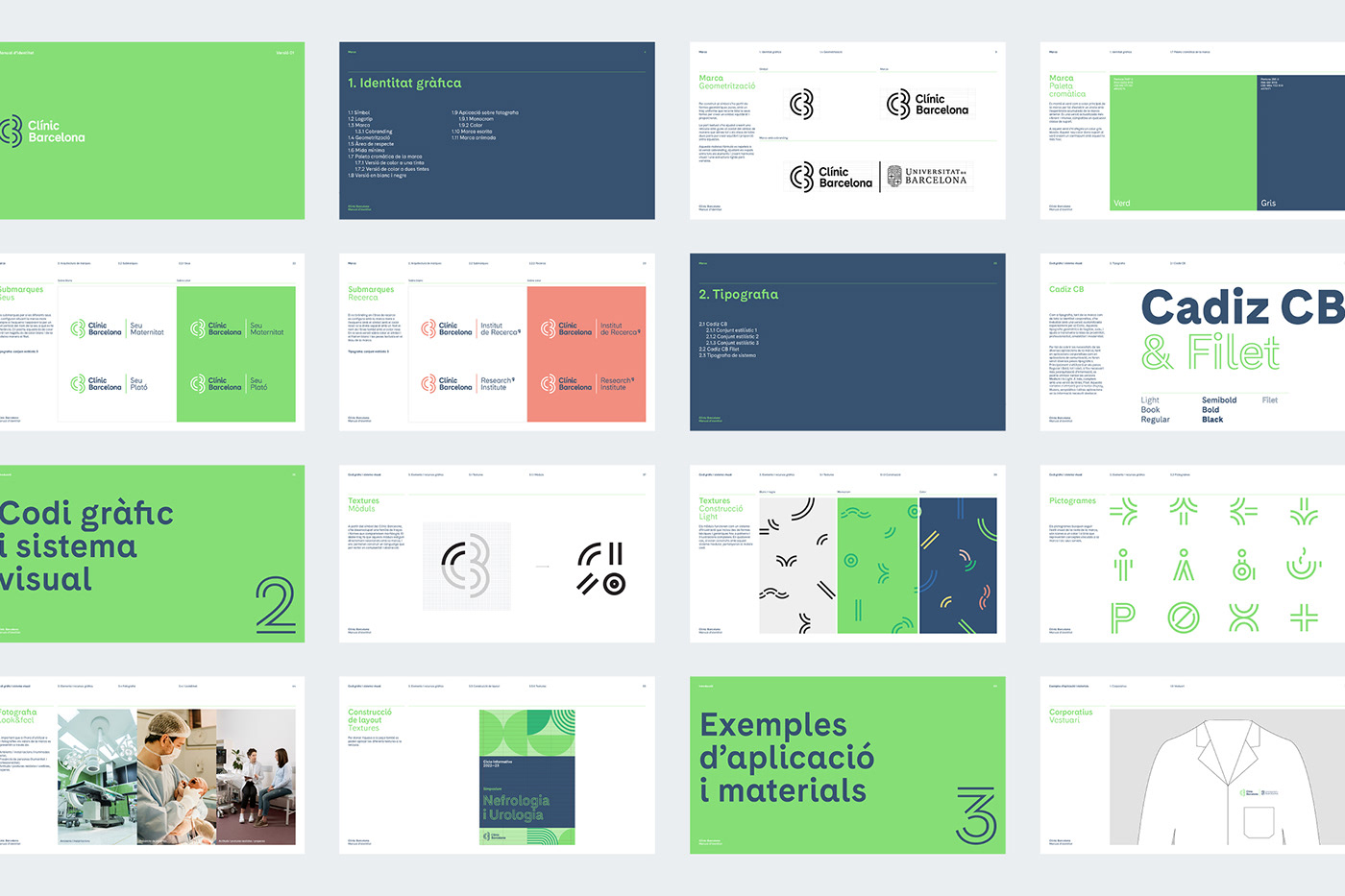
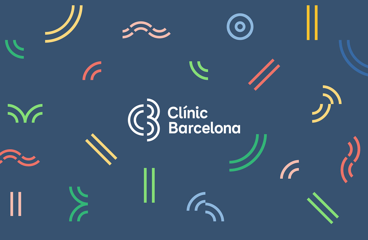
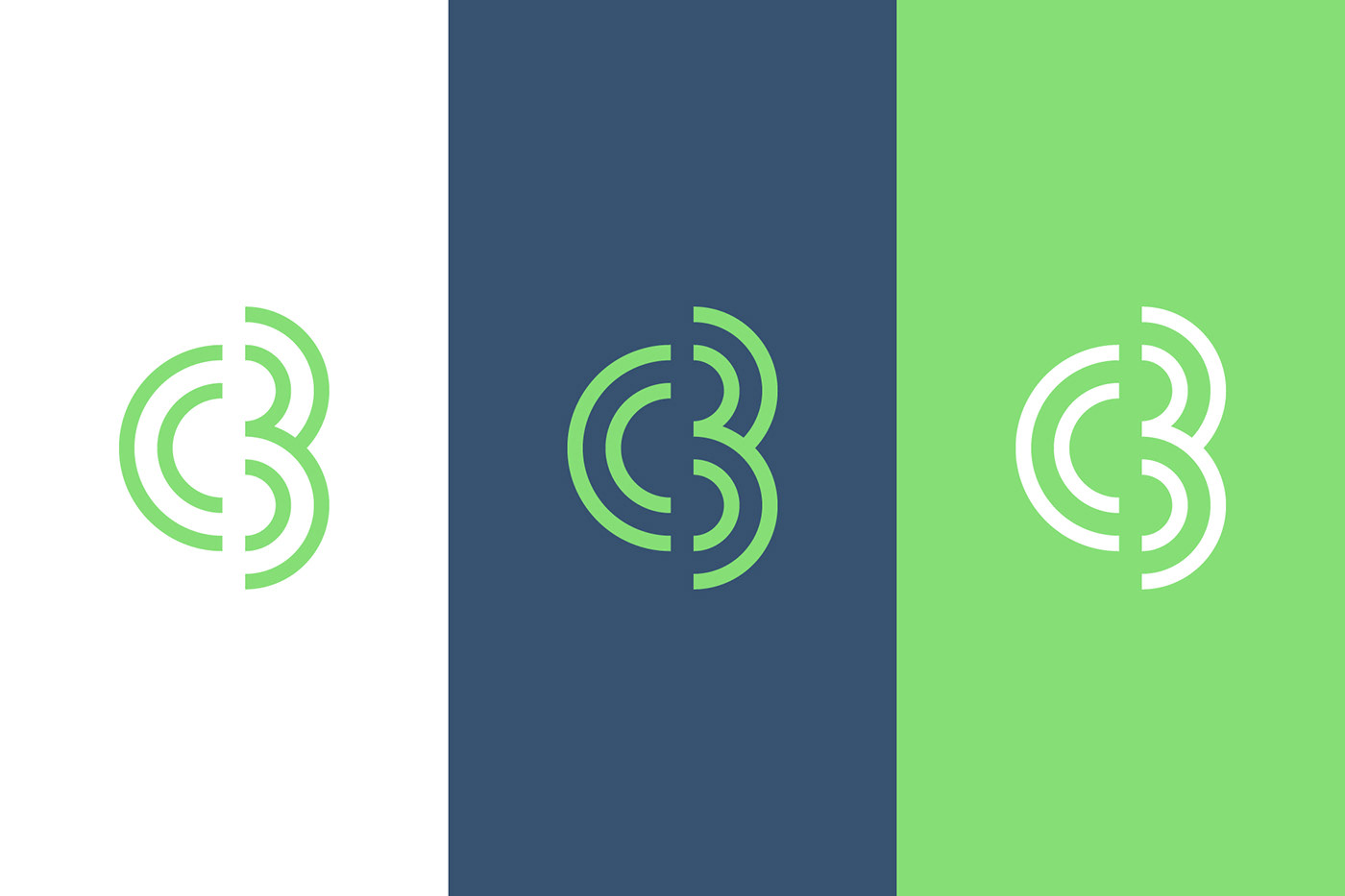
The creative concept is based on the idea of the “ecosystem” symbolizing the “C” of Clínic and the “B” of Barcelona open and permeable as if it were a biotope (the hospital as the habitat), an environment where the hatching of the biocenosis (community) and all the organisms that make it up and relate to it is facilitated (institutes, services, people, etc.). A geometric visualization that makes, at the same time, a reference to the panot of the flower of four petals so present in the streets of the city.
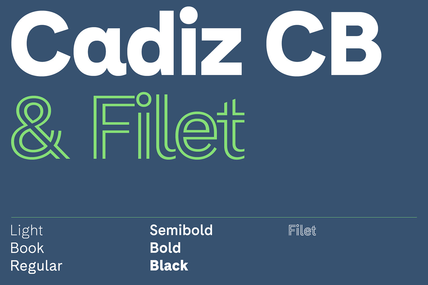
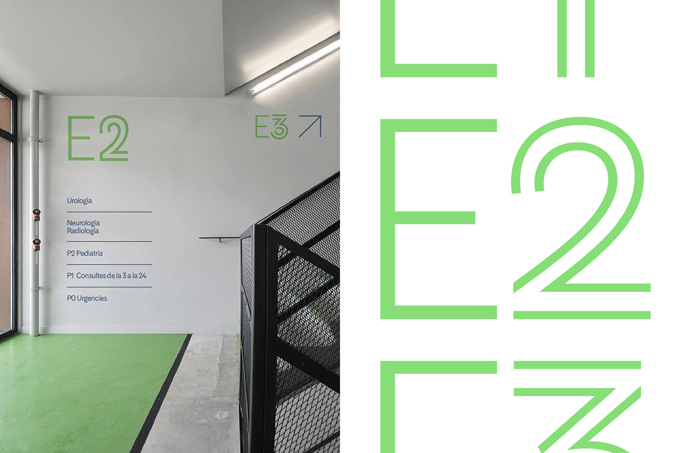
For the development of the identity we work with Luzi Gantenbein to customize its typography “Cádiz” and making a unique and exclusive version for Clínic Barcelona according to the initial prototype designed by Laura Meseguer, seeking to work a friendly, soft and unique typography.


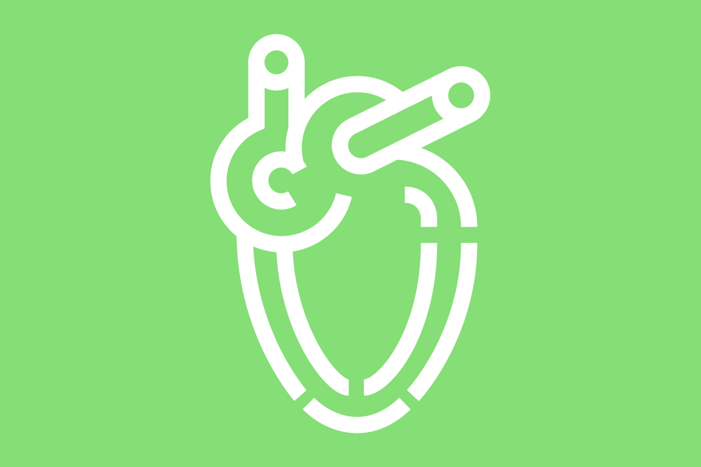
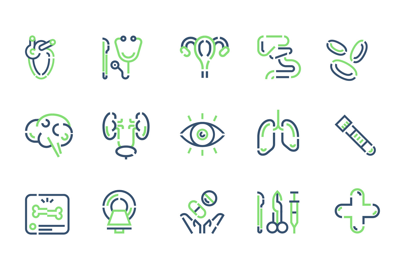
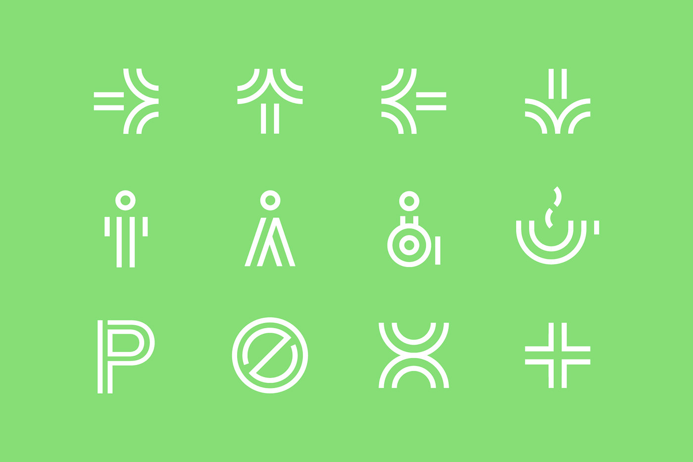
For the graphic system we work in a modular way starting from the quarter circle as the initial unit and from this element we will create illustrations to visually customize the institutes, signage elements and textures to create graphic elements with which to constitute an identifiable system.
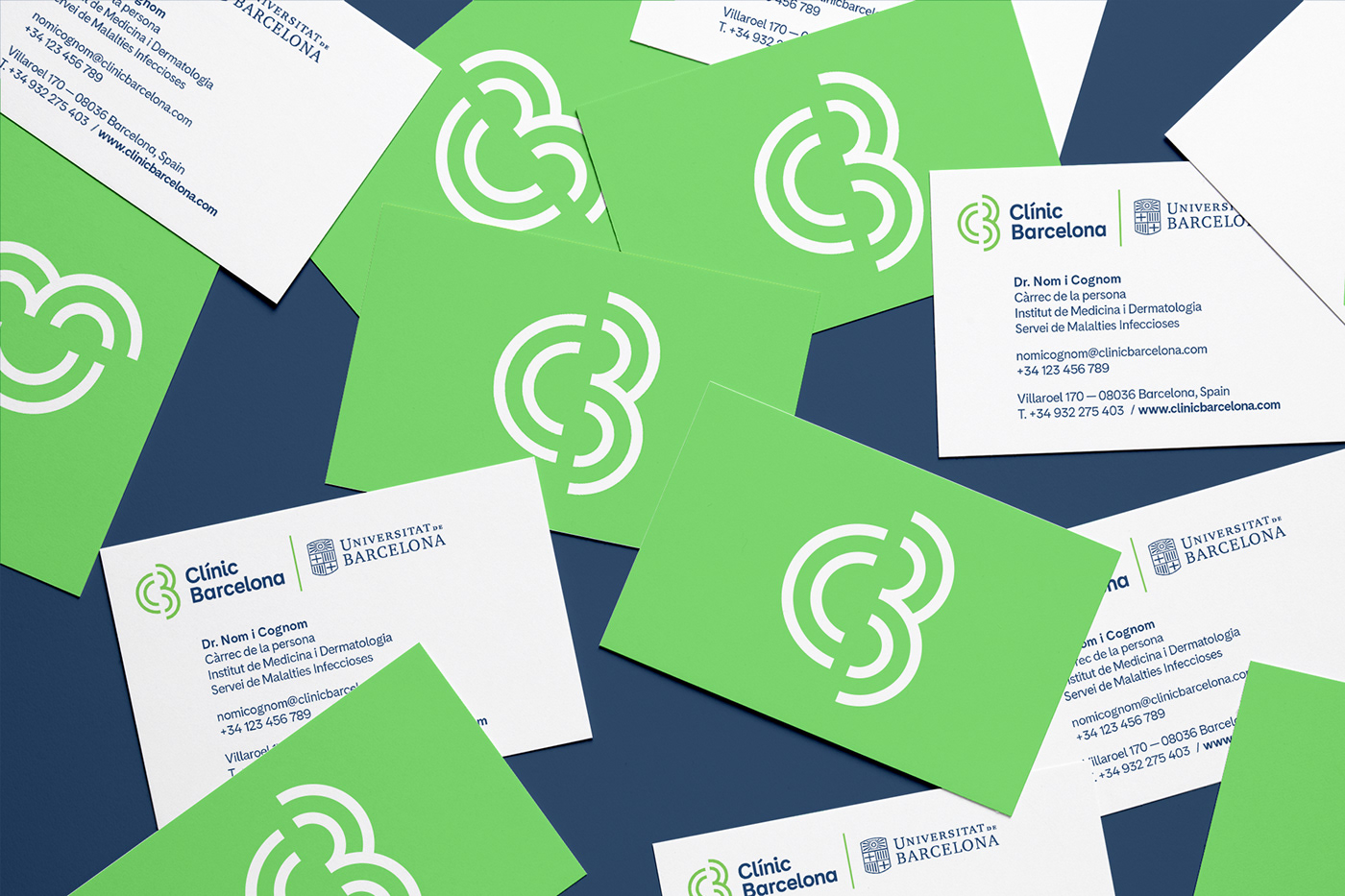
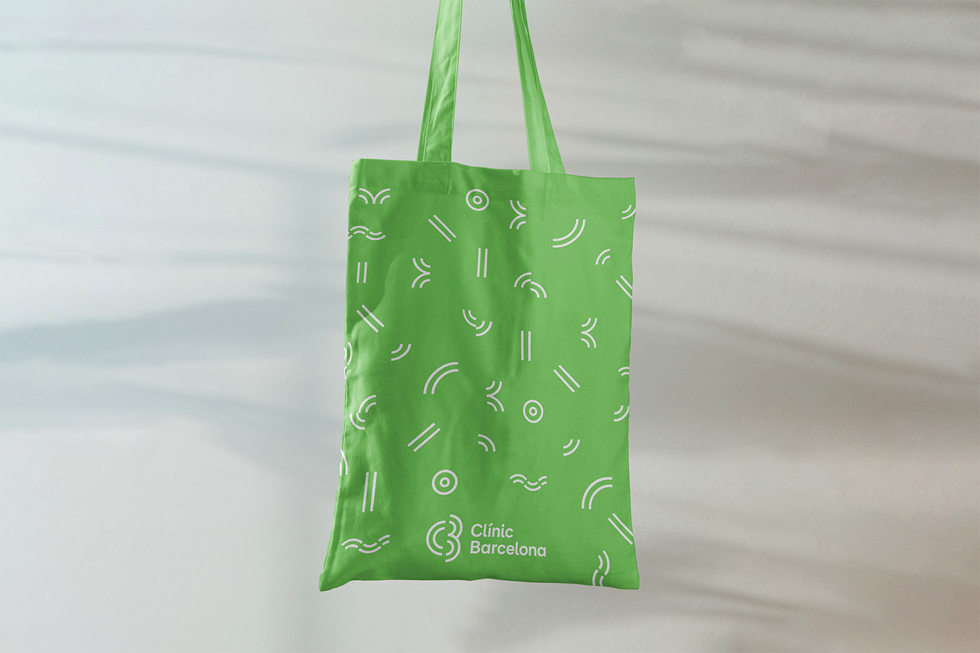

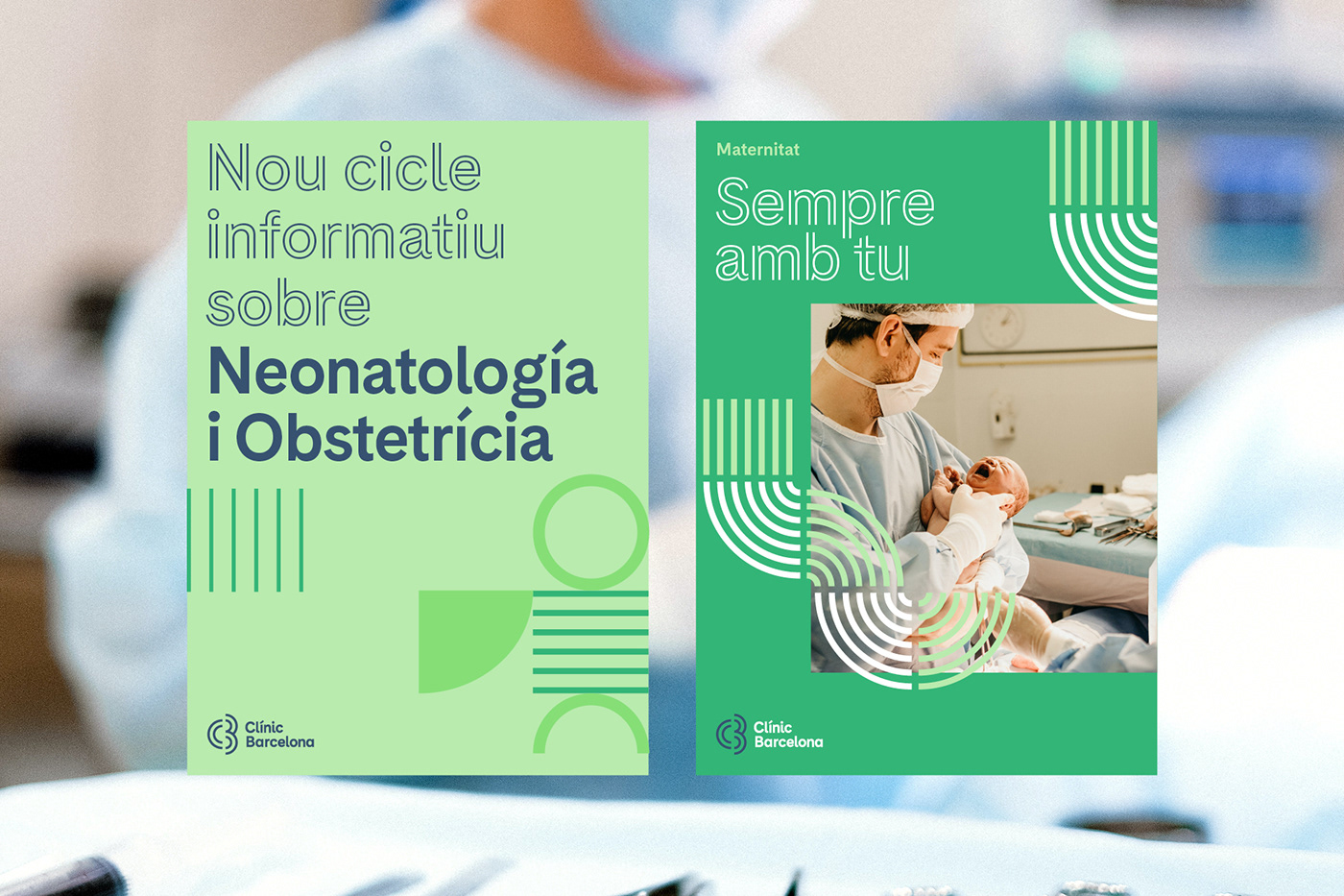
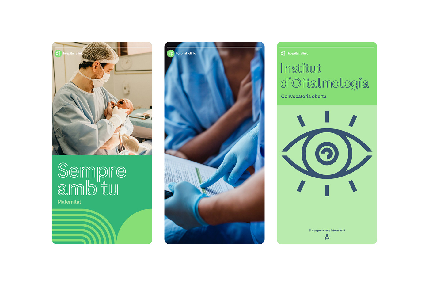
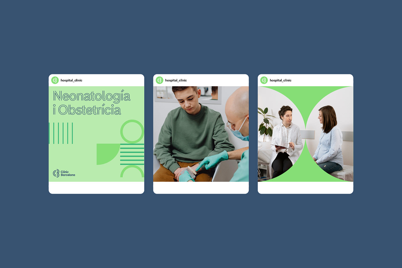

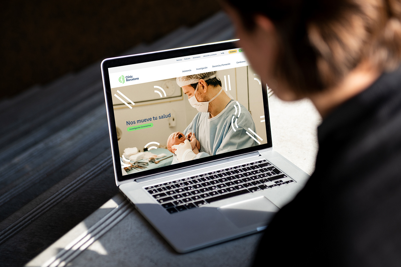
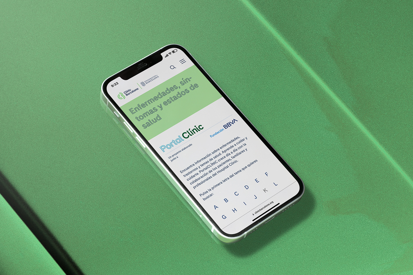
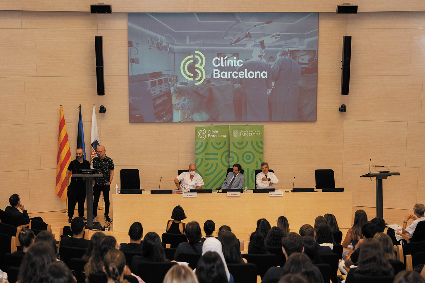
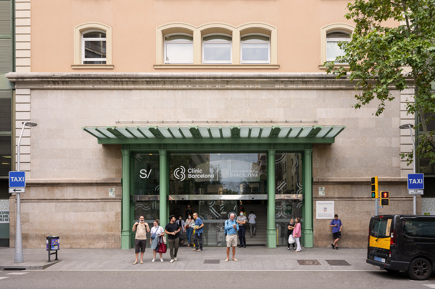
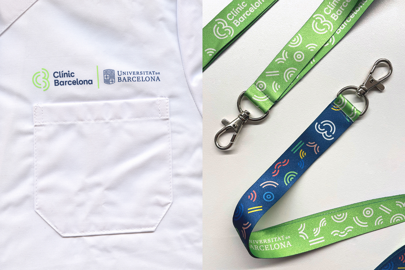
The final scope of the project ends with the definition of the system, the creation of the bases, the initial manual for the use and style of the brand and the creation of a folder of graphic and visual elements to be applied in all the communication channels of the institution: web, clothing, signage, computer systems and waiting rooms, steam track, physical and electronic appointments, printed and informative materials, Portal Clínic, audiovisual elements, etc. An application that will be implemented over the course of the next few years and that will ultimately have an impact on the environment and experience of users and even on their relationship with the institution.