


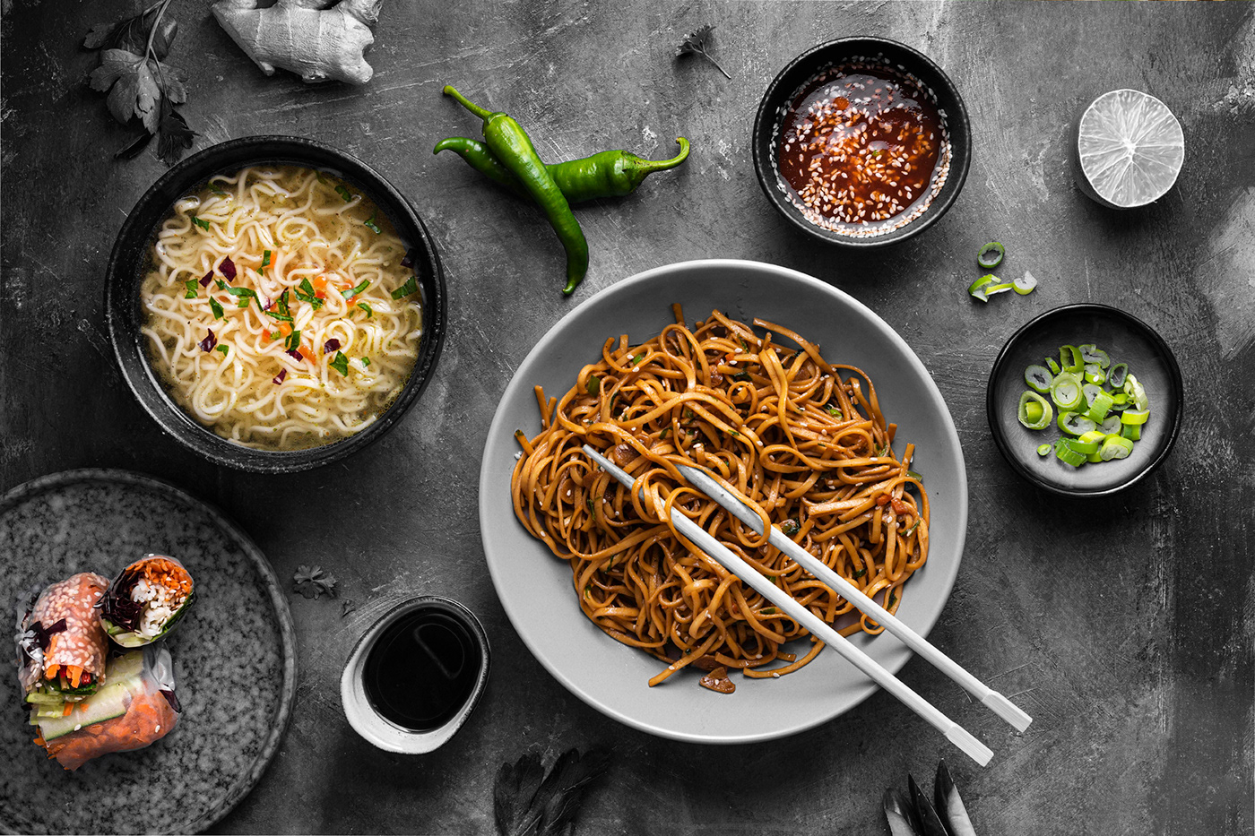
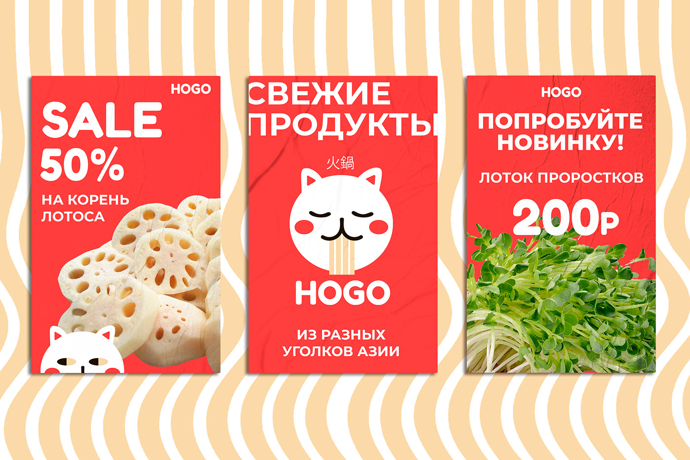
ХОГО - сеть магазинов азиатских продуктов с большим ассортиментом.
Задача: разработать не только логотип, но и фирменный стиль, который будет использоваться в рамках интерьерного оформления наших магазинов.
HOGO - is a chain of Asian food stores with a large assortment.
Task: to develop not only a logo, but also a corporate identity that will be used as part of the interior design of our stores.
Task: to develop not only a logo, but also a corporate identity that will be used as part of the interior design of our stores.


За основу логотипа я взяла первую часть иероглифа, который мне напомнил мордочку кота. Проработав её у меня получился вот такой милый кот, который поедает лапшу.
For the basis of the logo, I took the first part of the hieroglyph, which reminded me of a cat's face. After working it out, I got such a cute cat that eats noodles.


Вариация других эмоций нашего котика.
Variation of other emotions of our cat.


Есть интересный проект? Напишите мне в Telegram
Фотографии взяты с сайта https://ru.freepik.com
Мокапы https://ru.freepik.com
https://www.ls.graphics/free-mockups?52edfe79_page=4


