


What does living legend
Fito Páez’s latest
album trilogy looks like
His almost forty years career turned this hispanic music, literature and cinema hero into a widely famous mega-star both sides of the Atlantic where this project became unanimously acclaimed by the critic. Fito Páez became a Grammy nominee in the category of Best Latin Rock or Alternative Album twice in a row.


Vinyl & CD Ed.
The following’s a brief review about the design process of his latest music material titled Los Años Salvajes (Spanish for ‘The Wild Years’) which took more than six months of development before being released as a limited edition trilogy box-set back in 2022. Also, each copy was hand-signed by the artist himself who conceived its visual identity in collaboration with the art directing duo, Max Rompo and Ale Pippa. The three of them spotted that totally different visual languages were needed in order to match the completely contrasting mood of these albums and the particular styles and époques that each one represents.
There’s a close portrait of the artist in his youth on the cover of the first volume, Los años salvajes (Vol.1 - Rock/Pop songs). After carefully scrutinizing tons of archives this almost blind white and apparently illegible shot appeared on a print photo contact sheet from a shooting that Fito did back in his hometown, Rosario, with photographer Alejandro Lamas in the early 80’s. Not only hasn’t that material been to press before, but this particular portrait remained unseen by literally nobody till then. So after digitalizing it and numerous restorative treatments, this diaphanous figure of a flawless young Páez staring at the marvelous years to come emerged and it looked undoubtedly iconic.

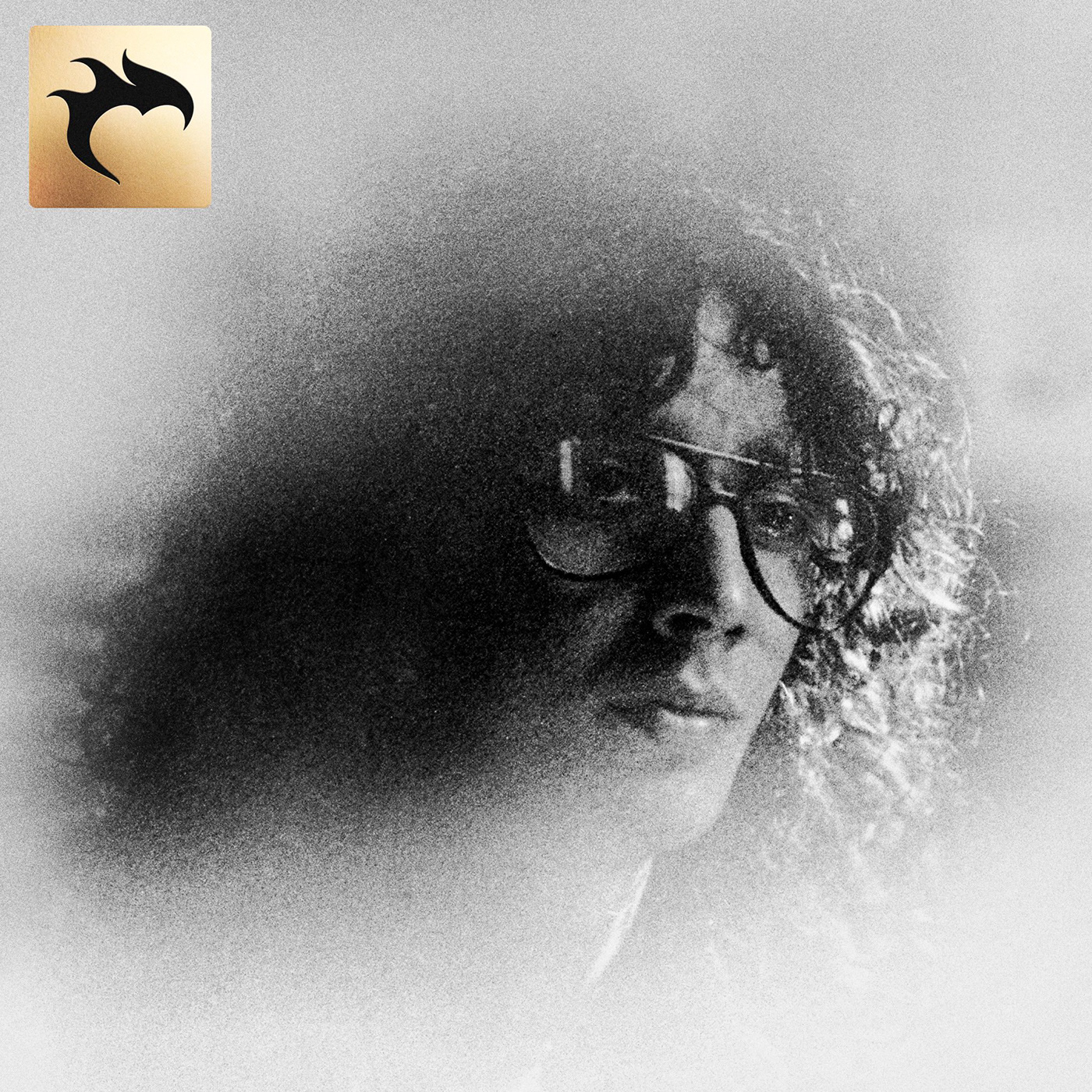


Left: A recovered pic of Páez in his youth appears on the front cover (Ph: Alejandro Lamas)
Right: A contrasting actual portrait displayed on the back cover and inner sleeve (Ph: Sebastián Arpesella)


Inner details print on Pantone silver spot ink


Preliminary proof vs. final result. Inner sleeve print in gold Pantone spot ink
The second —and double— volume, Futurulogia Arlt (Vol.2 - Symphonic), is a collection of symphonic classical pieces that Páez composed inspired by the work of Argentine cult novelist Roberto Arlt in the 30’s: Los siete locos (The Seven Madmen). The design duo commissioned a series of CGI artworks from 3D artist Gonzalo Kaiser based in the illustrated cover of the book’s first edition and the visual diaries on the same novel by painter Daniel Santoro which result in a bold mix of tense dramatic/conspiratorial and smooth erotic metaphors.
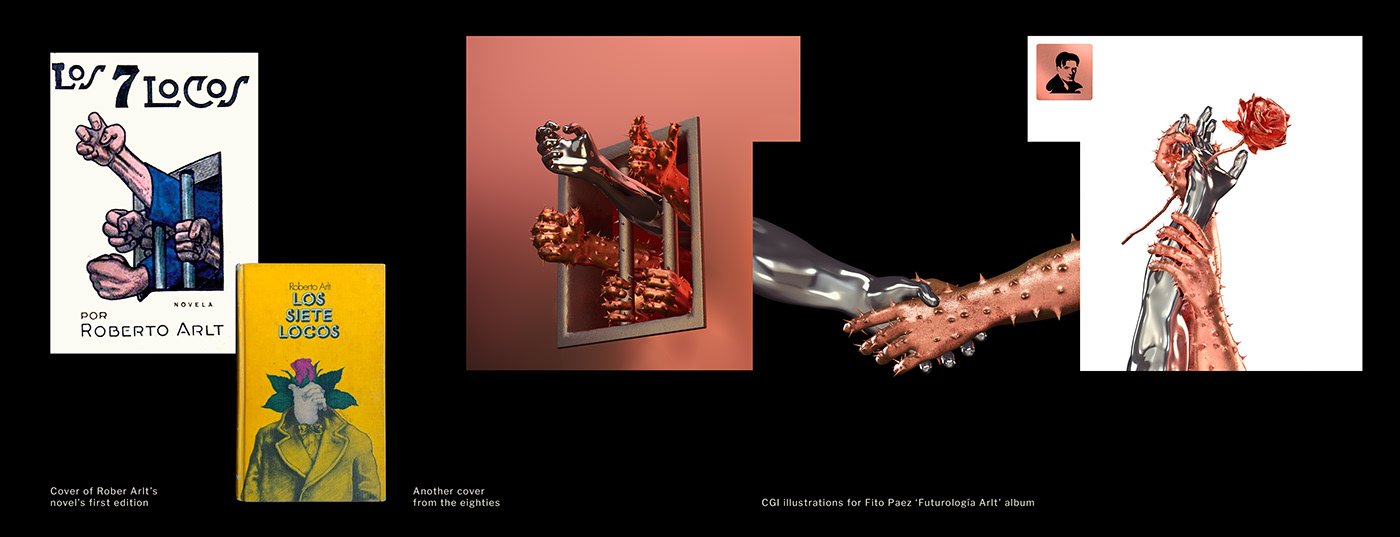
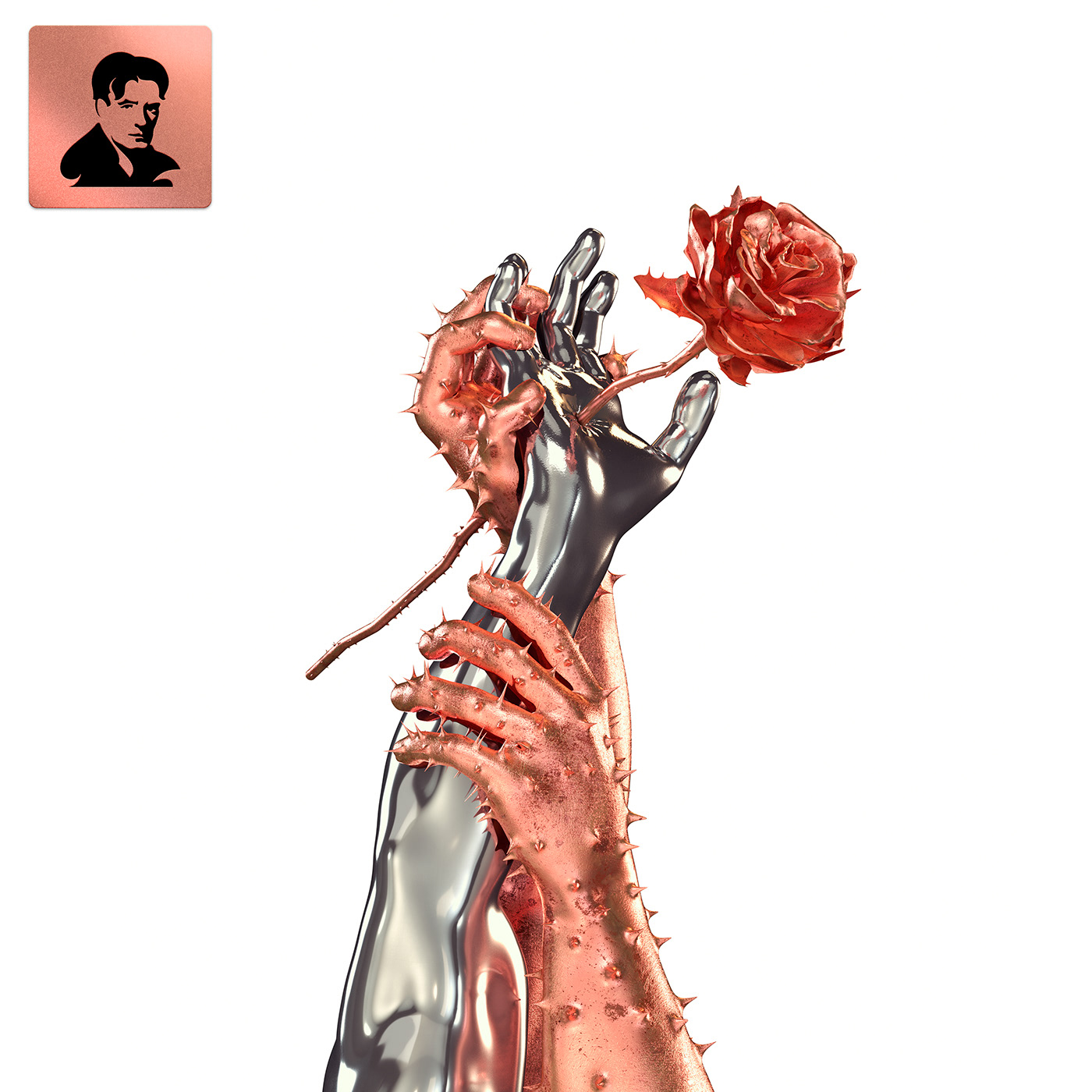


Every illustration was based on 'The Seven Madmen' novel's cover
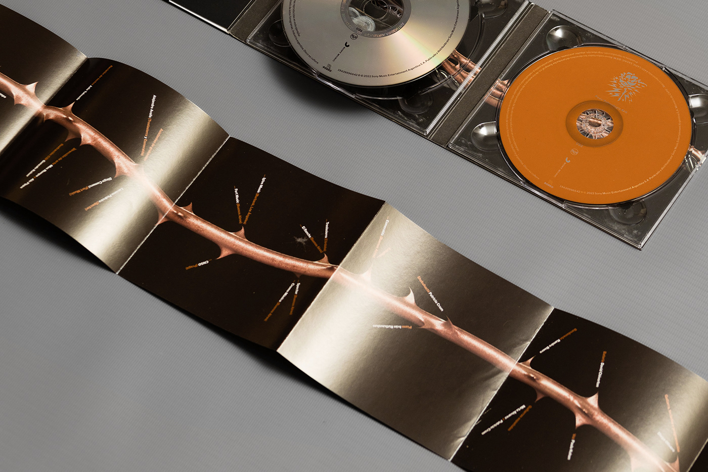
1.2 meter long, folded inlay booklet


Preliminary proofs including sketches from Arlt's bust illustration
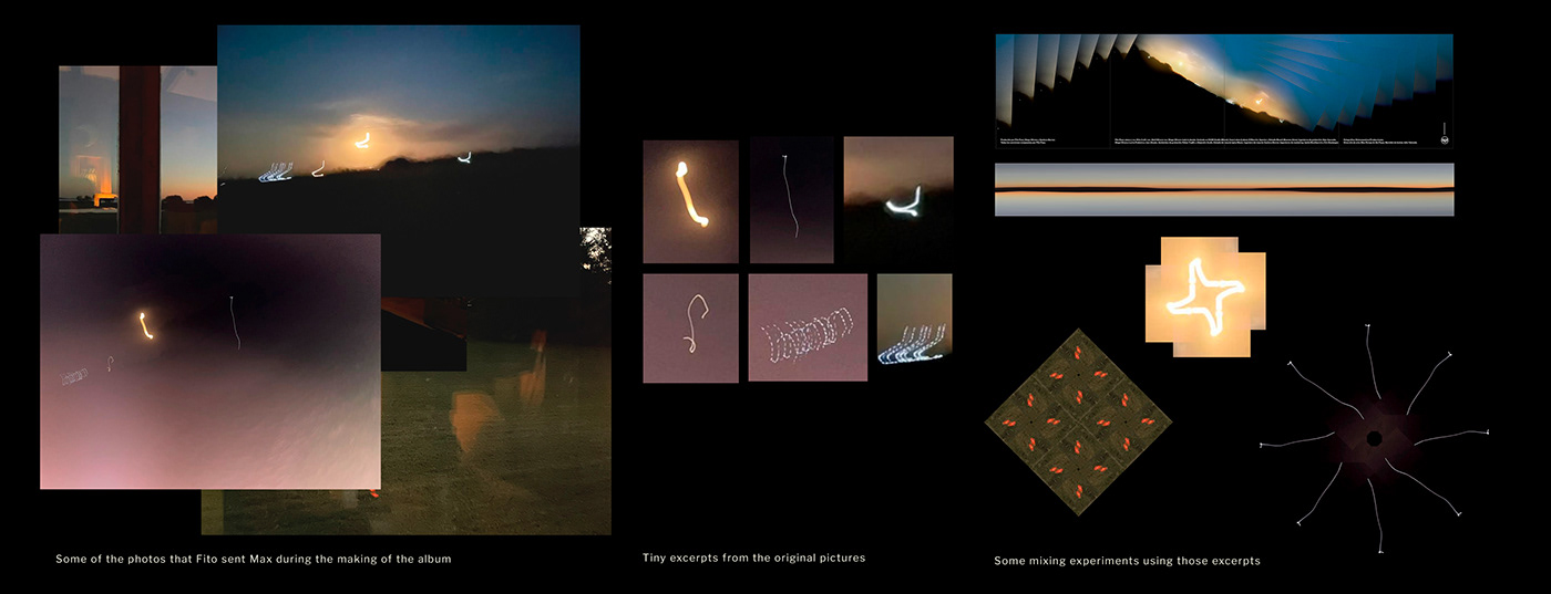
The many snaps that Fito shared with Max via WhatsApp during the midnight recording sessions of the third volume, The Golden Light (Vol.3 - Piano) became the perfect playground to get the sense of this jazzy introspective album. After some ping-cropping and pong-mixing tiny excerpts of them in their phones, these long exposure rural and studio lights began to make sense. So it ended up in a series of digital collages and abstract compositions on the cover of the third and last part of this trilogy. Those minuscule golden print patterns evoke the artist and listener’s inner journey while listening this beautiful piano pieces as well as the eye floaters phenomenon when looking directly into a strong source of (inner!) light.
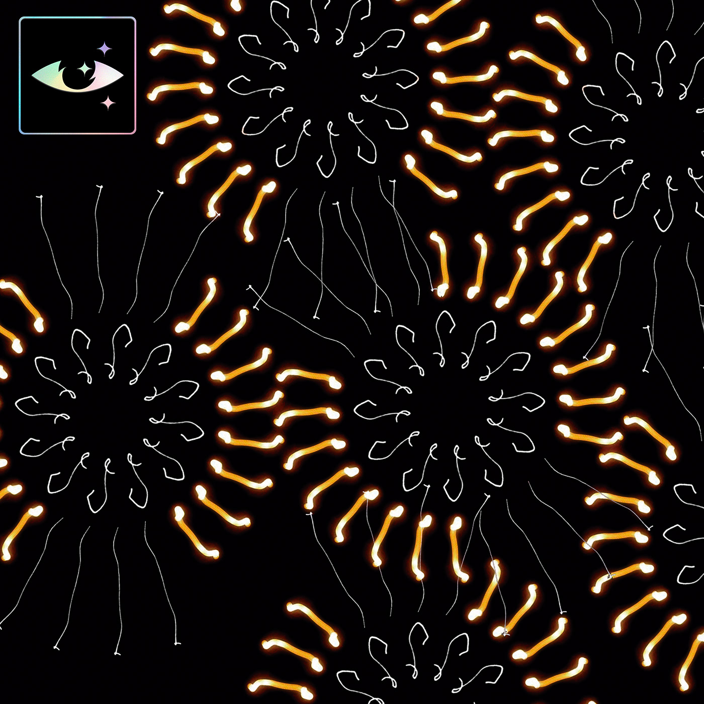


Left: Tiny marks cropped from long exposure mobile photos were used to make abstract and spiraled compositions
Right: One of Fito's original photos, taken with his own phone, is included in the album's booklet
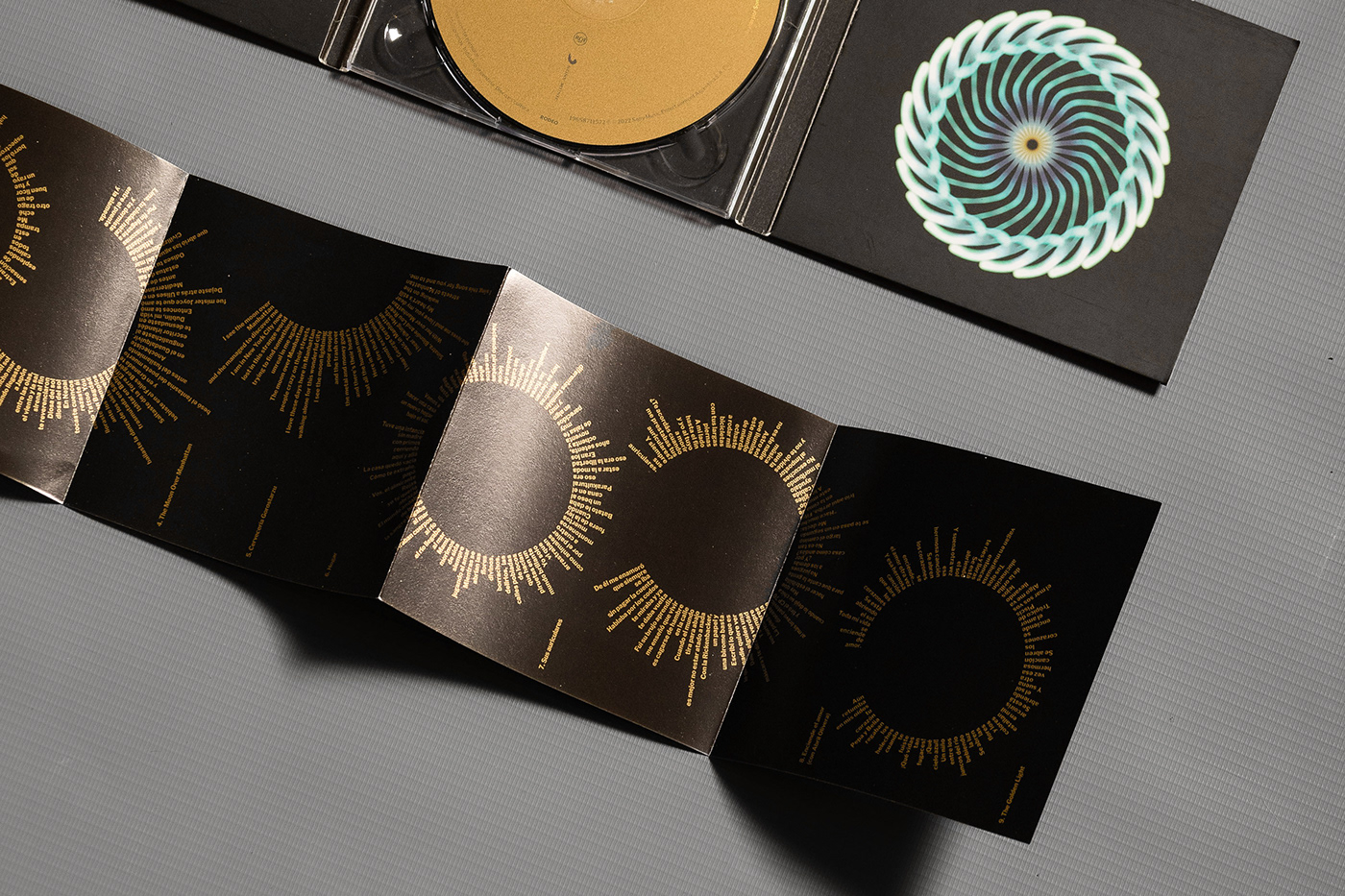
Playful typographic diagram for the lyrics


Sleeve's preliminary proof vs. final result print in gold Pantone spot ink as well as the CD's surface.
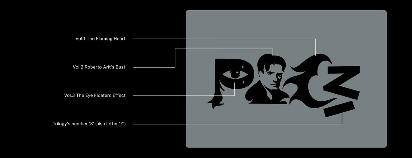
Actually, there is a metallic/holographic foil tag on each album. A flaming heart evoking the wild years from the first volume, a bust of Roberto Arlt, whose novel inspired the second one, and those same floaters over the figure of an eye in the third one too.
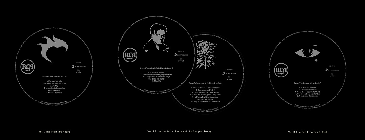
The same identifier is displayed on each disc’s label (see below...)
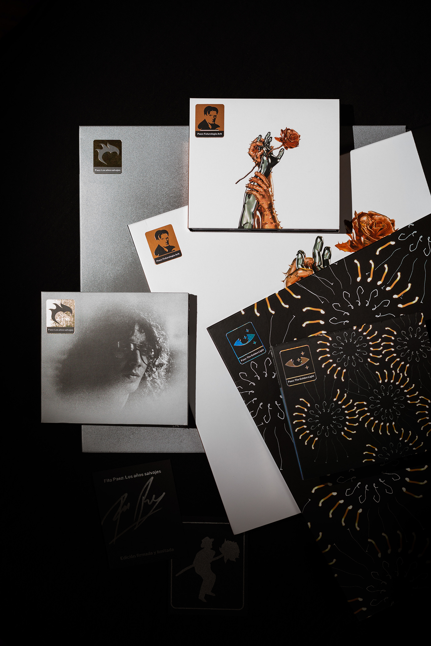
But beside being a good minimal, non-intrusive, way of keeping visual consistency between such disimilar cover artworks, it also serves as a codification of the trilogy’s box front cover layout, where all of these tags appear together, plus a fourth sign (both a number ‘3’ and a letter ‘Z’), to subtly let the author’s surname read inline: P A E Z
On each copy’s back side there’s one of 32 different illustrated and hand-signed authenticity certificate. Most of these illustrations were taken from several spots of the three albums plus some characters from the official videoclip that Pippa and Rompo animated for the only Futurología Arlt’s promotional single, Amor es dinero/Remo Erdosain that would require opening a whole new chapter, but you can see it by clicking here.


Preparing certificates at Rompo's studio, there're 32 different illustrated silver ink screen-printed certificates on black pulp paper. Each one hand signed by Fito himself.
Without similar precedents, this ambitious production becomes a highlight in Spanish music, not only because of Páez famous composing skills all through these years, but also because it crystallizes a wide spectrum of genres and sonorous styles being reunited in a same artist's unique edition. Most of this has to do with the effects of isolation due to COVID-19 lockdown on Fito’s life and his personal commitment to get more than forty new musical pieces born in such a short period of time. His collaborative relation with Rompo remained thoroughly fluent by countless late-night video calls during this unanimous hard times.
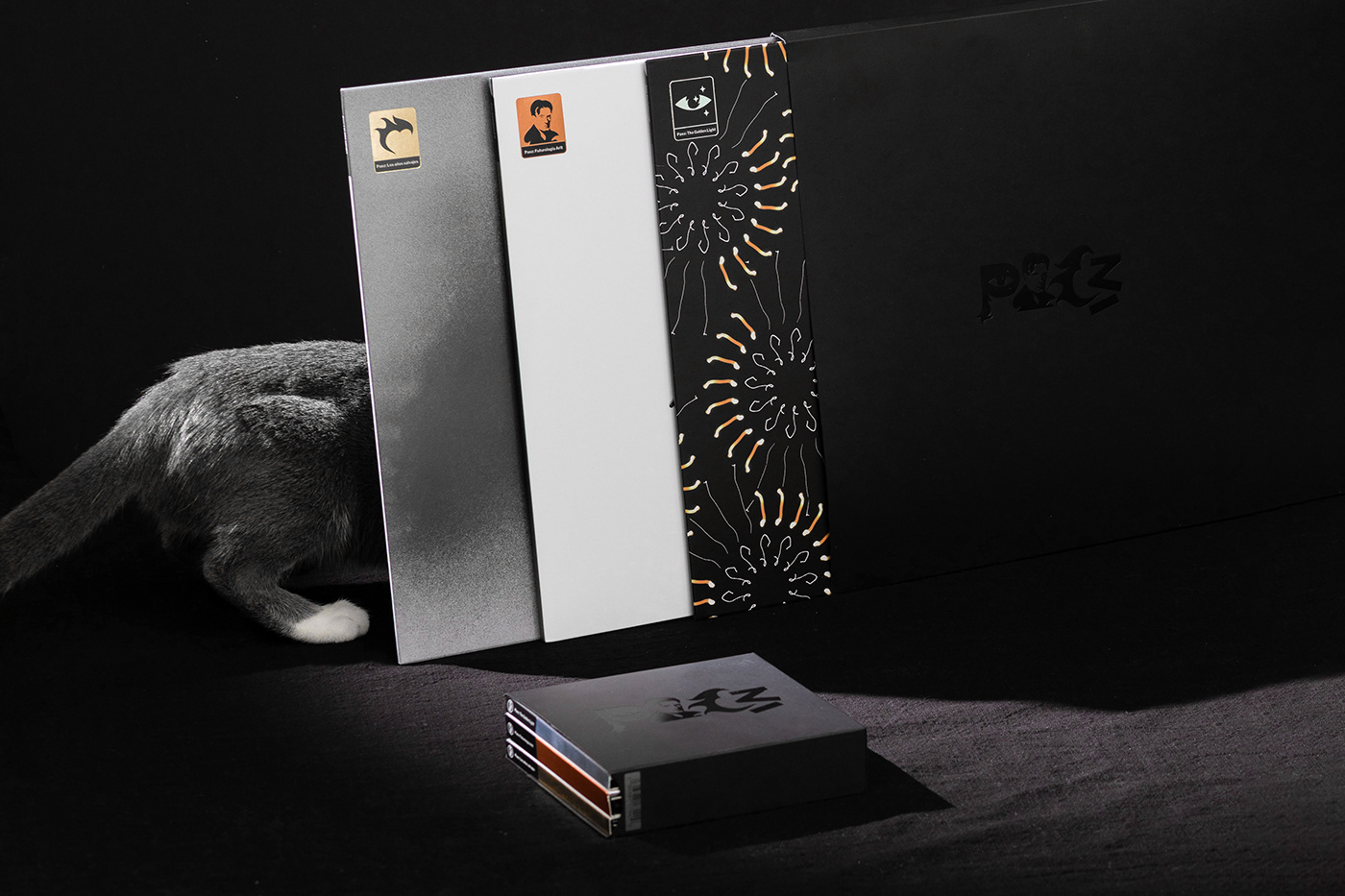
EDITION
3 albums(4 discs)
41 tracks.
Produced by Fito Páez, Gustavo Borner and Diego Olivero.
Recorded at Capitol Records, Igloo Music, East West,
Czech National Symphony Orchestra, Casa Lobos, Esmeralda,
Traslasierra, El Rancho, Spector, Fort Music and Estudios Rosetti.
Published by RCA / Sony Music in 2021/2022.
CREDITS
Design and Art direction: Max Rompo & Ale Pippa
Print production: Max Rompo, Jorge Massa and Morello.
Photos: Max Rompo & Fede Paul.
Animations: Ale Pippa.
Archive photos: Alejandro Lamas, Sebastián Arpesella,
Guido Adler and De las nuestras.
CGI graphics: Gonzalo Kaiser.
Literary advice and proof-reading: Julia Taboada.
PRINT PRODUCTION DETAILS
Case: Silver spot ink on black pulp cardboard. Metallic black foil and embossed logo at front.
Case: Silver spot ink on black pulp cardboard. Metallic black foil and embossed logo at front.
Anti-scratch biaxial oriented polypropylene matte film lamination.
Albums: Holographic and metallic foil stamping logo at front
Albums: Holographic and metallic foil stamping logo at front
Gold, Silver, Metallic Blue and Copper Pantone spot ink lyrics booklet.
Authenticity certificate: Screen printing by House of Prints.
Ink silver on black pulp cardboard.
Authenticity certificate: Screen printing by House of Prints.
Ink silver on black pulp cardboard.
Hand-signing by the artist with Silver Stack Sharpie® marker.
Extra pictures


1. 'Los años salvajes', Vinyl and CD editions
2. Metallic foiled spines
3.The flaming heart, Arlt's portrait and the shining eye
4. Black foiled 'Paez' logo on the cases's cover
5. Each copy comes with a signed certificate by the artist
6. Hot stamping metallic foiled album identifiers
7. Meow!