


Awaken curiosity. Darkeinu rebranding
Since 2010, Darkeinu has been creating textbooks, presentations and other materials for Jewish classes. Brand is well-known among teachers and wives of rabbis who manage kindergartens and schools in Jewish communities. But over time, Darkeinu launched new formats and products: cartoons, quests, video workshops, holiday scenarios. Now the brand needs to form an image for a new audience ― children and parents.

Logo
One of the important decisions was to reduce language redundancy: Hebrew became the main one, English remained for duplicating the name. English is also used in the OPEN YOUR J-WAY brandline, which complements the corporate block.
Client contacted a design studio from Tel Aviv to develop logotype based on our font. Rounded shapes and active colors here reflect the friendly and emotional nature of the brand.

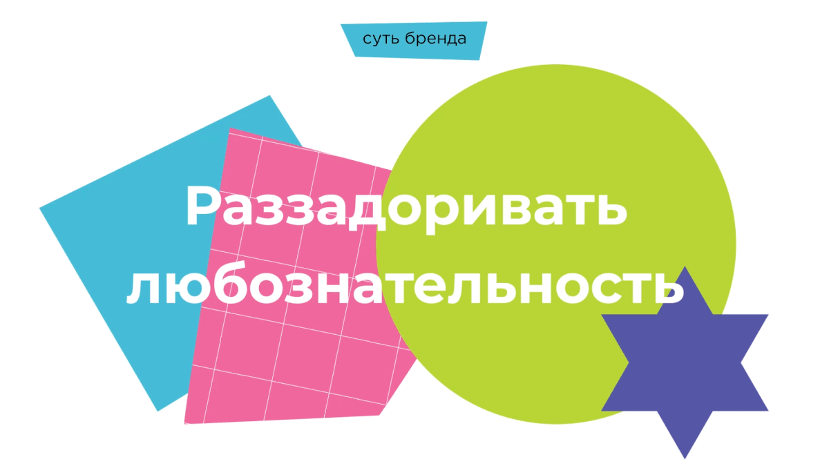
Corporate identity
Branded graphics, based on collage technique, includes large geometric shapes, logo elements, images of Jewish culture, linear graphics and photo images of Judaism.
Textures add a bright, dynamic feeling to the brand and reflect its character. Darkeinu can adjust the tone of the message due to the number of objects and colors in the composition.


Sub-brand system
Mono-brand architecture obliges to develop identity principles that will both unite sub-brands under the parent brand, and differentiate them. Sub-brands, on one hand, united by a corporate block. On the other hand, they have different colors that appear in the brand name in Hebrew and different descriptors such as EDU, PRO or BIZ.
Due to the smaller color diversity, the sub-brands identity looks more restrained. Still it is not devoid of dynamics and drive ― thanks to active geometric shapes and textures.


Communications
The key messages are different for each audience. For example, to build awareness among parents and children, Darkeinu speaks about new knowledge and impressions that await them on the way.
All messages begin with the words "we have ways". This is how we associate it with the Darkeinu name, which translates as "our way".


The brand now has tools for self-expression that will help it to communicate with all audiences. It is important that during the rebranding Darkeinu received a modern sound and bright character, without losing its ethno-cultural background.

Creative team
Art Director: Irina Schmidt
Strategist: Irina Mokrousova
Analysts: Maria Megrabyan, Irina Mokrousova
Designers: Margarita Popova, Natalia Lytkina
Project Manager: Marta Bekker


