

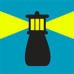
Free food, cool stuff, stranger danger? Be a beacon. Tell those around you with the push of a button. And the world will listen.
Beacon was created at the CSUA Hackathon on May 2-3, 2014 at UC Berkeley. It uses iBeacon technology through Bluetooth LE from the iOS7 SDK. Sends location-based "beacons" (notifications/signals) to all people in the area without the use of GPS.
I took on the role of both UI and Interaction Designer. Understanding what kind of interaction was most important for the app led to the overall design, as well as helped us iterate through early UIs.
From the beginning, we were inspired by the idea of a big button (think of Staple's Easy Button).
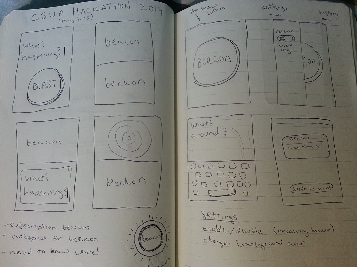
Sketches
To start, I drew lo-fi wireframes for different ideas of how the app could look. Since our original idea was a big button, my first sketch was of a skeuomorphic button with the phrase "What's happening?". When a user started typing, the phrase would disappear and their beacon would be written in its place.
Then, as a group we played around with other ideas for the name, and words that sounded good together. Another word we liked was "beckon", with its similarity in sound and syllables to "beacon". and I tried encorporating it into my next design.
I thought about how users would want to know they were receiving beacons or not, since the technology would work with their app closed and screen off. I believed users would also want an easy way to turn it off, in case of meetings or classes. This design featured two buttons — now rectangles instead of buttons — that controlled receiving notifications (beacon) and sending them (beckon). When pressed, the beacon button would pop up a pulsing radar image, and when beckon was pressed, it would open a "What's happening?" box like the first sketch.
All this can be seen on the first page of my sketches.
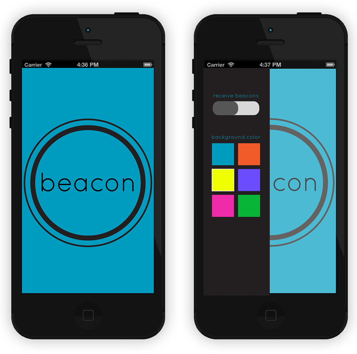
I made a nicer version of this design in Illustrator, to get a more full effect and in order to show my team. The right image is what the app looks like when you open it, and the left image is the app when both buttons are pressed.
At this point in the hackathon, we had decided that the word "beckon" did not fit our multi-purpose wants for the app. Beckon means "to gesture for someone to come nearer" but because we wanted people to send any kind of beacons, including things like safety warnings (for which you inherently do not go nearer), we decided to only stick with the word beacon.

After showing this design to my team, I received mixed feedback. People liked the two colors, and liked the font, but did not necessarily agree with having a large button with a pulsing image to denote that it was receiving beacons. One person said that it would actually make them worry about using this app, because it was so big and radar-like.
At this point, we started thinking more about the interaction we were interested in, and could not think of a good transition for the main screen when the keyboard was in use (because of the two buttons using the entire screen separately).
I decided to go back to our original interaction — one button. It was simple, clean, and very easy for the user to figure out the main interaction without getting distracted by other things on the screen. But we didn't want just any skeuomorphic button image. I was inspired by apps such as Shazam to create a button that followed the iOS7 Flat UI design principles while still feeling like a button.
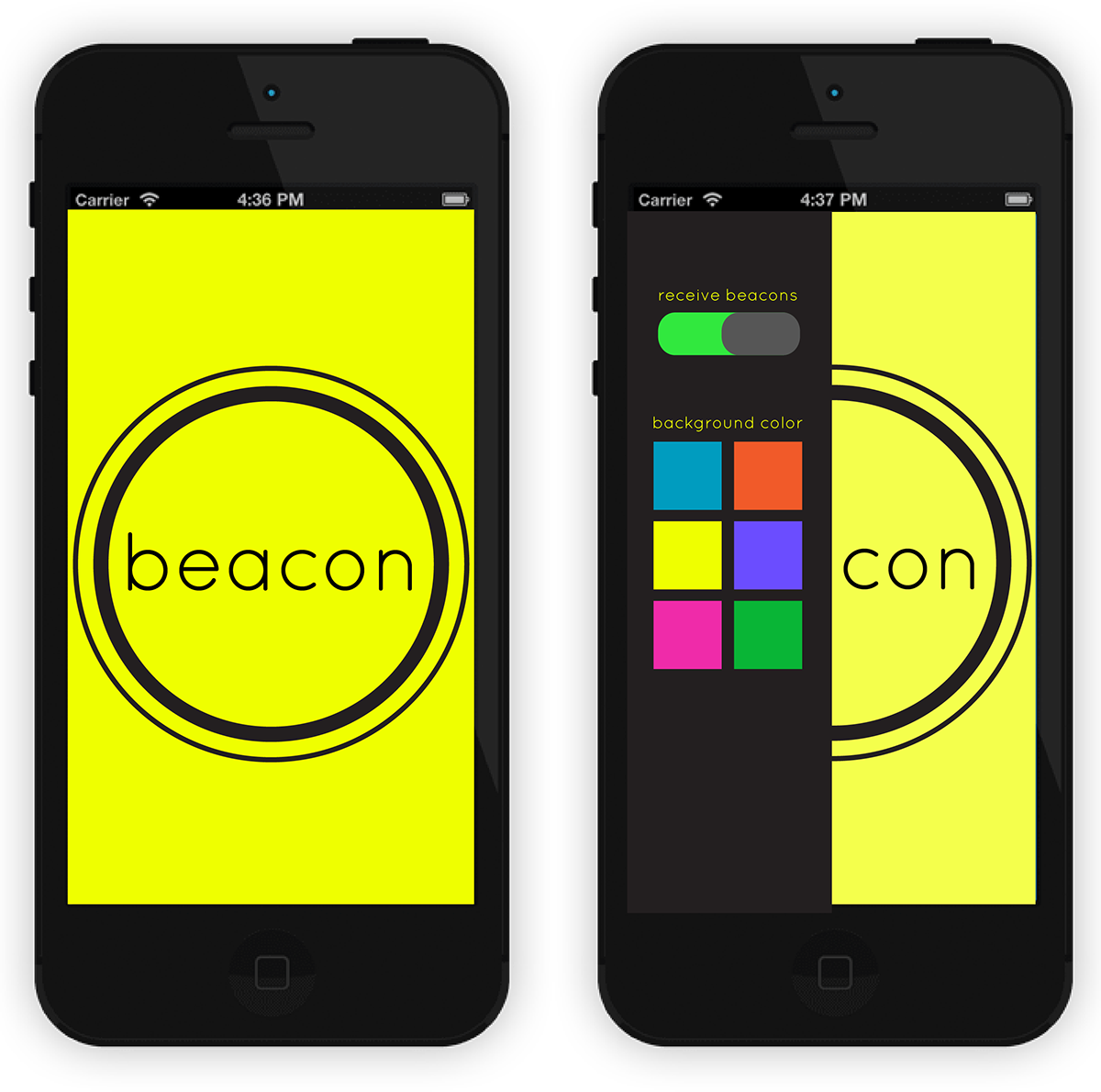
Also, after doing a mini-survey of other iPhone app layouts, I noticed that many apps have inherent swipe movements to open sidebars for things like settings or navigation. An iPhone-owner in our group told me that he even expects that when he swipes on an app it will open a side-screen. We encorporated this into the newest design. The sketch can be seen on the second page of the notebook at the top photo, and the Illustrator version is seen below.
Above: Left image is the main screen, right image is after a swipe to the right with the settings shown (receive beacons switch and buttons to change background color).
The colors we chose for the backgrounds are: #009CBF, #F15A29, #EFFF00, #6B4DFF, #EF2BA9, #09B536
These colors pop while also coordinating nicely, making for a fun way to customize your Beacon.
Above: Right is the background just changed to yellow from the button on the sidebar, left is after swiping left and closing the sidebar again.
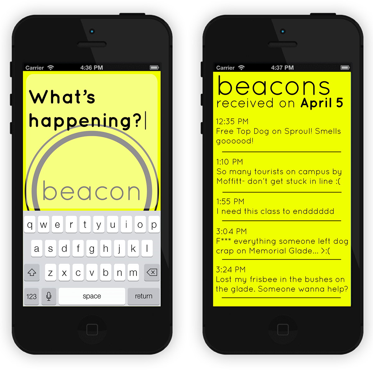
Above: Left is after clicking on the button and having the "What's happening?" textbox and keyboard pop up, right is after swiping to the left on the main screen and opening a new view for "received beacons" history.
When thinking over interactions, we also had to consider that the beacons would be received like pop-up notifications, and many times if a user is busy or wants to access something else on their phone, they will close a pop-up without looking at it. When texting, you can do this and simply look at the text later.
To keep with an interaction that people would already be used to, we decided that it was best to include a history of beacons page. This way, if users simply closed the pop-up beacon, they'd be able to view it again, at least for 24 hours.
This mock-up also shows how the app can be used in terms of the variety of beacons people can send.
Final App
Here are iPhone screenshots of the final application in use.
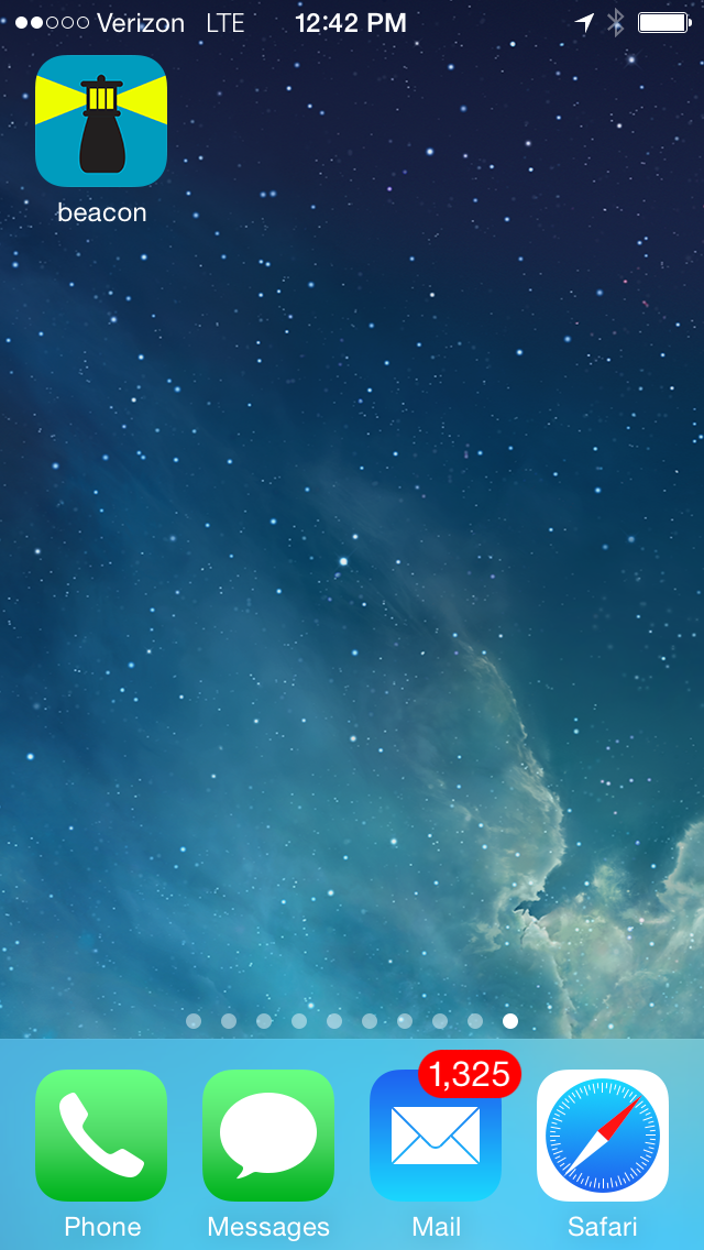
Above: App icon on iPhone main screen. We created the icon in all necessary sizes using Michael Flarup's App Icon Template.
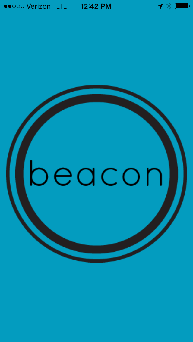
Above: Home screen of the app with starting background color.
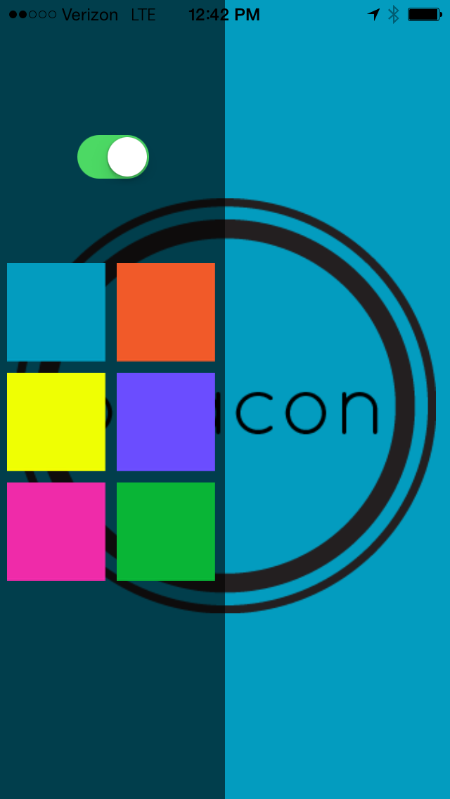
Above: Home screen after swiping left to open the settings sidebar.
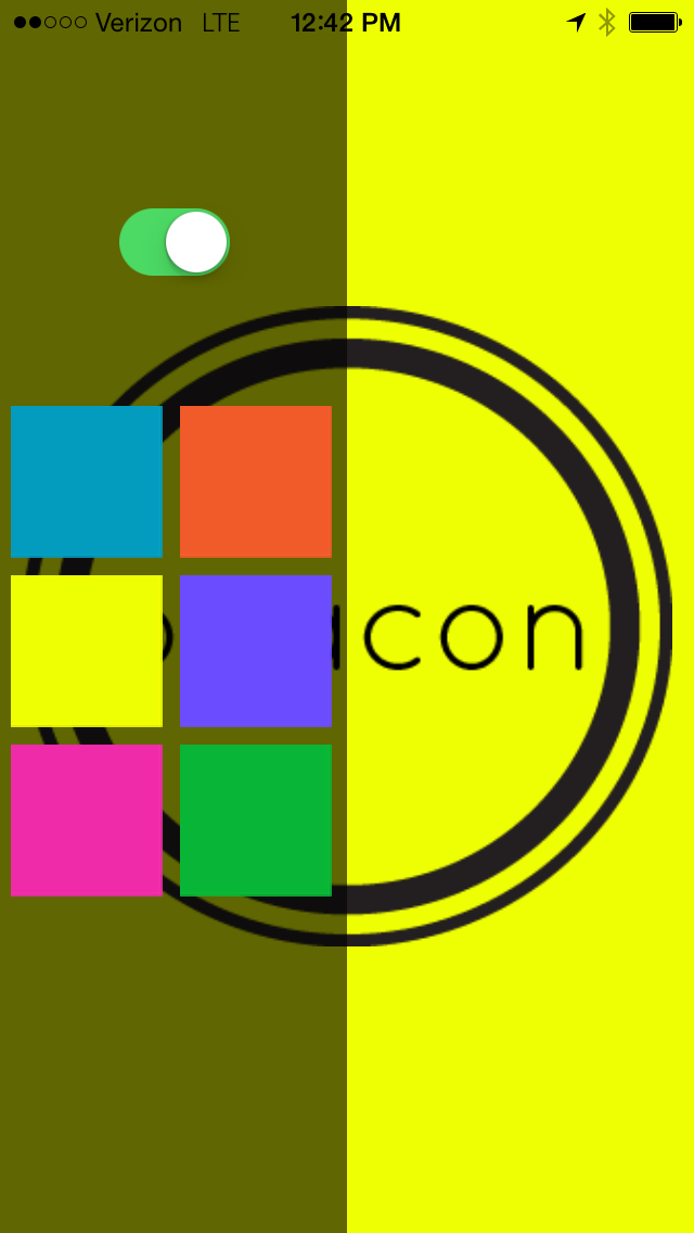
Above: Home screen after changing the background color.
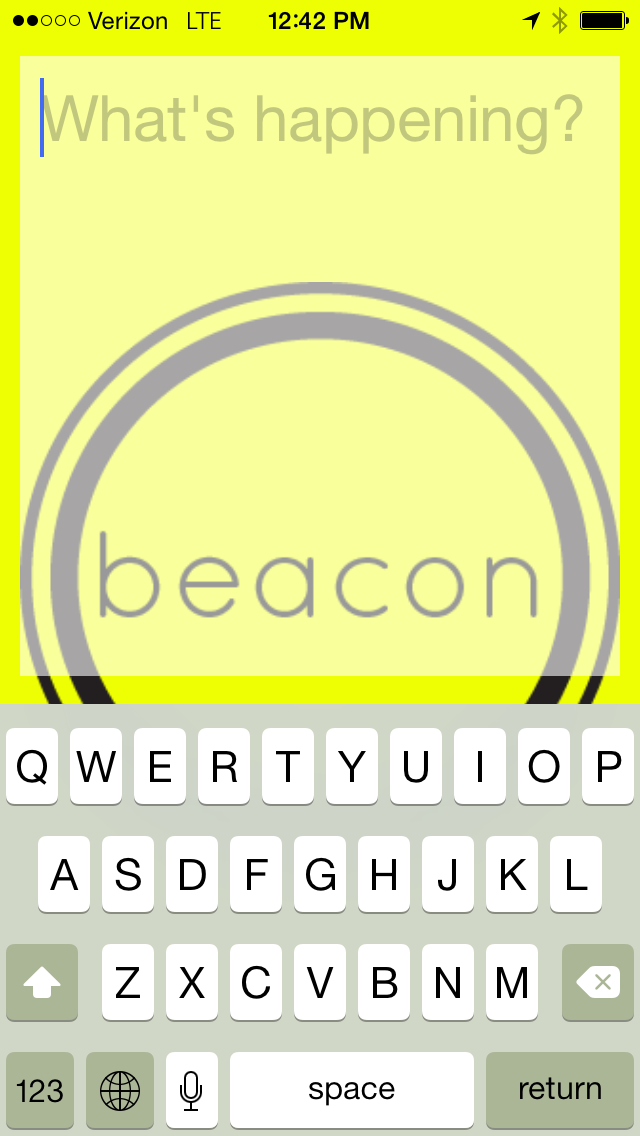
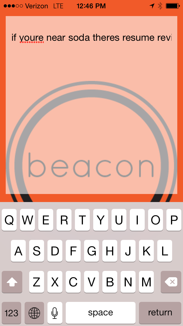
Above: "What's happening?" textbox and keyboard both appear after pressing the beacon button.
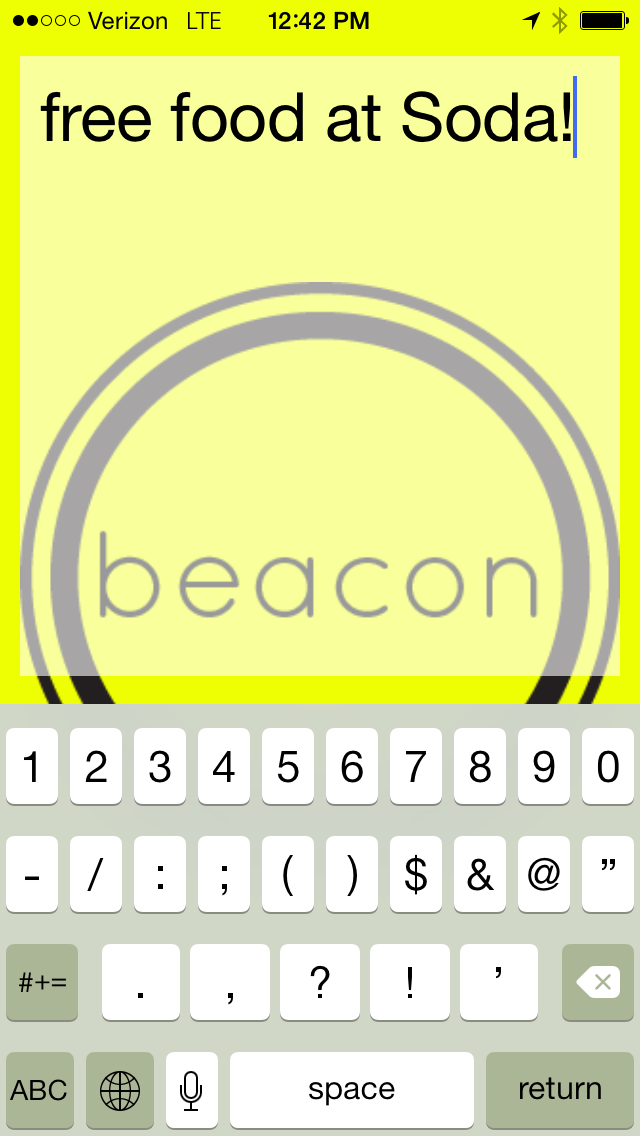
Above: Typing in a beacon in the textbook. Pressing return on the keyboard sends the beacon and the textbox shrinks to the bottom of the screen and disappears in a smooth transition.

Above: Receiving a beacon from someone while on iPhone main screen.
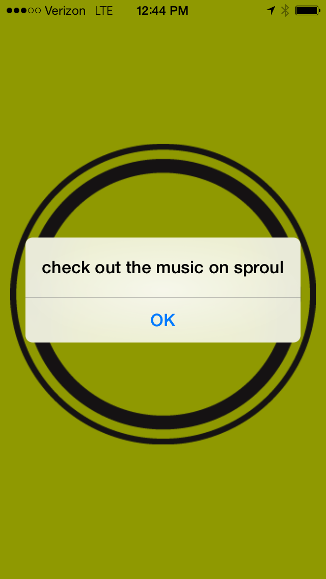
Above: Receiving a beacon from someone while on app home screen.
Above: Another demonstration of the main interaction and a different background color.
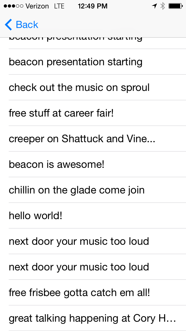
Above: The "beacons received" history screen (reach this by swiping right on the home screen).
Conclusion
I learned a lot from this hackathon project. Designing for a mobile app does have its constraints, but that structure helps creativity flourish. Designing a mobile app UI is not only about making something that looks good and has easy-to-learn interactions, but is also about keeping the design within the programmer's ability, as well as the hackathon time limit to implement. Especially at a hackathon, I cannot expect every design to be implemented to a T in the real app (for example, we did not have enough time to make the history page fit the UI designed for it). And finally, designing a mobile UI includes exporting the images in the correct size and format (which takes time) on top of providing the mock-ups.
Further Iterations
In the future, we would want to enclude categories/hashtags as a main feature of the app. With these, users can choose what kind of beacons to subscribe to (such as "safety warnings" but not "free food") in order to combat spam. When users send beacons they would be prompted to add these categories onto their message.


