GHS Athletics Team
40th Anniversary Campaign Identity
[Everyone is a winner]
40th Anniversary Campaign Identity
[Everyone is a winner]
International Design Awards, 2023
— Honourable Mention in Graphic Design, Multimedia-Other Graphic Designs
— Honourable Mention in Graphic Design, Print-Key Art
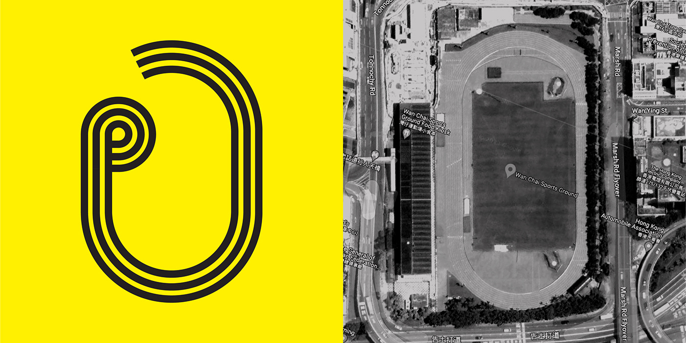
The GHS Athletics Team, one of the longest established girls running team in Hong Kong, was marking their 40th anniversary in 2022.
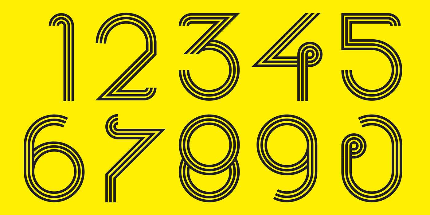
The logo design is a "40" in one continuous line, symbolising the 40th years of perseverance and hardship. It is no easy task. The triple-line represents we have teammates to accompany all together these years.
With the covid outbreak during 2020-2022, the annual inter-school competition has been cancelled. We wanted to use this opportunities to give everyone a support, to give everyone a gold medal for appreciation. They might be no competition to join these few years but the effort and hard work made is for their own improvement and it will pay off when opportunities appear. The overall tone used their signature yellow and black colour from their uniform.