Cosmódromo Studio
Visual Identity
THE CHALLENGE
Cosmódromo is an audio-visual content production studio with clients such as Flow Podcast, Dois Dedos de Teologia and Lucas Rosa in its portfolio.
With clients like these and with the recent expansion, the company needed to professionalize its visual communication and bring more intentionality to the brand, that is, to say and show exactly what they wanted, with consistency and demonstrating the robustness that the brand has.
In addition, there was an abstract concept of multiverses, still undefined in the minds of the founders, which needed direction and visual translation.
Challenge mounted. Let's go to the strategy now.
O DESAFIO
A Cosmódromo é um studio de produção de conteúdo audio-visual com clientes como Flow Podcast, Dois Dedos de Teologia e Lucas Rosa no portfólio.
Com clientes como esses e com a expansão recente, a empresa precisava profissionalizar a sua comunicação visual e trazer mais intencionalidade para a marca, ou seja, falar e mostrar exatamente aquilo que queriam, com consistência e demonstrando a robustez que a marca tem.
Além disso, existia um conceito abstrato de multiversos, ainda sem definição na mente dos fundadores, que precisava de direcionamento e tradução visual.
Desafio montado. Vamos para a estratégia agora.


THE STRATEGY
For Cosmódromo, we had a mostly digital brand, with a long name that was difficult to pronounce. We need to bring immediate recognition, differentiation from competitors and richness to the brand's visual universe.
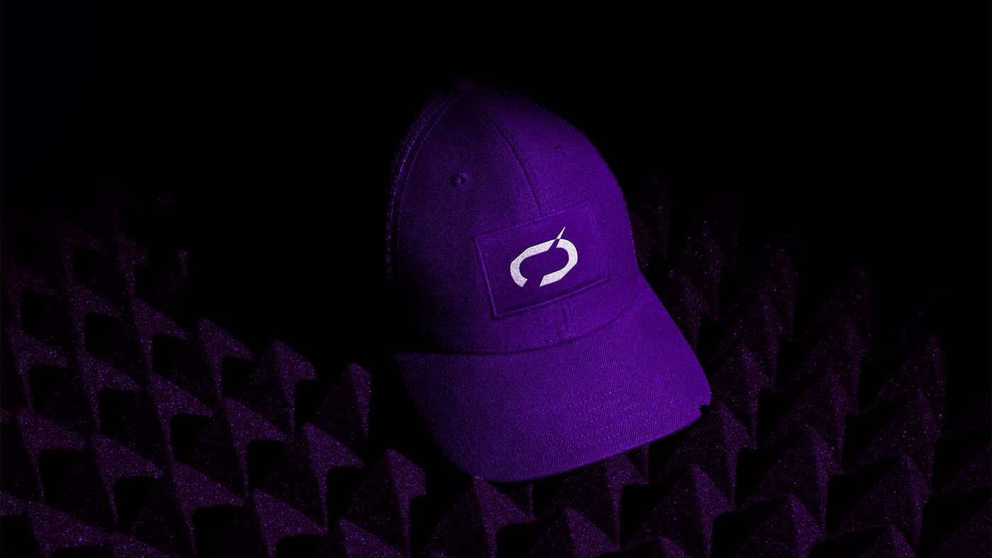
Our solution was to reinforce the name by building a logo without a symbol, but highlighting an element that would work as an identifying symbol for easy understanding by potential customers.
In addition, we maintained the main color of the brand (purple), with a slight adjustment, as we identified a blank space in the market in that specific color, which would bring immediate identification at the time of word of mouth indications.
In the field of typography, our choice was for an expansive, wide and strong font. With an undisputed presence, to further increase immediate brand recognition.
Finally, we use a mix of retrofuturistic style with controlled minimalism, which brings presence, character and distinctiveness to the layouts in front of the market.
A ESTRATÉGIA
Para Cosmódromo, tínhamos uma marca majoritariamente digital, com um nome extenso e com certa dificuldade de pronúncia. Precisamos trazer reconhecimento imediato, diferenciação dos concorrentes e riqueza para o universo visual da marca.
Nossa solução foi reforçar o nome construindo um logotipo sem símbolo, mas realçando um elemento que funcionaria como um símbolo identificador para fácil entendimento de possíveis clientes.
Além disso mantivemos a cor principal da marca (roxo), com um leve ajuste, pois identificamos no mercado um espaço em branco nessa cor específica, o que traria identificação imediata na hora das indicações boca a boca.
No campo da tipografia, nossa escolha foi por uma fonte expansiva, larga e forte. Com uma presença indiscutível, para aumentar ainda mais o reconhecimento imediato da marca.
Por fim, usamos uma mistura do estilo retrofuturista com um minimalismo controlado, que traz presença, característica e distintividade para os layouts frente ao mercado.