The primary objective of this project was to create an effective brand and identity for a Dublin based vintage fashion store. The design problem identified for the store was creating a brand that would effectivley communicate the companies core value and personality to its customers, setting it apart from its competitors. The target audience of the store was inclusive. They cater to both old and young customers, maintaining a cross board appeal to anyone who shares thier passion for vintage fashion. They wished to maintain the stores classic appeal as opposed to the young and trendy niche of other competitors.

An effective brand can be defined as one which "reinforces the good reputation of a company". My brand strategy was to create a brand that would be modern but also classic with a distinct vintage feel. The client had a preference for clothes of the late deco period of the early 1930s, and this was something that the brand was based around. After interviewing the client and discussing the company, I set a group of core values and personality traits which I believed best represented the company. The core values were; quality, expertise, trust, inclusivness. The brand personality was; eclectic, passionate, approachable, classic. My strategy was to create a brand and identity that would upfront the stores classic appeal and have longetivity, reflecting the stores core values and personality.
The typeface I chose for the logotype was P22 Art Deco Chic, designed by the P22 Type Foundary. Based on original streamline forms, this elegant typeface echoes of Eduardo Garcia Benito's cover for Vouge. This echo of fashion made the type face an ideal choice. It appears elegant and stylish in the Art Deco style but has a modern feel.
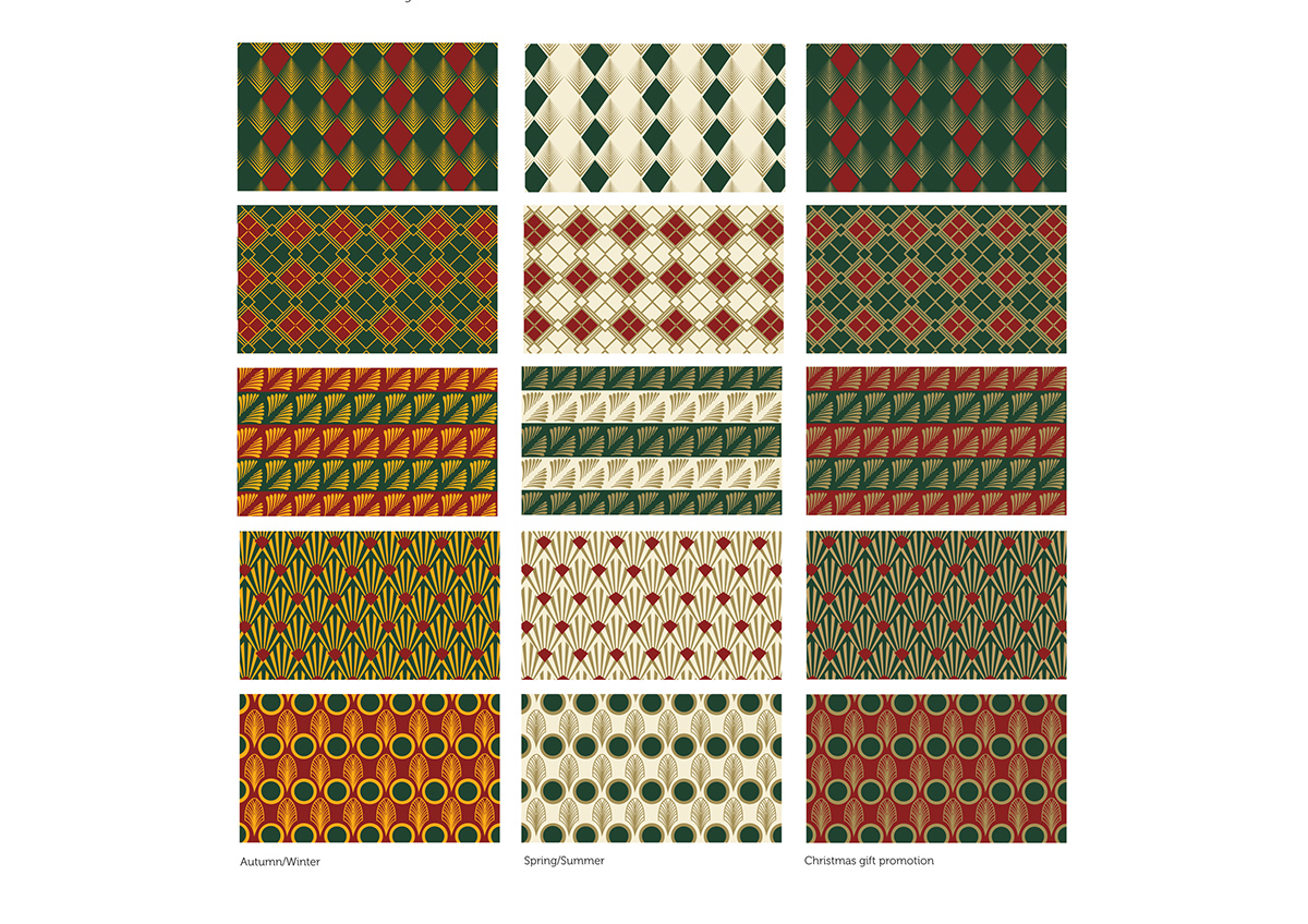
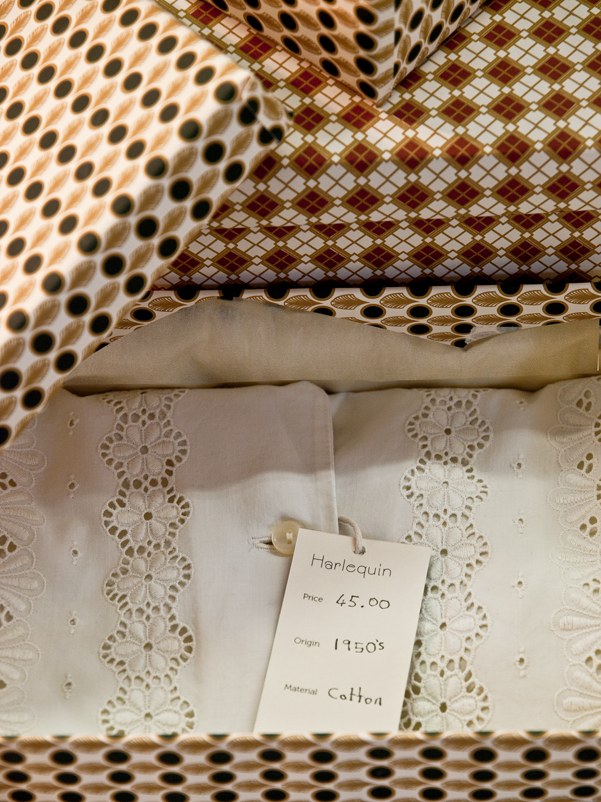
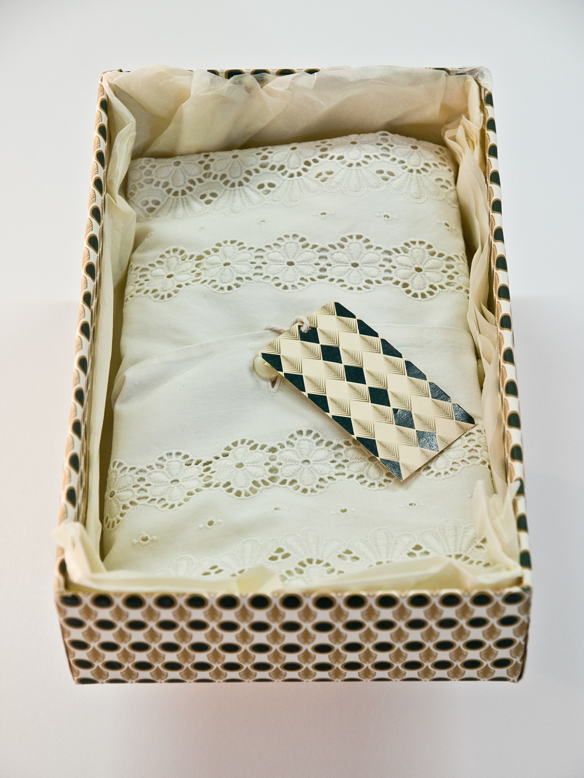
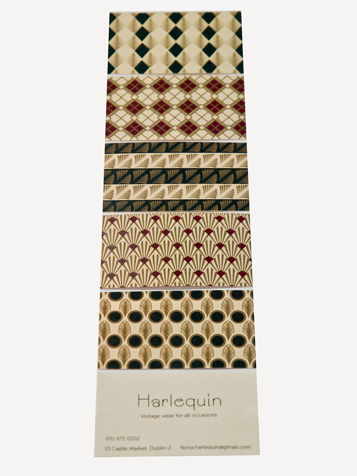
The art deco patterns which I designed for the visual identity are colourful, visually appealing, detailed and eye catching. The geometric patterns that I designed were inspired by my research on Art Deco furniture, textiles, metal works and jewellery. They reflect the stores quality, good taste and expertise. The geometric patterns suggest a sence of order, reflecting the stores particular pride in their neat and organised approach. The designs are intended to appeal across board and set the Harlequin apart from its competitors, making them instantly recognisable amongst their competitiors. The store prides itself on keeping stock regularly up to date and relevant for the seasons. A colour palatte has been selected for Autumn/Winter, Spring/Summer and for Christmas gift promotion. The rich green, red, yellow and gold colours are inspired by George V'almier deco designs. The dark red and green were chosen to evoke a classic feel for longetivity, avoiding trend colours. The Art Deco book cover for 'Le Livre de la Jungle' by Rudyard Kipling held inspiration for the colour scheme also.

www.emmagrattan.com


