A STUDY ON NETFLIX UI
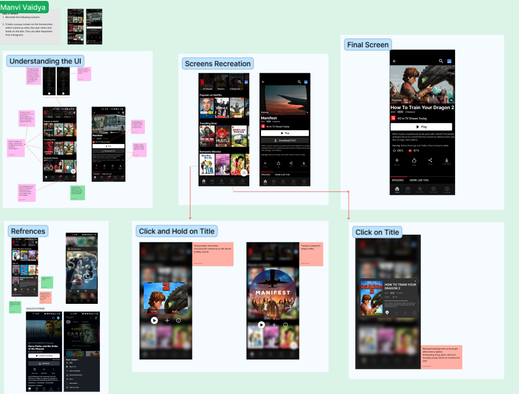
The brief given to us was to recreate Netflix Home Screen UI and add a feature of click and hold. I also tried to understand the whole UI of Netflix, it's loopholes and common understandings. Here's the whole process and final outcome of the same.
THE WHOLE FLOW OF PROJECT
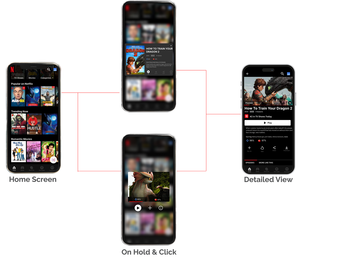
The whole point of doing this whole project, was to add the feature of rating in Netflix, as Netflix choses it's top 10 by the number of views the title has, which becomes a bit confusing and misleading when the content is presented to us in the form of our choices. As well as also limits us to the vast content the industry has given us.
The Click and Hold feature let's you see the ratings and the trailer like we do on Instagram, which saves our time and let's our mind process and be decisive in a better way. I added a blur in the background to increase the focus of the user, as for now netflix background also interrupts while we read the description in the pop up when the title is clicked.
A lot of options were repetitive also, like the download feature in the detailed screen, which makes the UI confusing and complicated for the user.
Video of whole flow
PROCESS
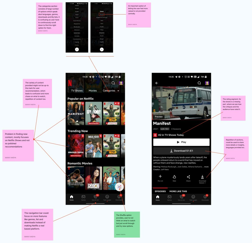
Finding loopholes and special features in Netflix
Screens and Components

Recreation of Old Screens


New Features with Screens
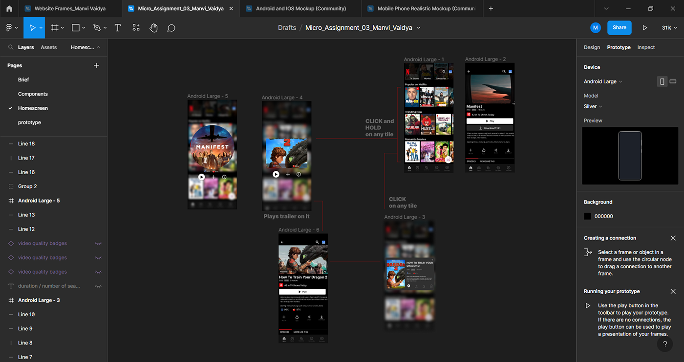


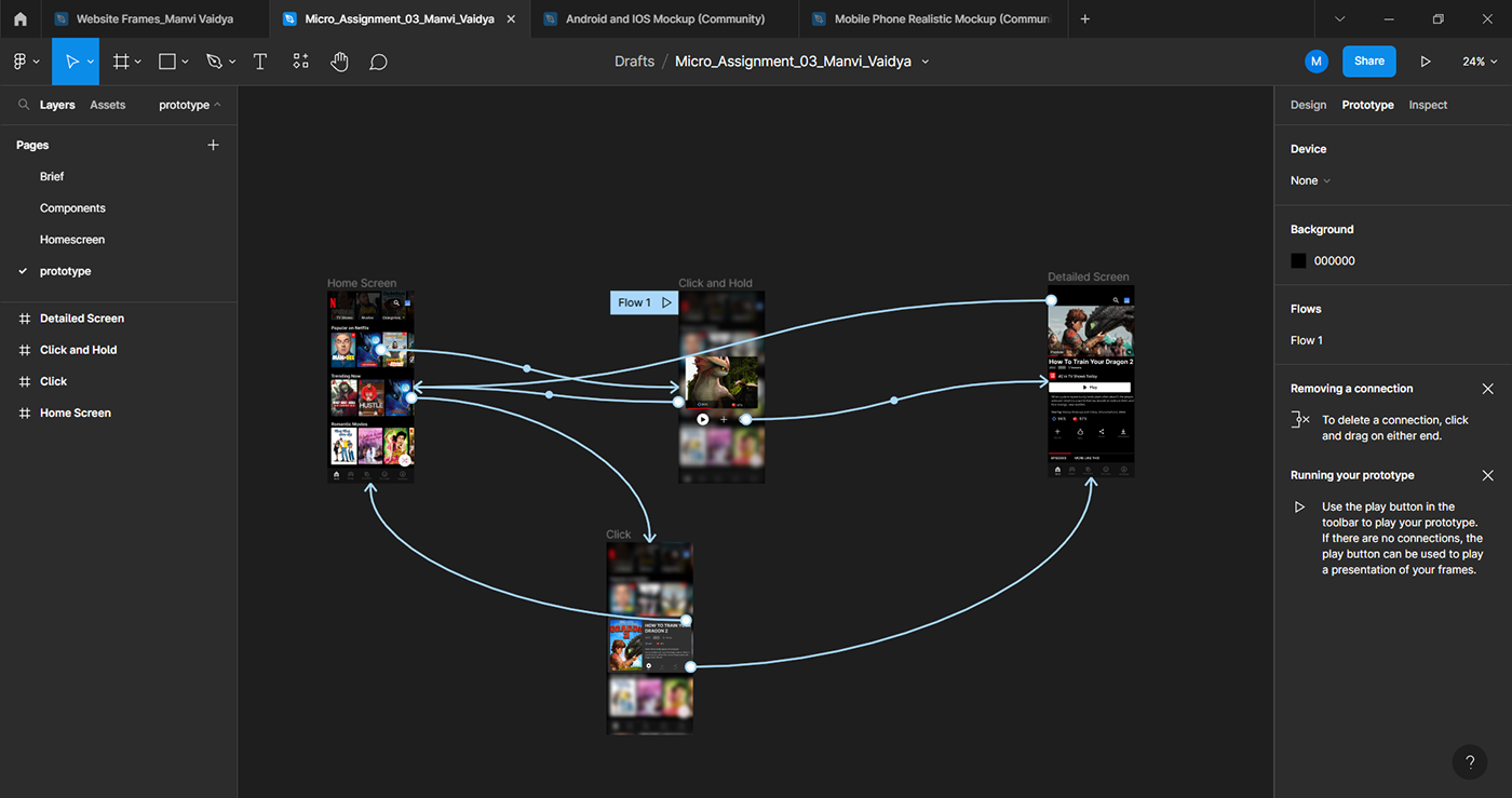
PROTOTYPE