


Storyboards


Micro-interactions
24x24px Mobile versions


48x48px Tablet/Computer Versions


All three micro-interactions
Rationale
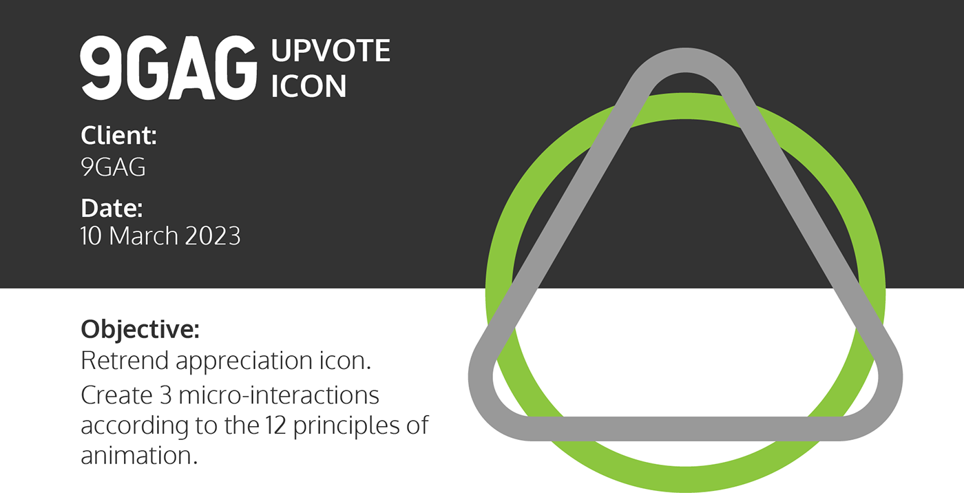
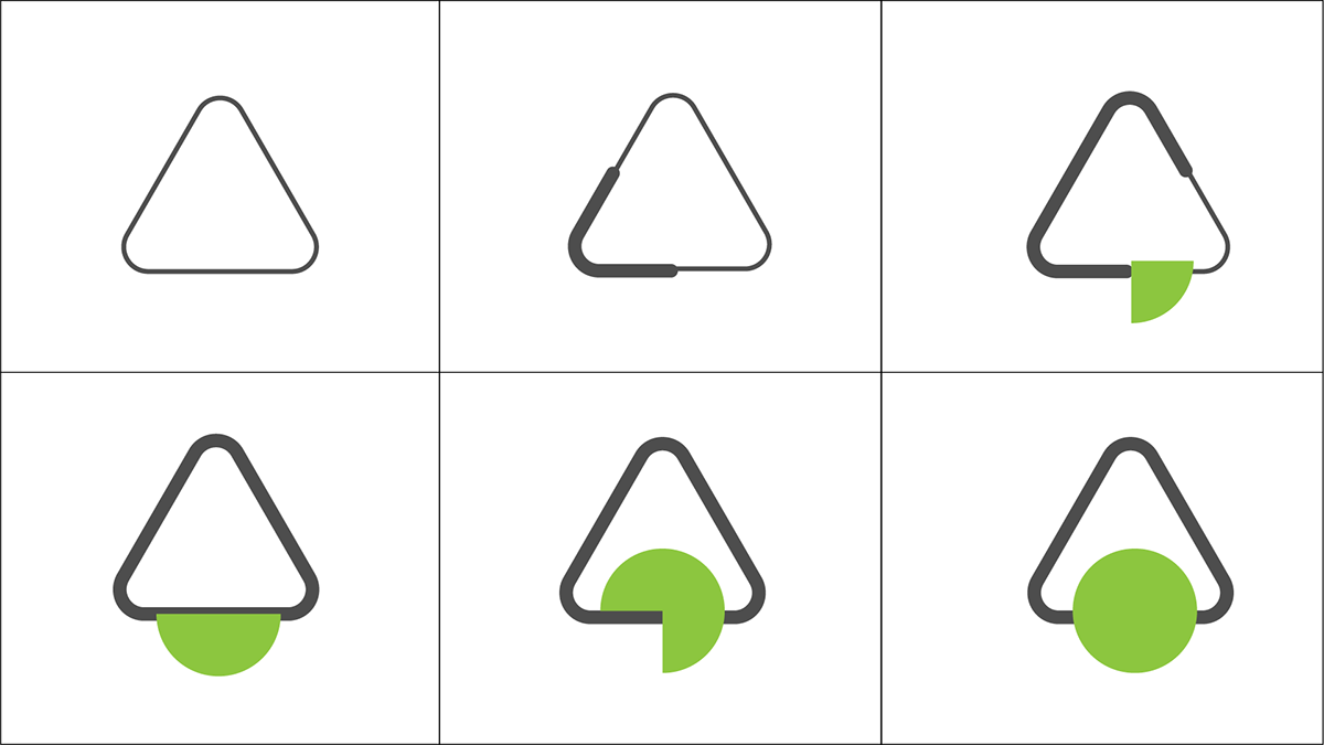
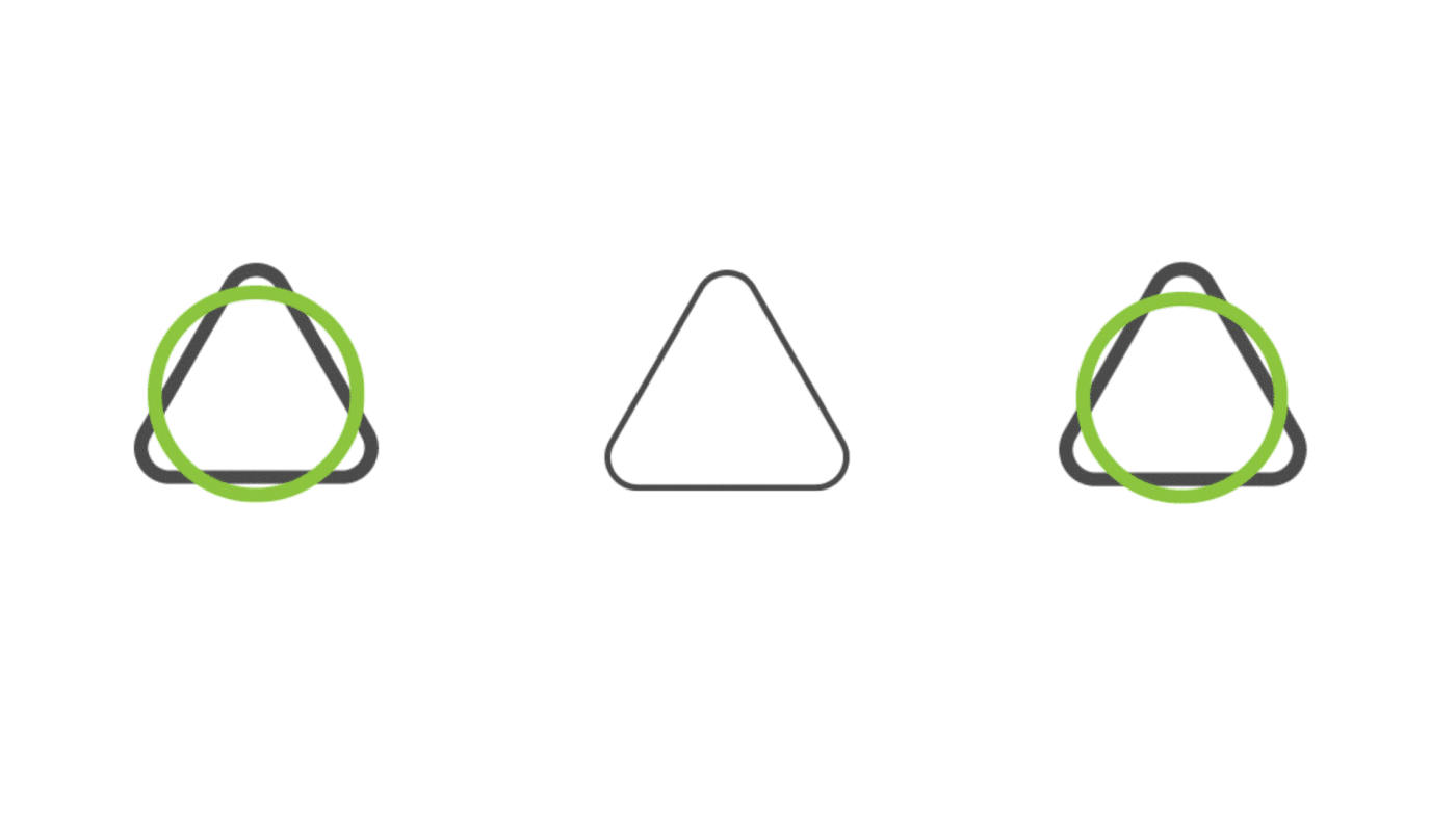
The icon: My finalised concept was using the abstract trend, by making the upvote arrow a simple circle and triangle that points upwards. It communicates the idea of an upvote icon without it just being a simple arrow. The more rounded edges and circular approach, now lines up better with the updated branding 9GAG went through, which was the reason why I wanted to redesign it in the first place.
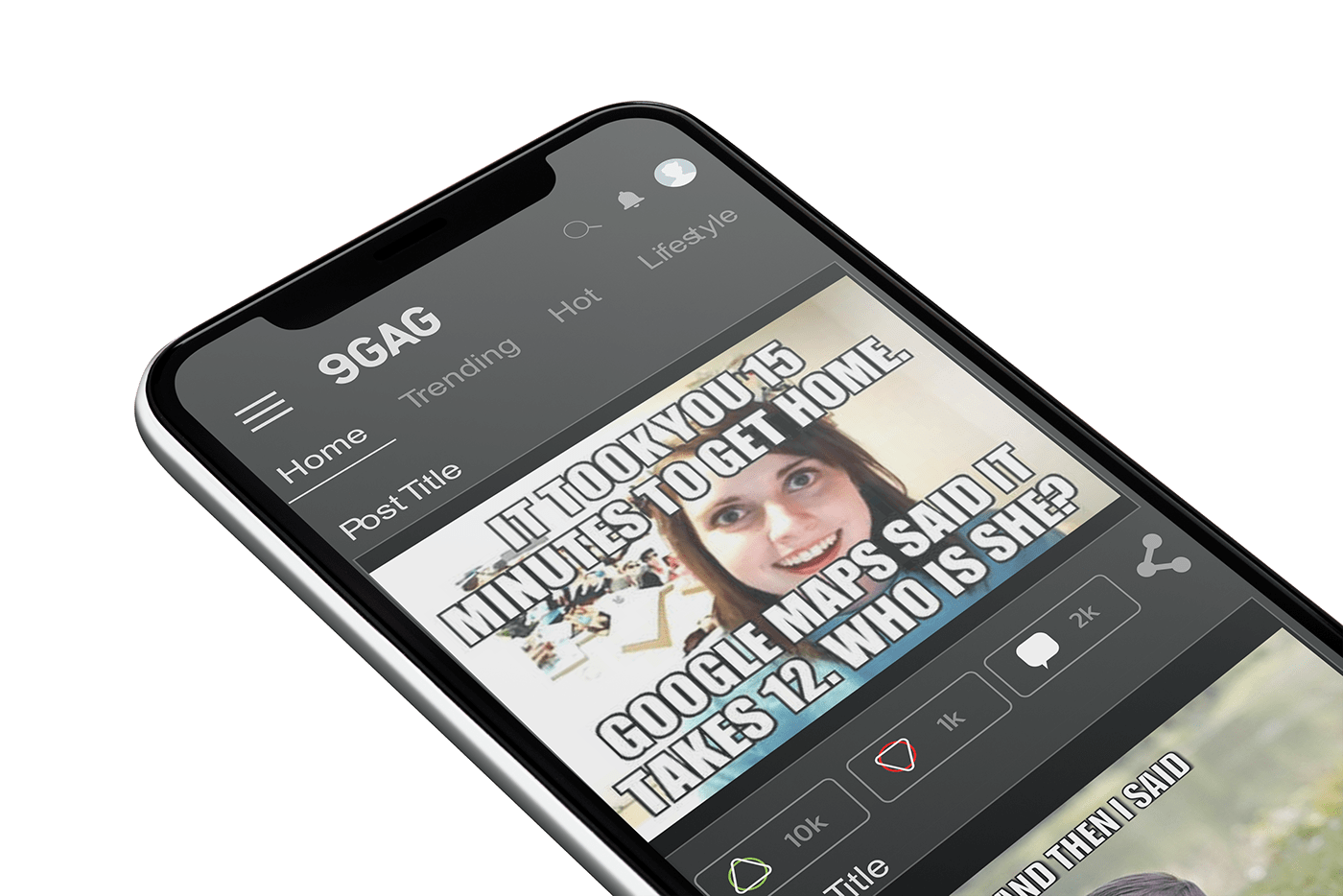
I then introduced green into the icon, instead of keeping with their original blue. As green is a more generic sign of positive feedback that has been given. The final state then shows the green ball dropping and be filled in, making it more apparent that the upvote button has been pressed.
I then introduced green into the icon, instead of keeping with their original blue. As green is a more generic sign of positive feedback that has been given. The final state then shows the green ball dropping and be filled in, making it more apparent that the upvote button has been pressed.
The micro-interaction: All three animations follow a few of the 12 principles of animation. Namely squash and stretch, follow through, pose to pose, straight ahead, arc, anticipation. Incorporating these principles were crucial to making successful animations.
The style or look and feel of the animations are supposed to represent a playful mindset, seeing as the main purpose of the 9GAG platform is to share funny content. Looking closely at the animations you will notice that the icons themselves have slight differences to them, this mainly occurred to adapt the icon to its corresponding animation, making sure that the message it was conveying is still clear in its purpose.


