서비스 제너레이터 Leolap(리오랩)의 MBC 키즈 어플리케이션 디자인을 소개합니다.
MBC의 40년 역사의 대표 어린이 프로그램 ‘뽀뽀뽀 좋아좋아’는 어린이들의 행동 발달 및 정서 발달 전문가들의
MBC의 40년 역사의 대표 어린이 프로그램 ‘뽀뽀뽀 좋아좋아’는 어린이들의 행동 발달 및 정서 발달 전문가들의
자문을 통해 진행되는 교육 프로그램입니다. 어린이들이 스마트 기기에 익숙한 디지털 네이티브가 되면서,
모바일과 타블렛 PC 사용 빈도수가 높아졌고, TV를 통한 자연스러운 어린이 콘텐츠 전달 효과가 하락하는 현상이 발생했습니다.
Leolap is a service generating company.
We designed the MBC Kids application from November 2022 to December 2022.
MBC's representative children's program ‘Ppo Ppo Ppo’ with 40 years of history is an educational program conducted with advice from experts in behavioral and emotional development of children. As children are digital natives familiar with smart devices, the frequency of using mobile and tablet PCs increased, and the effect of natural delivery of children's content through TV decreased.
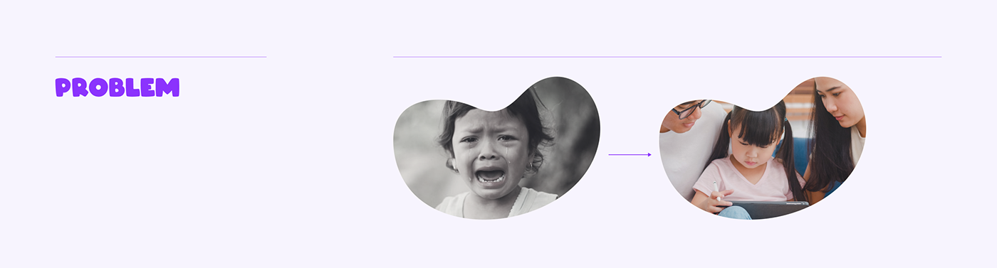
보호자들이 자녀들에게 스마트폰으로 뽀뽀뽀 콘텐츠를 보여주는 주요 목적 2가지는 아이의 기분 전환 44.7%,
행동 제어가 37%를 차지했습니다. (출처 : 한국언론진흥재단, 2021)
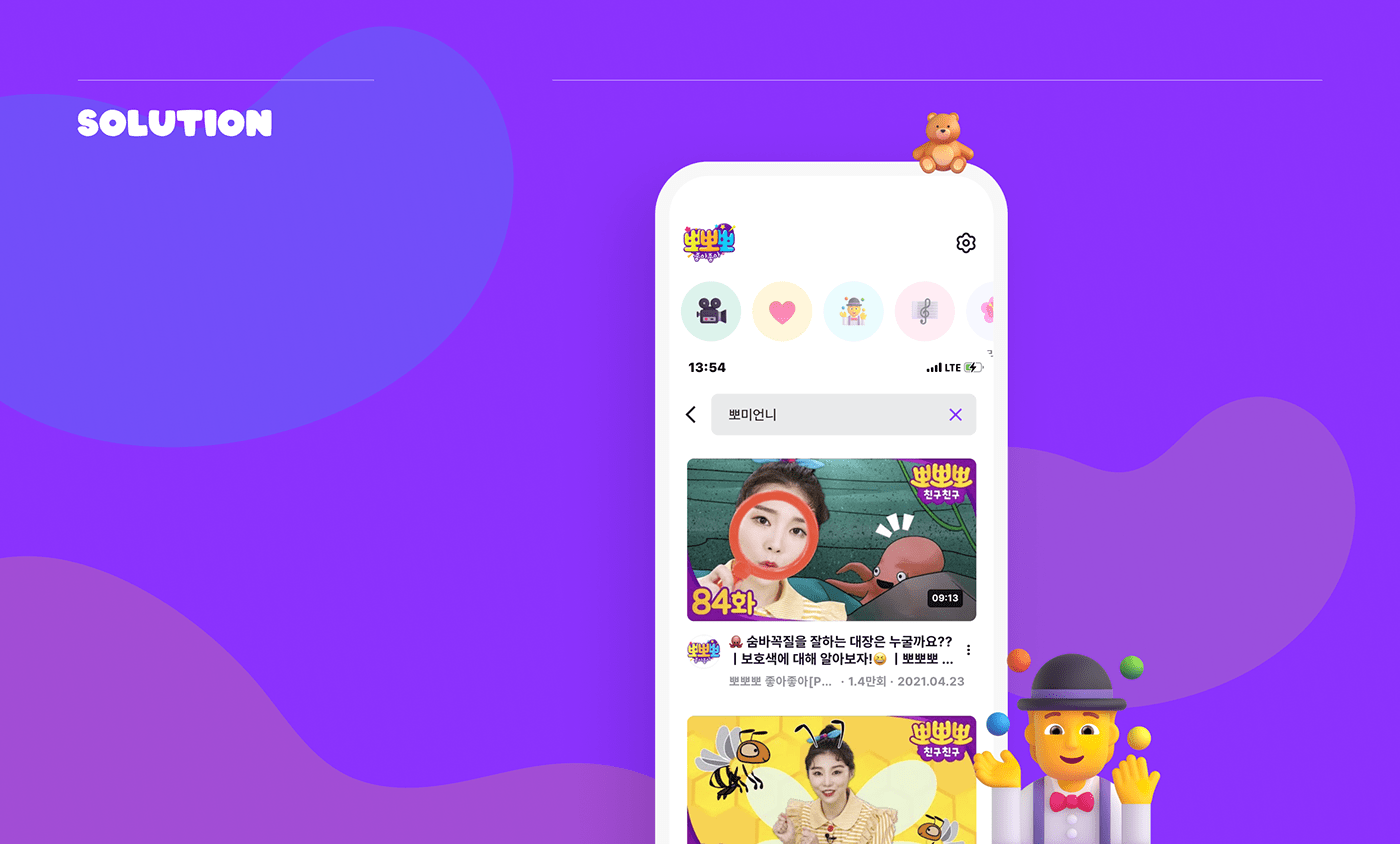
즉 매일 육아를 하는 보호자를 대상으로 하여 양질의 키즈 콘텐츠를 즉각적으로 선별해서 보여줄 수 있는 솔루션이 필요했습니다.
즉 매일 육아를 하는 보호자를 대상으로 하여 양질의 키즈 콘텐츠를 즉각적으로 선별해서 보여줄 수 있는 솔루션이 필요했습니다.
The two main purposes for parents to show their children ‘Ppo Ppo Ppo’ content on their smartphones accounted for 44.7% of their children's mood swings and 37% of their behavior control. (Source: Korea Press Foundation, 2021)
In other words, a solution that can select and display high-quality contents for kids was needed for parents.
In other words, a solution that can select and display high-quality contents for kids was needed for parents.
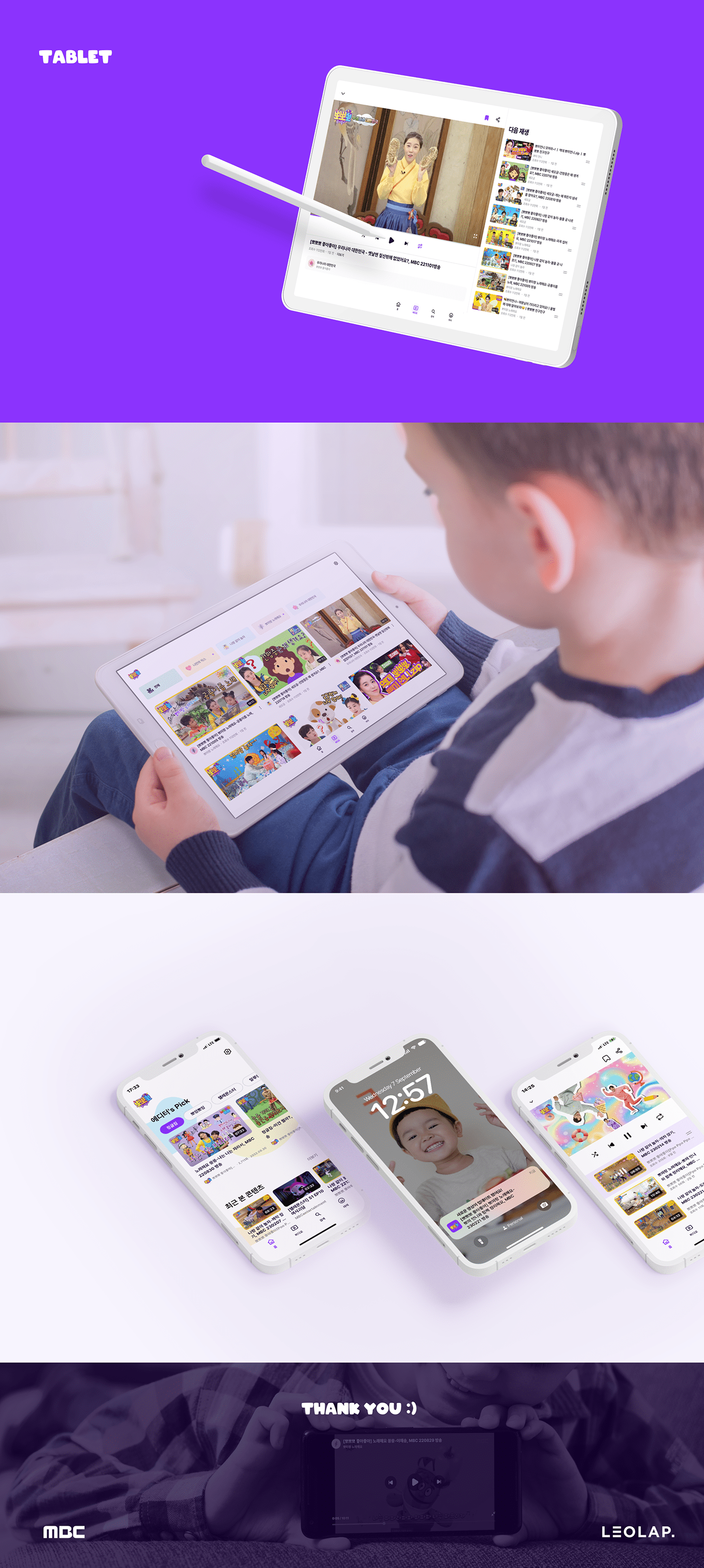
빠르고 간편한 뽀뽀뽀 앱 서비스를 별도로 출시하면서, 보호자는 TV 재방송 시간을 기다리거나 동영상 앱 내에서 여러번의 Depth를 거쳐 뽀뽀뽀 콘텐츠를 찾는 등 불필요한 행동 단계를 줄일 수 있습니다.
또 한 <뽀미언니랑 노래해요>, <나랑 같이 놀자> 등 자녀들이 특별히 좋아하는 코너를 별도로 연속 시청할 수
또 한 <뽀미언니랑 노래해요>, <나랑 같이 놀자> 등 자녀들이 특별히 좋아하는 코너를 별도로 연속 시청할 수
있습니다. 물리적 제약을 극복한 ‘뽀뽀뽀'는 고정 팬층을 확보하고, 프로그램의 새로운 정체성과 가치를 발견할 수 있습니다.
By releasing the ‘Ppo Ppo Ppo’ app service seperately, parents can reduce unnecessary steps of behavior, such as waiting for TV reruns or searching for ‘Ppo Ppo Ppo’ content through multiple Depths within the video app.You can also watch children's favorite corners, such as "Sing with Bo Mi" and "Play with me," separately.
Overcoming physical constraints, ‘Ppo Ppo Ppo’ can secure a fixed fan base and discover new identity and value of the program.
Overcoming physical constraints, ‘Ppo Ppo Ppo’ can secure a fixed fan base and discover new identity and value of the program.

기존 로고의 백그라운드에 컬러를 추출한 뒤, 명도와 채도를 모두 높인 퍼플을 메인 컬러로 선정하였습니다.
보라색은 여자아이는 분홍색, 남자아이는 파란색이라는 고정관념에서 벗어난 중립성을 상징합니다. 또한 옐로우
프레임을 사용하는 활발한 무드의 영상 콘텐츠 썸네일을 주요 페이지에서 균형감 있게 지지합니다.
After extracting the color in the background of the existing logo, purple with brighter and more saturated purple was selected as the main color.
Purple symbolizes neutrality that deviates from the stereotype that girls are pink and boys are blue. This color also provides balanced support for live video content thumbnails on key pages.
Purple symbolizes neutrality that deviates from the stereotype that girls are pink and boys are blue. This color also provides balanced support for live video content thumbnails on key pages.
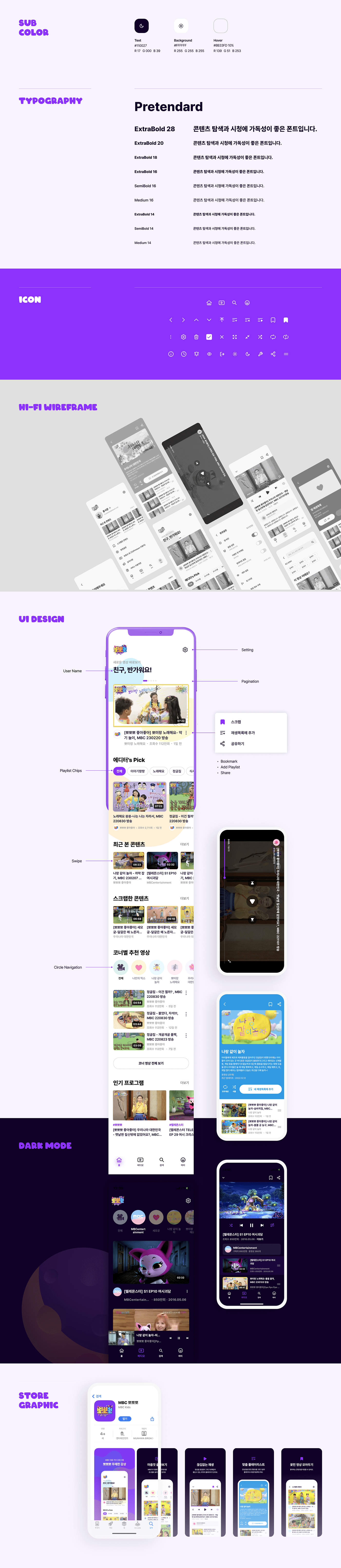
앱스토어, 구글플레이스토어 등록을 위한 앱 서비스 스크린샷 그래픽을 제작했습니다.
사용자가 빠르게 서비스 핵심기능을 파악할 수 있도록 심플한 메뉴 아이콘을 배치했고 가운데 텍스트 정렬로
사용자가 빠르게 서비스 핵심기능을 파악할 수 있도록 심플한 메뉴 아이콘을 배치했고 가운데 텍스트 정렬로
안정적인 레이아웃을 구성하였습니다.
We have created a screenshot graphic of the app service for registration of the app store and Google Play Store.
Simple menu icons have been placed so that users can quickly understand the core functions of the service, and stable layouts have been constructed with text alignment in the middle.
Simple menu icons have been placed so that users can quickly understand the core functions of the service, and stable layouts have been constructed with text alignment in the middle.