Glad Chocolate
Be real. Be true. Be glad.
Be real. Be true. Be glad.
—
GLAD is a carefully sourced bean-to-bar chocolate that focuses on transparency to reach their main objective: making us feel good and happy. For them, gladness comes from being true and real, so every ingredient, origin and detail matters to create the finest bean to bar chocolate.

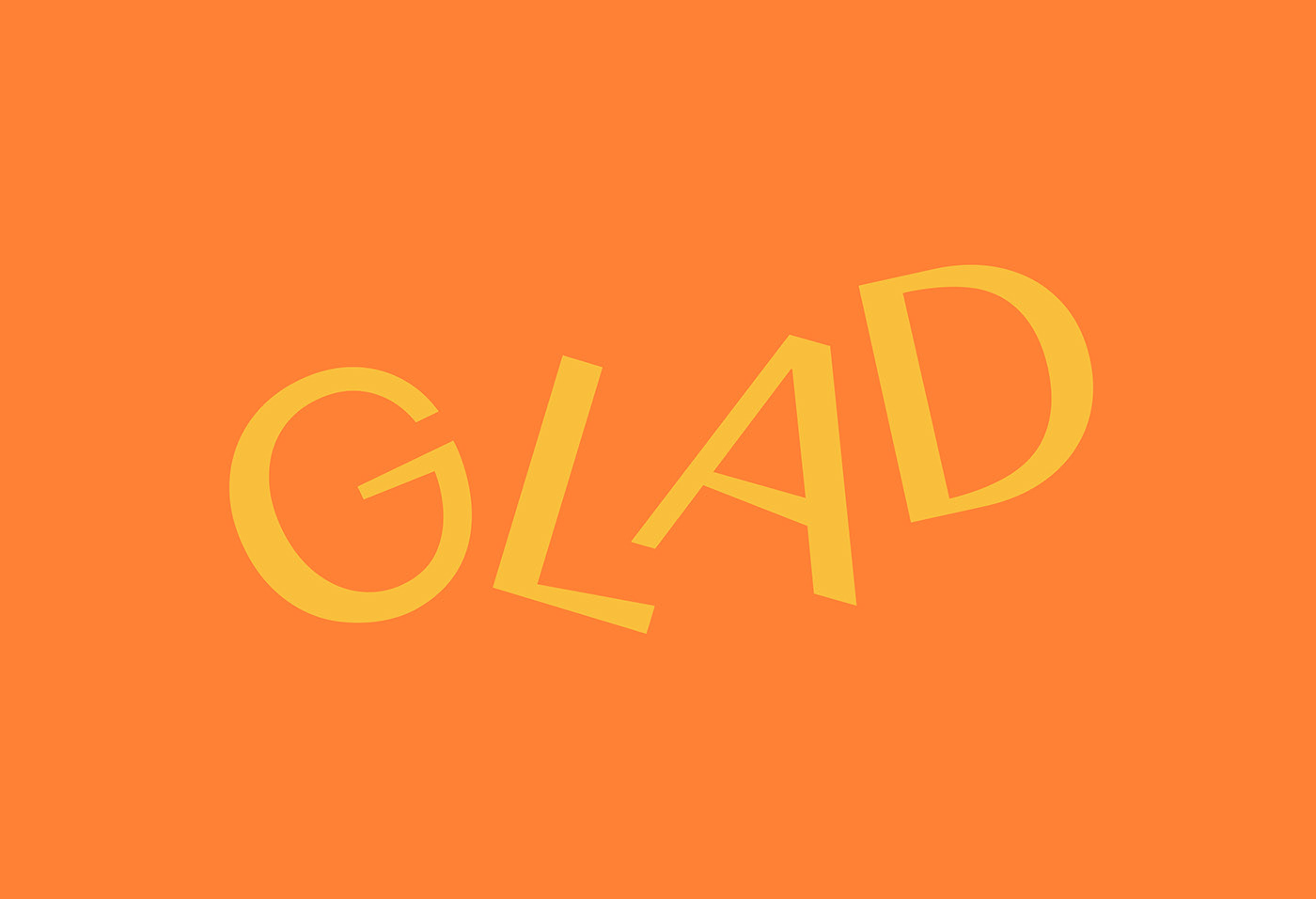
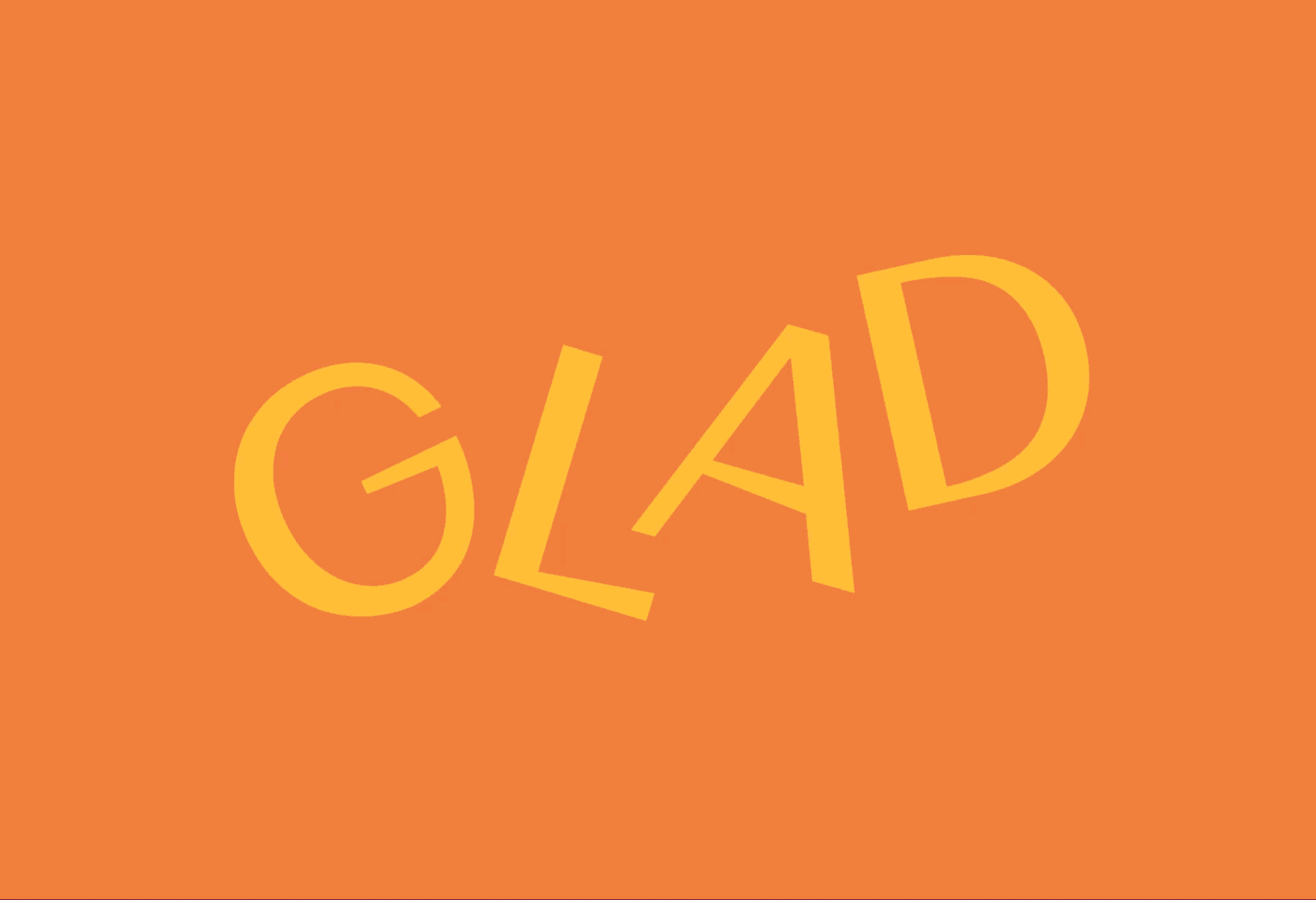
It all starts with the name, represented in a logo that shifts and springs to work as a visual metaphor for one’s cheerfulness and spontaneity when happy. Everything in the brand is about the happiness that both chocolate and honesty produce: that’s why we created a visual identity with a perfect mix of colour and text — colour for joy, text for truth.
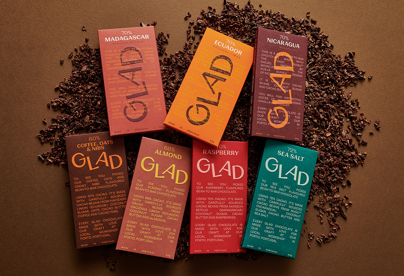
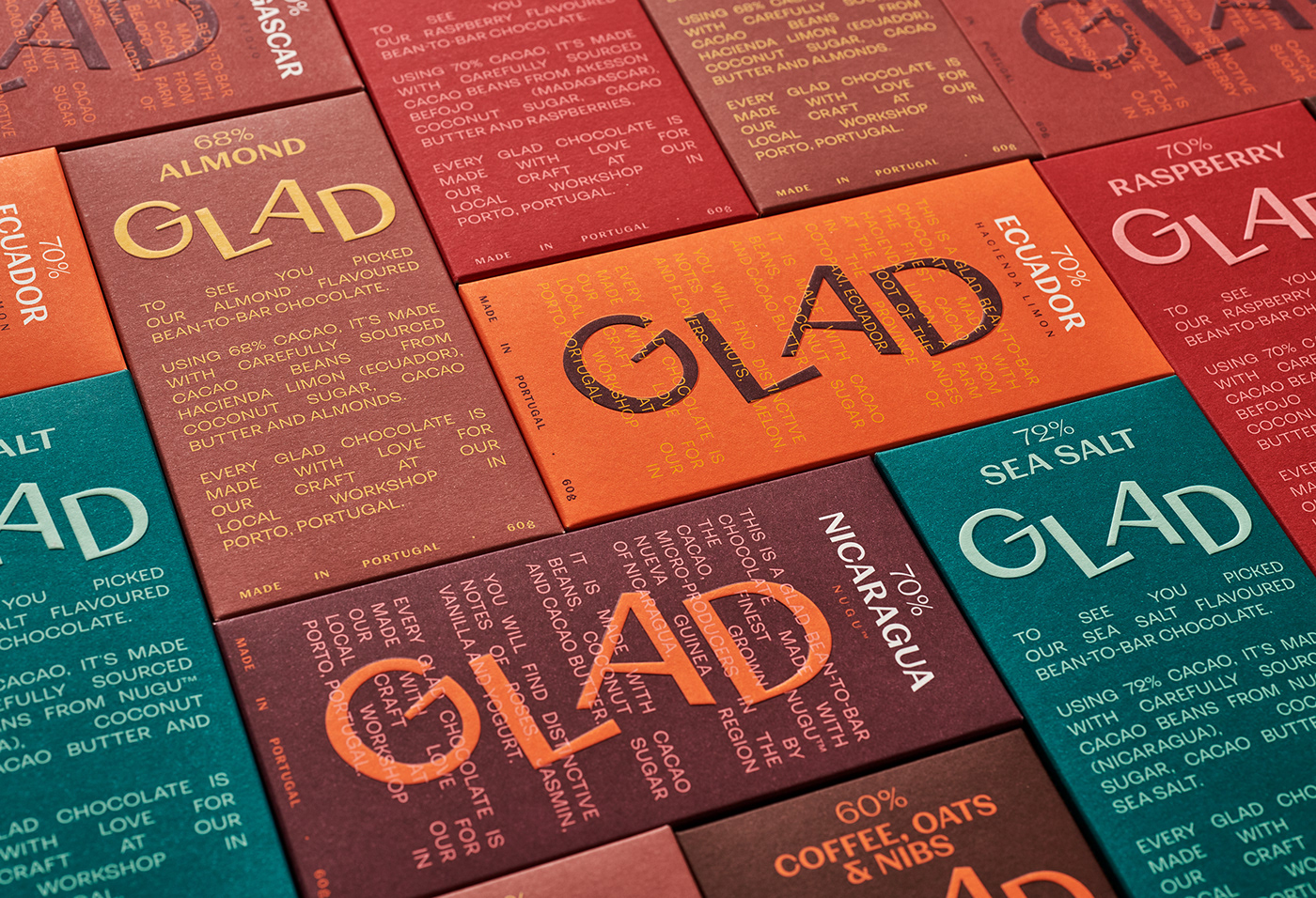
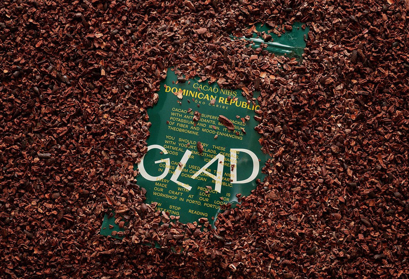
Being type and text based, Glad uses its packaging as a canvas
to tell as much about the product as possible: the origin of its
cacao beans, the intensity and style of its flavours and where it
is consciously crafted (Porto). No other graphic solutions
(like illustration or cacao images) other than plain text were used
to highlight the brand’s transparency.
to tell as much about the product as possible: the origin of its
cacao beans, the intensity and style of its flavours and where it
is consciously crafted (Porto). No other graphic solutions
(like illustration or cacao images) other than plain text were used
to highlight the brand’s transparency.
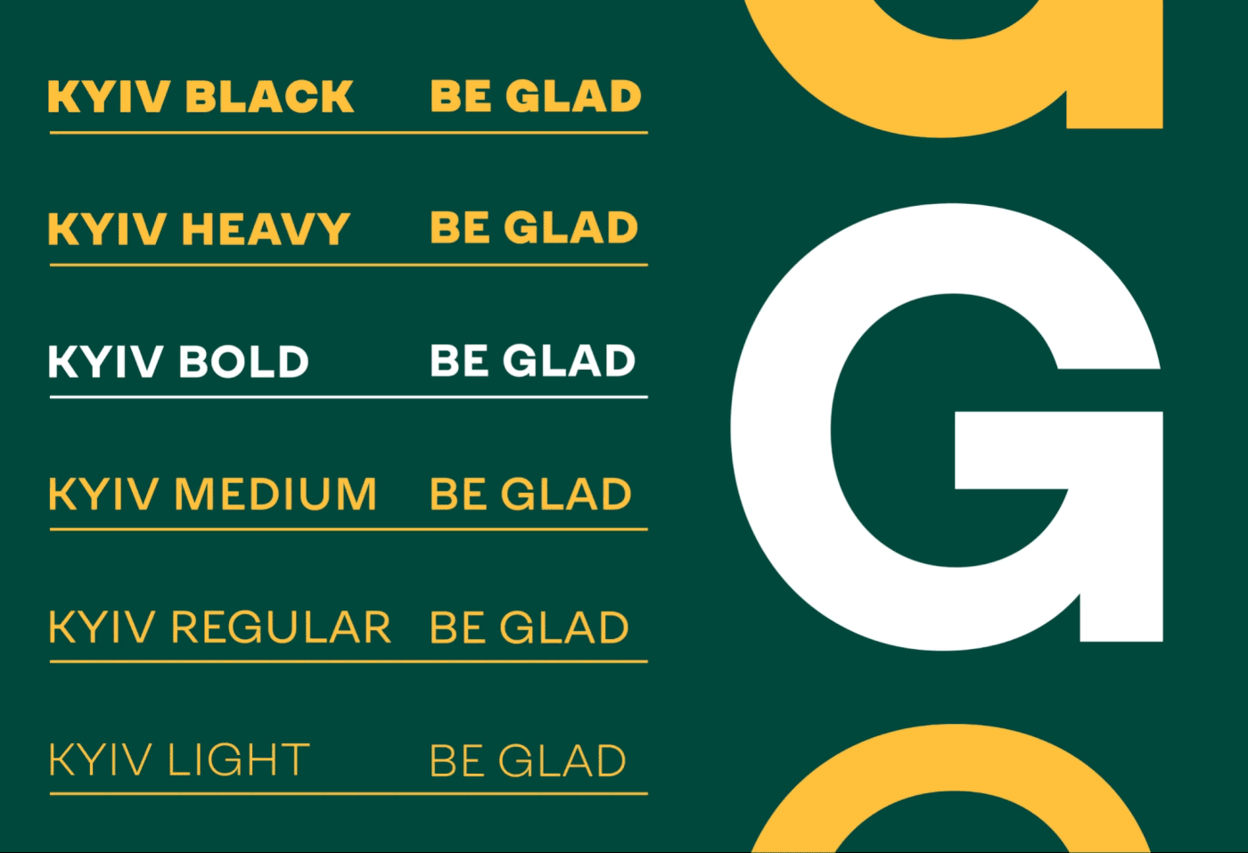
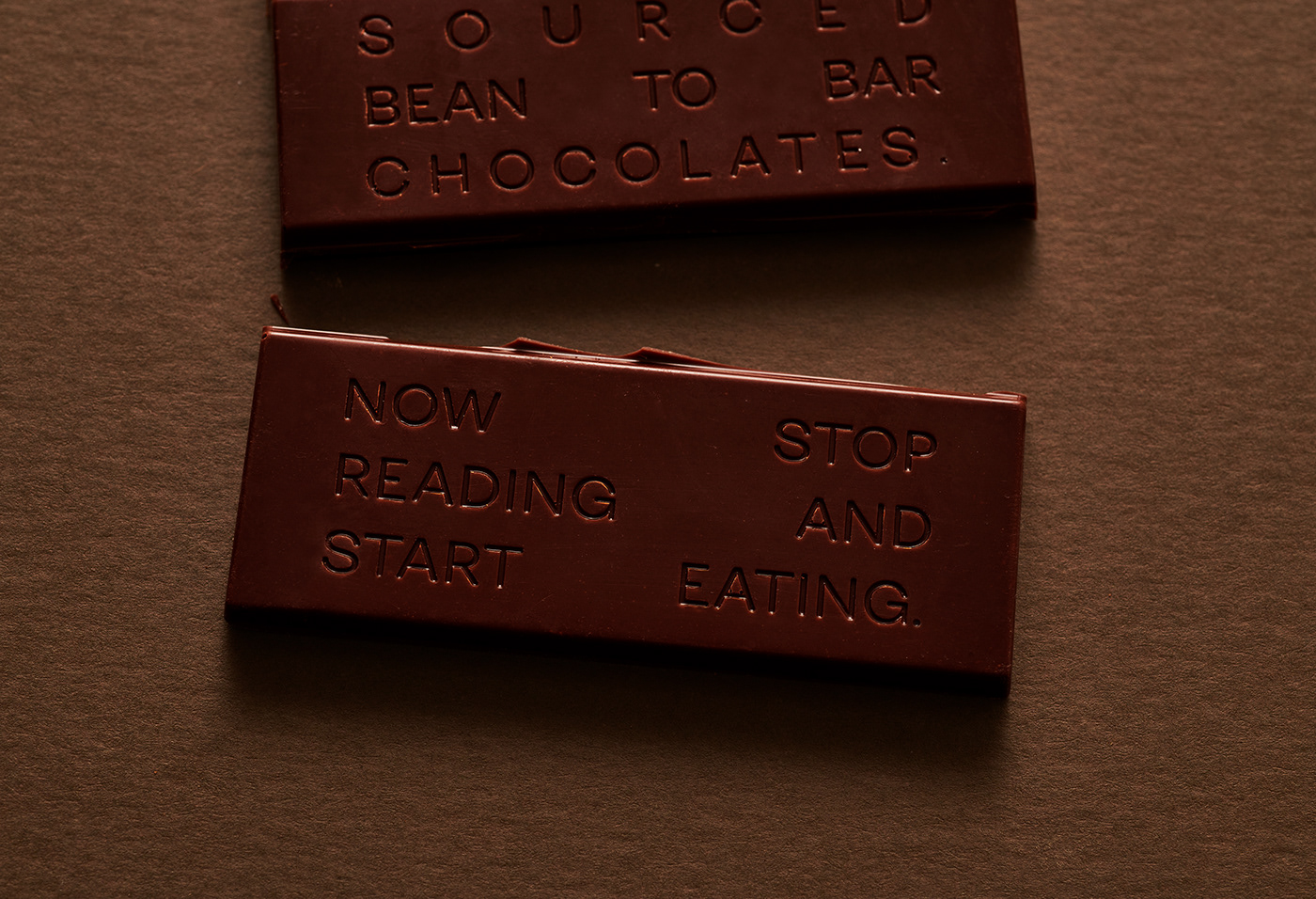
This was done using a simple and forthright typeface to reinforce Glad’s genuine approach, allied with a palette of warm tones that convey pleasant emotions. Its colours allow for great contrasts that offer both enormous shelf presence as well as feelings of intense and rich flavours.
Glad truly is what it says it is, working daily (and gladly) to respect their ever happy and positive motto:
Be real. Be true. Be glad.
Be real. Be true. Be glad.