New User Dashboard Design
Year: 2021
Role: UX Researcher
Research Type: Evaluative UXR
Research Method: Usability Testing, Prototype Testing & Preference Testing
Company: Health Karma
City: Fort Lauderdale, FL
Language: English

New User Dashboard Design
One of the main projects I supported as a solo UX Researcher in Health Karma was the design process for the new user dashboard, with different UX research studies (Usability Tests, Prototype Tests and Preference Tests), in different stages of design process.
Tools: UserTesting, Zoom, Figma, Invision, Confluence.
Usability Tests with the Previous Dashboard
These were the first user testing sessions we did with our platform and how we identified that we needed a new user dashboard design.
Research Goal
Understand how potential users interact with our platform, and specially with the user dashboard and what is causing confusion or frustration. Collect insights from users and identify opportunities for improvement.
Methodology
Moderated on-site or remote usability tests with our live platform and user dashboard with 15 users aligned to our personas, with a proxy recruiting process. Remote sessions were conducted by zoom with screen and audio recording.
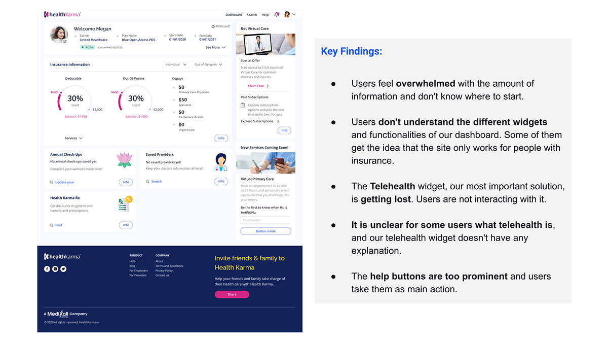
Impact
With all these findings, we decided as a team (with the UX designer, the UX director, and the product manager) to work on a new user dashboard design with the following design objectives:
- Improve the visual design of the dashboard to make it less overwhelming and more clean and appealing for our users.
- Increase the understandability of our different widgets and functionalities.
- Increase the visibility of our Telehealth widget to promote user interaction with it as a main measurement of success, claiming the free month or exploring our subscription plans.
- Improve the hierarchy of elements and buttons to ease navigation and usability.
- More direct access to the different services from the dashboard, reducing the number of clicks.
Preference Test with 4 Different Dashboard Layouts


Research Goal
Collect users' feedback and preferences over 4 different options of dashboard layouts in terms of visual appeal and functionality, and understand the impact of each design on how they would start interacting with the platform.
Methodology
Remote preference test with 20 users aligned to our personas, with the 4 dashboard designs. The recruiting process and tests were done with the UserTesting platform.To avoid bias, we randomly rotated the order in which each user would see the designs.
For each design, the test asked users to rate the visual appeal and functionality of the dashboard layout, providing feedback and explaining how they would start interacting with it. In the end, users had to select the layout they think works best in functionality and design and explain the reasons for their selection.
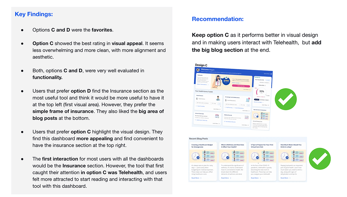
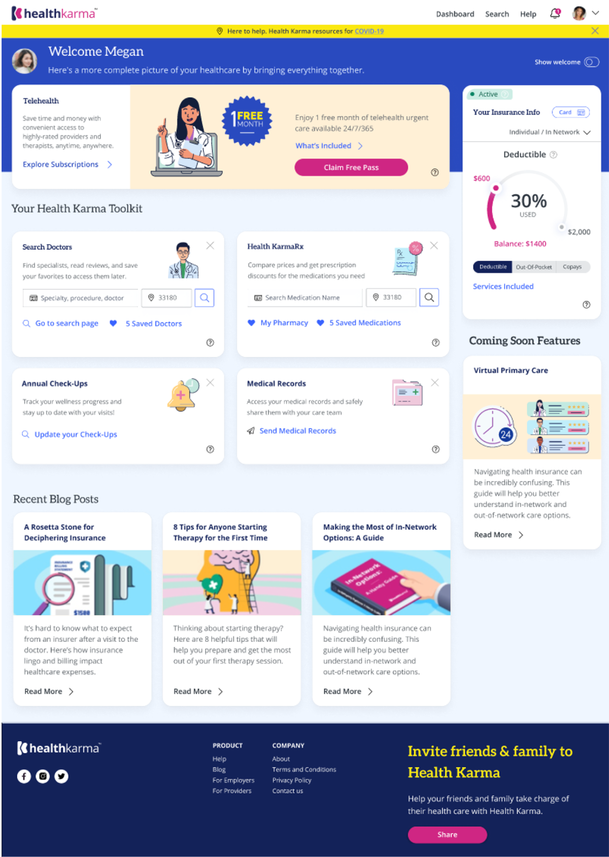
Prototype Test with the New Dashboard Design
Along with the preference tests I conducted some prototype testing sessions with the best performing dashboard design (Option C) to deep dive on the different widgets and identify more opportunities for improvements.
Research Goal
Evaluate the functionality and design of our new dashboard with potential users and identify opportunities for improvements.
- Do the users understand the capabilities of the platform?
- How clear and useful do they find the different features?
- Is the design appealing in terms of colors, images, icons,..?
- How would users start interacting with the platform?
- Does the overall layout make sense for the users?
Methodology
Unmoderated prototype test with 15 users aligned to our personas (males and females, US, 24 to 50 YO, uninsured or with high deductible insurance plan). The recruiting process and tests were done with the UserTesting platform.


Preference Test with 4 Different Telehealth Banners


Research Goal
Assess the performance of our Telehealth banner with our doctor avatar compared to other possibilities with real human doctors in visual appeal and explore preferences over different devices (mobile vs. laptop). Collect users' feedback and suggestions for improvements.
Methodology
Remote unmoderated preference test with 60 users divided into 4 groups with different genders and age ranges, as detailed below. The recruiting process and tests were done with the UserTesting platform.
- 10 Women 21-34 YO / - 10 Men 21-34 YO
- 10 Women 35-49 YO / - 10 Men 35-49 YO
- 10 Women 50-64 YO / - 10 Men 50-64 YO

Recommendations
- Keep the doctor Avatar as it work better with the dashboard design, creates differentiation, and it's appealing to most users.
- Develop and test a new design with our Avatar doctor and a laptop instead of a cell phone, taking into account users' attitudes towards the computer vs the cellphone for virtual doctor visits, and also that more than 60% of our current users and web visitors are using desktop.
- Create a different design for the blue bubble message apart from the doctor.
New Dashboard Design developed with Users' Insights and Feedback
Ready for new rounds of user testing!
Learnings
These were the first studies I conducted with these UXR methodologies, so the learnings were huge!
- Always run at least 2 pilot test for unmoderated sessions to validate the clarity of the tasks and the prototype navigation.
- It's important to provide good context and give users time to explore and familiarize themselves with the prototype before starting the test tasks.
- Include in the instructions the requirement of scrolling down to see the full page when required; otherwise, most users won't do it.
- Remind users all along the test to speak aloud when reading, thinking, making choices, or interpreting what they see.
Also, after 2 years of experience and a deeper understanding of these UXR methods, there are things I would now have conducted in different ways.
For example, for Preference Testing is better to mage maximum 3 variants of a design with only one different element. So, I would now conduct a first preference test with only 3 Telehealth banners with different doctors and then another preference test with a single doctor and 2 variants of devices (laptop vs cell phone).
